
Welcome to The 10 Worst Logos of 2021, one of two articles in my annual Best and Worst Logos of the Year series. Every year, I look back at the rebrands that caught my attention and share what businesses can learn from them. Here, we are going to take a look at some of this year’s rebrands that may have missed the mark. Looking for The 10 Best Logos of 2021? Read the companion article to learn about some of this year’s strongest work.
Below, I break down The 10 Worst Logos of 2021. For each one, I look at why the business rebranded, where the new identity falls short, what it gives up, and what your business can learn before starting a rebrand of its own.
A quick note before I get into the list: I have respect for every designer, studio, in-house team and client represented here. Putting a new identity into the world is hard. These reviews focus on the finished work, but the point is not criticism for criticism’s sake. This series is here to help business owners and brand teams understand why companies rebrand, learn from the choices behind the work and make better decisions when it is their turn. The entries are numbered to make the article easy to follow, but they are not presented in any particular order. Design is subjective, and I do not expect everyone to agree with every choice. That is part of what makes these articles fun to write and discuss.
But when it does come time for you to discuss a new logo, Parker Lee Creative is an award-winning, independent creative studio specializing in logo design and brand identity. We help businesses build new identities and refresh the ones they have outgrown. Our process starts with what the logo needs to communicate, then tests the work everywhere customers will see it. If you are considering a rebrand, contact us and tell us your story. We would love to help you create something worthy of next year’s Best Logos of the Year article.
1. General Motors
Why Did the Logo Change?
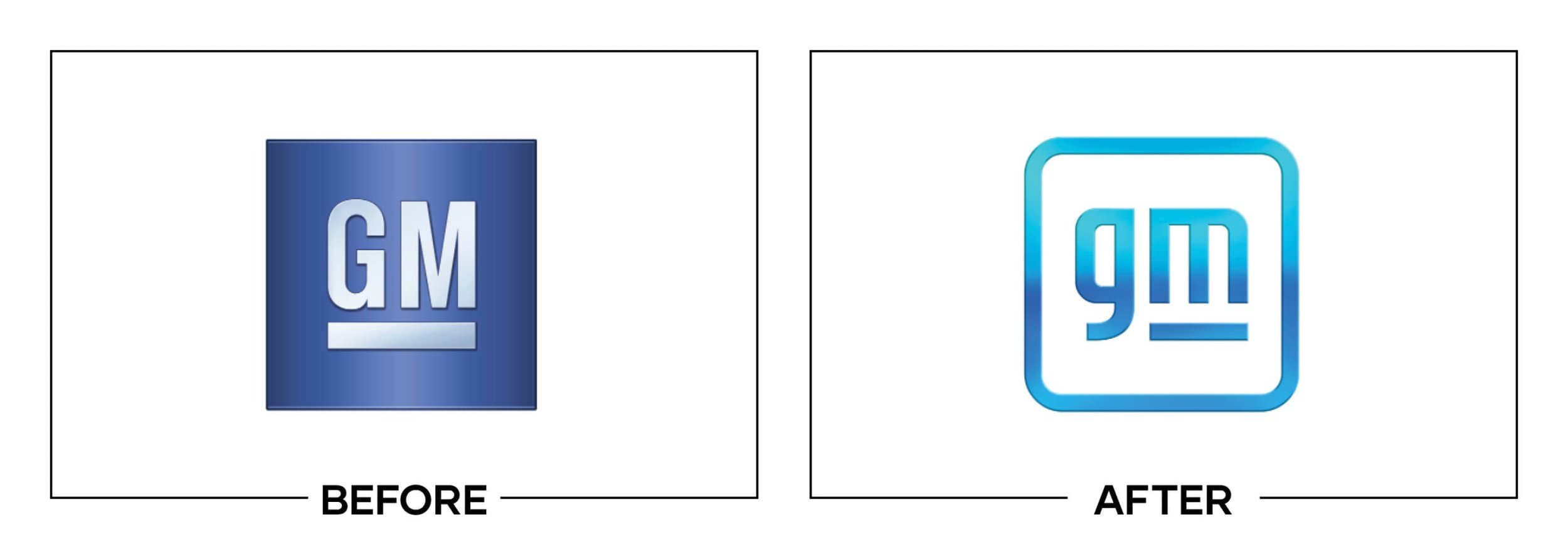
General Motors launched “Everybody In” to support its Ultium electric-vehicle strategy and wanted the parent identity to signal an electric, digital future. The redesign changed the industrial uppercase badge into a rounded lowercase gm.
Why It Made the List:
The lowercase letters and rounded box aim for accessible technology, but they push an industrial company toward the visual language of a generic mobile app. The old mark was rigid, yet it carried weight appropriate to a corporate manufacturer.
Design Week’s launch coverage documents the sky-blue gradient, lowercase shift, and underline intended to suggest an electric plug. The plug requires explanation, which is a warning when the detail is meant to carry the strategy.
The gradient narrows reliable reproduction and makes the mark feel delicate on facilities, vehicles, sponsorships, and one-color documents. A parent logo serving many divisions needs fewer technical conditions, not a finish tied to screens.
The Tradeoff:
GM retained blue, the enclosing square, and an underline, so the logo is not disconnected from its history. The softer form also fits digital channels. The issue is not change itself; it is trading industrial authority for a startup tone.
What Businesses Can Learn:
Do not compress an entire business strategy into one visual pun. A corporate mark should first identify the parent and reproduce everywhere it governs. Let campaigns explain the technology while the logo supplies a stable, ownable signature.

2. Google Fiber
Why Did the Logo Change?
After a decade of relying mainly on a wordmark, Google Fiber wanted a symbol for advertising, local outreach, its app, and Webpass. Google Brand Studio built a modular, upward arc around ideas of momentum and scalable community impact.
Why It Made the List:
The icon is colorful and active, but the separated Google-color pieces do not suggest fiber, speed, access, or a network without a paragraph of interpretation. It looks related to Google before it looks specific to Google Fiber.
Google Fiber’s explanation offers catalysts, communities, throughput, service qualities, shared access, and playfulness as possible readings. When one mark carries that many optional meanings, none becomes a clear first impression.
The symbol follows the multicolor fragmentation seen across other Google products, reducing distinction at app-icon size. Family resemblance can help, but this execution makes Fiber feel like another suite tile rather than infrastructure.
The Tradeoff:
The modular arc animates well and is unmistakably part of Google’s portfolio. It also supplied a base for the later GFiber expression. The problem is that the symbol depends on parent-brand color more than a distinctive broadband idea.
What Businesses Can Learn:
Limit a logo to one or two meanings an audience can actually perceive. A flexible explanation is not the same as a clear mark. Test the icon without its wordmark, then ask whether people identify the product or only recognize the parent company.

3. Discord
Why Did the Logo Change?
For its sixth birthday, Discord wanted a friendlier identity that reflected communities beyond gaming. The team corrected Clyde’s asymmetry, freed the symbol from its speech bubble, brightened Blurple, and introduced a more playful wordmark.
Why It Made the List:
Simplifying Clyde improved flexibility, but the new wordmark introduced uneven, cartoon-like forms that fight the cleaner icon. The letters feel like a separate personality rather than the natural name beside a familiar community symbol.
Discord’s own explanation details the geometry, brighter palette, and hundreds of type options considered. The care is clear, yet a long internal search does not guarantee that the selected wordmark will read naturally to users.
The more saturated Blurple created contrast and comfort complaints in Discord’s own community channels. A color central to a daily interface must be tested for sustained use and accessibility, not only for energy in launch graphics.
The Tradeoff:
Clyde is more symmetrical, easier to animate, and less constrained by the old bubble. Broadening the identity beyond gaming was also strategically sensible. The weakest decisions sit in the wordmark and color intensity, not the entire refresh.
What Businesses Can Learn:
Separate launch excitement from daily interface behavior. Test color for prolonged exposure, accessibility, dark mode, and notifications, then show the wordmark beside the icon at real sizes. Friendliness should not cost reading comfort.

4. Hot Pockets
Why Did the Logo Change?
Nestlé shifted Hot Pockets packaging from speaking mainly to purchasers toward appealing to both busy parents and the teenagers eating the product. The new system emphasized flavor, appetite photography, and a bolder interlocked wordmark.
Why It Made the List:
The tightly interlocked letters create a compact block, but the overlap makes “Hot Pockets” slower to read at freezer distance. A product already surrounded by flavor, crust, quantity, and nutrition information needs a simpler nameplate.
The Dieline’s process interview clearly explains the shift toward both buyer and eater. The package strategy and audience logic are thoughtful, yet the wordmark adds compression exactly where the front panel needs a stable anchor.
Rounded corners and the red field preserve appetite and familiarity, but the condensed lettering feels like a forced badge. The logo’s shape wins attention while sacrificing the easy reading that should turn attention into recognition.
The Tradeoff:
The package photography, flavor hierarchy, and stronger red block create real shelf presence. The identity also feels more self-assured than the version it replaced. My concern is focused on the crowded lettering, not the audience strategy.
What Businesses Can Learn:
Package design has two audiences: the person choosing and the person consuming. Build hierarchy for both, then keep the product name effortless to read from the aisle. A bold silhouette is only useful if the letters inside it stay clear.

5. Meta
Why Did the Logo Change?
Facebook renamed its parent company Meta because one social platform no longer represented its portfolio or its stated focus on immersive technology. The corporate identity introduced a blue continuous loop designed for flat, moving, and 3D use.
Why It Made the List:
The loop can read as an M, infinity sign, headset, or continuous path, but none is specific to Meta. The symbol entered a crowded field of technology and wellness marks, making scale and repetition do more work than the form itself.
Design Week’s rebrand report explains that the mark was drawn in virtual reality and designed to shift across perspectives and textures. That makes it a strong motion container, but the static corporate signature remains generic.
Retaining Facebook blue creates continuity, yet it also makes the new parent feel visually tethered to the single product it was supposed to outgrow. A new corporate architecture needed clearer distinction between Meta and the Facebook app.
The Tradeoff:
The loop is simple, scalable, and unusually well suited to dimensional motion. The short name also leaves room for product architecture. Its weakness is ownership: a flexible infinity form needs broad exposure before it belongs to one company.
What Businesses Can Learn:
An abstract mark can work, but flexibility is not distinctiveness. Compare it against adjacent categories, trademark fields, and common symbols before launch. With a new name, the icon should reduce the amount of recognition that must be taught.

6. Papa Johns
Why Did the Logo Change?
Papa Johns replaced its interim 2019 identity while introducing a new restaurant and pickup model. The 2021 wordmark removed the green border, Pizza banner, and possessive apostrophe, while custom type and ingredient colors expanded the toolkit.
Why It Made the List:
The simplified wordmark is flexible, but dropping the apostrophe changes the grammar without creating a stronger verbal idea. The move drew attention to ownership and the founder precisely when the design was trying to move forward.
Papa Johns’ official release documents customer research, restaurant operations, ingredient colors, and a dough-inspired typeface. The broader work is practical and well scoped, but the name edit overwhelms those useful improvements.
Removing the Pizza banner makes the mark easier to place online and on signs, but it also removes an immediate category cue from a name that sounds personal. The wider toolkit must rely more on context, food imagery, and reputation.
The Tradeoff:
The new typography, ingredient palette, and restaurant tools are warmer, cleaner, and more adaptable than the previous system. Most of the refresh is well considered. The unnecessary punctuation debate is what earns the logo a place here.
What Businesses Can Learn:
Every small edit can change meaning. Read a renamed wordmark as language, say it aloud, and test what customers infer before launch. If a punctuation change becomes the dominant story, it can bury stronger work elsewhere in the identity.

7. Calendly
Why Did the Logo Change?
Calendly had grown from a simple scheduling utility into a mature collaboration platform and wanted an identity with more confidence and range. Pentagram created a hollow C that could hold changing shapes representing meetings and overlap.
Why It Made the List:
The outer C and inner shape create a flexible container, but the static lockup strongly resembles a toilet viewed from above. Once seen, that unwanted association competes directly with the intended story of scheduling and connection.
Pentagram’s case study presents a rich toolkit of color, motion, photography, and intersecting shapes. The applications are lively, but the core logo proves that a strong visual language alone cannot cancel a distracting first read.
Changing the inner form for different meetings expresses variety, but it weakens the consistency an app icon needs. Calendly asks one container to be a logo, frame, animation, and metaphor, leaving the primary configuration less settled.
The Tradeoff:
The wordmark is more confident, and the shape language gives Calendly far more expressive range than its old identity. The C also works well in motion. The problem is a preventable association that broad, unaided testing should have surfaced.
What Businesses Can Learn:
Test a logo with people who have never heard the concept. Ask what they see before explaining what it means, and include cultural, accessibility, and thumbnail checks. An unintended image can overpower months of strategic rationale in seconds.

8. Cleveland Guardians
Why Did the Logo Change?
Cleveland’s baseball club replaced a name criticized for harming Native people and needed a respectful identity for the 2022 season. Guardians connected the renamed team to the Guardians of Traffic statues on the Hope Memorial Bridge.
Why It Made the List:
The name has credible local roots, but the winged G baseball forces too many references into one compact mark. Wings, mirrored letters, ball seams, and a split-finger grip compete before the symbol reads as one confident sports emblem.
SportsLogos’ detailed breakdown documents the bridge helmets, pitching reference, Diamond C, and championship-era type. The research is real and locally grounded, yet the primary Fastball logo tries to display too much of that story at once.
Forced perspective and fine interior seams make the emblem sensitive to angle and size, especially as a sleeve patch or small icon. A sports logo must remain decisive when stitched, viewed in motion, or seen from an imperfect seat.
The Tradeoff:
Keeping navy, red, the script style, and an evolved C preserved substantial baseball equity during a necessary name change. The local story is meaningful. The weakness is the crowded Fastball execution, not the decision to become Guardians.
What Businesses Can Learn:
A necessary rename still needs ruthless visual editing. Keep the story in the system, then choose one idea for the primary emblem and move secondary references into badges, patterns, or content. Local meaning should survive reduction.

9. Grubhub
Why Did the Logo Change?
After Just Eat Takeaway acquired Grubhub, the delivery service adopted its parent’s orange house with fork and knife. The goal was to align a global portfolio and shared sponsorships while retaining Grubhub’s familiar existing wordmark.
Why It Made the List:
Adding the JET house made the acquisition visible, but it traded a distinctive red wordmark for a borrowed parent symbol. Grubhub began to look like a regional label inside someone else’s system rather than a strong national brand.
The house and utensils also entered a crowded field of food-delivery and meal-kit imagery. A trademark dispute with Home Chef followed, and the litigation showed how quickly a shared global asset can create local similarity questions.
Grubhub’s 2025 announcement says the refreshed wordmark would move away from the house after Wonder acquired the company. The reversal does not prove business failure, but it confirms that the borrowed icon was no longer worth keeping.
The Tradeoff:
Orange aligned Grubhub with its new parent, and the retained wordmark protected some recognition. A shared house also simplified cross-border sponsorship. The logo did its portfolio job, but at the expense of local ownership and distinction.
What Businesses Can Learn:
Acquisition design should show the relationship without erasing the asset being acquired. Audit local trademarks, competitor shapes, and customer recognition before importing a parent symbol. Strong architecture lets both levels keep a role.
10. LegalZoom
Why Did the Logo Change?
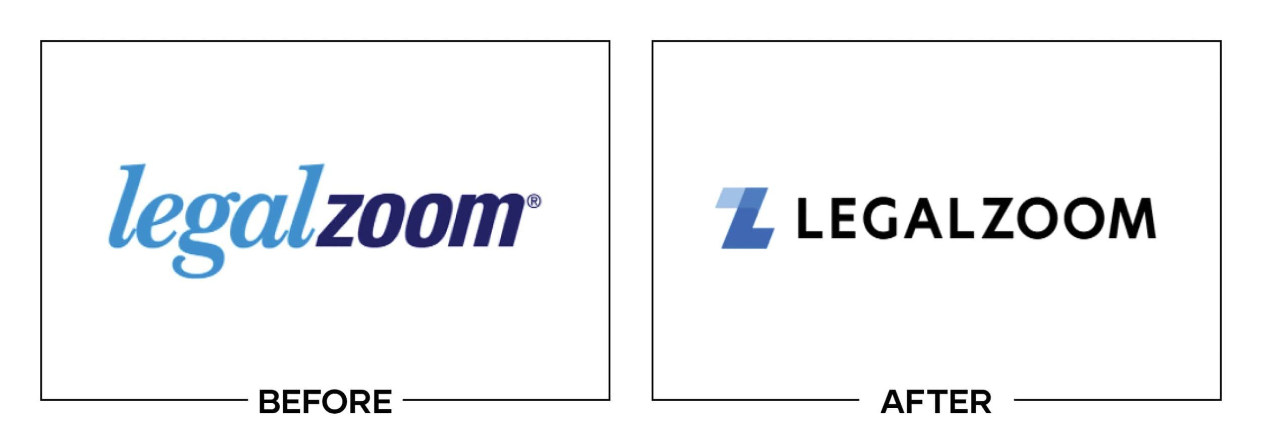
LegalZoom undertook its first major logo change and largest redesign in twenty years while building its first formal design toolkit. The new mark overlapped a translucent blue L and Z above a clear, single-color uppercase wordmark.
Why It Made the List:
The overlapping monogram introduces iconography, but its translucent layers create uneven visual weight and prevent a clean one-color conversion. The darkest intersection attracts attention without helping the L and Z read more clearly.
A project team case study documents more than 250 repository images and a coordinated switch across products, packaging, partners, signage, and tools. The rollout discipline was impressive even though the central mark was technically fussy.
Combining LEGAL and ZOOM into one uppercase color removes a useful reading cue and strengthens the association with the video platform. LegalZoom replaced this logo in 2023 with a visual language designed to better separate the names.
The Tradeoff:
The monogram gave LegalZoom a compact app and social asset, while its first toolkit improved consistency across a complex product. The weakness was the icon itself: transparency and overlap made a practical corporate mark less adaptable.
What Businesses Can Learn:
One-color reproduction is still a basic logo test, even for a digital business. Check overlap, contrast, and word separation before implementation. A disciplined rollout can distribute a flaw as efficiently as it distributes a solution.
What the Worst Logos of 2021 Have in Common
The worst logo redesigns of 2021 often asked one small mark to carry too much strategy. GM hid an EV plug in a lowercase letter. Google Fiber offered a menu of possible meanings. Cleveland compressed a bridge, wings, letters, a baseball, and a pitching grip into one emblem. Calendly made a flexible frame do several jobs before validating its first read.
The practical answer is not universal minimalism. It is hierarchy and testing. Decide what the logo must communicate first, then let naming, type, color, motion, imagery, architecture, and campaigns handle the rest. Test the result in one color, at real sizes, beside competitors, and with people who have not heard the presentation.
For stronger examples from the same year, read The 10 Best Logos of 2021.
Logos and trademarks belong to their respective owners and are shown for identification, criticism, and commentary. No sponsorship, endorsement, affiliation, or partnership is implied.
Thanks for Reading The 10 Worst Logos of 2021
Thanks for reading our annual Worst Logos of the Year article. It really means a lot to me. I also want to thank every designer, studio, in-house team and client who brought this year’s work to life. I may have opinions about the results, but this series would not exist without people willing to take creative risks in public.
For the other half of this year’s series, read The 10 Best Logos of 2021. You can also browse the blog for earlier Best and Worst Logos of the Year articles and more logo design reviews.
Does your business need a new logo? We provide logo design and brand identity services for businesses that need something new or have outgrown what they already use. Fill out the form below and tell us your story. We would love to help forge a new identity for your brand that connects with your customers, tells your story, and lands you at the top of next year’s Best Logos of the Year article.
Legal Disclaimer: This content is provided for educational and informational purposes and is intended as commentary and criticism; all product names, logos, and trademarks are the property of their respective owners, and any copyrighted materials shown are used under the principles of fair use solely to identify the subjects discussed and to support analysis, with only the limited portions reasonably necessary displayed; no sponsorship, endorsement, affiliation, or partnership is implied, and nothing on this page constitutes legal, financial, or other professional advice.
