
Welcome to The 10 Best Logos of 2021, one of two articles in my annual Best and Worst Logos of the Year series. Every year, I look back at the rebrands that caught my attention and share what businesses can learn from them. Here, we are going to take a look at some of this year’s strongest work. Looking for The 10 Worst Logos of 2021? Read the companion article to learn about rebrands that may have missed the mark.
Below, I break down The 10 Best Logos of 2021. For each one, I look at why the business rebranded, where the new identity succeeds, what it gives up, and what your business can learn before starting a rebrand of its own.
A quick note before I get into the list: I have respect for every designer, studio, in-house team and client represented here. Putting a new identity into the world is hard. These reviews focus on the finished work, but the point is not criticism for criticism’s sake. This series is here to help business owners and brand teams understand why companies rebrand, learn from the choices behind the work and make better decisions when it is their turn. The entries are numbered to make the article easy to follow, but they are not presented in any particular order. Design is subjective, and I do not expect everyone to agree with every choice. That is part of what makes these articles fun to write and discuss.
But when it does come time for you to discuss a new logo, Parker Lee Creative is an award-winning, independent creative studio specializing in logo design and brand identity. We help businesses build new identities and refresh the ones they have outgrown. Our process starts with what the logo needs to communicate, then tests the work everywhere customers will see it. If you are considering a rebrand, contact us and tell us your story. We would love to help you create something worthy of next year’s Best Logos of the Year article.

1. Kia
Why Did the Logo Change?
Kia needed an identity for Plan S, its shift from a conventional automaker toward electric vehicles and broader mobility services. The new signature wordmark removed the oval badge and introduced the line “Movement that inspires.”
Why It Made the List:
One continuous line gives the wordmark speed and confidence without adding a separate automotive symbol. The rising strokes, symmetry, and proportions feel engineered, yet the hand-signed quality keeps the mark from feeling purely mechanical.
Kia’s official launch ties the logo to a real portfolio and business transition. The identity does not merely make an old badge flatter; it gives a changing company a distinct signature suited to vehicles, screens, and mobility services.
Removing the oval lets the name occupy more space on a grille and reduces the visual baggage of a traditional manufacturer badge. The mark can be stamped, lit, animated, or used in one color without losing the same basic gesture.
The Tradeoff:
The connected I and A can make the name read as “KN” for people seeing the badge without context. Distinctiveness and ambiguity arrive together, so consistent wordmark use and repeated exposure are essential to building correct recognition.
What Businesses Can Learn:
A radical logo can support a radical business shift when the new mark still names the company and works across its products. Test unfamiliar letterforms with people outside the design room, then plan enough repetition to teach the new reading.

2. MIDI
Why Did the Logo Change?
MIDI 2.0 was the standard’s first major technical update in more than thirty-five years. The MIDI Association needed its first cohesive identity, including a certification mark that could connect instruments, software, education, and events.
Why It Made the List:
The M-shaped symbol is built from cross-modulated 440 Hz and 880 Hz sine waves, turning the identity into something that can be seen, animated, and heard. The concept comes directly from sound rather than generic music notes or controls.
Design Week’s identity report explains how Lissajous curves shaped the mark and how it expands across motion and audio. The technical idea is rigorous, but the result remains simple enough to sit on small instruments and software.
The logo gives a decentralized standard one shared signature without making every manufacturer look alike. That balance is important: certification needs consistency at the point of trust, while the products carrying it need brand space.
The Tradeoff:
The waveform concept is invisible without explanation, and the symbol can resemble a monogram before it suggests music. Certification applications also demand restraint, because detail and animation cannot carry the idea on every small product.
What Businesses Can Learn:
A technical concept is valuable when it produces a simple, useful mark, not when it only makes a clever story. Build meaning from the product itself, then test whether the result works for people who never hear the design explanation.
3. Pfizer
Why Did the Logo Change?
After roughly seventy years with a pill-shaped corporate mark, Pfizer wanted to shift attention from commerce toward scientific discovery. Its new identity kept the name and blue equity while replacing the capsule with a double helix.
Why It Made the List:
The two-tone helix gives Pfizer a scientific cue without turning the wordmark into laboratory clip art. Its crossing ribbons create movement and depth, while the familiar blue name keeps the redesign connected to decades of recognition.
Design Week’s rebrand coverage documents the strategic move from pill to science and the development of a multilingual system. The identity was designed for a global biopharma organization and its research teams, not only a corporate sign.
Retaining the recognizable wordmark was the right counterweight to a completely new symbol. The name carries trust and history, while the helix opens room for research, partnerships, and therapies that cannot be represented by one dosage form.
The Tradeoff:
DNA and helix imagery are common across healthcare and biotechnology, so the symbol is not distinctive through subject matter alone. Pfizer must own the exact ribbon construction, color, motion, and pairing with its established name.
What Businesses Can Learn:
When a business outgrows an old metaphor, change the symbol without discarding every familiar asset. Preserve the name, color, or typography customers know, then build the replacement around the company’s future work rather than one product.

4. Seattle Storm
Why Did the Logo Change?
Seattle Storm’s first major redesign since 2000 needed to express the team’s own achievements and city, rather than rely on visual ties to the former SuperSonics. The new mark combined the Space Needle, Mount Rainier, and lightning.
Why It Made the List:
The Space Needle forms the basketball’s central ribs, Mount Rainier shapes the lower horizon, and a bolt cuts through the composition. Three local ideas share one silhouette instead of becoming separate icons competing on a jersey.
The Storm’s official announcement connects the identity to the franchise’s championships, city, and future. Retaining green and yellow protects the color memory fans had built while letting the team claim a clear mark of its own.
The circular badge works on uniforms, courts, merchandise, and social profiles, while the nested symbols reward a closer look. It feels specific to Seattle and to basketball without requiring the team name inside every application.
The Tradeoff:
Several symbols occupy a compact badge, so the mountain and lightning detail soften when the logo gets small. The primary mark needs simpler wordmarks and one-color versions around it, especially for embroidery and tiny digital placements.
What Businesses Can Learn:
Multiple ideas can live in one logo when they share geometry and hierarchy. Start with the silhouette, then hide secondary meaning inside it. If every reference demands equal attention, split the system before the primary mark becomes a collage.

5. San Diego Zoo Wildlife Alliance
Why Did the Logo Change?
San Diego Zoo Global needed one architecture for its parks, research, and conservation work. The new Wildlife Alliance name put collaboration at the center, while a shared identity connected famous visitor destinations to the wider mission.
Why It Made the List:
A lion, California condor, and white rhino share one circular mark through positive and negative space. Each animal connects to a real part of the organization’s history, so the puzzle carries institutional meaning rather than novelty alone.
Pentagram’s case study shows how the parent, Zoo, Safari Park, and Kids brands fit together. The logo succeeds because it anchors a clear architecture that previously treated major parts of the organization as adjacent identities.
The warm palette, animal-like typographic details, and three-creature symbol balance urgency with hope. Conservation can be presented without making every visitor touchpoint bleak, while the Alliance name invites partners into the mission.
The Tradeoff:
Not every viewer will find all three animals, and the rhino and condor become especially subtle when reduced. The puzzle is rewarding at larger sizes, but the wordmark and simpler applications must carry recognition when detail disappears.
What Businesses Can Learn:
Brand architecture should explain how visible services connect to a larger mission. Give the parent a clear role, preserve the names audiences know, and use one meaningful symbol to connect the system without making every division identical.

6. Colt 45
Why Did the Logo Change?
Colt 45 needed to modernize aging packaging while respecting a product with decades of recognition. The refresh simplified the horse and horseshoe, tightened the wordmark, and moved away from a dated campaign tone without denying its history.
Why It Made the List:
The red horse remains the fastest recognition cue, but cleaner drawing and a bolder horseshoe make it easier to reproduce. The update respects the old mark’s attitude while removing small details that did not survive on cans or signs.
The Dieline’s rebrand report shows how the simplified assets work across retail packaging, pattern, and type. The designers did not turn a malt-liquor brand into a luxury product; they gave its existing personality more control.
A condensed wordmark creates vertical impact and lets flavor or format information sit within a repeatable hierarchy. The system feels contemporary because the parts are better drawn and organized, not because the heritage was scrubbed away.
The Tradeoff:
The larger wordmark can overpower the red colt, and the polish risks sanding away some of the rough, populist character customers recognize. The identity works best when the horse remains active rather than becoming a small heritage stamp.
What Businesses Can Learn:
Modernization does not require changing a brand’s personality. Improve drawing, hierarchy, and reproduction around the assets people know. Polish should make the original character clearer, not make the product pretend to be something else.

7. Chicago Fire FC
Why Did the Logo Change?
Chicago Fire FC replaced its widely rejected 2019 Fire Crown after a community process involving more than twenty thousand supporters. The new crest returned to Chicago flag colors and combined a six-point star, C, and Florian-cross structure.
Why It Made the List:
The crest repairs a relationship as much as an image. By inviting supporters into the process and visibly returning to Chicago symbols, the club acknowledged that a sports identity belongs to a community, not only an ownership presentation.
The club’s launch story explains how the star, C, cross, and flag colors were drawn from fan input. Those references create a clear local answer for uniforms, signage, and merchandise to the abstract crown the identity replaced.
The roundel fits soccer applications, and the red C creates a useful center at jersey size. Secondary wordmarks and patterns extend the identity without asking the detailed crest to solve every broadcast, social, and merchandise placement.
The Tradeoff:
Round soccer crests are common, and nesting a star, C, and cross creates more municipal symbolism than some small uses can hold. Announcing the mark in 2021 for full 2022 use also left the club navigating two identities during rollout.
What Businesses Can Learn:
When a redesign damages trust, the next process must be visibly different. Invite audiences early, show what feedback changed, and keep implementation honest. Participation is not a vote on a curve, but it should leave evidence in the result.
8. New York State Parks
Why Did the Logo Change?
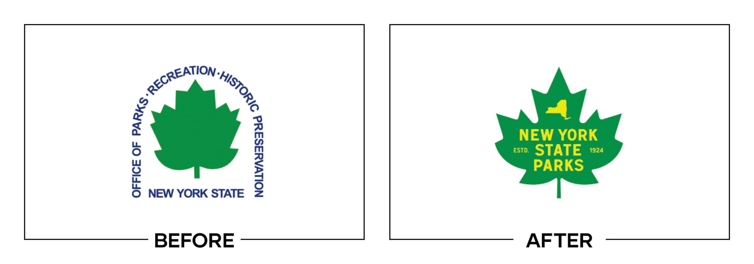
New York State Parks needed a warmer, more flexible public identity for parks, recreation, and historic sites. The refresh replaced a dated maple leaf, adjusted the green and yellow palette, and built a system inspired by park posters.
Why It Made the List:
Replacing the generic maple with foliage found across New York makes the seal feel more rooted in the state. The drawing retains an official presence while introducing enough irregularity to suggest landscapes rather than administration.
The dated identity record documents custom typography, poster-inspired layouts, and the revised emblem. Those elements create a public-facing system across signs, maps, and campaigns that can celebrate places, seasons, and history.
Warmer yellow and green feel natural without mimicking another outdoor brand, while the vintage illustration language gives campaigns a consistent voice. The identity can be institutional when required and inviting when asking people to visit.
The Tradeoff:
The seal still contains a long agency name and fine leaf detail, so it cannot carry every small sign, icon, or digital placement alone. Supporting typography and simplified layouts are essential if the system is going to remain legible.
What Businesses Can Learn:
Public identities must balance authority with invitation. Keep the official mark credible, then create practical tools for campaigns, locations, and services. A seal should anchor the system, not force every message into a dense container.

9. ABC
Why Did the Logo Change?
ABC needed Paul Rand’s circle to reproduce more consistently across streaming interfaces, social icons, affiliate lockups, and on-air graphics. The update flattened the mark, redrew the letters, and introduced clearer network-wide rules.
Why It Made the List:
The redesign respects one of broadcasting’s most recognizable marks. Smaller letters and more internal space improve the black circle’s balance, while removing gradients lets the same logo travel across screens, print, signage, and motion.
NewscastStudio’s technical review documents changes to the A, B, C, spacing, and affiliate lockups. This is the kind of precise governance a large network needs, even when most viewers never notice the refinements across markets.
Heldane, GT America, and stricter station relationships give the network a system beyond the circle. Affiliates can identify their local service without redrawing, stretching, or crowding the national mark in a different way by market.
The Tradeoff:
The smaller letters reduce some of the old mark’s boldness at tiny sizes, and a network-wide transition can leave mixed versions on air for years. The visual change is subtle, so its value depends on disciplined adoption rather than novelty.
What Businesses Can Learn:
Do not redraw an iconic logo more than the applications require. Fix spacing, reproduction, and lockup rules, then document the change carefully. For a mature brand, consistent governance can create more value than a dramatic new symbol.

10. Burger King
Why Did the Logo Change?
Burger King’s first complete rebrand in more than twenty years needed to work digitally and make the food feel more honest. The system replaced blue swooshes and synthetic shine with a refined heritage logo, warm color, and custom type.
Why It Made the List:
Returning to the bun-shaped wordmark recovers equity without simply scanning an old logo. The proportions, spacing, and flat color are redrawn across current screens and packaging, giving a familiar idea cleaner daily performance.
Design Week’s rebrand coverage shows how Flame type, ingredient colors, uniforms, packaging, and retail spaces extend the identity. The logo feels convincing because the same rounded, appetizing logic appears throughout the system.
Removing blue and glossy effects makes the brand look more like the food it sells. Warm brown, orange, red, and green create appetite and range, while the simple badge stays recognizable in apps, drive-through signs, wrappers, and advertising.
The Tradeoff:
The seventies references are strong enough to become costume if every application piles on retro type and pattern. A vast franchise network also rolls out slowly, which means customers can encounter new packaging beside older signs for years.
What Businesses Can Learn:
Heritage is most useful when it solves a current problem. Recover the recognizable idea, redraw it for modern production, and build new tools around it. The goal is continuity with better performance, not nostalgia for its own sake.
What the Best Logos of 2021 Have in Common
The best logo redesigns of 2021 knew where to spend change. Kia and Pfizer introduced new central symbols while retaining a recognizable name or color. ABC refined an icon almost invisibly. Burger King recovered heritage. Chicago Fire FC changed the process as well as the crest.
Strong identity work begins with an audit of equity, audience, applications, and business direction. It builds a logo that can reproduce under pressure, then gives typography, color, imagery, motion, and architecture clear supporting roles. The result should still make sense when the launch video is gone.
For the other side of the year, read The 10 Worst Logos of 2021.
Logos and trademarks belong to their respective owners and are shown for identification, criticism, and commentary. No sponsorship, endorsement, affiliation, or partnership is implied.
Thanks for Reading The 10 Best Logos of 2021
Thanks for reading our annual Best Logos of the Year article. It really means a lot to me. I also want to thank every designer, studio, in-house team and client who brought this year’s work to life. I may have opinions about the results, but this series would not exist without people willing to take creative risks in public.
For the other half of this year’s series, read The 10 Worst Logos of 2021. You can also browse the blog for earlier Best and Worst Logos of the Year articles and more logo design reviews.
Does your business need a new logo? We provide logo design and brand identity services for businesses that need something new or have outgrown what they already use. Fill out the form below and tell us your story. We would love to help forge a new identity for your brand that connects with your customers, tells your story, and lands you at the top of next year’s Best Logos of the Year article.
Legal Disclaimer: This content is provided for educational and informational purposes and is intended as commentary and criticism; all product names, logos, and trademarks are the property of their respective owners, and any copyrighted materials shown are used under the principles of fair use solely to identify the subjects discussed and to support analysis, with only the limited portions reasonably necessary displayed; no sponsorship, endorsement, affiliation, or partnership is implied, and nothing on this page constitutes legal, financial, or other professional advice.
