The 10 Worst Logos of 2021
Did you know time travel is possible? Come with me and we'll travel back in time and review The 10 Worst Logos Of 2021.
As is tradition, I wanted to use this article as a set of exemplary tales and tips for businesses looking to change their look. Hopefully, we can learn from these rebrands and apply a lesson or two to our own work! With that in mind, let’s see The 10 Worst Logos Of 2021 in no particular order.
GENERAL MOTORS
Why It Made The List:
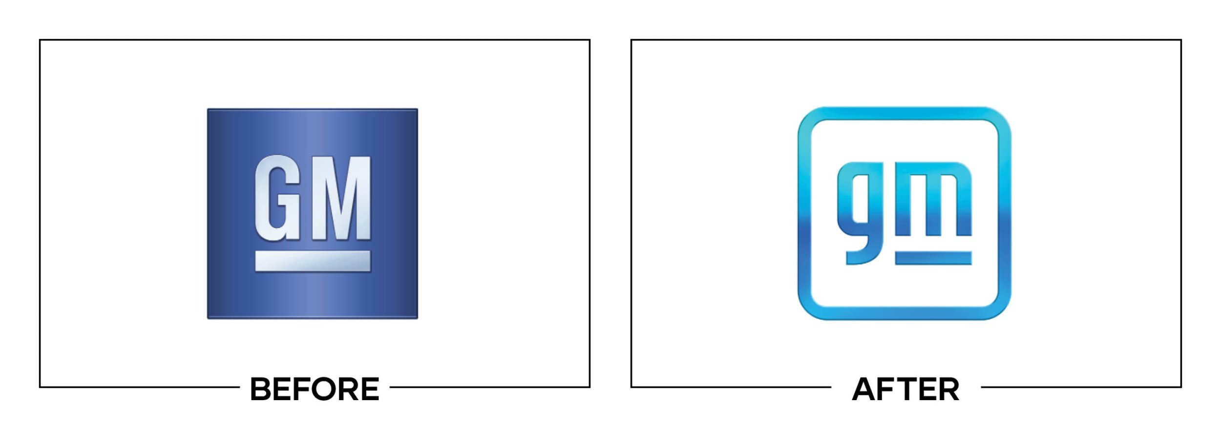
Gradient logos for automotive brands need to be a thing of the past. In fact, KIA (one of 2021’s best logos) embraced the trend.
The new logo is meant to elude to GM’s electric future, but it runs out of battery on a journey that was doomed from the start.
In a side-by-side with its peers, this logo feels frail.
GOOGLE FIBER
Why It Made The List:
In 2020 Google tried to similarly brand all of its services. This new look is so far off from their family of services.
When brought into a one-color format this mark loses the Google vibe.
For a brand that is attempting a hostile take over of the country's hosting, the logo feels inadequate.
DISCORD
Why It Made The List:
The "i"
The "d"
The rebrand is meant to kick off a shift away from gaming but leaves in the controller icon.
HOT POCKETS
Why It Made The List:
This feels like "hello fellow kids" as a rebrand.
The "KETS" feels very forced. It adds nothing but visual confusion.
Not using the shape of the hot pocket itself is a missed opportunity.
META
Why It Made The List:
This is my pick for the worst rebrand of the decade. It seems that the metaverse was established to shift away from Facebook being under legal fire.
The mark fails to tell me what the product does or is.
The "M" is a copy/paste of a logo from a company called Sense.
PAPA JOHN’S
Why It Made The List:
While the old logo wasn't taking home any awards it was iconic in its own sense.
Ditching the green makes this rebrand feel so close to its competitor Papa Murphy's similar rebrand that it muddies brand recognition.
Similar to the Meta logo, this new look fails to tell me what the company does or offers.
CALENDLY
Why It Made The List:
Is it a fortune cookie or a doughnut? The type treatment of the "C" is nearly illegible.
While the service is eluded to in the name, ditching a calendar-based icon is a disconnect.
This logo cannot be a one-color mark.
GUARDIANS
Why It Made The List:
While the Guardians get major props for ditching a racist mascot, embracing local traditions, and producing retro vibes; the mark is going down as an error on the score sheet.
In an industry that needs its logos to frequently scale down and become one-color, this logo fails both of these tests.
A forced perspective logo feels out of place in the sports world and looks odd on stadium signage when viewed at non-optimal angles.
GRUBHUB
Why It Made The List:
The company called this rebrand an attempt to become a "trustworthy lifestyle company." This feels like a fallacy considering their embracing ghost kitchens.
The old logo felt more befitting of the brand's aesthetic.
As part of a merger with JET and Seamless creating a mess of similar logos.
LEGALZOOM
Why It Made The List:
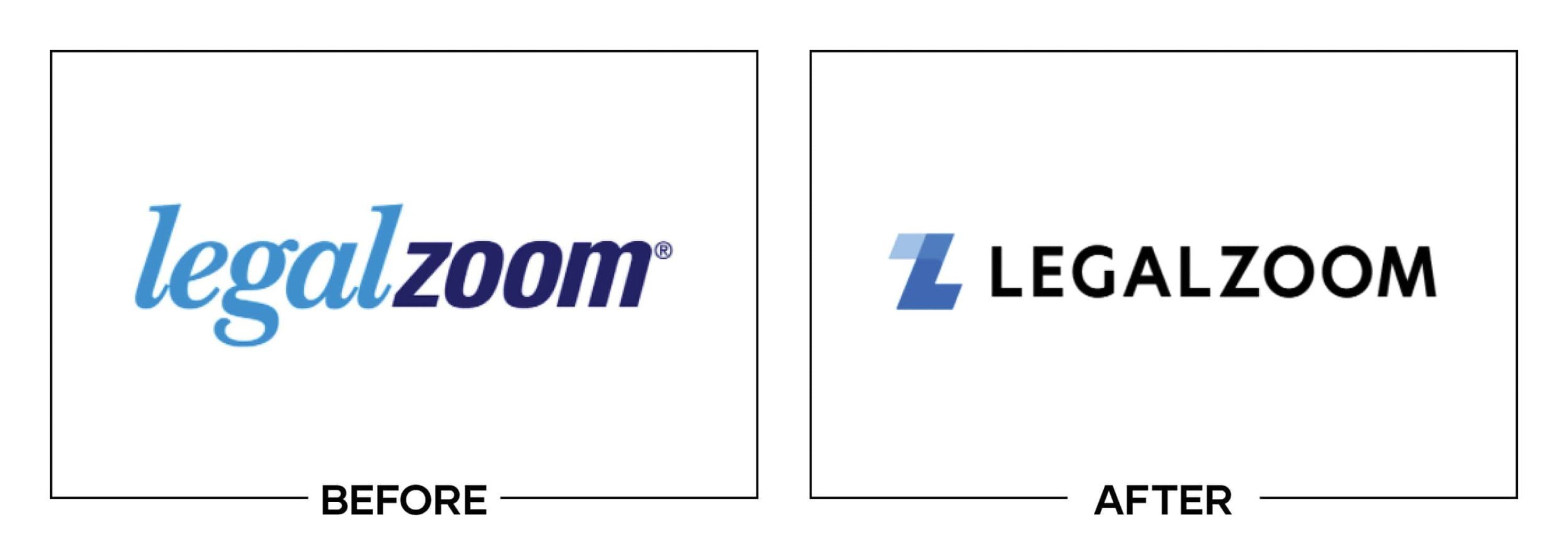
Iconography is almost always welcome, but the z-l combo is poorly weighted due to the opacity of the tip of the "Z".
That same opacity disqualifies this from being a one-color logo.
The removal of different colors for "legal" and "zoom" makes "LEGALZOOM" read as one word and it feels wrong.
Thanks for reading my annual Worst Logos of the Year article. It really means a lot to me!
Does your brand need a new logo? Let’s talk about creating a one-of-a-kind logo for your brand!


