
Welcome to The 25 Worst Logos of 2025, one of two articles in my annual Best and Worst Logos of the Year series. Every year, I look back at the rebrands that caught my attention and share what businesses can learn from them. Here, we are going to take a look at some of this year’s rebrands that may have missed the mark. Looking for The 25 Best Logos of 2025? Read the companion article to learn about some of this year’s strongest work.
Below, I break down The 25 Worst Logos of 2025. For each one, I look at why the business rebranded, where the new identity falls short, what it gives up, and what your business can learn before starting a rebrand of its own.
A quick note before I get into the list: I have respect for every designer, studio, in-house team and client represented here. Putting a new identity into the world is hard. These reviews focus on the finished work, but the point is not criticism for criticism’s sake. This series is here to help business owners and brand teams understand why companies rebrand, learn from the choices behind the work and make better decisions when it is their turn. The entries are numbered to make the article easy to follow, but they are not presented in any particular order. Design is subjective, and I do not expect everyone to agree with every choice. That is part of what makes these articles fun to write and discuss.
But when it does come time for you to discuss a new logo, Parker Lee Creative is an award-winning, independent creative studio specializing in logo design and brand identity. We help businesses build new identities and refresh the ones they have outgrown. Our process starts with what the logo needs to communicate, then tests the work everywhere customers will see it. If you are considering a rebrand, contact us and tell us your story. We would love to help you create something worthy of next year’s Best Logos of the Year article.
1. Cracker Barrel
Why Did the Logo Change?
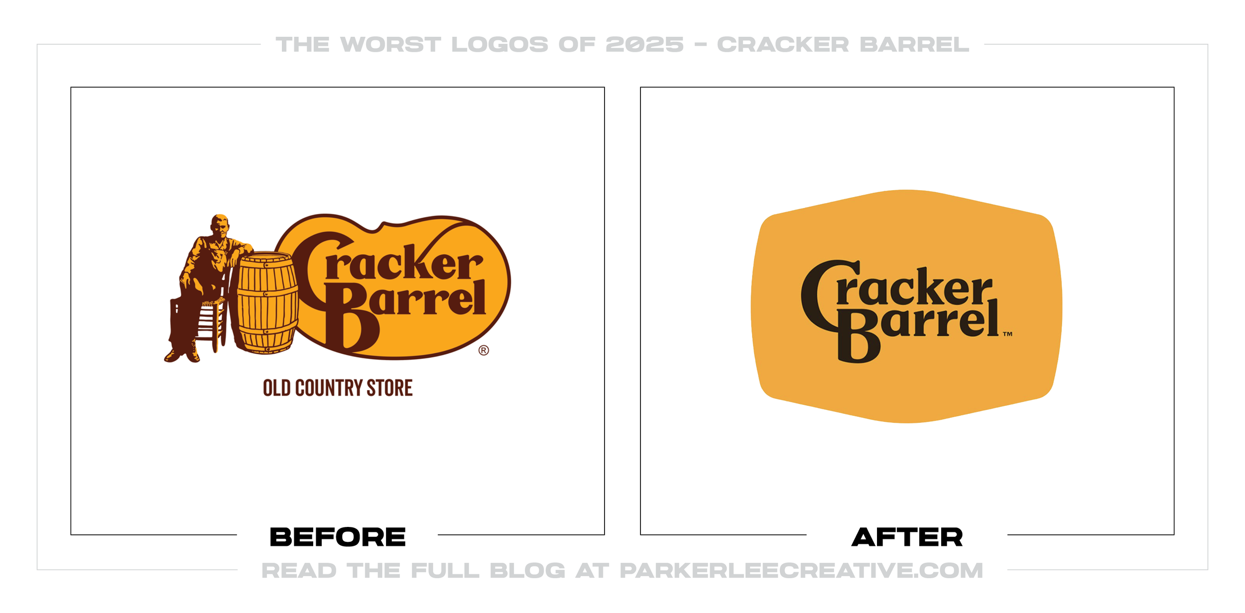
Cracker Barrel wanted a simpler identity that could move from digital screens to roadside signs while supporting a broader restaurant refresh. The fifth logo evolution kept the gold, brown, and barrel shape but removed Uncle Herschel.
Why It Made the List:
The redesign removed the person, barrel, and porch-sign character that made Cracker Barrel feel like a specific place. What remained was a clean restaurant label with far less of the hospitality and nostalgia customers could recognize.
The company restored its illustrated logo one week later. That reversal is unusually direct evidence that the launch failed to protect a piece of brand equity customers valued, even if the simplified mark reproduced more easily.
The rollout treated a high-risk identity change as an answer before the audience had accepted the premise. When an established character carries decades of memory, testing must determine whether it is clutter to remove or equity to preserve.
The Tradeoff:
The silhouette was easier to reproduce across signs, screens, menus, and small placements. That functional gain was real. But it did not justify removing the illustrated scene that gave an otherwise generic restaurant name its personality.
What Businesses Can Learn:
Before simplifying a familiar logo, identify which details customers use to recognize and interpret the brand. Test those assets independently, stage the rollout, and make sure improved reproduction does not erase the meaning built over time.
2. PepsiCo
Why Did the Logo Change?
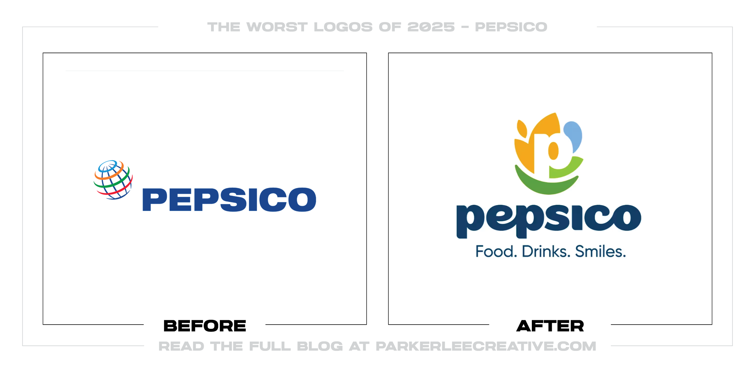
PepsiCo, the corporate parent, needed an identity that represented more than the Pepsi drink brand. Company research found only 21 percent of consumers could name another portfolio brand, so it created a P symbol and “Food. Drinks. Smiles.”
Why It Made the List:
The circular P is asked to contain food, a beverage drop, a leaf, a smile, sustainability, and human connection. Each idea supports the business story, but together they make a small corporate badge carry more explanation than recognition.
The lowercase wordmark and earth-toned palette make the company feel warmer, yet they also place it in a familiar world of wellness, agriculture, and sustainable-enterprise branding. The result is approachable but difficult to own.
PepsiCo’s lead designer explains the mark’s many layers. The rationale is thoughtful, but a logo should not require a guided tour before its central idea becomes clear. That burden weakens a symbol meant to unite more than 500 brands.
The Tradeoff:
PepsiCo genuinely needed an umbrella that could unite food and beverage brands without borrowing the consumer-facing Pepsi identity. The new system provides that structure, even if the central symbol tries to summarize too much of the company.
What Businesses Can Learn:
A corporate logo does not need to illustrate every strategic pillar. Choose one memorable idea, then let typography, imagery, messaging, and applications explain the organization. More meaning in the brief can produce less clarity in the mark.
3. Microsoft AI
Why Did the Logo Change?
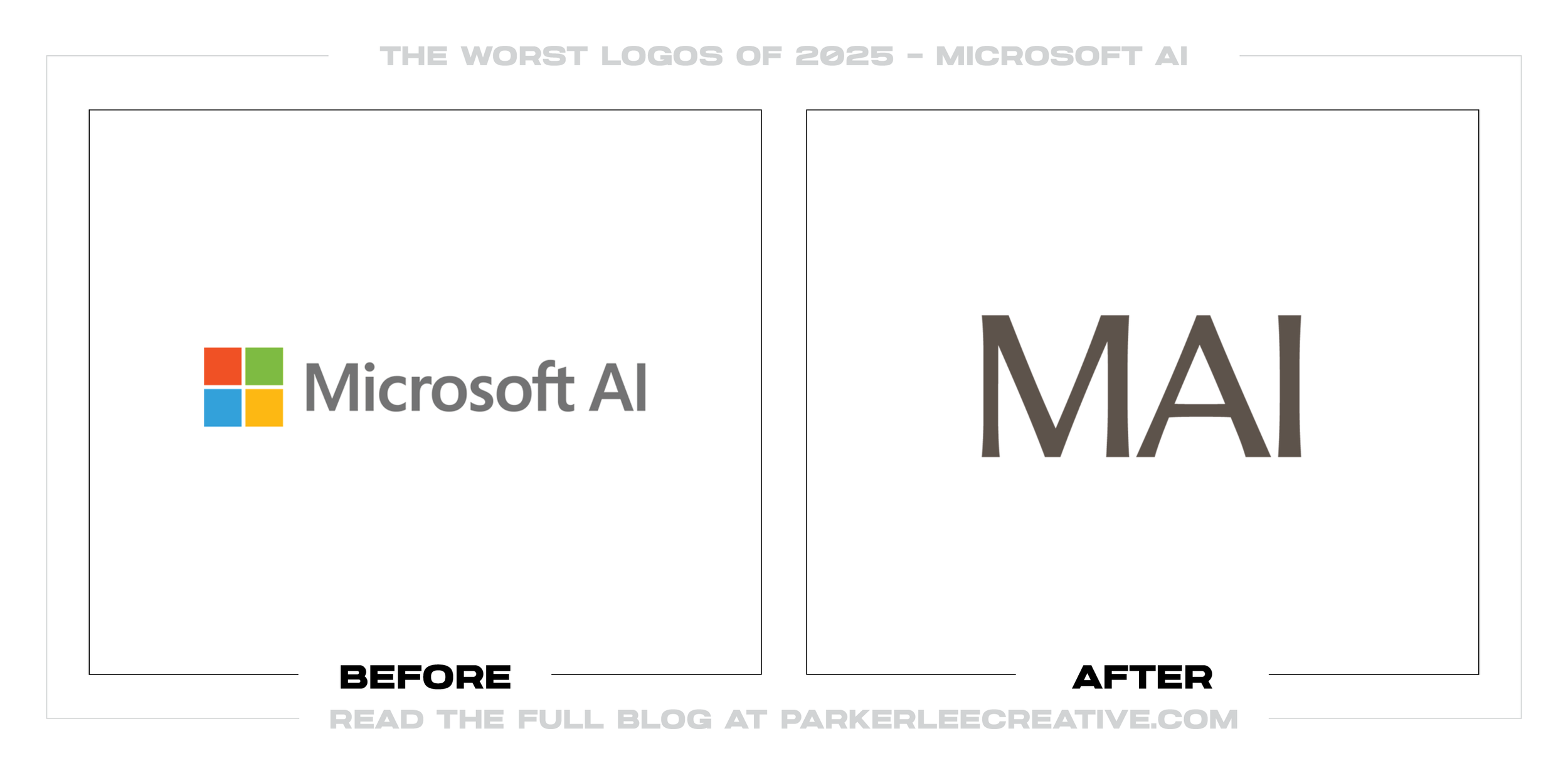
Microsoft AI wanted an identity distinct from its parent company’s corporate technology language. Developed in-house with Column, the system uses the abbreviated MAI name, editorial serif typography, and painterly imagery to feel more human.
Why It Made the List:
MAI functions as the organization’s visual shorthand while also naming Microsoft’s in-house model family. That overlap makes the hierarchy harder to read: the same three letters can identify the lab, the brand, or a product inside it.
The refined serif wordmark and watercolor imagery create a thoughtful editorial mood, but the mark alone could belong to a journal, gallery, or luxury service. Very little in it signals artificial intelligence or Microsoft ownership.
Microsoft AI’s own site shows how much the identity depends on writing, illustration, and layout to establish its category and voice. Remove that surrounding system, and the MAI wordmark has little distinctive information when isolated.
The Tradeoff:
The softer system gives Microsoft AI room to speak differently from a global software company and avoids another predictable neon technology identity. That separation has value, even though it weakens parent recognition and naming clarity.
What Businesses Can Learn:
A subbrand can develop its own voice without severing attribution. Define whether the abbreviation names the company, a division, or a product, then retain enough parent and category cues that the identity makes sense outside its launch website.
4. Lay's
Why Did the Logo Change?
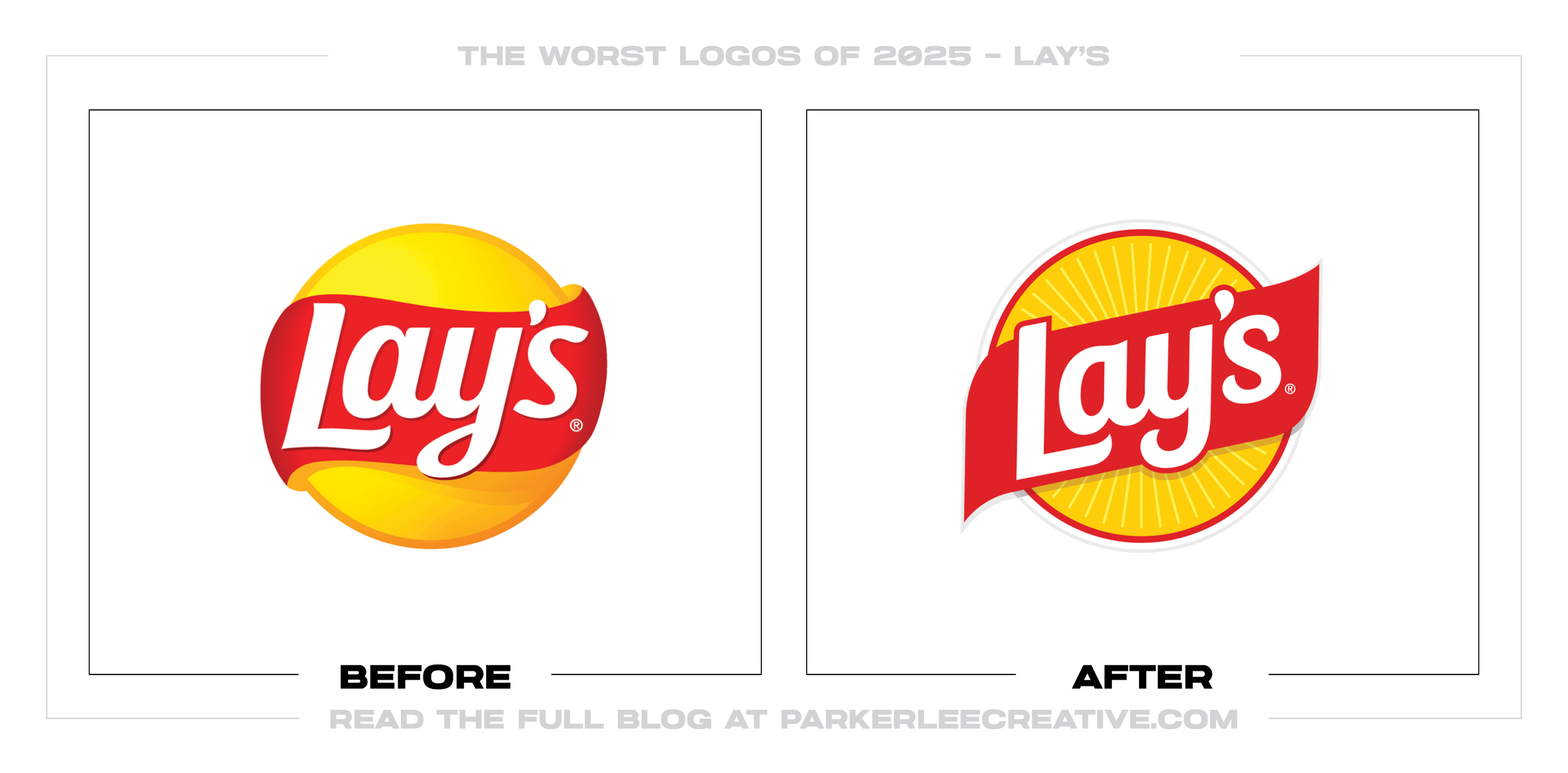
Lay’s wanted its largest global redesign in nearly a century to reconnect the snack with potatoes, farms, and simpler ingredients. The refresh updated its sun, type, photography, colors, and packaging while keeping the red ribbon.
Why It Made the List:
The bags ask sun rays, wood-grain textures, potatoes, ingredient colors, enlarged chip photography, and supporting copy to tell the story. Each cue is understandable, but the combined hierarchy feels busier than the familiar snack needs.
The official farm-to-chip explanation makes “Lay’s Rays” central to the system. On the bag, those rays compete with the ribbon and chip image instead of giving the eye one dominant brand cue. The extra layer adds more visual noise.
Farm imagery makes the source of the product clearer, but it nudges an indulgent snack toward the visual language of produce and natural foods. Ingredient transparency should support appetite appeal, not make the package defend itself.
The Tradeoff:
Lay’s retained the sun, red ribbon, and familiar yellow that made its 2019 refresh work, while adding global consistency and clearer flavor navigation. Those are useful gains. The problem is how many devices now compete on one bag.
What Businesses Can Learn:
Packaging has seconds to establish brand, product, flavor, and appetite. Rank those jobs before adding a new story. A strong origin message can live across the system, but the front panel still needs one clear cue to win attention first.
5. Domino's
Why Did the Logo Change?
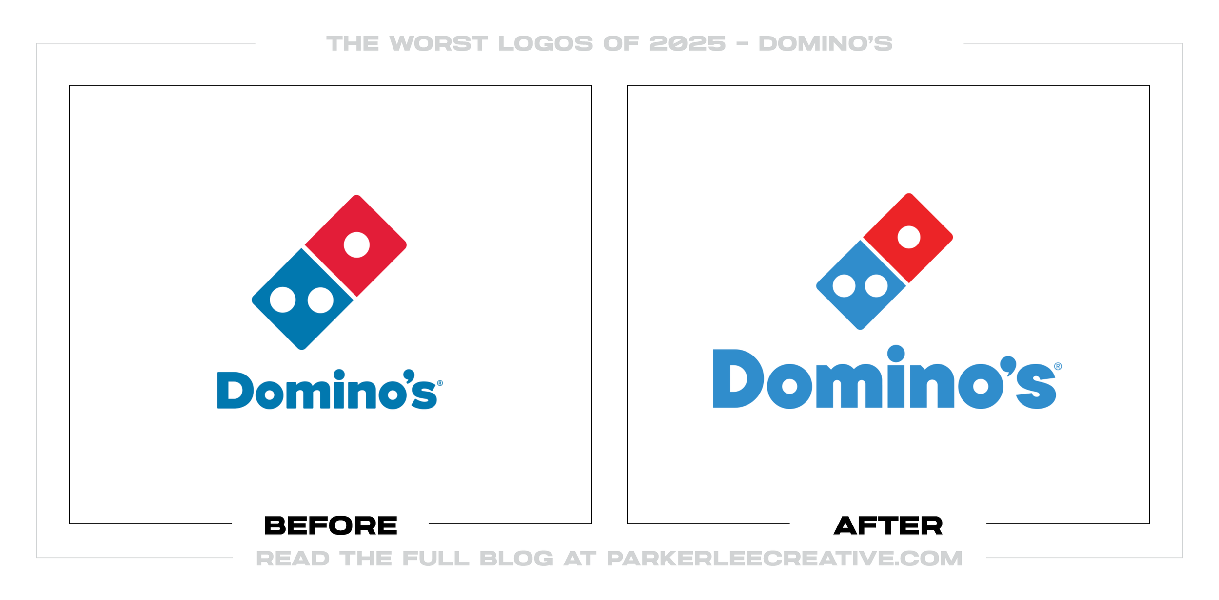
Domino’s first major refresh in 13 years shifted attention from delivery technology back to craveable food. WorkInProgress retained the domino tile, brightened the palette, thickened the type, simplified boxes, and added a sonic identity.
Why It Made the List:
The “Dommmino’s” expression translates the new sound into a written name, but three m’s can look like an error when the audio is absent. A memorable jingle does not need to create a second spelling for an already recognizable masterbrand.
The thicker, doughier custom type supports the food strategy, yet it gives up some crisp utility that helped Domino’s work on storefronts, uniforms, boxes, and small screens. Appetite appeal and operational legibility still need balance.
Domino’s launch pairs black-and-gold premium boxes with its red-and-blue system. The polished upgrade creates a second color language just as the refresh is meant to strengthen recognition, making the premium tier feel detached from the brand.
The Tradeoff:
The core domino tile remains intact, the simplified boxes have real shelf and delivery presence, and the sonic “mmm” is hard to forget. This is a capable system weakened by moments where one campaign idea is allowed to rewrite the brand rules.
What Businesses Can Learn:
Build sonic, verbal, and visual assets to reinforce the identity, not compete for authorship. A sound can stretch a name without changing its spelling, and a premium tier can feel elevated without abandoning the colors customers already know.
6. America's Best
Why Did the Logo Change?
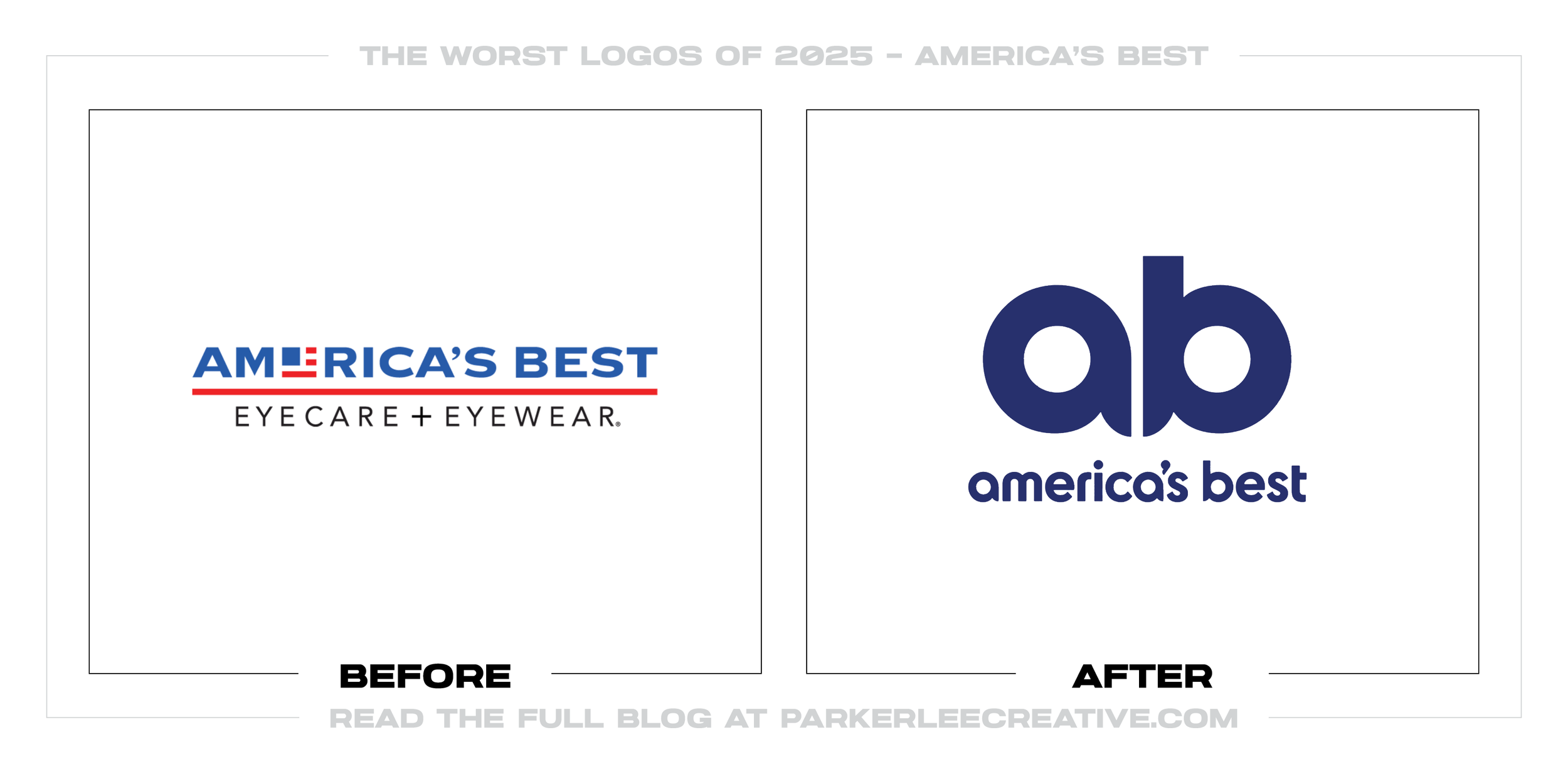
America’s Best wanted to modernize a value-focused eye-care brand and make it feel warmer and more personal across more channels. VML replaced the flag-style logo with a lowercase wordmark, an AB monogram, cleaner stripes, and a playful owl.
Why It Made the List:
“America’s Best” is a broad claim, not a clear service description. Removing “Eyecare + Eyewear” leaves the new wordmark with less help explaining what the company does, especially when it appears away from glasses, stores, or advertising.
The AB monogram is intended to suggest an owl and an eye, but neither idea reads immediately at small sizes. A clever construction can reward a look, yet the primary mark still has to identify the brand before its hidden idea is explained.
VML’s launch case shows a genuinely warm campaign and a flexible identity. The weakness is concentrated in the logo, where a generic name and subtle monogram are expected to supply category recognition. That gap matters most at first glance.
The Tradeoff:
The new system is friendlier, more flexible, and better suited to motion, social content, and a national campaign. The playful owl gives it personality. Those improvements make the loss of an immediate eye-care descriptor more noticeable.
What Businesses Can Learn:
When a company name does not reveal the category, the logo system must provide a clear cue. A compact monogram can support recognition after familiarity grows, but it should not replace the descriptor customers need to understand the offer.
7. Starburst
Why Did the Logo Change?
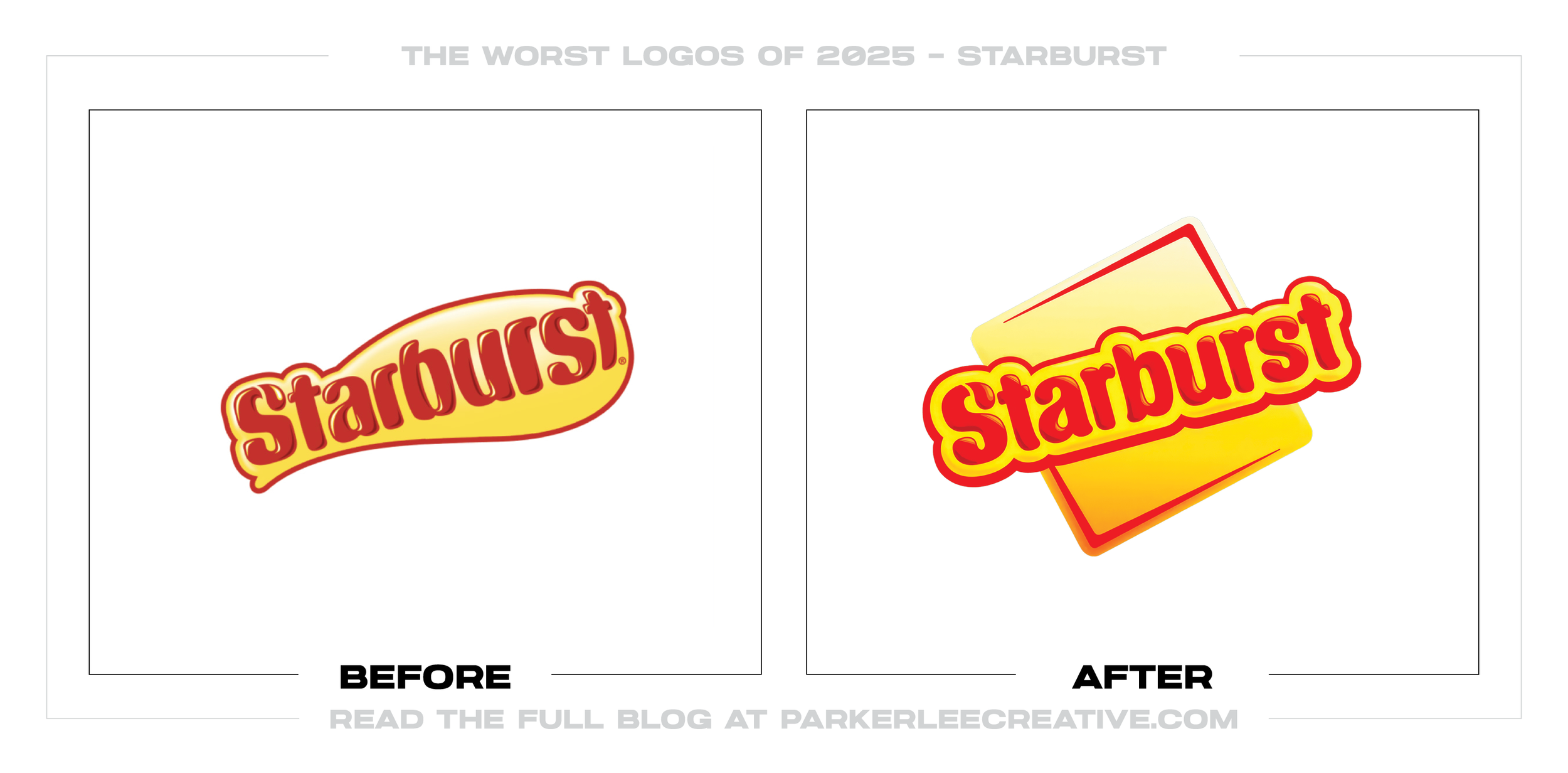
Starburst wanted greater clarity in a crowded candy aisle and a system that could connect with younger buyers. Straight Forward Design made the square candy the organizing idea, refreshed the wordmark, and strengthened yellow as a brand cue.
Why It Made the List:
Locking the wordmark inside a square makes the logo orderly, but it contains the outward energy promised by the name Starburst. The former diagonal movement felt less controlled and more expressive of the bright, chewy product it represents.
A square is true to the candy, yet it is not ownable by itself in a category filled with small geometric pieces. The juicy drop, burst details, colors, and package layouts must work hard to keep the central concept from feeling generic.
Straight Forward Design calls the idea “Squarish Joy”, which gives the wider system a useful rule. The trouble begins when that rule becomes a box around the name rather than a flexible frame for the brand. The container takes over.
The Tradeoff:
The yellow, flavor palettes, custom type, and repeatable square layouts create a clearer global range. The packaging system is more successful than the logo at its center, proving a useful design rule can still be applied too literally.
What Businesses Can Learn:
Product geometry can organize an identity, but the master mark still has to express the brand’s unique promise. Use the square as a flexible system asset, then let the logo preserve the motion, flavor, or emotion that made the name memorable.
8. Great British Railways
Why Did the Logo Change?
Great British Railways needed one new public identity for train operators moving into national ownership. The system keeps the 1965 Double Arrow, adds Rail Alphabet 2, and builds a red, white, and blue livery from Union Flag angles.
Why It Made the List:
The Double Arrow already carries decades of railway recognition with exceptional economy. Wrapping it in flag-derived angles and patriotic color adds a second story to a symbol that did not need help explaining national rail travel.
Across trains and graphics, the diagonal livery, wordmark, color fields, and heritage symbol can compete for attention. A public-service system needs a calm hierarchy that survives stations, timetables, rolling stock, and digital screens.
The official rollout guidance shows the identity moving across many operators and assets. That scale makes restraint more important, because every extra motif becomes a repeated production and consistency problem at national scale.
The Tradeoff:
Keeping Gerry Barney’s Double Arrow was the right decision, and one shared system can make a fragmented railway easier to identify. The tradeoff is a louder national treatment that risks dating the timeless mark it was meant to revive.
What Businesses Can Learn:
Heritage assets should be evaluated before they are decorated. If an existing symbol already owns the category, build a disciplined system around it and let it lead. New strategy does not require every surface to carry a new layer of symbolism.
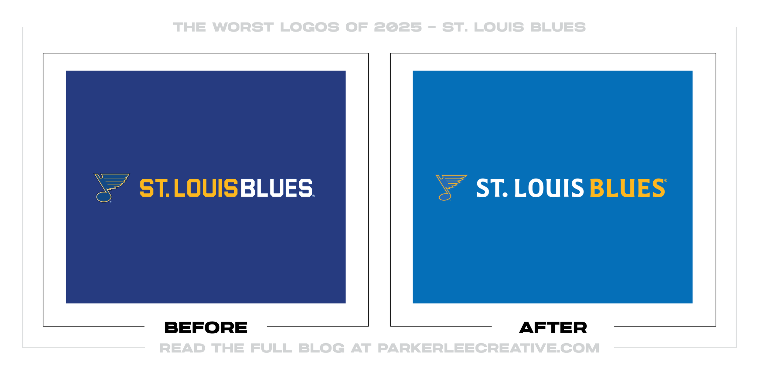
9. St. Louis Blues
Why Did the Logo Change?
The Blues had strong evidence for making heritage blue permanent: fans preferred the Winter Classic look, and the Blue Note needed bolder reproduction. The overreach was turning that update into a collection of densely layered civic symbols.
Why It Made the List:
The core Blue Note gets a practical two-color build and thicker keylines, but it is surrounded by marks that compete to tell every St. Louis story at once. A primary logo should lead a system, not referee several equally elaborate ideas.
The Blues’ official brand announcement explains a fleur mixed with a clef and note, an STL shaped by another clef, and a trumpet formed from the Arch and river. If every symbol needs a paragraph, the drawing is carrying too many jobs.
The wordmarks add flowing river forms, sheet-music references, smooth curves, and sharp hockey edges. Each cue is defensible alone, but together they make the identity feel art-directed around a list of references instead of one clear idea.
The Tradeoff:
The heritage colors, uniforms, and heavier Blue Note are decisions backed by years of fan feedback. That makes this a split verdict: the recognizable center improved, while the expanded logo family became harder to read, recall, and manage.
What Businesses Can Learn:
Research can reveal much about a place or company, but a logo is not required to depict all of it. Choose the strongest idea, let supporting graphics carry the richer story, and test whether each mark remains clear without an explanation.
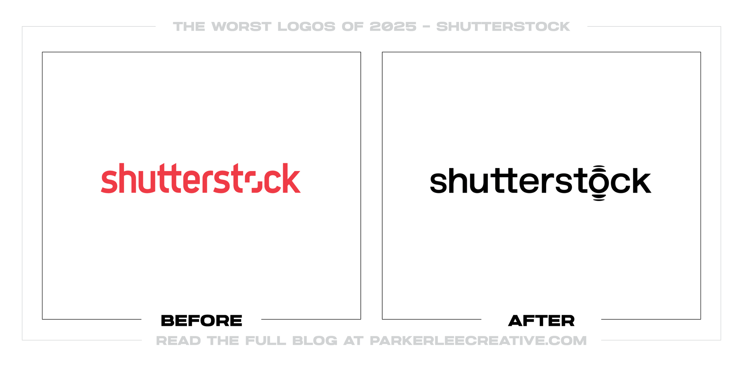
10. Shutterstock
Why Did the Logo Change?
Shutterstock had grown beyond a stock-image library into content, production, data, distribution, and creative technology. Its June refresh tried to signal that larger role, but exchanged familiar red framing equity for a quiet black wordmark.
Why It Made the List:
Removing the red viewfinder erased the quickest link to images, selection, and point of view. The replacement “o” device is subtle enough to miss in the full wordmark, leaving typography that could represent almost any software platform.
Shutterstock’s logo guidelines demonstrate a disciplined family of primary, endorsed, and freestanding marks. The governance is useful, yet consistency cannot replace the color and shape that previously made the parent brand recognizable.
The “universal ingredient” idea asks Shutterstock to feel broad, but its black-and-white identity equates breadth with neutrality. A company selling creative possibility should support many customer styles without making itself anonymous.
The Tradeoff:
The system is controlled, flexible, and easier to extend across a growing family of services. It may work cleanly in decks and interfaces. The cost is a parent logo with less visual energy and a weaker immediate connection to creative media.
What Businesses Can Learn:
When a business expands, the identity may need more structure, but the answer is not always a more neutral logo. Protect the few assets customers already recognize, then design the architecture, templates, and rules that let those assets scale.
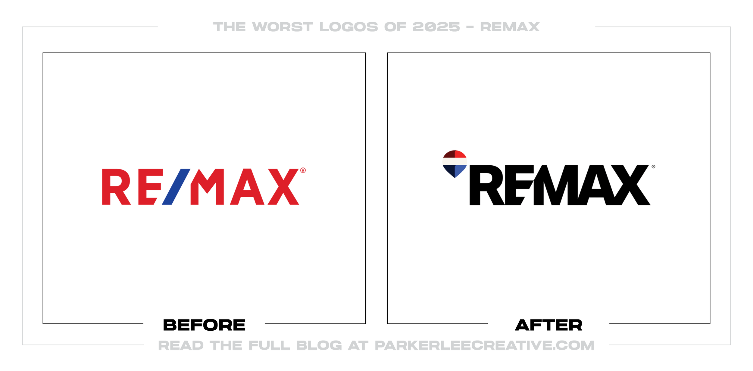
11. RE/MAX
Why Did the Logo Change?
RE/MAX wanted affiliates to stand out in social media and digital advertising, so it removed the name from its balloon and opened the wordmark’s center for agent imagery. The campaign device weakened the consistency of the signature itself.
Why It Made the List:
The brand is still written RE/MAX, but the visual wordmark now reads REMAX. Removing the slash creates useful campaign space, yet it also splits the company’s name into official and visual versions that franchisees must learn to manage.
Camp + King’s RE/MAX case study shows a system built for more than 100 countries and 100,000 agents. At that scale, letting people insert photography into the core wordmark increases variation precisely where control matters most.
The balloon retains red, white, blue, and a familiar silhouette, but removing RE/MAX from its center asks the symbol to work harder. The mark may be recognizable, yet recognition alone does not make the new composition more distinctive.
The Tradeoff:
RE/MAX reported strong recognition and preference in its research, while the louder type works in quick digital layouts. The concern is operational: flexible wordmarks plus overlapping old and new assets make a franchise harder to govern.
What Businesses Can Learn:
A logo system should create useful options without making the signature negotiable. Keep the master mark fixed, place portraits or campaign ideas in surrounding zones, and document when symbols may appear alone before distributing files widely.
12. Amazon
Why Did the Logo Change?
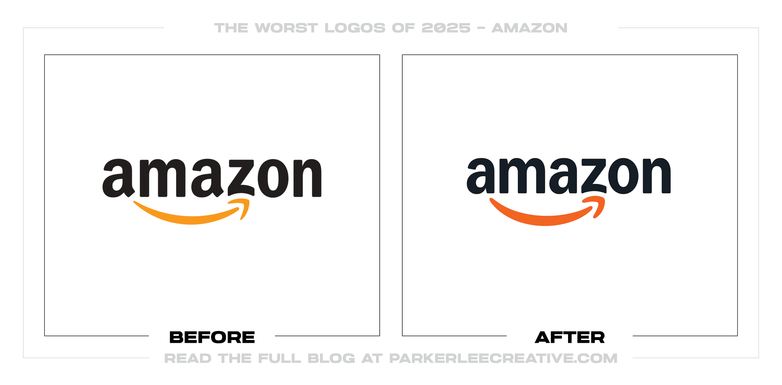
Amazon needed order across more than 50 sub-brands and 15 markets, built independently as the company expanded. Koto created shared type, color, and logo systems, but the deeper smile and tighter family resemblance introduced new tradeoffs.
Why It Made the List:
The arrow carried two ideas efficiently: a smile and everything from A to Z. Deepening the curve puts more emphasis on friendliness, but the heavier gesture feels less precise and makes the symbol work harder to communicate the same promise.
Koto’s Amazon case study documents an exceptional program spanning languages, vehicles, packaging, health, grocery, devices, and entertainment. The scale is the achievement, while the revised master logo is the less convincing part.
A shared logo alphabet lets teams build marks quickly, yet efficiency can make unlike businesses feel templated. A pharmacy, streaming service, grocery brand, and device platform need a family connection without sharing one emotional tone.
The Tradeoff:
The redesign solves a real governance problem and gives Amazon’s teams a coherent global toolkit. Its weakness is not functionality. It is the risk that a warmer parent mark and tighter family rules smooth away distinctions between categories.
What Businesses Can Learn:
Brand consistency does not mean making every division look alike. Define elements that signal parentage, then give each offer enough range to match the audience and job. Efficiency is valuable only when customers can still tell services apart.
13. Max
Why Did the Logo Change?
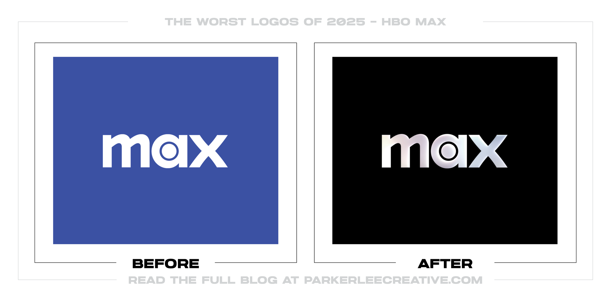
Max replaced its bright blue identity with black, white, and metallic styling on March 30, visually moving closer to HBO without restoring the HBO name. Warner Bros. Discovery reversed course weeks later and retired Max for HBO Max in July.
Why It Made the List:
The monochrome palette borrowed the strongest visual association HBO owned while the generic Max name remained. The halfway decision admitted premium equity mattered without restoring the name that gave that equity meaning to viewers.
Reporting on the March Max refresh described a wider identity still to come. Before that system could establish itself, the company announced HBO Max’s return, turning interface, social, and marketing assets into short-lived production work.
The March logo was not unusable. The failure was asking design to imply a connection that naming had removed. When the company restored HBO, it confirmed that resemblance could not substitute for recognition and promise carried by the name.
The Tradeoff:
Black and white gave the service a sharper, premium presentation than its bright blue predecessor. It created a bridge to the identity that followed. A bridge lasting roughly 100 days, however, is an expensive substitute for a settled decision.
What Businesses Can Learn:
Do not commission a refresh while the name and positioning are still moving. Resolve the promise and architecture first, then build the identity. Otherwise, even polished design becomes transition material customers barely have time to learn.
14. Rocket
Why Did the Logo Change?
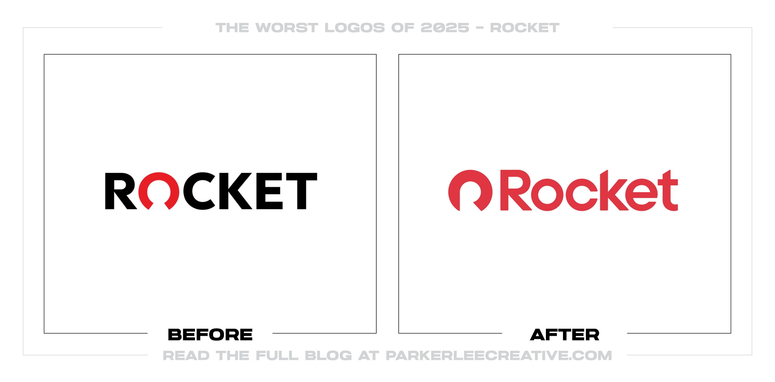
Rocket unified its mortgage, real estate, closing, and personal-finance businesses around one name and Rocket.com. The identity supports that architecture, but its Halo symbol asks a red arc to communicate more meaning than viewers can see.
Why It Made the List:
The R inside the Halo is difficult to find until someone points it out. Hidden letters can reward a second look, but the outer form still needs to communicate clearly on the first, especially when it represents trust in a high-stakes service.
Otherway’s Rocket case study describes the Halo as protection, homeownership, prosperity, generational wealth, progression, and a link to the old logo. That is a thoughtful story, but more concepts do not make an ambiguous shape clearer.
The title-case wordmark and warmer red make it more approachable, yet they also reduce some of the authority carried by the former uppercase mark. In lending, friendliness helps, but it cannot come at the expense of stability and precision.
The Tradeoff:
The wider system is carefully made: two custom typefaces, a scalable grid, warmer photography, and one architecture for many services. The logo is the weak link, not the whole rebrand. Applications often provide the clarity the Halo lacks alone.
What Businesses Can Learn:
A symbol can hold layers of meaning, but it needs one immediate read. Test what people see before explaining the concept, especially in categories built on trust. If the story only appears in the presentation, simplify or redraw the mark.
15. MS NOW
Why Did the Logo Change?
MSNBC needed a separate identity when NBCUniversal kept the NBC name and peacock during the Versant spinout. A rename was unavoidable. Keeping “MS,” inventing a phrase around it, and pairing it with a generic striped flag were not.
Why It Made the List:
MS NOW expands to “My Source for News, Opinion, and the World,” a phrase that reads as if it was written to rescue available initials. Viewers must learn the name, decide how to pronounce it, and remember words the brand rarely needs to say.
Versant’s launch announcement promised the same mission under a new name, yet the striped banner resembles political-campaign and national-flag graphics. It signals news broadly without replacing the peacock’s distinctive ownership cue.
The network launched at ms.now because the dot-com was unavailable. The domain is usable, but the compromise illustrates why naming, trademark, pronunciation, search behavior, and web availability should be solved as one connected decision.
The Tradeoff:
The new identity separates the newsroom from NBC and gives MS NOW an independent platform, app, studios, and visual system. Familiar hosts and programming preserved continuity. The logo and name still demand more explanation than they return.
What Businesses Can Learn:
Sometimes constraints force a rebrand, but urgency does not lower the naming standard. Test what people call the brand, what initials mean, whether the domain is defensible, and whether the symbol remains distinctive without borrowed equity.

16. Evernote
Why Did the Logo Change?
Evernote refreshed its identity in October 2025 ahead of the wider v11 release in January 2026. The product had changed substantially under Bending Spoons, but smoothing Mads and replacing the serif wordmark made the brand feel more ordinary.
Why It Made the List:
Mads remains recognizable, which protects the asset, but the simplified ear loses the folded-page detail that linked an elephant’s memory to notes and documents. The redraw is cleaner while making the original idea less rewarding to discover.
Evernote’s 2025 recap confirms the new look arrived in October before v11. That timing gave the visual change a product story, yet the lowercase rounded wordmark follows the same approachable SaaS pattern used across newer productivity tools.
The brighter green still stands out, but the sans-serif lockup trades editorial character for app-friendly softness. Evernote once looked like a place for writing and keeping knowledge; the new typography says useful software, but little more.
The Tradeoff:
The simpler mascot, icons, website, and interface create a more cohesive experience, and retaining the elephant prevents a total loss of recognition. The redesign improves consistency while giving up wit and craft that made Evernote memorable.
What Businesses Can Learn:
Modernization should sharpen the idea behind a memorable brand. Before removing a detail, ask whether it is clutter or meaning. A cleaner shape is not automatically a stronger one when the lost feature carried the story customers could retell.
17. Snuggle
Why Did the Logo Change?
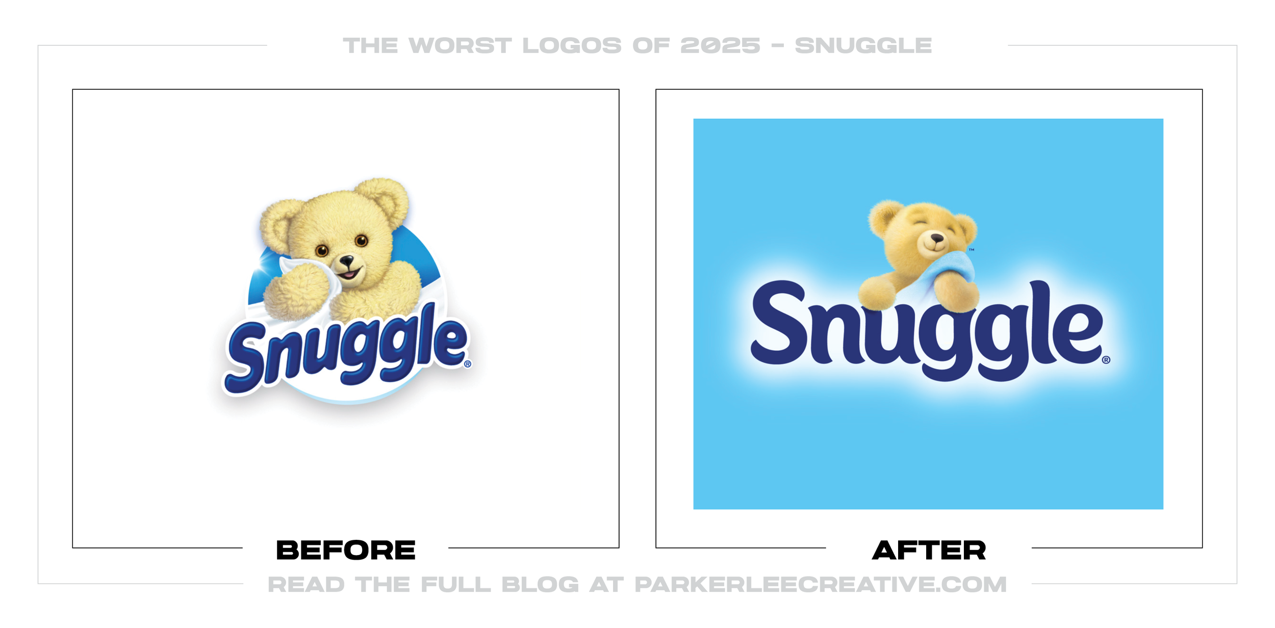
Snuggle refreshed its logo, bear, and packaging after more than 40 years, using consumer research to make softness, scent, and the comfort of home easier to recognize. The result tries so hard to look cuddly that the system loses clarity.
Why It Made the List:
The plumper wordmark turns softness into an idea, but its crowded curves and compressed joins feel forced. Friendly lettering still needs rhythm and open space, especially when it must compete with a mascot, scent name, and benefit claims.
The newly rendered bear adds texture, shadows, fabric, and a closed-eye expression to an already busy label. Those details may feel warm at full size, but they create a fragile asset for small packs, thumbnails, and limited-color printing.
Henkel’s rebrand announcement names new scent cues and a Snuggle Promise badge. Both may help shoppers, yet the package now asks the logo, bear, fragrance imagery, product type, and claims to compete at once in the same small field.
The Tradeoff:
Keeping the bear, blue lettering, and comfort positioning protects recognition, while scent cues can improve shelf navigation. The cost is a more polished but more crowded identity whose many soft effects may not reproduce with equal strength.
What Businesses Can Learn:
A mascot can carry warmth without carrying every visual effect at once. Protect the character people know, then test its silhouette, expression, lettering, and package hierarchy. Comfort should be felt through clarity, not layers of decoration.
18. Living Roots
Why Did the Logo Change?
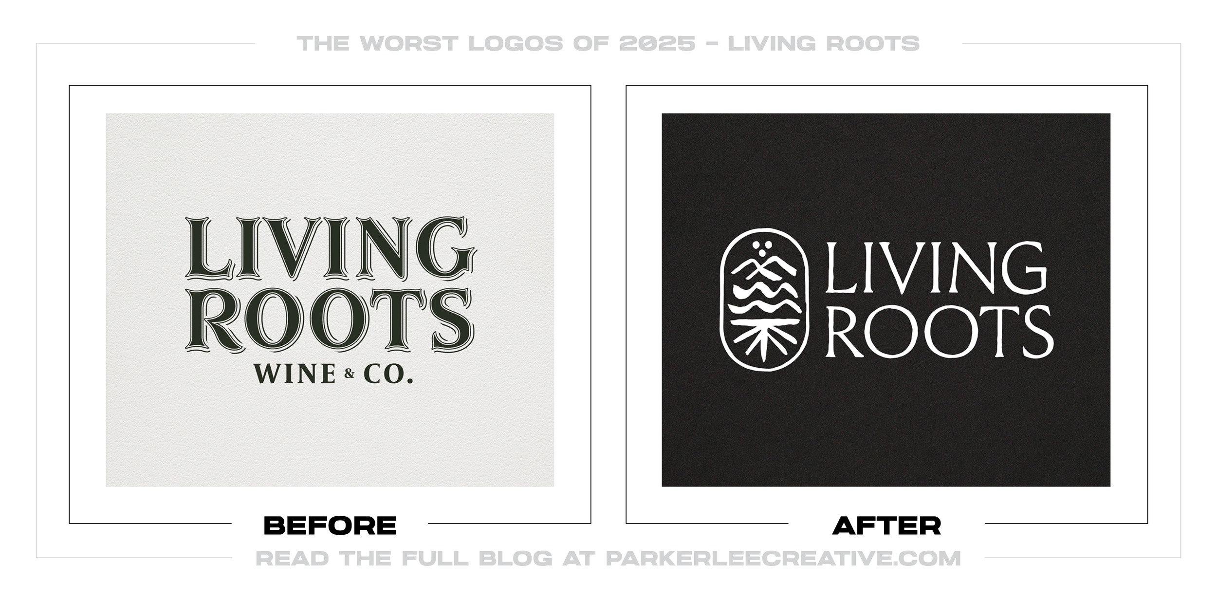
Living Roots was opening a Finger Lakes tasting room and needed an identity that could support wines from both New York and South Australia. The redesign sought a more elevated voice, but packed geography, history, and process into one symbol.
Why It Made the List:
The “story symbol” combines water, roots, rocks, sun, soil, two regions, and the winery’s family history. Those references are thoughtful, but almost none are visible without explanation, leaving an abstract emblem to carry an oversized story.
Allowing the symbol to stack, stretch, separate, and reorder makes it adaptable across uses. It also weakens the fixed structure people need to remember, because the brand’s main recognition device can change shape whenever the layout changes.
Smith & Diction’s case study documents three typefaces, soil textures, rock windows, several lockups, a stamp, and Rooty the mascot. Each has logic, but together they create several competing voices before the wine establishes one.
The Tradeoff:
The redesigned labels improve practical hierarchy by moving names forward and separating bottles through color and rock shapes. Rooty also gives the tasting room warmth. The logo remains the least immediate part of an otherwise useful system.
What Businesses Can Learn:
A rich origin story does not require every chapter inside the logo. Choose one visual idea that can be recognized without narration, then let labels, illustration, interiors, and copy carry geography, heritage, and personality where they belong.
19. Nextdoor
Why Did the Logo Change?
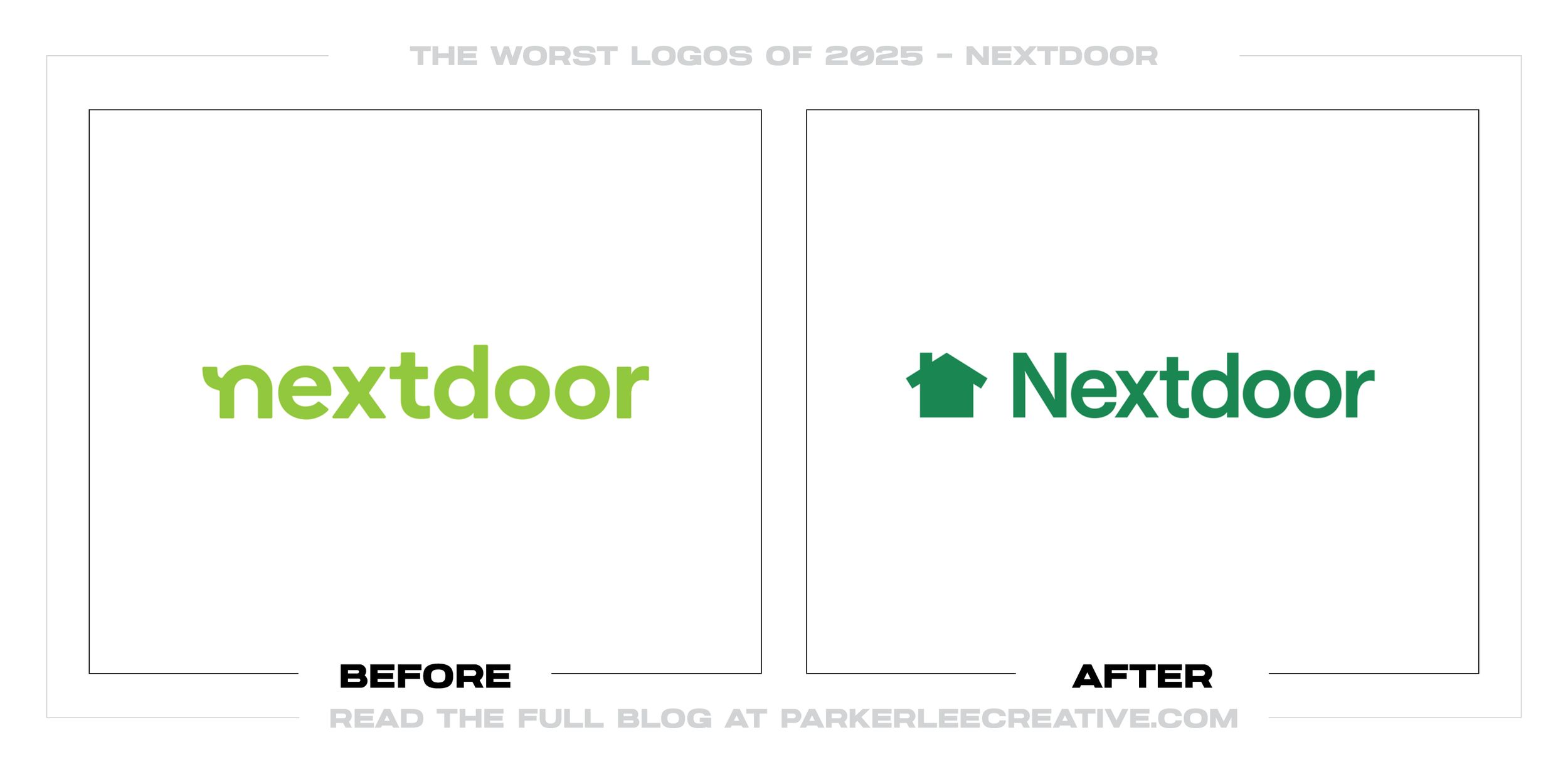
Nextdoor paired its product redesign with a return to the house logo, hoping to recommit the platform to useful local information. The move makes “home” obvious, but trades a more distinctive community symbol for familiar category shorthand.
Why It Made the List:
A house is easy to understand, yet it is also one of the most common symbols in real estate, security, home services, and neighborhood apps. Returning to it clarifies the subject while giving Nextdoor less visual territory it can uniquely own.
The previous mark turned an N into connected people and homes, linking its name to the community it served. Replacing that idea with a house narrows the story at the same moment the product is expanding into news, alerts, and recommendations.
Nextdoor’s relaunch announcement calls the change a refounding and ties it to a redesigned product. A familiar house can signal return, but it cannot answer questions of relevance, trust, and content that the product work must address.
The Tradeoff:
The house reads quickly at app-icon size and brings the brand back to an uncomplicated local cue. Green continuity also helps. The problem is not legibility. It is that greater clarity arrives with less distinction in a crowded home category.
What Businesses Can Learn:
Literal symbols can improve comprehension, but they often reduce ownership. Before choosing the obvious category icon, compare it against competitors, search results, and app stores. The mark should explain the business and identify only you.
20. Canterbury-Bankstown Bulldogs
Why Did the Logo Change?
The Bulldogs said their detailed 2010 crest embroidered poorly and fell behind cleaner digital marks, so they made a simpler badge for the 2026 season. The update solved a production problem but removed much of the club’s hard-earned edge.
Why It Made the List:
The forward-facing bulldog is easier to reduce, but its round head, wide eyes, and tidy symmetry make it feel more like a youth mascot than a hardened sporting emblem. Cleaner construction should not erase the attitude supporters recognize.
Removing the shield, founding year, Canterbury-Bankstown name, and CB monogram leaves a compact icon, but also strips away the cues that separated this club from any team called the Bulldogs. The result is scalable before it is unmistakable.
The club’s official reveal says the mark draws from 90 years of visual history. Yet most of that heritage survives only in the explanation, while the visible badge relies on a generic mascot treatment and the club’s existing blue.
The Tradeoff:
The badge should embroider, animate, and scale more reliably than the layered crest, and its forward gaze supports the future-facing idea. Those gains are practical. The loss is the local history and severity that made the old crest specific.
What Businesses Can Learn:
When a logo fails in embroidery or small digital use, redraw the structure before discarding its identity. Preserve the posture, expression, initials, or frame that customers value, then simplify linework and detail around those assets.
21. OpenAI
Why Did the Logo Change?
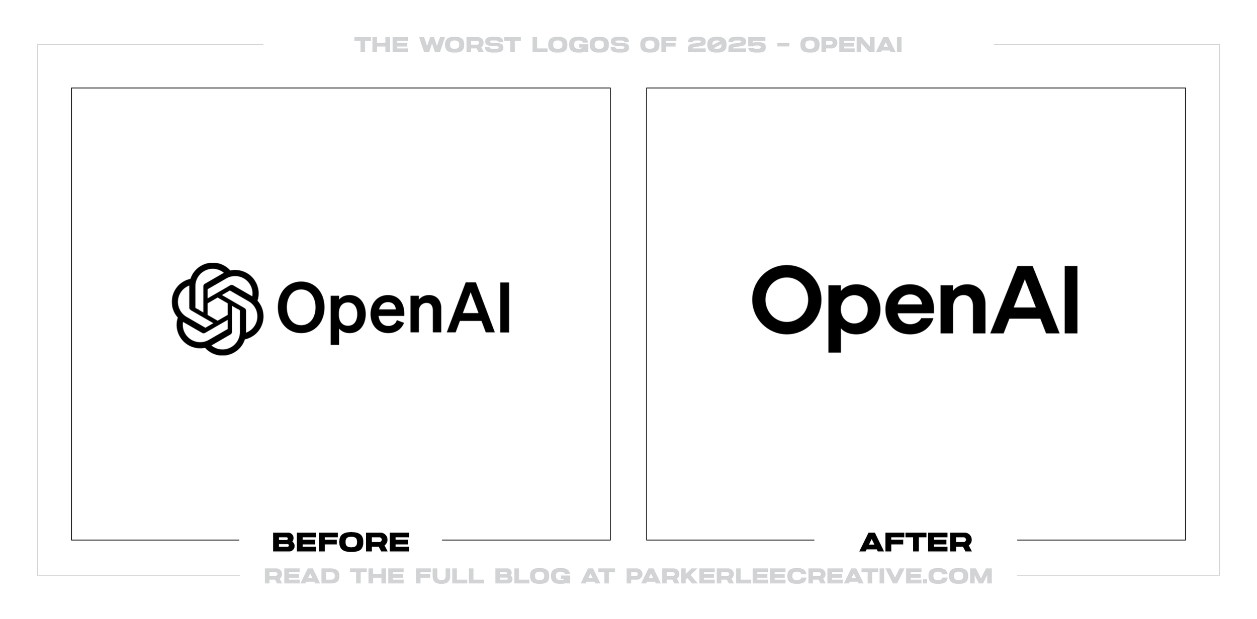
OpenAI grew from a research lab into a product company while using an inconsistent mix of fonts, marks, and colors. Its first full identity created order, but the tiny logo adjustment carries far less visible change than the strategy around it.
Why It Made the List:
The Blossom received refined geometry and multiple weights, yet the before-and-after difference is nearly invisible to most viewers. Precision matters, but a logo update this subtle cannot bear much of the rebrand’s human-centered narrative.
OpenAI prioritizes its wordmark over the Blossom for primary branding. That rule creates control, but it also demotes the company’s most recognizable visual asset just as products, partners, and audiences need stronger family recognition.
Wallpaper’s launch interview explains a system of circles, points, grids, imperfection, photography, and responsive motion. The work is disciplined, but the plain wordmark and restrained Blossom reveal little of that character on their own.
The Tradeoff:
OpenAI Sans, a shared grid, clearer data graphics, and defined logo rules solve consistency problems across products and research. The identity is stronger than the logo change, which makes this a critique of hierarchy and payoff, not craft.
What Businesses Can Learn:
A brand system can need repair even when the logo does not. Be clear about which problem each change solves, and do not burden a microscopic redraw with a large story. If the symbol carries equity, define its role before reducing its visibility.
22. Network Solutions
Why Did the Logo Change?
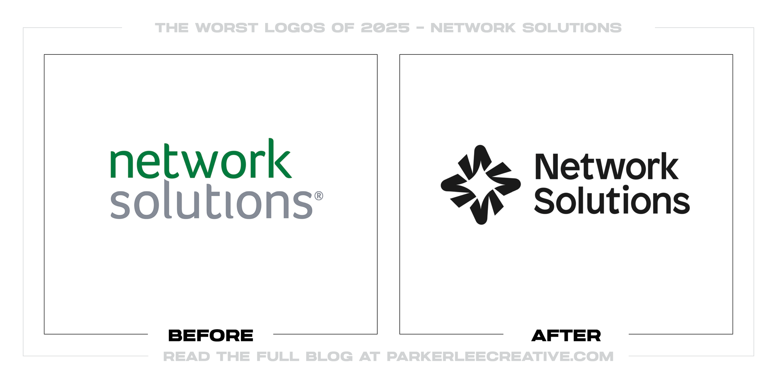
Network Solutions absorbed Web.com and became the lead destination for a wider suite of domains, hosting, security, marketing, and website tools. The refresh needed a unifying symbol, but chose an abstract tech star that requires decoding.
Why It Made the List:
Rotating and interlocking shapes can reveal an N, an S, a network, and a radiant star. That clever construction rewards study, but the first read is a generic sparkle, a device already crowded across technology and digital-service brands.
The inner cuts create motion at display size, yet they also divide the symbol into narrow pieces that may close up in favicons, embroidery, and small placements. A logo for web infrastructure should be strongest where digital space is tight.
Newfold’s consolidation announcement clearly explains why one masterbrand was useful, but not why this mark uniquely represents it. A merger creates a rare chance to clarify trust and scale, not another symbol customers must learn.
The Tradeoff:
The new icon is energetic, compact, and more flexible than relying on a long wordmark alone. It gives Network Solutions an asset for app icons and product navigation. Its weakness is category familiarity, not a lack of visual polish.
What Businesses Can Learn:
Hidden initials are a bonus, not a substitute for an immediate idea. Ask viewers what they see before explaining it, then compare the silhouette against competitors. In a crowded category, clever geometry still needs an ownable first read.
23. Phoenix Mercury
Why Did the Logo Change?
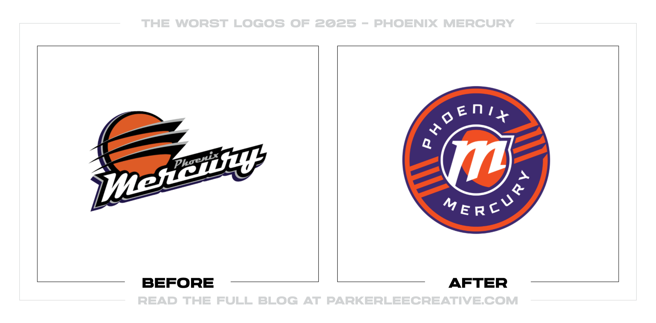
Ahead of its 30th season, Phoenix wanted flexible marks for uniforms, merchandise, and digital use without abandoning the original Mercury identity. The in-house system improves production, but loads nearly every shape with hidden references.
Why It Made the List:
The primary M sits at 19.97 degrees for the team’s 1997 debut, includes a crescent for the planet’s shadow, and ends in an arrow for momentum. None of those references clearly improves recognition as much as the explanation suggests.
The global logo divides four historic rings into eight lines for the WNBA’s original teams, while the wordmarks use an eight-degree horizon. Repeating counts across the geometry turns heritage into a specification sheet, not a clearer emblem.
The Mercury’s official reveal adds an Arizona basketball, the “Merc” nickname, an updated PHX mark, and custom type. The toolkit offers options, but several secondary ideas compete with a primary logo that is already doing too much.
The Tradeoff:
Purple, orange, the M, planetary rings, and PHX preserve useful equity, while the expanded toolkit gives the team more merchandise and campaign options. The redesign respects its past. It mistakes encoded detail for visible meaning.
What Businesses Can Learn:
Dates, locations, and milestones can inspire design without appearing as angles, line counts, and hidden references. Build one strong sporting silhouette first, then let uniforms, exhibits, copy, and anniversary graphics tell the deeper history.
24. CNBC
Why Did the Logo Change?
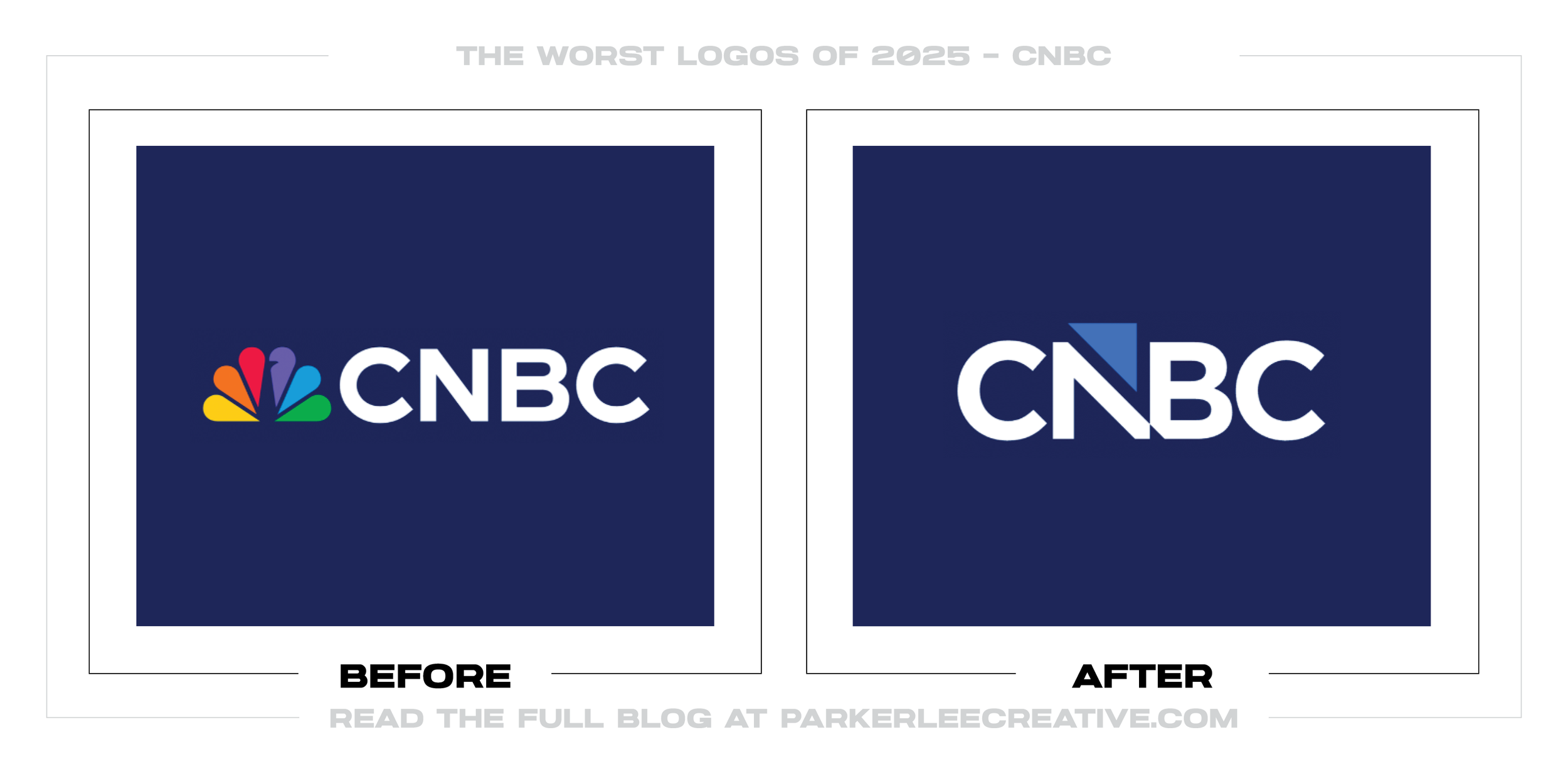
CNBC had to separate from NBCUniversal’s peacock as the network moved into Versant, although it retained the CNBC name through a license. The in-house replacement met that legal need, but surrendered three decades of instant visual recognition.
Why It Made the List:
The peacock gave CNBC color, heritage, and connection to a major news organization. Replacing it with blue and black letters makes the network look more independent, but also less distinctive across crowded screens, apps, and broadcast guides.
An upward arrow appears in the N and B, extending a device from CNBC’s market graphics. The cue fits financial news, but upward arrows are generic promises of growth and feel predictable for a network that reports markets in both directions.
TVNewser’s launch report confirms an in-house design and December 13 rollout. The tight N-B construction nods to an older CNBC mark, yet the negative-space arrow can slow the reading of four letters that should remain effortless.
The Tradeoff:
CNBC needed an identity it could carry outside NBCUniversal, and the new mark connects to on-air graphics familiar to viewers. It is compact, practical, and legally workable. Independence, however, arrived with a sharp loss of color and equity.
What Businesses Can Learn:
Forced rebrands still need a deliberate equity plan. Identify what cannot move, then preserve what can through color, typography, sound, motion, or layout. A new symbol should replace lost recognition with distinction, not category shorthand.
25. Texas Tech Athletics
Why Did the Logo Change?
Texas Tech Athletics used a 2024 audit and its Adidas partnership to revisit the Double T, drawing on the flat mark used from 1963 to 1999. The update improves production, but removes the beveling many current students know as the brand.
Why It Made the List:
Flattening the Double T makes uniforms, courts, fields, and licensed products easier to reproduce. Yet the red-and-white construction loses the black depth that gave the mark weight, leaving a familiar collegiate monogram with less presence.
The retro reference matters to older supporters, but students built their memories around the beveled version used since 2000. Heritage is not one fixed period. Choosing which era to revive is a strategic decision, not automatic authenticity.
Texas Tech’s official announcement separates the athletics identity from the beveled campus logo. Running both versions preserves institutional needs, but also creates two official Double Ts for audiences to distinguish and teams to govern.
The Tradeoff:
The new suite has research behind it, named design partners, custom type, and installations in use. It is also cleaner for apparel and licensing. The issue is whether production efficiency justified dividing the university’s strongest symbol.
What Businesses Can Learn:
Nostalgia is not a single audience truth. Research which version groups recognize and test whether parallel marks create confusion across merchandise, signage, and digital channels. A revival should unite generations, not make ownership harder.
What the Worst Logos of 2025 Have in Common
The weakest decisions on this list do not share one visual style. Some identities became too generic. Others became too complicated. Several protected consistency while sacrificing the character that made the brand recognizable. The recurring problem is not minimalism, boldness or change itself. It is solving one design problem while ignoring a more important business or audience problem.
A better redesign begins by identifying the equity customers already use, the applications that currently fail and the change the business genuinely needs. Concepts should then be tested against those requirements, not chosen because they look contemporary in a presentation. The best logo redesigns of 2025 show how much stronger a change becomes when recognition, strategy and execution move together.
Logos and trademarks shown belong to their respective owners and are included for identification, criticism and commentary. No endorsement or affiliation is implied.
Thanks for Reading The 25 Worst Logos of 2025
Thanks for reading our annual Worst Logos of the Year article. It really means a lot to me. I also want to thank every designer, studio, in-house team and client who brought this year’s work to life. I may have opinions about the results, but this series would not exist without people willing to take creative risks in public.
For the other half of this year’s series, read The 25 Best Logos of 2025. You can also browse the blog for earlier Best and Worst Logos of the Year articles and more logo design reviews.
Does your business need a new logo? We provide logo design and brand identity services for businesses that need something new or have outgrown what they already use. Fill out the form below and tell us your story. We would love to help forge a new identity for your brand that connects with your customers, tells your story, and lands you at the top of next year’s Best Logos of the Year article.
Legal Disclaimer: This content is provided for educational and informational purposes and is intended as commentary and criticism; all product names, logos, and trademarks are the property of their respective owners, and any copyrighted materials shown are used under the principles of fair use solely to identify the subjects discussed and to support analysis, with only the limited portions reasonably necessary displayed; no sponsorship, endorsement, affiliation, or partnership is implied, and nothing on this page constitutes legal, financial, or other professional advice.
