
Welcome to The 25 Best Logos of 2025, one of two articles in my annual Best and Worst Logos of the Year series. Every year, I look back at the rebrands that caught my attention and share what businesses can learn from them. Here, we are going to take a look at some of this year’s strongest work. Looking for The 25 Worst Logos of 2025? Read the companion article to learn about rebrands that may have missed the mark.
Below, I break down The 25 Best Logos of 2025. For each one, I look at why the business rebranded, where the new identity succeeds, what it gives up, and what your business can learn before starting a rebrand of its own.
A quick note before I get into the list: I have respect for every designer, studio, in-house team and client represented here. Putting a new identity into the world is hard. These reviews focus on the finished work, but the point is not criticism for criticism’s sake. This series is here to help business owners and brand teams understand why companies rebrand, learn from the choices behind the work and make better decisions when it is their turn. The entries are numbered to make the article easy to follow, but they are not presented in any particular order. Design is subjective, and I do not expect everyone to agree with every choice. That is part of what makes these articles fun to write and discuss.
But when it does come time for you to discuss a new logo, Parker Lee Creative is an award-winning, independent creative studio specializing in logo design and brand identity. We help businesses build new identities and refresh the ones they have outgrown. Our process starts with what the logo needs to communicate, then tests the work everywhere customers will see it. If you are considering a rebrand, contact us and tell us your story. We would love to help you create something worthy of next year’s Best Logos of the Year article.
1. Utah Mammoth
Why Did the Logo Change?
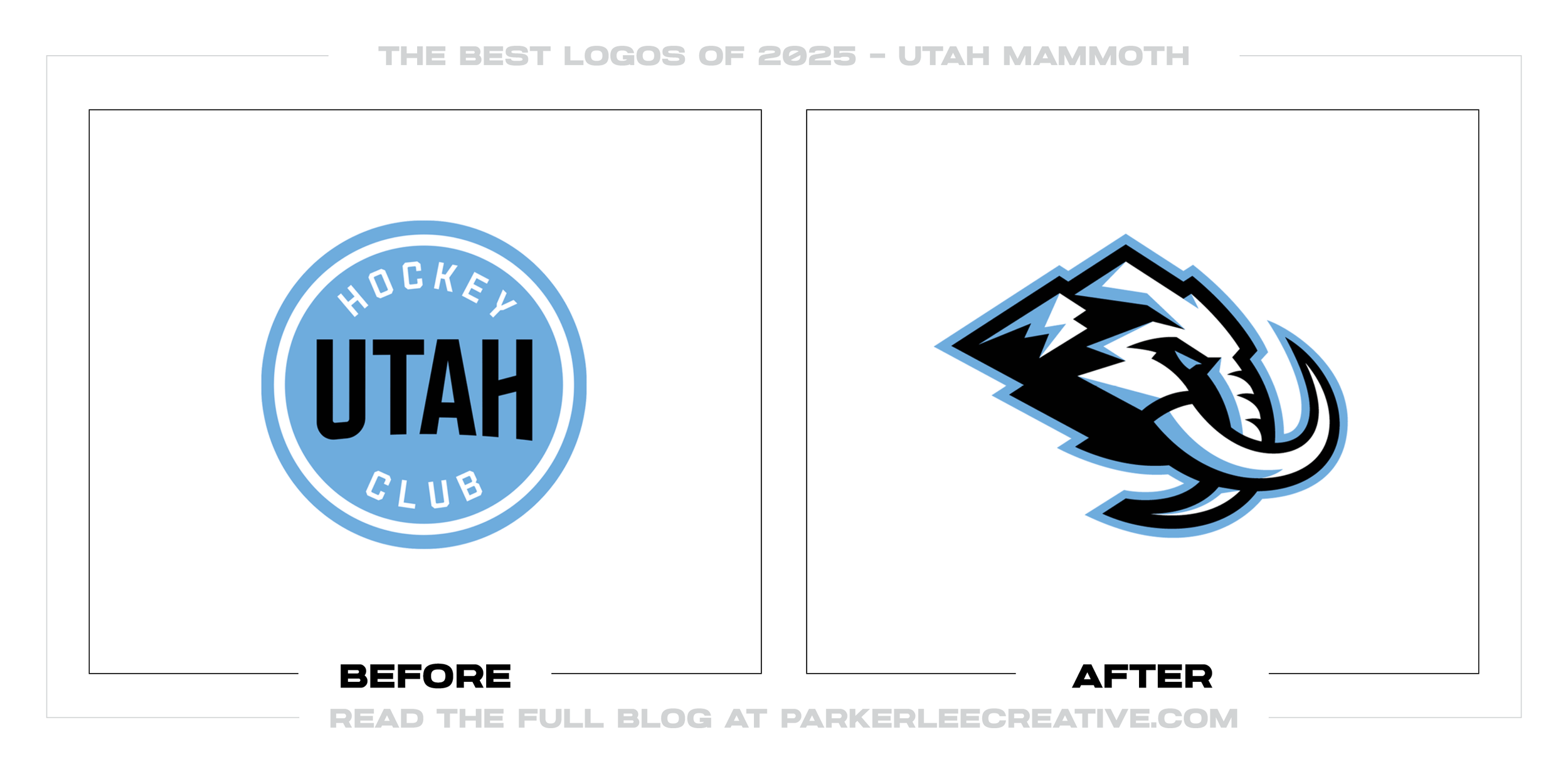
Utah Hockey Club was a temporary name, and it looked like one. The franchise needed something fans could claim as their own, but throwing out the colors and uniform details from year one would have wasted recognition it had already earned.
Why It Made the List:
What I like most is that the idea does not stop at “mammoth.” Doubleday & Cartwright worked Wasatch peaks, the shape of Utah, and a U into the head. The animal reads first, while those local details reward a closer look on repeat.
The primary mark has backup. Mammoth Sans, the Utah Badge, tusk U, wordmarks, patches, and the Tusks Up gesture give the franchise useful options for jerseys, scoreboards, hats, social posts, and all the awkward spaces a sports brand faces.
Rock Black, Mountain Blue, and Salt White stayed. So did the stripe pattern and diagonal UTAH on the road jersey. Those choices keep the first season in the story instead of acting as if recognition only began when the mascot arrived.
The Tradeoff:
The small Utah shape and mountain details will not survive every reduction. I would reach for the tusk U long before forcing the full mammoth into a tiny space. That is why the supporting marks are doing real work, not filling a guidelines page.
What Businesses Can Learn:
If a temporary identity has earned recognition, do not throw it away just to make the reveal feel bigger. Keep the parts people know, build the permanent idea around them, and have simpler marks ready when the hero logo is too much.
2. Breyers
Why Did the Logo Change?
Breyers had a freezer-aisle problem, not an identity crisis. The script still belonged on the carton, but the logo, flavor cues, and product photography needed more presence so shoppers could find what they wanted without studying every package.
Why It Made the List:
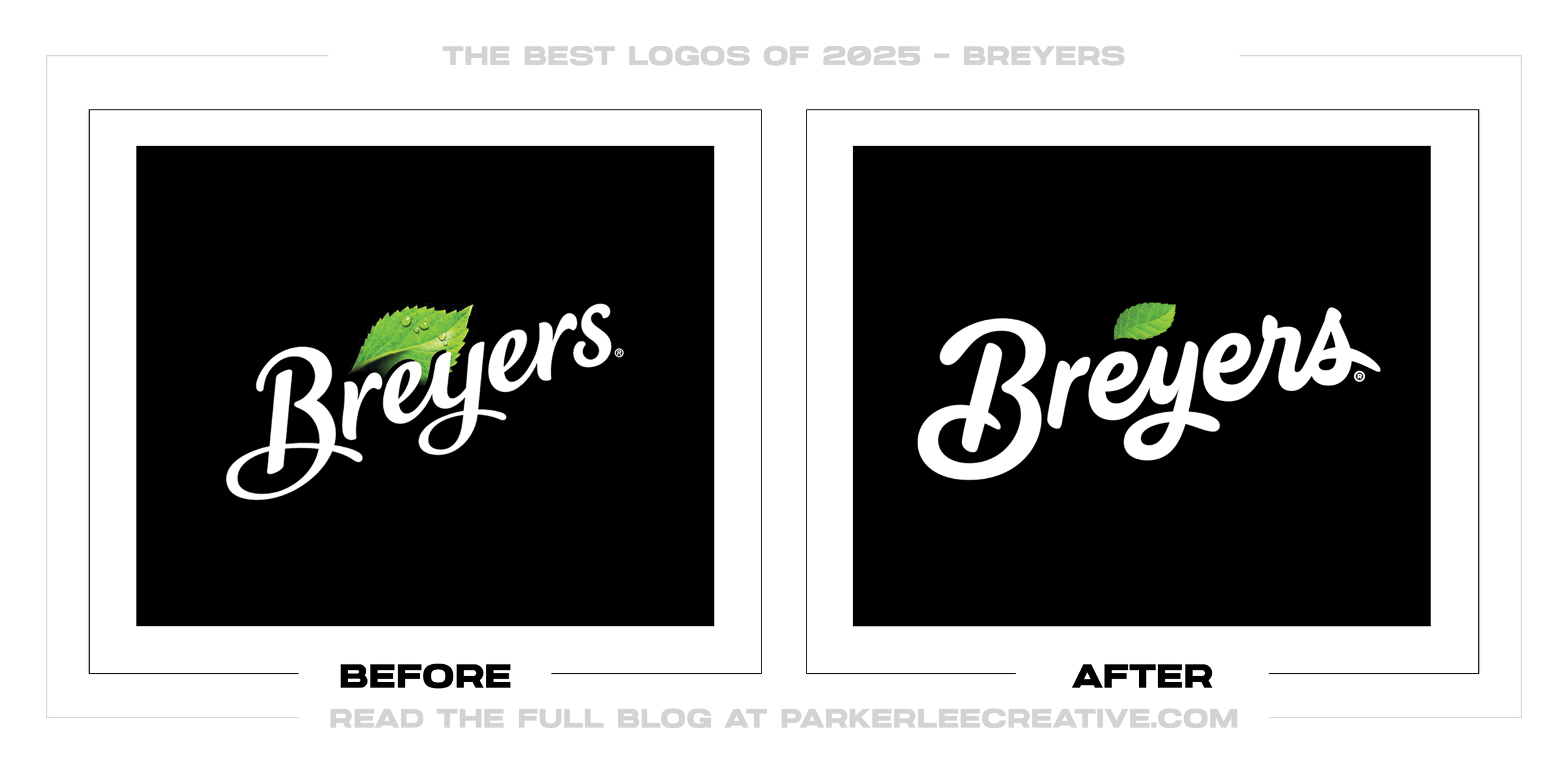
The smartest choice was treating the carton as a whole. A heavier script gives the name more presence, while larger food photography and clearer flavor colors do the practical work of helping shoppers sort the range from a few feet away.
Breyers calls this a new look, but it also tells customers the recipes and familiar taste have not changed. That is a small sentence with a big job: improve how the product shops without making loyal buyers question what is inside.
The script had value, so Breyers did not replace it with a fashionable new voice. It kept the familiar signature, gave it more weight, and let the package hierarchy carry the change. That feels right for a brand people recognize in seconds.
The Tradeoff:
Thicker lettering is easier to spot, but some of the older script’s openness is gone. Breyers says findability drove the work. Without public shelf testing, I can say the choice makes sense, not that the redesign proved shoppers find it faster.
What Businesses Can Learn:
Packaging design starts with how someone shops, not how the logo looks alone on a white page. Find the cues people use to locate the product, strengthen the hierarchy around them, and protect anything that tells a customer, “Yes, this is yours.”
3. City of Austin
Why Did the Logo Change?
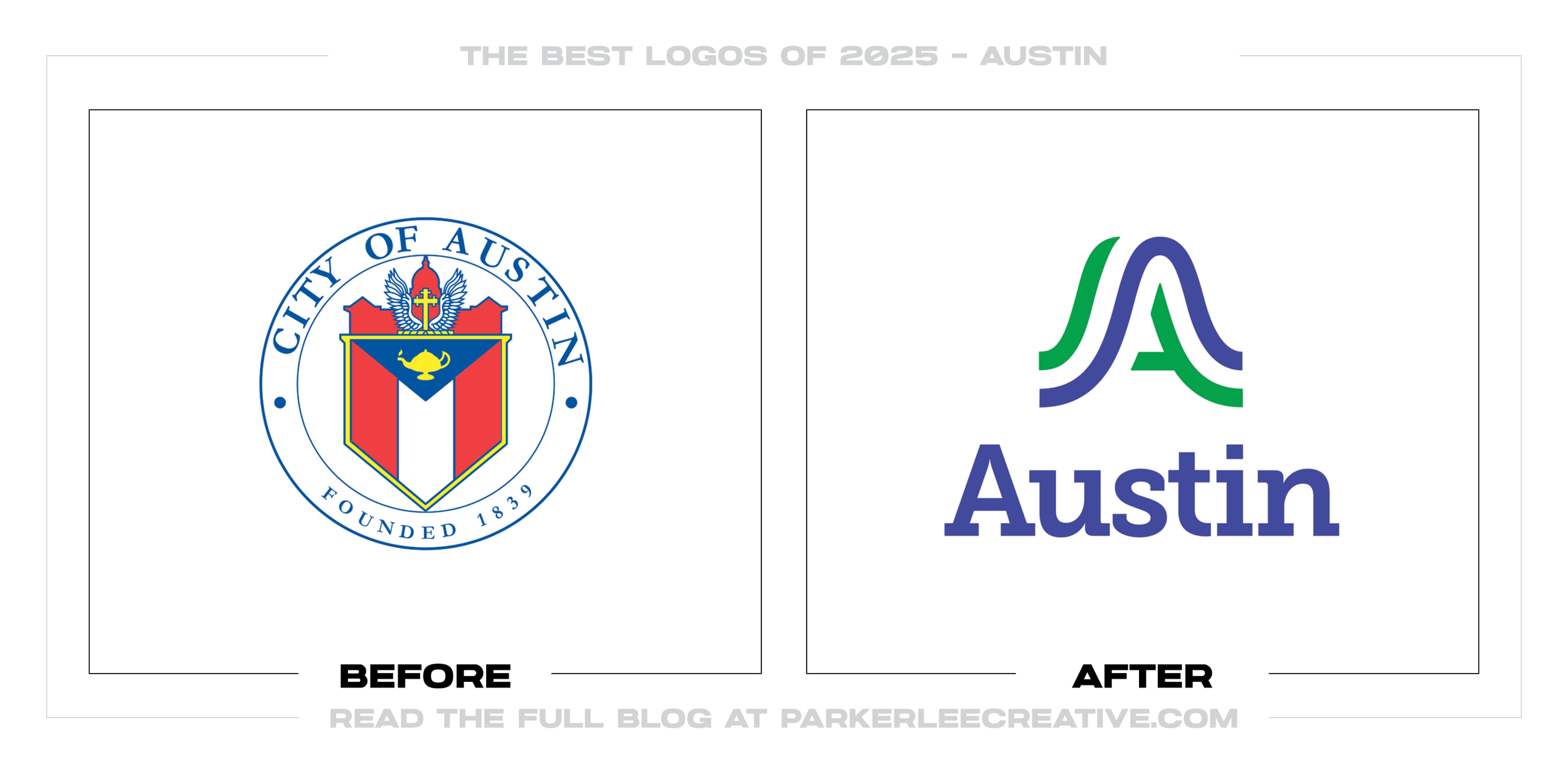
Austin had more than 300 department logos and a naming problem to match. Residents could not always tell which information was official or how one service related to another. A shared civic identity was meant to make the city easier to navigate.
Why It Made the List:
This was a service problem before it was a style problem. Austin’s own announcement says the real goal was to help residents recognize city information across departments, which is a much better brief than “make us look modern.”
Putting Austin first in department names gives people a reliable way to read the organization. Shared type, color, and layouts do the rest. Starting online, then replacing physical assets as they wear out, avoids a wasteful overnight swap.
The ribbon A hints at waterways, hills, bridges, and motion without illustrating every Austin landmark. Violet and green nod to the sky and parkland. I like the restraint, even if the result does not capture all of the city’s personality.
The Tradeoff:
That restraint is also the weakness. Plenty of residents saw a generic corporate mark instead of Austin. The reported $1.1 million covered the program, not one logo, but public work still has to feel like it belongs to the people paying for it.
What Businesses Can Learn:
When an organization has too many logos, another symbol will not fix the mess. Start by mapping names, teams, channels, and replacement costs. Then design one recognizable structure with enough personality that people can see themselves in it.
4. Grok
Why Did the Logo Change?
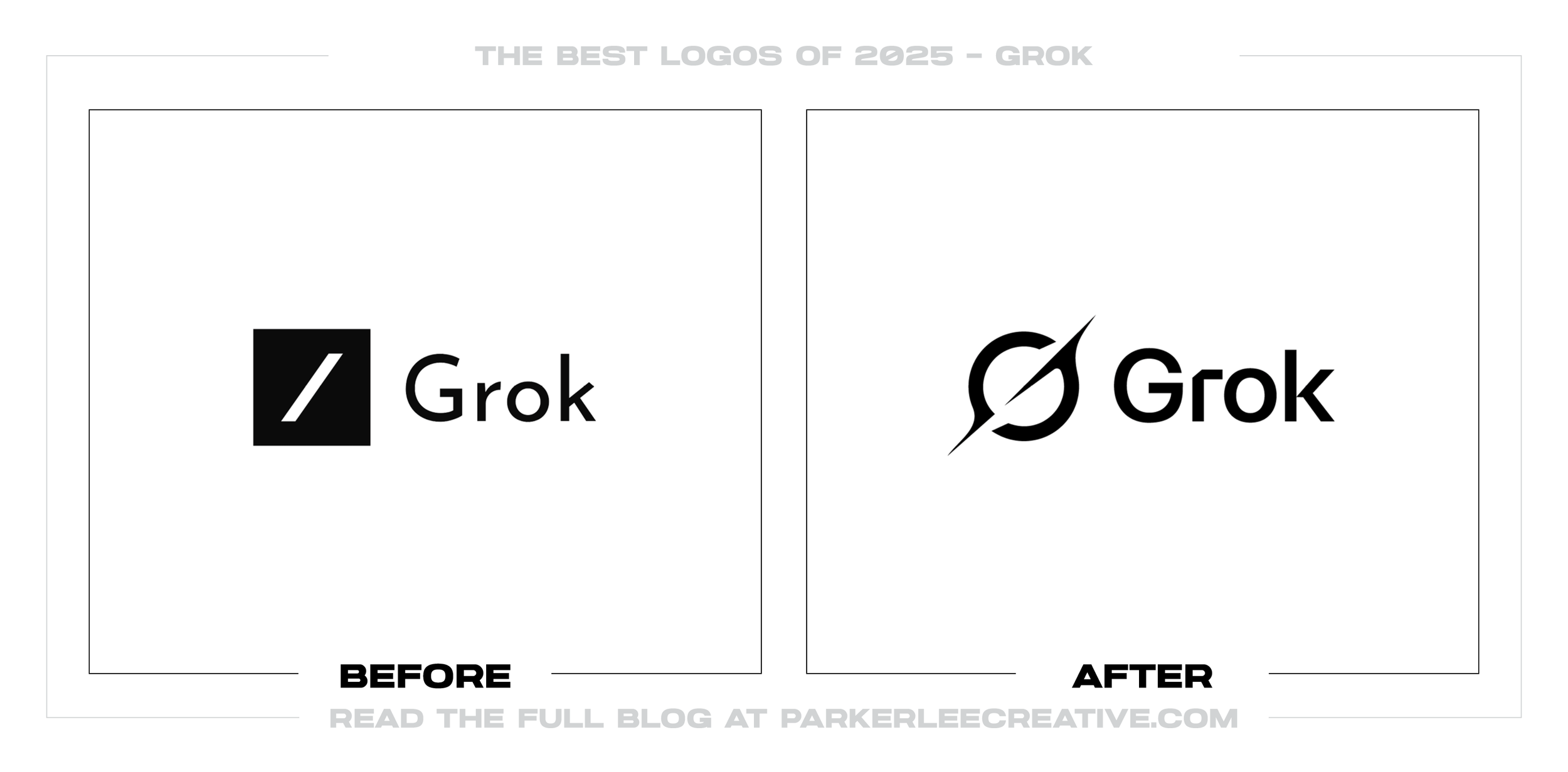
Grok had already moved through several marks, so it lacked a stable icon people could learn. The February 2025 version turned to a black-hole form, tying the product to curiosity and understanding while fitting the places where people meet it.
Why It Made the List:
At icon size, the black-and-white orbit has enough weight to hold together. The central void and suggested G add a second reading, but neither gets in the way of the silhouette. It feels considered for a screen rather than shrunk to fit one.
Jon Vio described the idea through a singularity, mystery, and the act of understanding. That concept matches Grok without falling back on a chatbot face, a speech bubble, or another literal piece of product-interface shorthand.
The near-circle sits naturally in square and round containers, and the bold palette behaves in light or dark interfaces. That practical fit earns its place here. I am judging an effective icon, not pretending Grok launched a complete identity.
The Tradeoff:
Black holes and orbit lines already crowd technology branding, so the idea is not Grok’s to own. Grok and xAI changed their presentation again after 2025, which makes this version feel like a stop along the way, not a settled identity.
What Businesses Can Learn:
An app icon needs a durable job, not constant novelty. Pick a concept that belongs to the app, prove it at the smallest size, and repeat it long enough to become familiar. A clever mark cannot earn memory if the company will not leave it alone.
5. Eventbrite
Why Did the Logo Change?
Eventbrite had become something people used at the end of a decision: find a ticket, check out, leave. Its 2025 app and identity push the brand sooner in the journey, toward finding an event, getting there, and holding onto the memory afterward.
Why It Made the List:
The Path is a three-part monogram, but it does more than sit in a corner. It can hold pattern, illustration, photography, texture, or depth. That range fits a business whose events can look like almost anything without losing the same frame.
Eventbrite launched the identity with a redesigned discovery app, which makes the strategy believable. The mark connects the steps from first finding an event to remembering it instead of decorating another digital ticket screen.
Brite Orange stayed while BUCK changed nearly everything around it: type, color, imagery, and motion. The familiar orange gives users one quick point of recognition as the rest of the system shifts from concerts to classes to parties.
The Tradeoff:
The Path is flexible enough to invite misuse. If every team fills it with a different color, image, texture, or animation, the shape can become a costume instead of a signature. The brand will need firm rules about when the mark stays quiet.
What Businesses Can Learn:
When a business wants to be known for more than one transaction, the identity should show that wider journey. Keep one cue customers already know, then give the new promise a visual idea that can organize products, campaigns, and everyday use.
6. Lyft
Why Did the Logo Change?
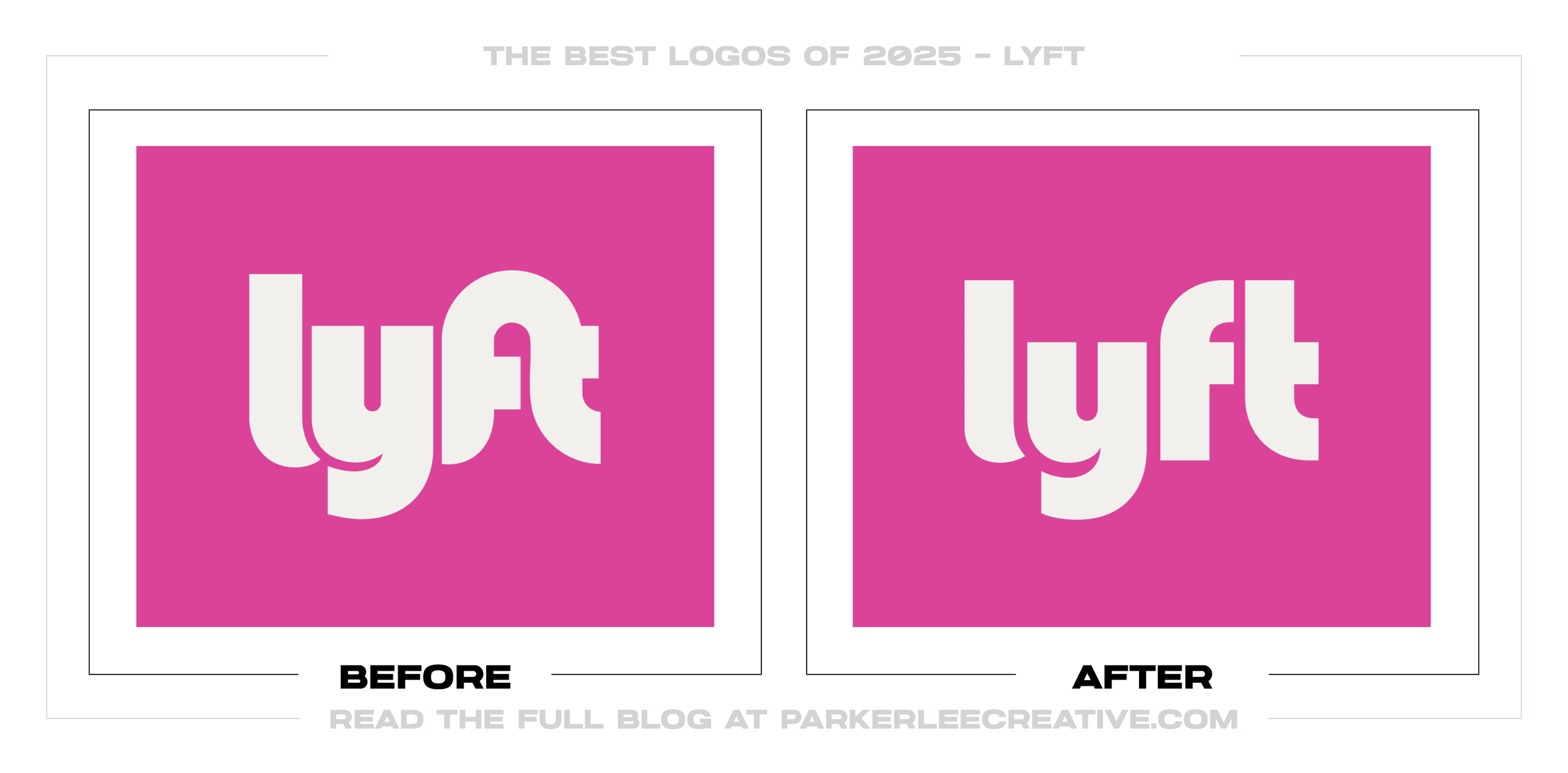
Lyft’s wordmark was already easy to spot. The harder job was helping the brand mature without draining out its friendliness. The 2025 work refined the logo, then brought more order to type, color, photography, and product use across services.
Why It Made the List:
Koto’s case study shows how little the wordmark had to change. The lowercase name and pink survive, but cleaner construction and firmer rules make the familiar logo easier to manage as Lyft stretches across more services and markets.
Rebel Sans adds a voice Lyft can own, while the photography puts people back into a category that looks like maps, cars, and price screens. Warmer moments are not decoration. They remind you what the ride makes possible after the app closes.
The system holds together across the rider app, driver messages, social posts, outdoor ads, and campaigns. Lyft does not need the logo to carry every piece; its type, color, photography, and layouts make the connection clear at a glance.
The Tradeoff:
The change is so quiet that most riders will never notice it. That is fine if the wider system does its job. My concern is the opposite: too much polish could sand away the odd, slightly unruly character that once made Lyft instantly different.
What Businesses Can Learn:
If people already recognize the logo, do not mistake familiarity for a limitation. Keep the equity, fix the parts around it, and put the visible change into type, imagery, motion, and product details that actually shape the customer experience.
7. Adobe
Why Did the Logo Change?
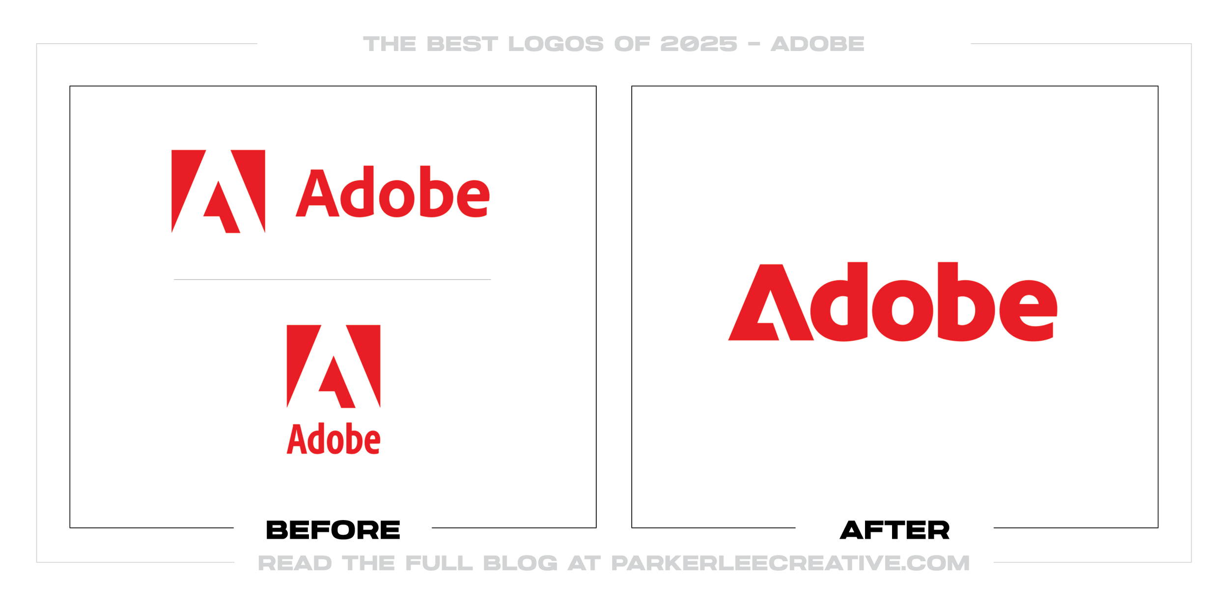
Adobe’s mark and product family had to feel related, especially inside the software where customers spend their time. The 2025 refresh joined the A and wordmark, tightened the palette, and set rules for icons, lockups, interfaces, and motion.
Why It Made the List:
The best move is almost invisible. Folding the familiar A into the wordmark removes an awkward lockup without discarding the 1982 idea behind it. Adobe gets one cleaner signature, and long-time users do not have to learn a new symbol.
The Adobe Lens is where the identity gets room to play. A red frame can crop, stage, focus, and transform imagery without pretending every product needs the logo pasted over it. It gives campaigns a recognizable behavior, not just a layout.
Adobe’s app-icon case study is the proof I wanted to see. Shared geometry, color logic, and mnemonics carry the brand into the interface. For a software company, that daily product layer matters more than the corporate logo on a keynote slide.
The Tradeoff:
Joining the A to the name fixes a lockup, but it leaves fewer options when only a symbol will fit. The icon rollout creates a snag: during the transition, users can see old and new rules sitting beside each other across the same product family.
What Businesses Can Learn:
A complicated brand will not become coherent because its logo got cleaner. Decide how company names, products, icons, motion, and interfaces relate, then document where each asset belongs. Consistency comes from decisions people can follow.
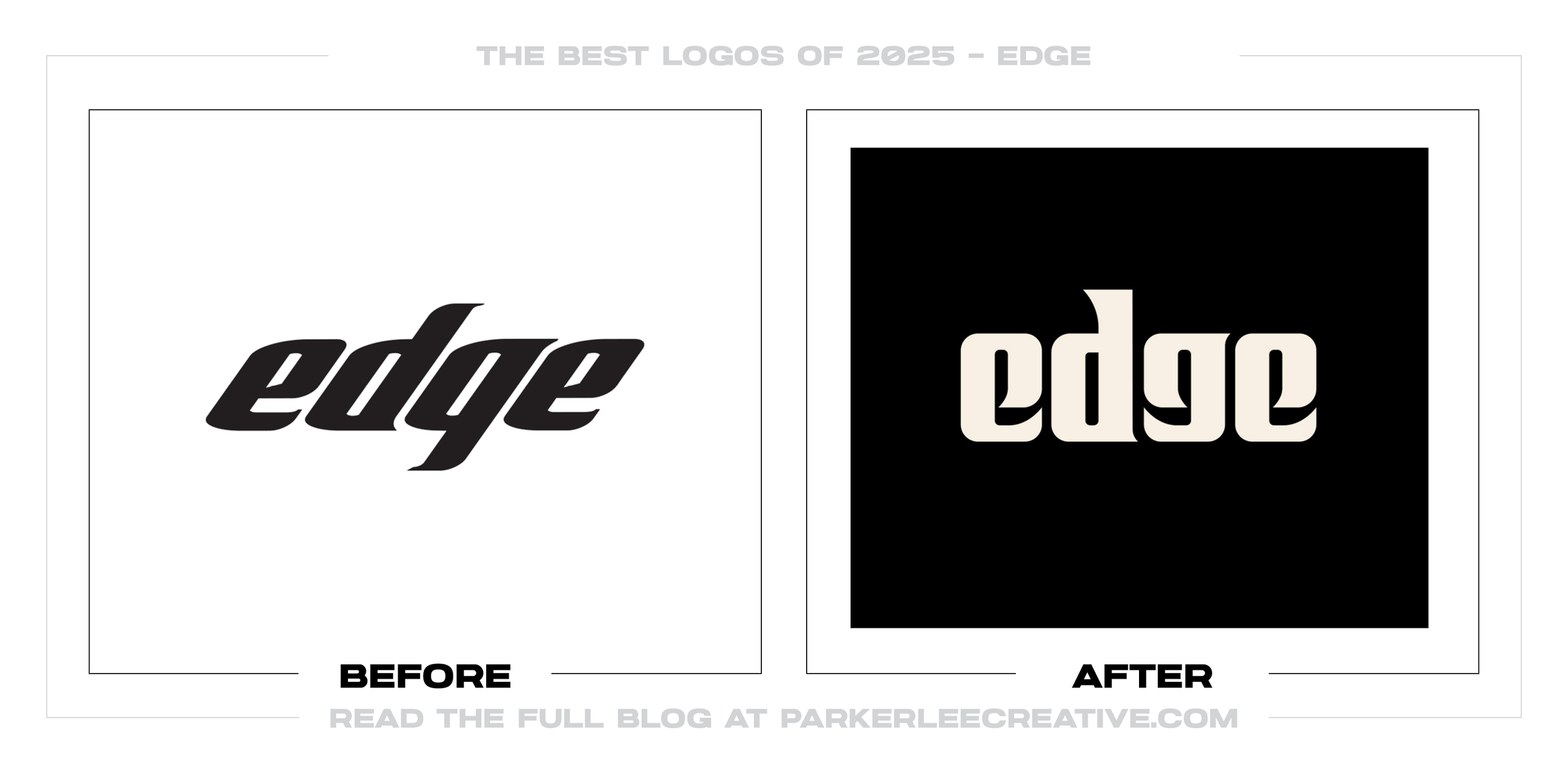
8. Edge Shave Gel
Why Did the Logo Change?
Edge had buried a straightforward shave gel under aerospace claims, speed graphics, and sporty gradients. The 2025 refresh went back to the product people knew, revived a heavier legacy feel, and made the orange cap hard to miss on shelf.
Why It Made the List:
The Young Jerks noticed that loyal shoppers searched for “The Orange Cap.” That insight gives the whole job a backbone. Instead of inventing a story for a deck, the package now leans into the cue people were already using in the aisle.
The new custom lettering is heavy, rounded, and a little strange. I prefer that to the former italic logo, which looked like it belonged on sports equipment. The cuts in the letters keep the weight from becoming one anonymous slab.
Clearing away the aerospace copy and effects lets the orange cap, product name, and variant colors do their jobs. You can understand the package before reading every claim. For a purchase, that kind of speed is more useful than visual drama.
The Tradeoff:
The retro wordmark restores personality, but it gives up some of the technical edge shoppers may expect from a grooming product. It is a dense piece of lettering. Reduced too far or crowded by claims, those forms could turn into a dark block.
What Businesses Can Learn:
Before touching a package, watch how customers find it. The answer may be a cap, color, shape, or phrase that never appeared in the brand story. Protect that behavior first, then remove anything that slows the choice or hides the product.
9. Walmart
Why Did the Logo Change?
Walmart’s 2008 identity was familiar, but the company around it changed. An app, ecommerce, health services, and omnichannel work asked more of the brand than a store sign did. The 2025 refresh had to catch up without making shoppers start over.
Why It Made the List:
The new custom wordmark borrows from lettering on Sam Walton’s trucker hat. I like that history shows up in the actual forms, not as a paragraph in the launch story. The heavier name also holds together from a storefront to a phone.
True Blue, Spark Yellow, and the familiar Spark all stay, but their weight and construction are tighter. It is a careful amount of change for assets seen by millions of people. Nothing asks a shopper to stop and solve the logo again.
The bigger story lives beyond the logo: voice, photography, illustration, interfaces, stores, and the Bentonville campus. Those applications give a mark somewhere to prove itself. Without them, the update would barely amount to heavier type.
The Tradeoff:
Many people missed the change or mocked it. I understand why. When the visible move is this subtle, the rollout has to make the investment feel worthwhile. Otherwise, restraint can look like an expensive way to arrive at almost the same place.
What Businesses Can Learn:
Familiarity is equity, not a problem a designer must erase. If customers already know the core assets, sharpen them and spend the effort on service, experience, and application. A mature brand can move forward without staging a dramatic break.
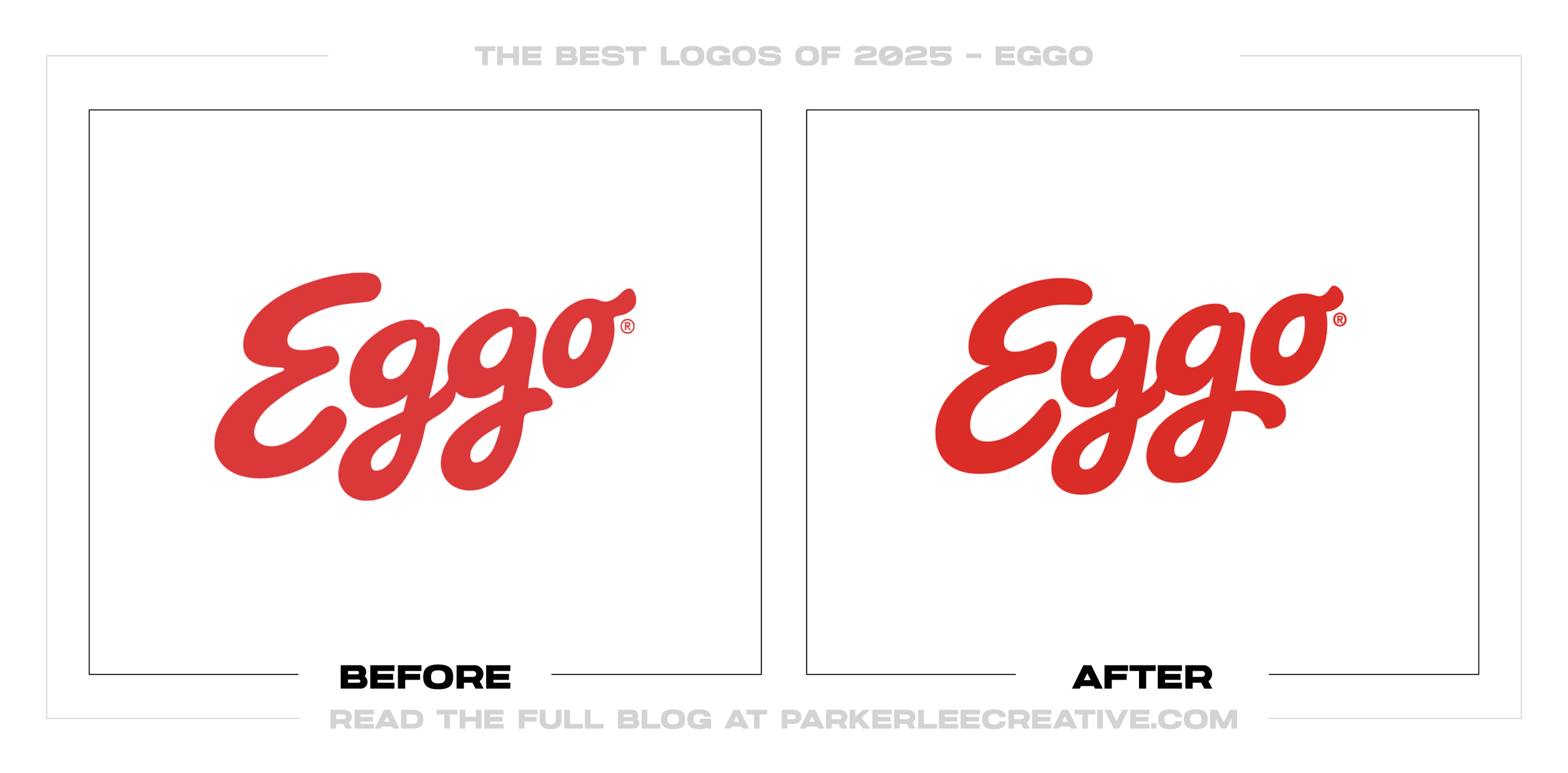
10. Eggo
Why Did the Logo Change?
Eggo was not short on recognition. Its red script and yellow boxes already owned space in the freezer aisle. The 2025 job was to clean up the logo, make the food look better, and organize a growing range without losing the warmth families knew.
Why It Made the List:
The script still says Eggo at a glance, only with flatter construction and lettering. It reproduces with less clutter and stays familiar from several feet away. That is the kind of quiet drawing work most shoppers will feel rather than notice.
Design B&B’s case study makes clear that the logo was one part of the job. Packaging, photography, motion, and a usable asset library give the familiar name a consistent world now and room for products Eggo has not launched yet.
The food gets room to look warm, crisp, and worth eating. Flavor cues still work, but they no longer compete with a pile of graphics. In a freezer full of boxes, a yellow field and a waffle photograph can sell the idea faster than extra copy.
The Tradeoff:
Most shoppers will never spot the redrawn letters, which is partly the point. The risk is that the update looks trivial when pulled away from the packaging. Its value depends on the shelf system, not a dramatic before-and-after logo comparison.
What Businesses Can Learn:
A brand does not owe the internet a shocking reveal. First identify what still works, then improve the hierarchy, photography, typography, and production around it. Restraint is not timid when it protects recognition and fixes the right problem.
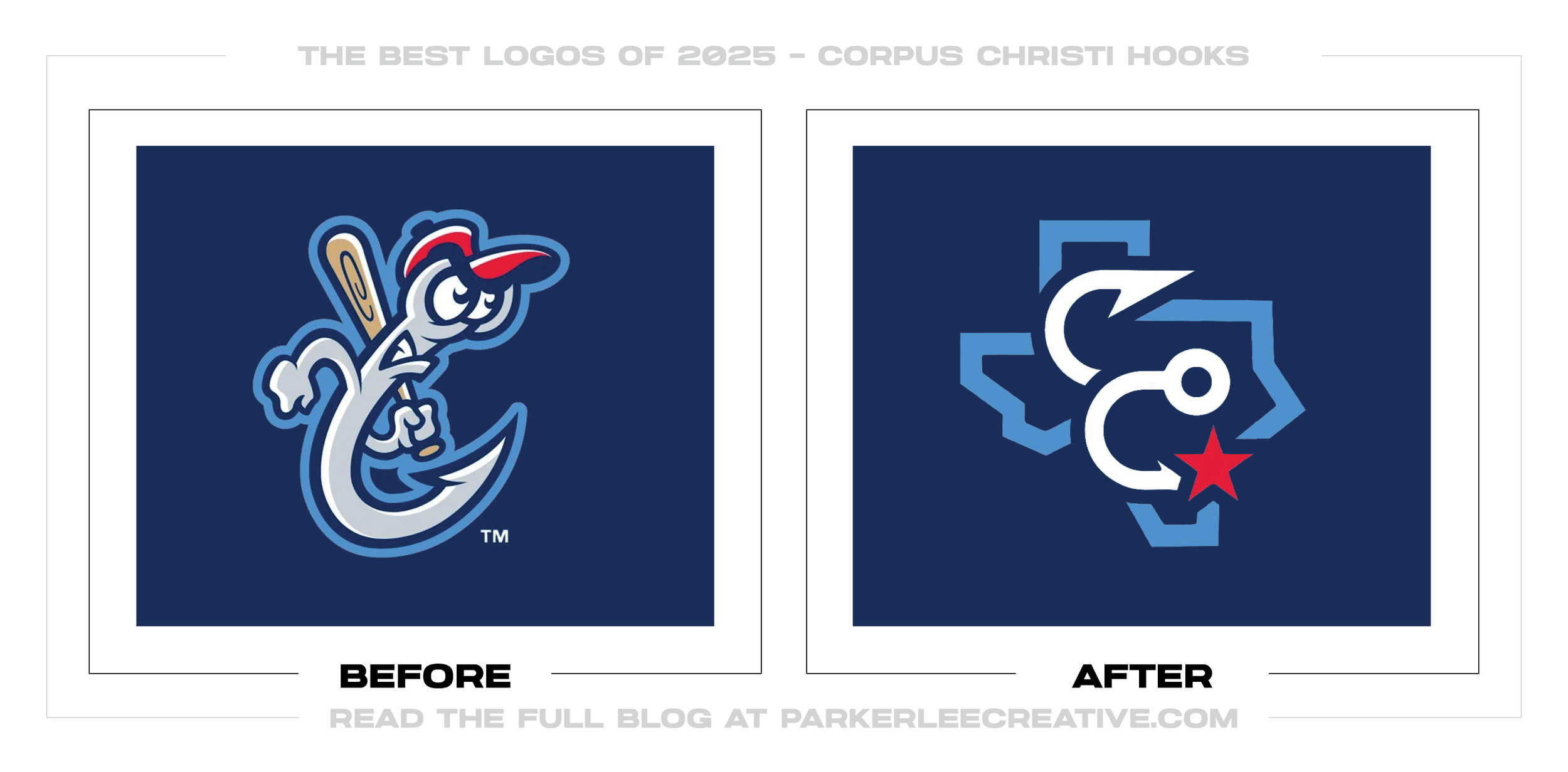
11. Corpus Christi Hooks
Why Did the Logo Change?
The Hooks had carried the same character-led identity since they arrived in 2005. For its twentieth season, the club wanted something rooted in Corpus Christi, drawing from the bayfront, city flag, local industry, Texas, and regional history.
Why It Made the List:
The primary badge and seven supporting marks pull from details that belong to Corpus Christi, including the bayfront miradores and city flag. That specificity gives fans more to discover than generic hooks, baseballs, or nautical clip art.
The Hooks’ official unveiling explains why each cap and uniform looks different. Interlocking hook-shaped C’s, city nicknames, stars, flags, and local history give the club a deep bench of stories for merchandise and promotions.
Courtney Gatlin built the identity in-house and clearly understood where it had to live. Caps, jerseys, patches, wordmarks, and alternates share a family resemblance without pretending one detailed badge can handle every baseball application.
The Tradeoff:
The club gave up Rusty Hook, a character many fans loved. In return, it gained civic meaning but also a primary badge that feels formal and carries small details. I respect the depth, though I am not convinced every piece gained personality.
What Businesses Can Learn:
Local research cannot stop at maps and landmarks. Fans build equity through mascots, rituals, merchandise, and memories. A place-based identity works when it adds regional meaning without erasing the things people already claimed as theirs.
12. Tripadvisor
Why Did the Logo Change?
Tripadvisor was beginning to blend into the booking and price-comparison crowd. For its twenty-fifth year, the brand returned to an advantage competitors cannot quickly manufacture: its archive of reviews and the travelers who wrote them.
Why It Made the List:
Ollie the owl keeps the face people know but finally gets out of the old circle. In motion, the eyes follow traveler content. It is a small, likable behavior that makes the mascot feel curious instead of stamped onto the corner.
The green feels new without pretending the old brand never existed. Review dots stay as a familiar cue. I like that Koto changed the energy around those assets instead of replacing everything and asking users to relearn what trust looks like.
Real reviews and vacation photos now carry the identity. That is a much stronger choice than staging polished travel fantasy, because Tripadvisor already owns the material. The funny, specific, human details are hard for a competitor to fake.
The Tradeoff:
User photography brings honesty and endless variety, but it also brings bad crops, uneven color, and questionable taste. The brand needs a strong frame and an editor with judgment. Otherwise, “authentic” can become an excuse for a messy feed.
What Businesses Can Learn:
Before writing a brand story, look for the thing the business has already earned. A product, process, archive, community, or customer behavior can become identity material. It will feel more credible, and competitors cannot borrow it as easily.
13. GF Smith
Why Did the Logo Change?
GF Smith’s 2014 identity no longer matched the people-focused company it wanted the world to see. The paper maker needed more warmth, a clearer international presence, and a brand that could connect its culture, products, and charitable work.
Why It Made the List:
TEMPLO turned the letters in GF Smith into a face that smiles in every direction. It can rotate, bounce, and wink, which gives a paper supplier a surprisingly human signature. Better still, the idea works both standing still and in motion.
Colorplan paper supplies the palette, which lets GF Smith’s best-known product shape the brand itself. Swatches, packaging, digital work, events, and merchandise all trace back to something the company makes, not colors chosen in a workshop.
The smile carries through Colorplan and the sub-brands, a custom typeface, the website, wayfinding, samples, merchandise, and charity work. Seeing it handle jobs beyond stationery makes GF Smith’s friendliness feel credible across the company.
The Tradeoff:
The smile drew criticism for looking childish and weakening the premium tone. Fair enough. Approachability and prestige do not always move together, so the mark has to prove itself through the quality of GF Smith’s materials and execution.
What Businesses Can Learn:
A bold logo needs support from the rest of the company. Tie the new personality to products, culture, spaces, motion, and everyday tools so customers can see that the change is real. One surprising mark cannot carry a transformation by itself.
14. Philadelphia Museum of Art
Why Did the Logo Change?
The museum wanted to feel less like a monument at the top of the steps and more like part of Philadelphia. Gretel brought back the griffin, drew Fairmount Serif, and built an identity from the city’s architecture, lettering, and street life.
Why It Made the List:
The griffin was already hiding in plain sight, in a 1938 identity and on the museum itself. Redrawing it gave the institution a memorable badge with real history behind it, plus enough clarity for a facade, tote bag, ticket, or social avatar.
What I like in Gretel’s museum case study is how much local material made it into the work. Fairmount Serif pulls from archives, building inscriptions, and Sol Hess, so the identity feels formal without becoming another hushed museum brand.
The quieter institutional layer and louder exhibition graphics know their jobs. Shows and public programs can change their tone without dragging the master identity along, while the griffin, type, and layout rules keep the museum recognizable.
The Tradeoff:
The visual work survived, but the Philadelphia Art Museum name and PhAM acronym lasted only four months. Stakeholders rejected the naming move, a sharp reminder that a handsome identity cannot make an unwanted name feel considered or inevitable.
What Businesses Can Learn:
A polished presentation does not validate a rebrand. Test the name, shorthand, symbol, and rollout language with the people expected to use them. If evidence exposes a bad choice, fix it without throwing away the work that still earns its place.
15. Conair
Why Did the Logo Change?
Conair’s uppercase wordmark still spoke the language of an appliance maker, while hair care had become more expressive. The company needed a warmer face and a clearer way to organize a sprawling range of tools, categories, and price points.
Why It Made the List:
The new lowercase lettering is round, tightly spaced, and impossible to miss on the package. It trades Conair’s industrial stiffness for a friendlier shelf presence, without pretending the company has suddenly become a luxury salon brand.
Conair’s launch announcement explains how lilac and five supporting colors sort categories and price tiers. That is color earning its keep: shoppers get clear navigation across a broad range, not decoration looking for a reason.
“Here for Hair” gives the packaging and campaign a point of view: experimentation should feel open to everyone. I would rank the work lower if it were only a rounder logo, but the idea holds together from positioning to the retail shelf.
The Tradeoff:
Rounded lowercase wordmarks are everywhere in beauty, so warmth is not a distinctive idea by itself. Conair gives up some of its engineering authority, and that tight spacing will need watching whenever the name appears small or at speed.
What Businesses Can Learn:
When a company sells many products, the logo is only the front door. Color, type, photography, naming, and hierarchy must help someone find the right item. If the family resemblance disappears in the aisle, the identity is not finished.
16. Blue Diamond Almonds
Why Did the Logo Change?
Blue Diamond had not made a major refresh since 2004. It unveiled a cleaner, more flexible system for its growing range in September 2025 and put it on Snack Almonds that fall. The broader nationwide rollout followed in June 2026.
Why It Made the List:
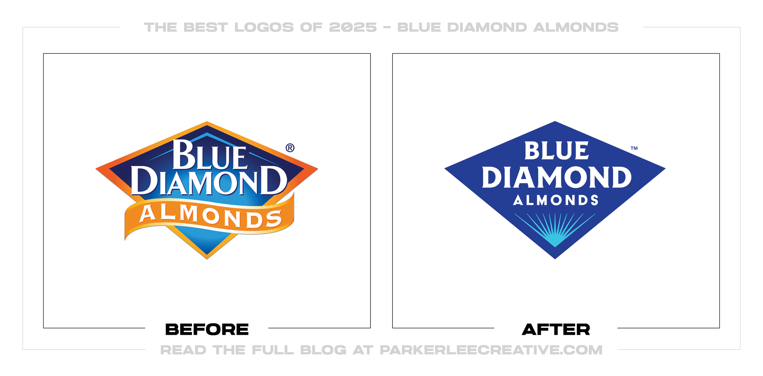
The badge looks unmistakably like Blue Diamond. Its name, blue field, and diamond silhouette remain, but the drawing has more focus and less decorative weight. This restraint respects familiarity instead of mistaking it for baggage.
Turner Duckworth’s Blue Diamond case study makes almonds the hero and the brand their champion. That premise carries into the badge, bold typography, flavor color, star details, motion, and voice without erasing the cooperative’s history.
Across cans, bags, cartons, and digital listings, the diamond provides an anchor while flavor colors and typography do the sorting. The architecture can flex by product without making every package look like it came from a different company.
The Tradeoff:
The champion language adds energy, but the stars, glow, and “G.O.A.T.” attitude can drown out Blue Diamond’s credibility as a grower-owned cooperative. Confidence works here only if the farms and people behind the product remain visible.
What Businesses Can Learn:
Blue Diamond’s familiar badge already had the recognition it needed. The useful work was making that diamond clearer across cans, bags, cartons, and screens, then using flavor color and typography to make the full range easier to shop.
17. King’s Hawaiian
Why Did the Logo Change?
King’s Hawaiian reached its 75th anniversary with more products to organize and a package worth protecting. The brief was not to start over. It was to keep the orange, crown, and clear window while giving the brand a warmer, flexible voice.
Why It Made the List:
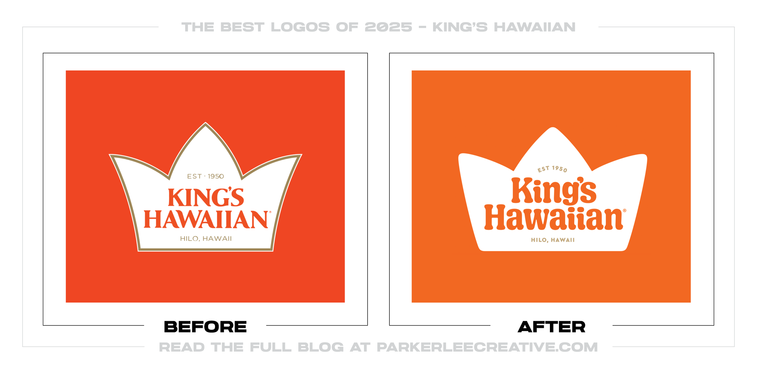
Mrs&Mr rounded the crown and drew lowercase lettering with the pillowy character of the rolls. That choice gives the friendly look a product-based reason. The logo is not soft merely because rounded type happens to be fashionable.
Orange still owns the shelf, while warm colors, Hawaiian floral imagery, ribbon shapes, and bakery stamps add range. They can shift from one product to another without losing the crown, clear window, and appetite appeal holding it together.
The official anniversary announcement shows what the team wisely left alone. The crown, orange frame, and view of the actual rolls still do the recognition work; new lettering and graphics add energy around assets shoppers already know.
The Tradeoff:
The lowercase wordmark is warm but less compact and commanding than the old uppercase serif. Add flowers, ribbons, stamps, supporting type, and a product window, and the package can get busy fast. The food still has to win the hierarchy fight.
What Businesses Can Learn:
Do not begin a refresh by listing everything you are tired of. Start with what customers would miss. Protect the color, shape, packaging cue, or phrase that earns recognition, then let the real product guide the decisions around it.
18. Radisson Hotels Americas
Why Did the Logo Change?
Choice Hotels needed clearer roles for Radisson, Radisson Blu, and Radisson Individuals after acquiring the Americas business. The 2025 identities gave each flag a specific position for guests and owners instead of forcing one look across three.
Why It Made the List:
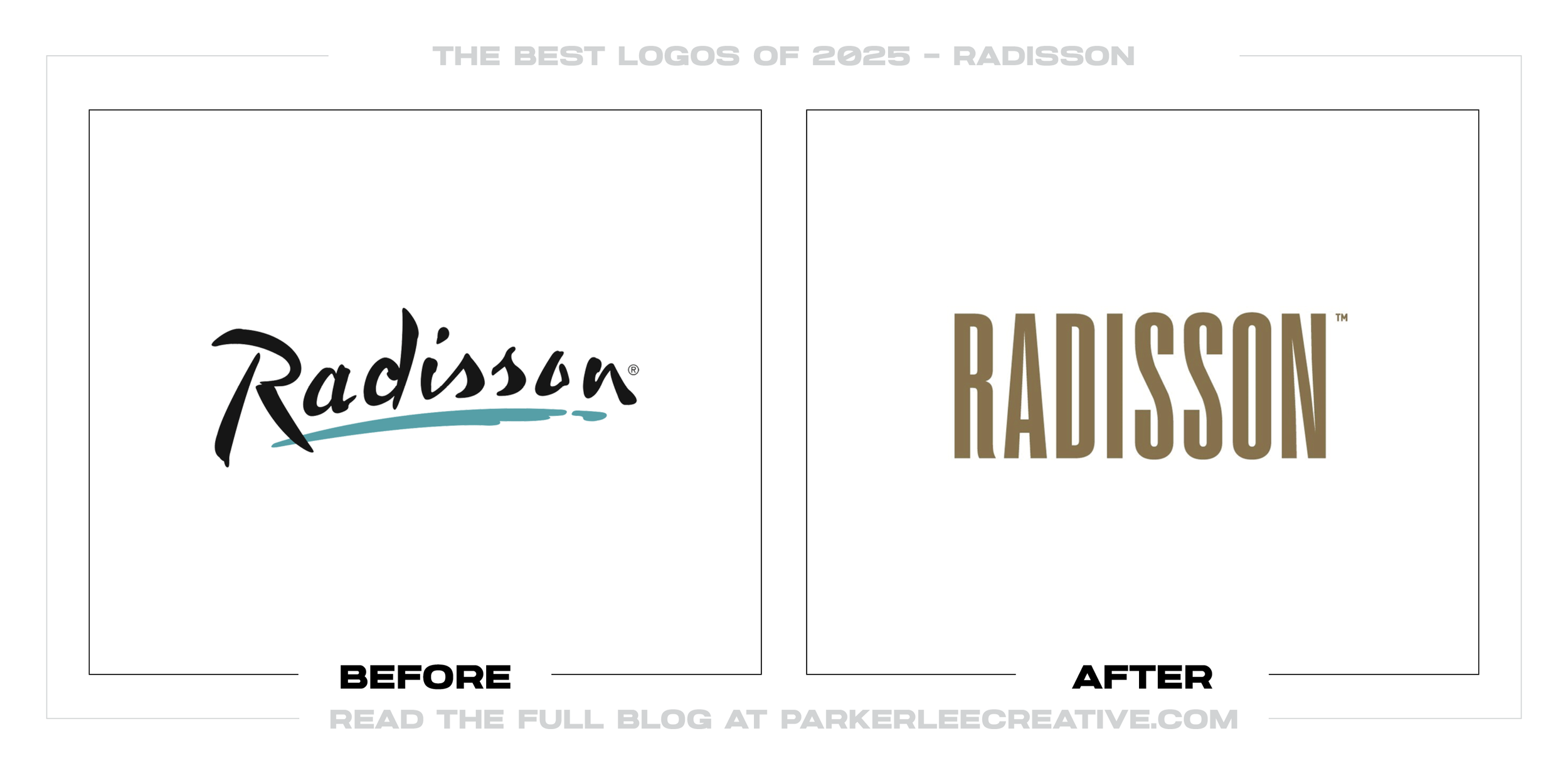
Radisson’s long uppercase letters come from American property signage. The reference is specific enough to feel owned, not borrowed from a luxury-hotel mood board, and it gives the main brand a shape for signs, keys, and digital use.
Radisson Blu’s spacing and gradient lean into its Scandinavian positioning. Radisson Individuals stays restrained so independent properties can lead. I like that the hierarchy follows the model instead of dressing every tier alike.
Choice Hotels’ identity announcement puts the marks on keycards, property signs, interiors, amenities, guest materials, and rooms. That evidence matters in hospitality, where a logo has to live in the building, not just above it.
The Tradeoff:
This work covers the Americas, not Radisson worldwide. An unaffiliated company owns the brands elsewhere, so travelers can meet different identities under one name. That ownership split creates a problem no visual system can fully solve.
What Businesses Can Learn:
Brand architecture should make a company easier to understand. Related offers need shared logic to feel connected and enough difference to explain their roles. Ownership, licensing, and geography shape the system, even when the reality is messy.
19. Association of Tennis Professionals / ATP Tour
Why Did the Logo Change?
ATP unveiled this mark in November 2025 for the 2026 season. The detailed player and “Tour” wording were hard to carry across broadcast, phones, merchandise, and signs, so ATP concentrated the identity into three letters and one curve.
Why It Made the List:
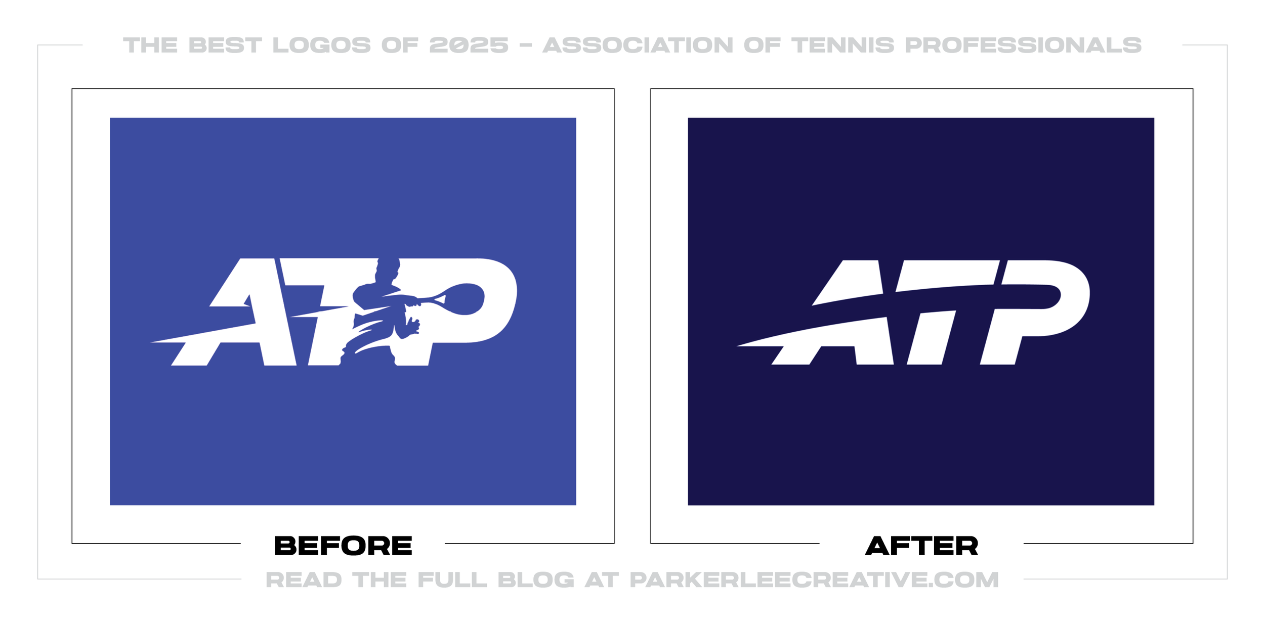
Chermayeff & Geismar & Haviv kept the ATP letterforms that held recognition, then removed the swinging player and “Tour.” The compact result is easier to place in a broadcast corner, avatar, cap, or sponsor lockup without turning to mush.
A curved ball path puts motion back into the mark. It reads as a trajectory at rest and gives motion designers a ready-made behavior for scoreboards and video. That is more useful than squeezing a detailed tennis illustration into the letters.
ATP’s official identity announcement names broadcast, social, merchandise, products, and tournament branding as applications. I judge sports marks at game speed, and this one was designed for the places fans will actually encounter it.
The Tradeoff:
The old player made the sport obvious and brought a body into the mark. Without him, the curve can look like a generic swoosh or slash when ATP context disappears. The new logo is more versatile, but it gives away some tennis storytelling.
What Businesses Can Learn:
Simplifying a logo should remove a production problem, not detail for detail’s sake. Identify the piece people recognize, then test the reduced mark in its smallest, fastest, and most crowded settings to be sure it signals the right category.
20. Google Gemini
Why Did the Logo Change?
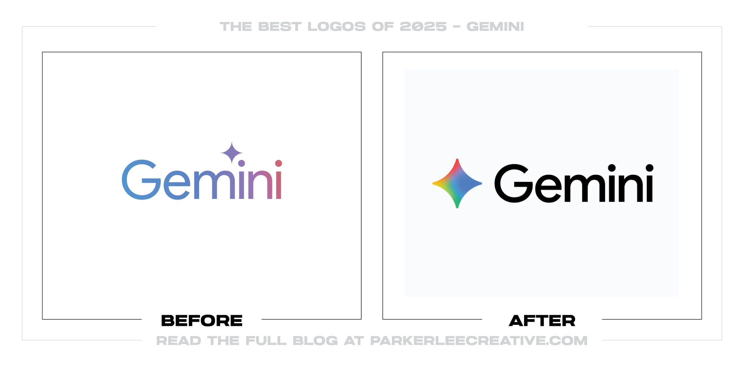
Gemini’s sharp blue-purple spark was spreading across apps, widgets, and browser tabs. Google made the points fuller and introduced its four-color gradient, giving the icon more weight at small sizes and a clearer place in the product family.
Why It Made the List:
The tips became hairlines when the icon shrank. Rounding and thickening the four points sounds minor until you compare them at phone or favicon size. The new silhouette holds together where people see it instead of relying on a launch graphic.
Red, yellow, green, and blue make the owner obvious without throwing away Gemini’s four-point shape. The balance is sensible: Google gets family recognition, while returning users do not have to learn a completely different product symbol.
Google’s gradient update confirms that the treatment reached Gemini in June 2025 before moving across more products. Seen that way, the spark is not an isolated color swap; it is one part of a broader, cohesive new visual language.
The Tradeoff:
Google’s palette pulls Gemini closer to the family, but it makes the product less independent in a crowded group of icons. A gradient cannot handle every production method either, so solid-color and low-fidelity fallbacks still matter.
What Businesses Can Learn:
Judge a digital mark at the size it will live, not at the size it is presented. A few pixels can change the value of point weight, open space, and silhouette. Family resemblance helps, but only when each product remains easy to tell apart.
21. Graeter’s Ice Cream
Why Did the Logo Change?
At 155 years old, Graeter’s needed to carry its Cincinnati recognition into a growing national retail footprint. It kept the script and maroon people knew, then built more range for scoop shops, grocery pints, digital work, and ads.
Why It Made the List:
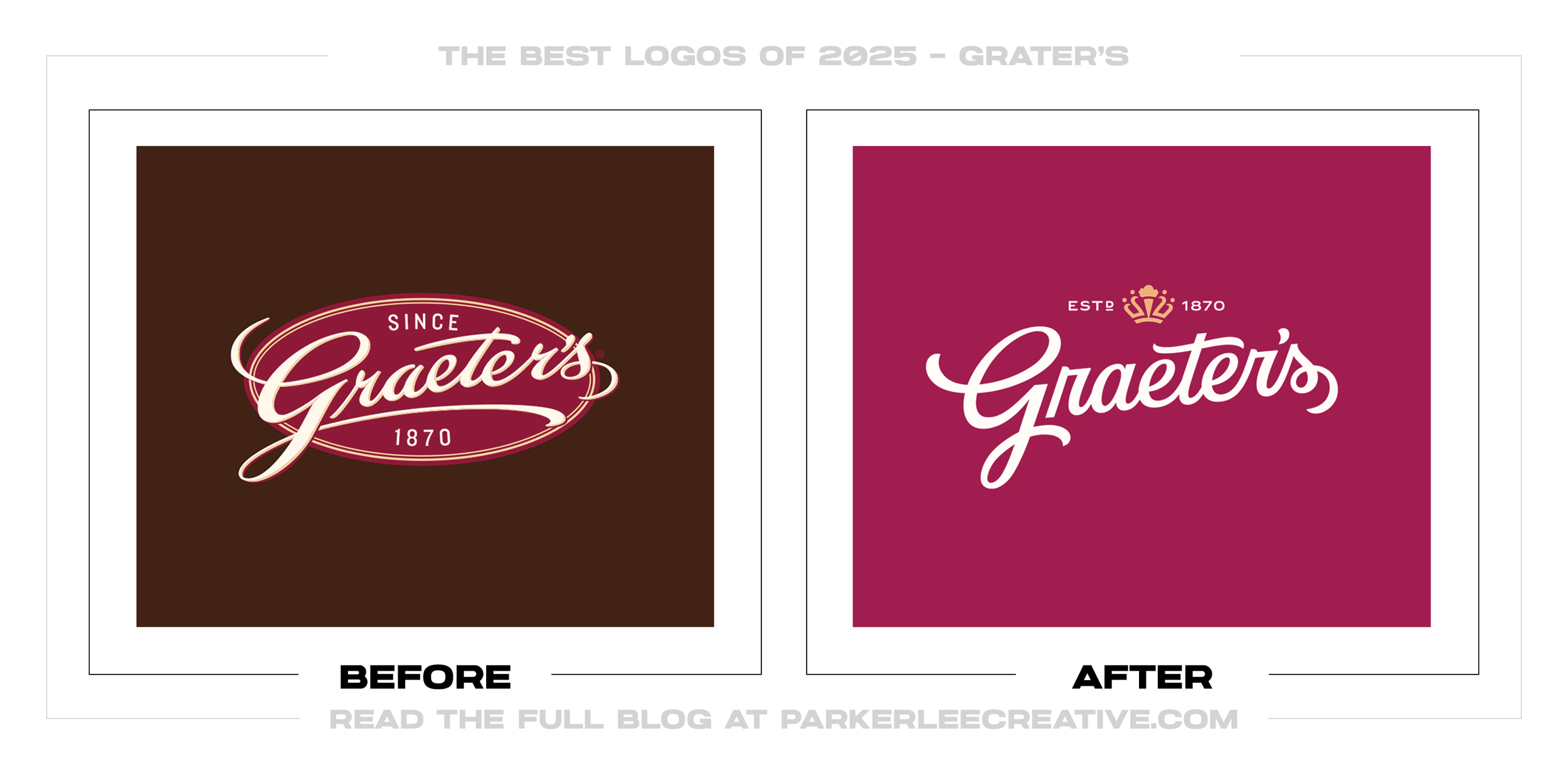
Dewhaus shortened the swashes on the familiar script and cleaned up its construction. The name keeps its signature character, but it now has more breathing room on a pint lid, storefront, or phone. This is refinement with a practical point.
Maroon, flavor colors, Art Deco-inspired patterns, and supporting type let pints have appetite and personality without breaking the family. The script remains the anchor, so the shelf can feel varied without looking like unrelated brands.
Graeter’s official brand announcement ties the crown to Cincinnati’s Queen City identity and shows the first package rollout on its holiday collection. The refresh was visible in real use in 2025, even as broader adoption continued in 2026.
The Tradeoff:
The crown has a Cincinnati story, but crowns are common for quality and heritage. Making it mean both “Queen City” and ice cream royalty strains the explanation. The “Taste the Graetest” line may land better with loyal fans than newcomers.
What Businesses Can Learn:
A brand does not need to sand away quirks to look current. Clean the recognizable signature, give it room to work, and build color, pattern, and hierarchy around it. If the core still carries trust, replacement may solve the wrong problem.
22. Resmed
Why Did the Logo Change?
Resmed had grown beyond CPAP machines into connected sleep, breathing, software, and home-health services. The company needed one identity that could unite that portfolio over time and speak to people before they entered a clinical setting.
Why It Made the List:
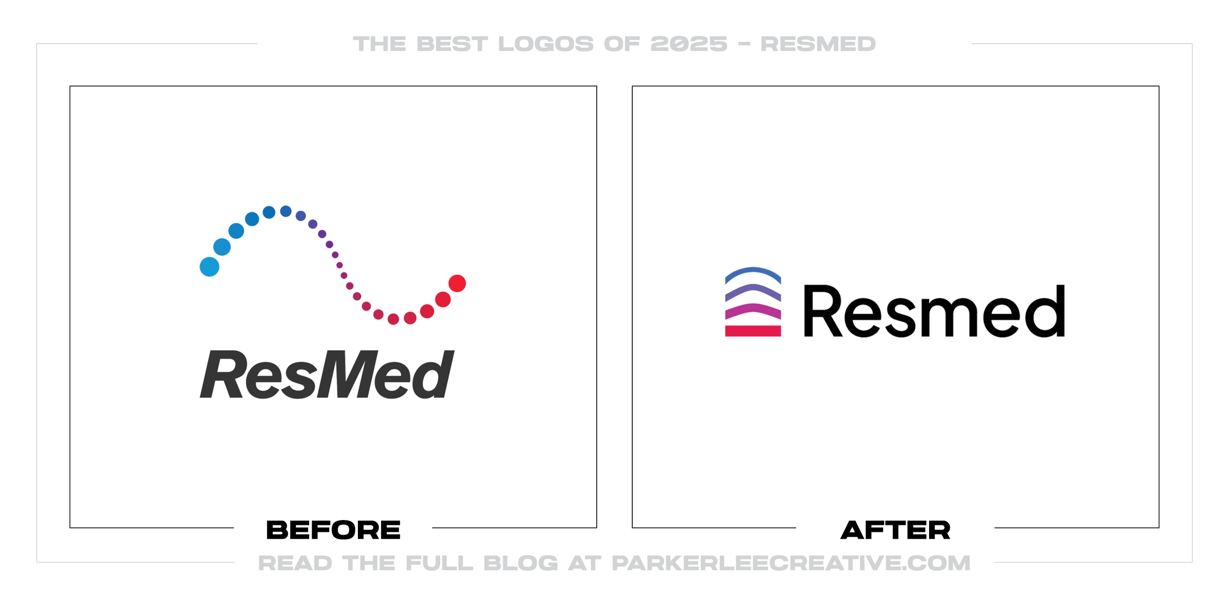
The rising arcs come from diagrams of oxygen and carbon dioxide moving through alveoli, then double as an upward gesture. It is a smart source for the symbol because it connects the company’s real work to its more optimistic “rise” language.
A black wordmark keeps the blues, reds, purples, and gradients from floating away. The lowercase “m,” people-centered photography, graphic arcs, and voice all help the brand feel less like a device catalog and more like a health platform.
Resmed’s live logo standards cover one-color versions, approved backgrounds, clear space, icon use, and a 12-pixel minimum height. I trust a mark more when I can see how it is meant to fail safely outside the perfect launch image.
The Tradeoff:
Rising arcs and glowing health-tech gradients occupy familiar territory, so the symbol needs the Resmed name to feel specific. The lowercase “m” creates a temporary casing problem while legal names, older products, and sub-brands catch up.
What Businesses Can Learn:
A symbol is only the first half of the job. Tie it to something true about the business, then define minimum size, one-color use, backgrounds, photography, voice, and naming before launch. Production rules are part of the design, not cleanup.
23. KIND Snacks
Why Did the Logo Change?
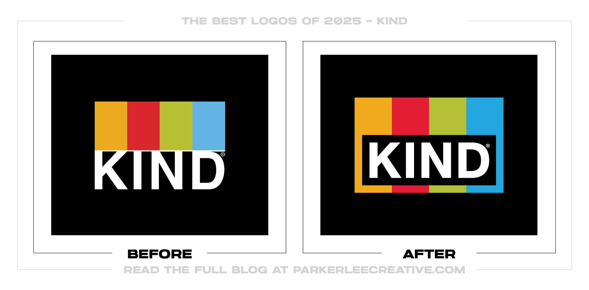
KIND needed to stand out in a crowded snack aisle without discarding the assets shoppers remembered. Research pointed to the four-color bars and clear wrapper, so the refresh enlarged those cues and rebuilt the package hierarchy around them.
Why It Made the List:
Jones Knowles Ritchie enlarged the four-color bars until they frame the white KIND name on black. That modest move is the point: the work strengthens a memory cue instead of manufacturing novelty where recognition already exists.
The package shows the whole unwrapped bar, exposes its ingredients, and gives functional benefits more room. Those choices answer shopping questions. The clear window stays in place, so the product itself backs up the promise on the front.
Packaging World’s KIND interview credits JKR for design and SGK for technical production, then explains the research behind the color bars. That record makes the restraint feel deliberate, not like a tiny change dressed up as strategy.
The Tradeoff:
The change is subtle enough to become a “spot the difference” exercise, and most of the improvement lives in the package around it. It earns a place as an identity evolution, but the mark alone is not one of the year’s dramatic transformations.
What Businesses Can Learn:
Distinctive assets become valuable because people see them repeatedly. Before replacing a mark, find the color, shape, window, sound, or phrase customers already connect to the business. Making that cue easier to notice may be the braver move.
24. Goodreads
Why Did the Logo Change?
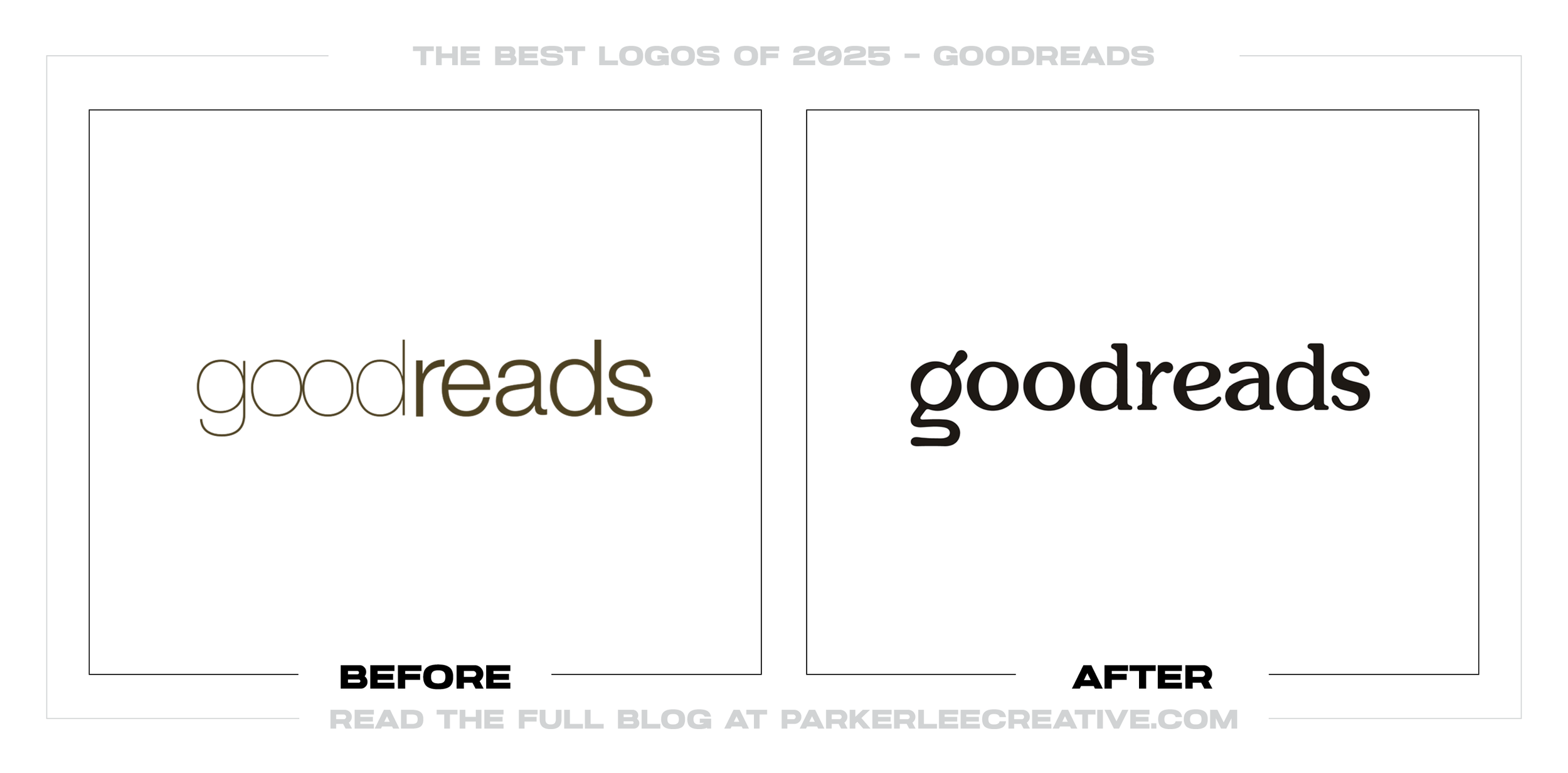
Goodreads had carried a thin, quiet wordmark since its early years, even as readers increasingly met the platform through a phone icon or browser tab. The 2025 refresh gave it a bolder literary voice and a symbol for discovery and reading.
Why It Made the List:
The lowercase “g” combines a magnifying glass and an open book, compressing the platform’s two central actions into one monogram. It can lead on an app icon or favicon, while the rounded serif wordmark has enough character for larger moments.
Heavier, softer letterforms bring warmth and visibility where the old thin sans serif disappeared. The result feels connected to books without leaning on a stack of volumes or quill. It is friendly, but not dressed up as a vintage bookstore.
Goodreads’ official announcement says the logo was built to stay clear from phone to billboard. That practical range explains the heavier forms and simpler monogram better than any claim that the platform merely wanted to look modern.
The Tradeoff:
The open-book and magnifying-glass idea is clever, but it is not legible at every size. More importantly, a friendlier identity raises expectations for the product itself, and a new logo cannot answer long-running complaints about the interface.
What Businesses Can Learn:
A new identity can announce that a neglected product is moving again, but it cannot stand in for product work. Brand and product teams should make one promise and improve the experience together, or customers will notice the gap immediately.
25. Famous Amos
Why Did the Logo Change?
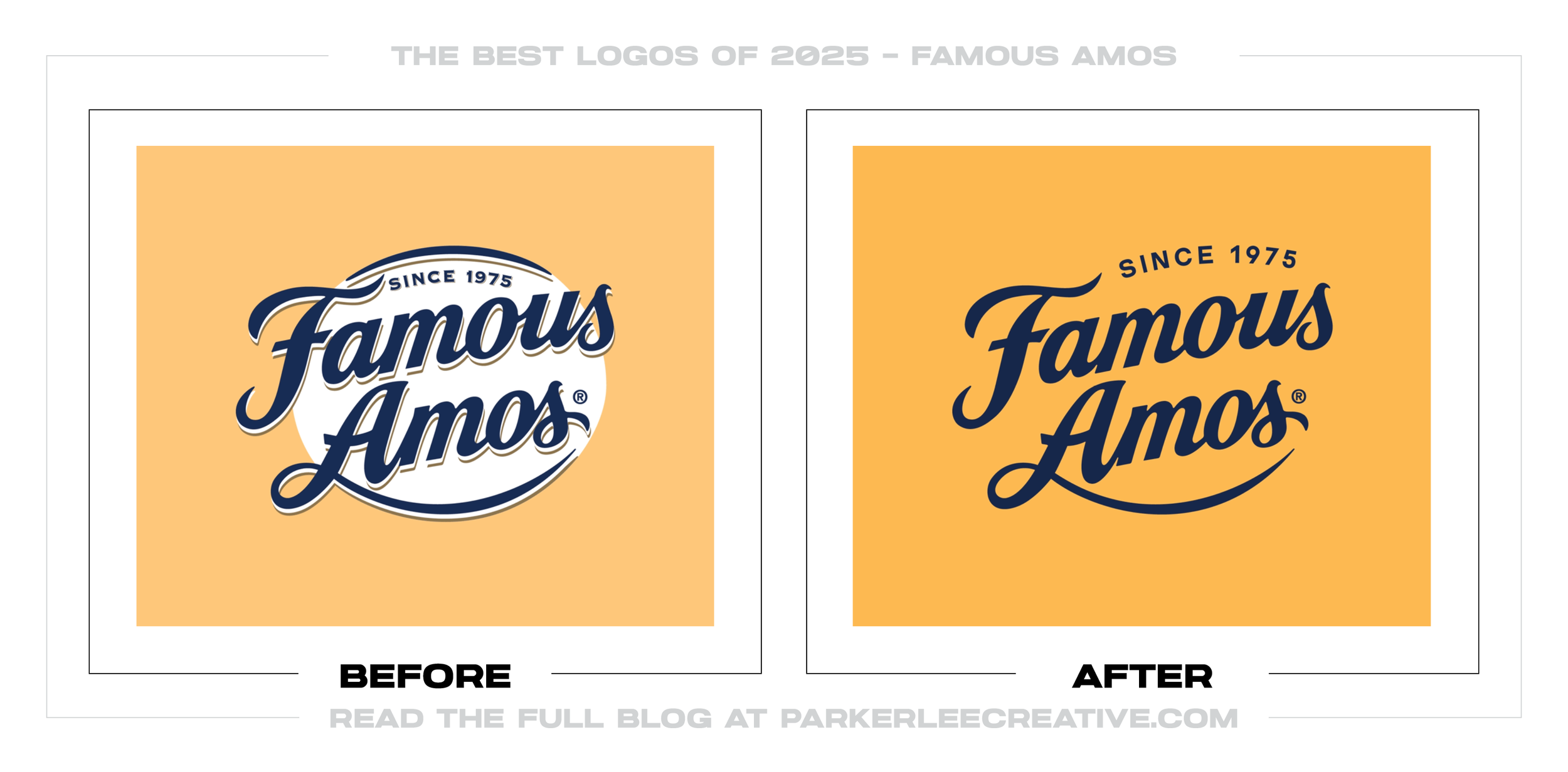
For its 50th anniversary, Famous Amos wanted to reconnect with its founder, Wally Amos, and the playful individuality behind the brand. It simplified the mark for everyday use, then let a separate collector package carry the fuller 1975 story.
Why It Made the List:
The everyday logo loses its white frame and dimensional shading, but keeps the navy script and “Since 1975.” It reproduces more cleanly on packs and screens without making a heritage cookie look like another anonymous sans-serif food brand.
The collector pack brings Wally back through his signature shirt, original-store imagery, and details from the 1975 design. That human history supplies the warmth and specificity the simplified everyday logo cannot reasonably carry by itself.
Ferrero’s anniversary announcement separates the “Famously You” campaign from the collector package. Keeping those pieces distinct in the review prevents a limited heritage tribute from being mistaken for the permanent identity.
The Tradeoff:
Removing the frame and shading improves reproduction, but it also strips away some retro shelf character. Most of the memorable personality lives on the limited collector package, which leaves the permanent mark looking restrained beside it.
What Businesses Can Learn:
Heritage is more than an old typeface. Find the story, product choice, visual cue, or memory that gives the brand meaning, then decide where each belongs. An anniversary package should celebrate history without confusing the everyday identity.
Thanks for Reading The 25 Best Logos of 2025
Thanks for reading our annual Best Logos of the Year article. It really means a lot to me. I also want to thank every designer, studio, in-house team and client who brought this year’s work to life. I may have opinions about the results, but this series would not exist without people willing to take creative risks in public.
For the other half of this year’s series, read The 25 Worst Logos of 2025. You can also browse the blog for earlier Best and Worst Logos of the Year articles and more logo design reviews.
Does your business need a new logo? We provide logo design and brand identity services for businesses that need something new or have outgrown what they already use. Fill out the form below and tell us your story. We would love to help forge a new identity for your brand that connects with your customers, tells your story, and lands you at the top of next year’s Best Logos of the Year article.
Legal Disclaimer: This content is provided for educational and informational purposes and is intended as commentary and criticism; all product names, logos, and trademarks are the property of their respective owners, and any copyrighted materials shown are used under the principles of fair use solely to identify the subjects discussed and to support analysis, with only the limited portions reasonably necessary displayed; no sponsorship, endorsement, affiliation, or partnership is implied, and nothing on this page constitutes legal, financial, or other professional advice.
