
Welcome to The 10 Worst Logos of 2022, one of two articles in my annual Best and Worst Logos of the Year series. Every year, I look back at the rebrands that caught my attention and share what businesses can learn from them. Here, we are going to take a look at some of this year’s rebrands that may have missed the mark. Looking for The 10 Best Logos of 2022? Read the companion article to learn about some of this year’s strongest work.
Below, I break down The 10 Worst Logos of 2022. For each one, I look at why the business rebranded, where the new identity falls short, what it gives up, and what your business can learn before starting a rebrand of its own.
A quick note before I get into the list: I have respect for every designer, studio, in-house team and client represented here. Putting a new identity into the world is hard. These reviews focus on the finished work, but the point is not criticism for criticism’s sake. This series is here to help business owners and brand teams understand why companies rebrand, learn from the choices behind the work and make better decisions when it is their turn. The entries are numbered to make the article easy to follow, but they are not presented in any particular order. Design is subjective, and I do not expect everyone to agree with every choice. That is part of what makes these articles fun to write and discuss.
But when it does come time for you to discuss a new logo, Parker Lee Creative is an award-winning, independent creative studio specializing in logo design and brand identity. We help businesses build new identities and refresh the ones they have outgrown. Our process starts with what the logo needs to communicate, then tests the work everywhere customers will see it. If you are considering a rebrand, contact us and tell us your story. We would love to help you create something worthy of next year’s Best Logos of the Year article.
1. Washington Commanders
Why Did the Logo Change?
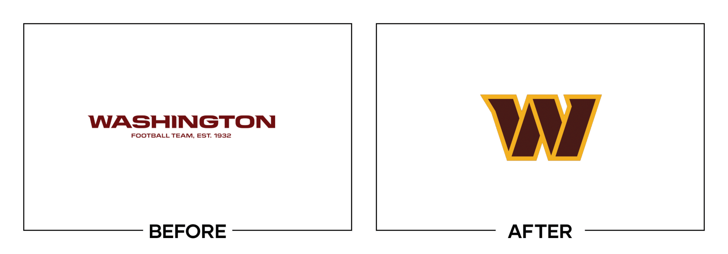
After two seasons under the Washington Football Team name, the franchise needed a permanent identity. An eighteen-month process produced Commanders, a stylized W, uniforms, and a circular crest meant to connect the team with the capital.
Why It Made the List:
The primary W is clean enough for a helmet, but it feels close to a refined interim mark rather than a fully considered franchise symbol. Its clipped strokes imply motion without expressing the name, the city, or a distinctive football story.
The launch system split attention among a W, military-inflected wordmark, crest, and three uniforms that did not feel built from one visual idea. A permanent identity should make its parts reinforce each other after a long public process.
The team revised the crest’s title years shortly after launch because the original dates marked championship seasons inconsistently. A factual error in a heritage symbol is not a taste issue. It is a research and approval failure.
The Tradeoff:
The W scales well, keeps burgundy and gold intact, and gives merchandise a simple focal point. Those are strengths. The problem is that the safest component became the primary mark while the more specific Washington story remained fragmented.
What Businesses Can Learn:
Treat factual accuracy as part of design quality. Build one hierarchy before expanding into badges, uniforms, and merchandise, then verify every date and claim with the people who own the history. A long process does not replace a final audit.

2. PowerBar
Why Did the Logo Change?
PowerBar wanted to expand beyond elite athletes into a broader lifestyle market while retaining professional credibility. Its European refresh revived 1980s stripes, added a flexible P symbol, and rebuilt more than one hundred packages.
Why It Made the List:
The angled, striped wordmark has energy, but too many cuts compete inside a name that must read quickly on bars. What works as an athletic poster becomes harder to parse when flavor, benefit, and nutrition information surround it on shelf.
Peter Schmidt Group’s case study presents a much stronger supporting system than the logo alone. The custom type, icons, expanded colors, and P device create flexibility, yet that abundance also shows how much help the primary wordmark needs.
Reviving the founding-era look supports heritage, but the execution leans into retro speed graphics that narrow the lifestyle ambition. A brand trying to feel more open should not make its visible asset feel more aggressive and technical.
The Tradeoff:
The original red and yellow remain available for performance products, while new colors help separate audiences and ranges. That architecture is useful. My concern is the logo’s density, not the decision to broaden a once-specialist brand.
What Businesses Can Learn:
Test a heritage revival at package size, not only as a large wordmark. A reference to the past must improve present-day navigation and reading. If the surrounding system has to rescue the logo, simplify the mark before multiplying the assets.

3. The Verge
Why Did the Logo Change?
The Verge rebuilt its website on Vox Media’s Duet platform and wanted a more direct daily relationship with readers. Its new identity accompanied a mobile-first news feed, Storystreams, brighter color, and a wider editorial remit.
Why It Made the List:
The broken letterforms turn the wordmark into a statement about an unfinished future, but the gaps interrupt reading in the asset that should identify the publication instantly. Conceptual friction is not useful when recognition is the task.
Vox Media’s launch explanation makes a strong case for the new product experience. The problem is that the logo repeats the interface’s restless energy instead of serving as a stable signature above fast-moving editorial content.
Bright color, type styles, cards, feeds, and illustrations already give the site a loud voice. Adding a fractured wordmark makes every element compete at once. A publishing identity needs rhythm, including quiet places that let headlines lead.
The Tradeoff:
The logo is unmistakable and fits The Verge’s willingness to experiment in public. It also works better in motion and within the full site than as a static sample. Distinctiveness is real, but it comes with a reading cost the brand did not need.
What Businesses Can Learn:
Do not make every brand element express the same idea at maximum volume. If the product is dynamic, the logo can be the steady anchor. Test name recognition separately from whether a concept looks interesting inside a launch animation.

4. Ortto
Why Did the Logo Change?
Autopilot had grown beyond automation into customer data, messaging, analytics, and journey orchestration. The company renamed itself Ortto, a phonetic nod to “auto,” and introduced a connected-letter identity for the expanded platform.
Why It Made the List:
Ortto is available, but its spelling asks customers to learn a pronunciation before the name communicates anything. The logo reinforces the ambiguity by joining letters into a shape that is clever as motion, yet less immediate as a word.
Ortto’s own rebrand explanation clearly documents why Autopilot had become too narrow. The strategic problem was real. The replacement still makes the company spend attention explaining the new name rather than its broader product.
The connected shapes are strongest when illustrating journeys and customer movement around the wordmark. Inside the logo, the joins reduce letter distinction. A useful graphic language was compressed into a naming problem it could not solve.
The Tradeoff:
The new name is broad enough for future products, and the blue, modular shapes create a flexible system for a complex platform. Ortto gained room to grow. It paid for that room with pronunciation friction and a less direct first impression.
What Businesses Can Learn:
A name can outgrow a product, but the replacement should reduce explanation, not move it elsewhere. Test spelling, hearing, search behavior, and referrals before launch. Let a flexible graphic system support the name instead of disguising it.

5. Hootsuite
Why Did the Logo Change?
Hootsuite wanted to escape the visual sameness of social-media software and present itself as a guide through an unruly category. The refresh expanded Owly into a full character system with new expressions, color, motion, and voice.
Why It Made the List:
Promoting Owly was a distinctiveness decision, but the redrawn head is softer, rounder, and less clearly an owl at small sizes. The earlier eyes and ear-like tufts formed a faster silhouette for an icon used inside dense software interfaces.
Hootsuite’s launch materials show twenty expressions and a useful full-body character library. The wider system is confident, yet the primary face can feel more like a general cartoon companion than a central enterprise product mark.
“Your Guide to the Wild” gives the mascot a job, but it also pushes every message toward a playful metaphor. Hootsuite serves teams and governance needs. The identity needs room for authority when the owl’s personality is not the main point.
The Tradeoff:
Owly gives Hootsuite an asset competitors cannot easily copy, and the expanded poses create campaign material. The refresh is not generic. Its risk is tonal: a charming guide can become a barrier when customers need control and clarity.
What Businesses Can Learn:
A mascot needs roles and limits. Design versions for product UI, campaigns, support, and serious communications, then test the simplest face at tiny sizes. Character should add recognition and warmth without controlling every conversation.

6. Sprite
Why Did the Logo Change?
Sprite needed one identity across markets, packaging formats, and its original and Zero Sugar products. The 2022 system flattened the wordmark, detached the star-like Spark, and standardized bright green packaging with black Zero Sugar cues.
Why It Made the List:
Removing the lemon-lime Lymon from the wordmark stripped away the brand’s most direct sensory cue. The detached Spark could animate and frame content, but as a static asset it felt less specific to flavor and easier to mistake for decoration.
Turner Duckworth’s case study shows a disciplined global system with strong green ownership and cleaner range rules. My issue is the center: a white wordmark on green is clear, yet too generic for a product with distinctive visual equity.
Coca-Cola restored the Lymon to Sprite’s wordmark in 2026. That later decision does not prove the 2022 system failed commercially, but it confirms that the missing lemon-lime cue was valuable enough to return to the primary signature.
The Tradeoff:
The 2022 packaging was consistent, high contrast, and easier to manage worldwide. The Spark gave motion designers a flexible tool. Operational simplicity was gained, but the brand traded away a sensory asset that did more than decorate the name.
What Businesses Can Learn:
Before removing an old detail, identify the job it performs. A shape may carry flavor, category, or memory even when it looks ornamental. Simplify the system around proven equity first, then test whether the logo still says enough without it.

7. Buick
Why Did the Logo Change?
Buick introduced a new tri-shield badge while announcing its electric-vehicle direction and Wildcat EV concept. The first major emblem change since 1990 removed the outer ring and arranged the three shields horizontally for 2023 vehicles.
Why It Made the List:
The three separated shields are simpler to manufacture and illuminate, but they can read as generic chevrons or claws before they read as Buick. Removing the ring also gives up the compact, heraldic container that held the old badge together.
Buick’s official reveal ties the emblem to an electric design future, yet the mark does not express that shift on its own. It looks flatter and wider, which is modernization by styling rather than a sharper brand idea at a glance.
Horizontal spacing creates a badge that works on a grille, but it is awkward in square icons and narrow digital placements. The redesign solved one vehicle application while making the supporting lockup and small-format system work harder.
The Tradeoff:
Buick retained the three shields, its most recognizable piece of heritage, and created a badge suited to vehicle surfaces. The change is evolutionary rather than reckless. The weakness is how much coherence disappeared with the outer ring.
What Businesses Can Learn:
Do not judge a physical badge only on a vehicle rendering. Test it as an app icon, dealer sign, social avatar, embroidery, and one-color mark. When removing a container, verify that the internal pieces still form one recognizable object.

8. GSK
Why Did the Logo Change?
After separating its consumer-health business as Haleon, GSK became a focused biopharma company. Its new identity paired the purpose “Ahead Together” with an uppercase wordmark and a flexible orange signal inspired by science across media.
Why It Made the List:
The orange signal is meant to suggest cells, technology, and adaptable forms, but its soft container makes the wordmark feel swollen rather than precise. The previous lozenge was not exciting, yet it held a compact, unmistakable silhouette.
Wolff Olins’ case study documents accessibility testing, custom type, motion, and a global system. Those strengths deserve credit. The central mark still requires a long scientific rationale to explain what its amorphous outline contributes.
Changing from lowercase to uppercase adds confidence, but it removes the approachable character people associated with GSK. Paired with the irregular container, the result sits awkwardly between institutional authority and friendly biotech.
The Tradeoff:
GSK kept orange and the familiar initials, while the signal can animate and adapt across complex communications. The broader system is thoughtful. My objection is focused: the static logo is less compact and less immediate than it should be.
What Businesses Can Learn:
Do not confuse a flexible brand device with a better logo. Motion, patterns, and forms can carry complex stories around the signature. If the mark needs a paragraph of scientific metaphor, test whether a simpler shape would communicate faster.
9. Ninja
Why Did the Logo Change?
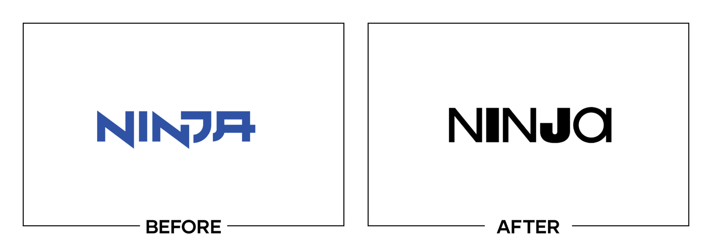
Streamer Tyler “Ninja” Blevins needed a personal brand that could extend beyond competitive gaming. The new identity used a hair-inspired symbol, custom lettering, and mixed character widths to express different sides of his personality.
Why It Made the List:
Mixing narrow and wide letters creates energy, but it breaks the name into competing chunks and can make “Ninja” read like “Nin joi.” A personal wordmark should make a handle faster to recognize, especially in thumbnails and merchandise.
EAT Studio’s case study explains the deliberate contrast and the link to Ninja’s signature hair. The rationale is coherent, yet the spiky icon still resembles a broad category of gaming marks before it feels uniquely tied to one creator.
The identity tries to show plurality through every letter, producing more variation than the short name can absorb. The strongest personal brands often reserve personality for one move, then use repetition to make that move unmistakable.
The Tradeoff:
The symbol is bold, easy to animate, and connected to a visual trait rather than a random esports animal. The wider system gives Ninja room beyond one game. The wordmark’s forced contrast is the part that weakens an otherwise useful direction.
What Businesses Can Learn:
Build a personal identity around one repeatable cue. Then protect the name’s readability across avatars, apparel, video titles, and sponsor lockups. A short handle does not need every letter to perform a different part of the personality.

10. Baskin-Robbins
Why Did the Logo Change?
Baskin-Robbins launched its first major refresh in roughly sixteen years to reach younger adults and support “Seize the Yay.” The system retained the hidden 31 while adding a new monogram, serif wordmark, packaging, and store uniforms.
Why It Made the List:
Keeping the hidden 31 was sensible, but the thinner diagonal and compact BR make the puzzle harder to spot without explanation. The previous mark was not elegant, yet its trick read faster and carried more of the brand’s playful energy.
Baskin-Robbins’ announcement shows a thoughtful system inspired by midcentury shops. The problem is the logo’s tone: the serif name feels more mature, while the monogram still depends on a visual gag built for play across signs and apps.
Multiple palettes add range, but they also weaken the instant pink-and-blue memory customers brought to the old sign. A heritage refresh should make one core configuration unmistakable before inviting seasonal colors and merchandise variants.
The Tradeoff:
The new system is better crafted across packaging, uniforms, and interiors, and the monogram reproduces cleanly. Baskin-Robbins gained polish and flexibility. It lost some immediate joy in the primary signature while trying to look grown up.
What Businesses Can Learn:
Preserve an old visual trick only if customers can still find it quickly. Test the mark without a before-and-after explanation, then define one color configuration. Flexibility is useful after recognition is secure, not as a substitute for it.
What the Worst Logos of 2022 Have in Common
The worst logo redesigns of 2022 often solved a legitimate business problem but weakened the simplest recognition task. Washington needed permanence. Ortto needed a broader name. Sprite needed global consistency. PowerBar needed a wider audience. None of those needs required factual errors, reading friction, or the loss of useful equity.
The recurring lesson is to test the actual signature, not only the launch system. Read the name at thumbnail size. Reproduce it in one color. Place it beside competitors. Ask what each legacy detail communicates before deleting it. Verify every historical fact. Then compare the mark with the strategy without letting a polished explanation excuse a weak result.
For stronger examples from the same year, read The 10 Best Logos of 2022.
Logos and trademarks belong to their respective owners and are shown for identification, criticism, and commentary. No sponsorship, endorsement, affiliation, or partnership is implied.
Thanks for Reading The 10 Worst Logos of 2022
Thanks for reading our annual Worst Logos of the Year article. It really means a lot to me. I also want to thank every designer, studio, in-house team and client who brought this year’s work to life. I may have opinions about the results, but this series would not exist without people willing to take creative risks in public.
For the other half of this year’s series, read The 10 Best Logos of 2022. You can also browse the blog for earlier Best and Worst Logos of the Year articles and more logo design reviews.
Does your business need a new logo? We provide logo design and brand identity services for businesses that need something new or have outgrown what they already use. Fill out the form below and tell us your story. We would love to help forge a new identity for your brand that connects with your customers, tells your story, and lands you at the top of next year’s Best Logos of the Year article.
Legal Disclaimer: This content is provided for educational and informational purposes and is intended as commentary and criticism; all product names, logos, and trademarks are the property of their respective owners, and any copyrighted materials shown are used under the principles of fair use solely to identify the subjects discussed and to support analysis, with only the limited portions reasonably necessary displayed; no sponsorship, endorsement, affiliation, or partnership is implied, and nothing on this page constitutes legal, financial, or other professional advice.
