
Welcome to The 25 Worst Logos of 2023, one of two articles in my annual Best and Worst Logos of the Year series. Every year, I look back at the rebrands that caught my attention and share what businesses can learn from them. Here, we are going to take a look at some of this year’s rebrands that may have missed the mark. Looking for The 25 Best Logos of 2023? Read the companion article to learn about some of this year’s strongest work.
Below, I break down The 25 Worst Logos of 2023. For each one, I look at why the business rebranded, where the new identity falls short, what it gives up, and what your business can learn before starting a rebrand of its own.
A quick note before I get into the list: I have respect for every designer, studio, in-house team and client represented here. Putting a new identity into the world is hard. These reviews focus on the finished work, but the point is not criticism for criticism’s sake. This series is here to help business owners and brand teams understand why companies rebrand, learn from the choices behind the work and make better decisions when it is their turn. The entries are numbered to make the article easy to follow, but they are not presented in any particular order. Design is subjective, and I do not expect everyone to agree with every choice. That is part of what makes these articles fun to write and discuss.
But when it does come time for you to discuss a new logo, Parker Lee Creative is an award-winning, independent creative studio specializing in logo design and brand identity. We help businesses build new identities and refresh the ones they have outgrown. Our process starts with what the logo needs to communicate, then tests the work everywhere customers will see it. If you are considering a rebrand, contact us and tell us your story. We would love to help you create something worthy of next year’s Best Logos of the Year article.

1. Nokia
Why Did the Logo Change?
Nokia wanted to move beyond mobile phones and present itself as a business-to-business network and cloud technology company. Its 2023 identity replaced the familiar blue wordmark with fragmented custom lettering and a broad color system.
Why It Made the List:
The missing strokes make the name dependent on context and pattern completion. That may look sophisticated in motion, but a corporate wordmark should not ask a new audience to decode letters before identifying the company behind the message.
Removing the familiar blue and sturdy lettering helps signal change, yet it also discards the strongest assets Nokia owned. The abstract construction enters the same visual territory as many consulting and enterprise technology identities.
Lippincott's Nokia case study explains the shift from consumer electronics perceptions toward network technology and B2B leadership. The strategy is clear, but strategic change did not require making the company name less immediate.
The Tradeoff:
The fragmented letters create a flexible digital language and communicate that Nokia is no longer the phone brand many remember. In exchange, the wordmark loses instant legibility and much of the confidence that made the old name memorable.
What Businesses Can Learn:
Repositioning should change the associations around a recognizable asset before throwing the asset away. Test whether audiences understand the new business, but also measure how quickly they can read, recall, and reproduce the identity itself.

2. Rooster Teeth
Why Did the Logo Change?
Rooster Teeth marked its 20th anniversary in 2023 with a new identity intended to unify an expanding entertainment network. The long-used rooster-and-teeth rebus became an R with a rooster head, paired with mixed-case lettering and new colors.
Why It Made the List:
The old rebus was odd, direct, and inseparable from the name. Compressing that idea into an R removes the visual joke and asks a less distinctive letterform to represent an entertainment company built on irreverent internet entertainment.
Orange-red and electric blue add useful energy, but the mixed-case wordmark and small symbol compete rather than reinforce one another. At narrow sizes, the long name still creates the production problem the compact icon was meant to solve.
The redesign was later reversed after the company closed and returned under new ownership. GameSpot's 2025 report documents the revival and restoration of the original rooster-and-teeth icon after its acquisition, making the status clear.
The Tradeoff:
The 2023 system gave Rooster Teeth brighter motion, typography, and channel tools that the old lockup lacked. Its central mark, however, exchanged an ownable rebus for a less readable abbreviation and did not survive the brand's later revival.
What Businesses Can Learn:
An eccentric logo can be valuable precisely because it would be wrong for anyone else. Before simplifying it, identify whether the oddness is a liability or the memory structure customers use, then modernize production without erasing the idea.

3. Android
Why Did the Logo Change?
Google refreshed Android in September 2023 to align it more closely with the Google portfolio. The update capitalized the name, rounded the wordmark, and turned the flat bugdroid head into a dimensional character with new colors and expressions.
Why It Made the List:
Capitalizing Android improves conventional grammar, but the rounded wordmark moves closer to Google's visual language and gives the operating system less independence. Alignment helps architecture when it does not flatten product ownership.
The dimensional bugdroid is expressive, yet highlights, eye colors, and full-body poses add states to govern. The simple one-color head introduced in 2019 was easier to recognize and reproduce across devices, partners, and small placements.
Google's September 2023 Android update says the bugdroid became more dynamic and the wordmark aligned with Google's portfolio. Those goals are documented, but added dimensionality still creates costs for a mark used by many hardware partners.
The Tradeoff:
The character system gives Android warmth and more room for animation, events, and product storytelling. It works best as a mascot. As a logo family, the many treatments can make the core asset feel less stable across manufacturers and surfaces.
What Businesses Can Learn:
A mascot and a logo can share DNA without carrying the same production burden. Define one stable, reproducible mark first, then let dimensional characters, poses, and campaigns expand around it without replacing the basic identifier.

4. Slurpee
Why Did the Logo Change?
7-Eleven refreshed Slurpee in June 2023 as part of the "Anything Flows" platform, following research with a large consumer panel. The new identity introduced a heavier, fluid wordmark, bolder cups, and a prominent registration symbol.
Why It Made the List:
The stretched letters express frozen motion, but several shapes collapse into one another and make the name harder to scan. The previous mark had stronger separation and a clearer cup-top silhouette without losing the product's playful energy.
Treating the registration symbol as a visible design element is distinctive, yet its scale pulls attention away from the final letters and unbalances the wordmark. Legal notation should not become the second thing customers notice in the logo.
7-Eleven's official Slurpee announcement documents the Brainfreeze Collective panel and the "Anything Flows" brief. The research supports the platform, but it does not excuse reduced name clarity in the asset every cup and campaign must share.
The Tradeoff:
The refreshed cups and campaign have color, movement, and a visual world suited to a frozen drink. The wordmark fits that energy, but its condensed flow and oversized legal mark reduce clarity in the asset that should anchor the entire system.
What Businesses Can Learn:
Research can validate a position without proving every execution choice. Test the logo separately for reading speed, balance, one-color reproduction, and small sizes, especially when a visual effect is being asked to embody the campaign idea.

5. Facebook
Why Did the Logo Change?
Meta refreshed Facebook in September 2023 to create a more consistent and accessible identity across products and marketing. The update darkened the blue, redrew the f, refined Facebook Sans, and expanded supporting colors and reaction icons.
Why It Made the List:
The darker blue and adjusted f are so subtle that partners and users can struggle to distinguish assets from older ones. A quiet evolution can be sensible, but repeated near-identical versions create avoidable file and governance confusion.
The standalone f and the initial in the Facebook wordmark do not share identical construction. That gap is minor at a glance, yet it weakens the logic of a system whose stated purpose includes consistency and identifiable brand behavior.
Design Week's 2023 Facebook review documents Meta's in-house changes to blue, the f, typography, and reactions. The expanded toolkit has value, but the primary logo offers too little visible improvement to justify another near-duplicate file.
The Tradeoff:
Facebook kept enormous recognition and improved contrast, typography, and assets without forcing users to relearn the brand. The cost is an update that adds another almost-identical logo to an already crowded history of official f icons.
What Businesses Can Learn:
Subtle evolution is valid when recognition is strong, but it still needs operational value. Maintain one source of truth, retire obsolete files, align symbol and wordmark construction, and explain which practical problem the new version solves.

6. Minor League Baseball
Why Did the Logo Change?
Minor League Baseball introduced a new mark in September 2023 to align more closely with Major League Baseball under a "One Baseball" structure. The batter silhouette, red and blue frame, and four stars prepared for a broad 2024 rollout.
Why It Made the List:
Borrowing MLB's batter silhouette makes the relationship immediate, but it also reduces MiLB's ability to stand apart as its own experience. The new mark can look like an alternate league badge rather than a distinct system for 120 clubs.
Four stars represent the player-development levels, yet the detail is easy for viewers to miss and needs explanation. At small sizes, the stars become decoration while the much larger MLB silhouette supplies nearly all of the recognition.
MiLB's official logo announcement explains the four stars, the MLB connection, and the 2024 rollout. The architecture is intentional, but the solution gives the parent brand far more visual authority than the league it identifies.
The Tradeoff:
The mark clarifies MiLB's relationship with MLB and creates a consistent badge for league communications. That order comes at the expense of the local, developmental, and eccentric qualities that make minor league baseball feel different.
What Businesses Can Learn:
Parent-brand alignment should clarify ownership without making the organization disappear. Decide which audience benefit comes from the relationship, then preserve enough shape, voice, or symbolism for the endorsed brand to remain recognizable.

7. Seattle Sounders FC
Why Did the Logo Change?
Seattle Sounders FC used its 50th anniversary to evolve the crest for the 2024 season. After nearly two years of work and extensive fan input, the club simplified the Space Needle, refined its colors, and added a family of local symbols.
Why It Made the List:
The primary shield removes the team name and relies almost entirely on the Space Needle. That creates a clean badge for established supporters, but gives new or distant viewers little evidence that the mark belongs to a soccer club.
The simplified Needle reads well, yet the outer shield and subtle blue changes contribute limited personality. Much of the richer Seattle story lives in secondary marks, leaving the asset labeled primary with the least expressive information.
The club's behind-the-design account documents nearly two years of work, more than 10,000 fan surveys, and several specialist partners. The process was deep, but audience participation does not eliminate the primary crest's clarity tradeoff.
The Tradeoff:
The full identity contains thoughtful local assets, from the orca and carnation to 1974 and a custom typeface. The stripped primary shield is highly usable, but it depends on familiarity while the secondary family does more of the storytelling.
What Businesses Can Learn:
Do not judge a logo system only by how many details it contains. Confirm that the primary mark still identifies the organization to someone outside the core audience, then use secondary assets to deepen the story rather than rescue it.

8. Johnson & Johnson
Why Did the Logo Change?
Johnson & Johnson replaced its script in September 2023 after separating consumer health into Kenvue. The new corporate identity supports a focused medicine and medical-technology business with a sans serif, a J&J shorthand, and brighter red.
Why It Made the List:
The former signature had genuine historical ownership, even when it was difficult to read. Replacing it with a conventional sans serif improves clarity but puts one of the world's best-known healthcare names into familiar corporate territory.
The shortened J&J mark is compact, yet it depends on the ampersand and company reputation rather than a distinctive symbol. Across medicine and medical technology, the identity now has fewer visual cues that only this organization could own.
Johnson & Johnson's 2023 announcement links the update to its post-Kenvue focus and describes the single-stroke letters. The business reason is credible, but the design trades unusual heritage for a wordmark many companies could use.
The Tradeoff:
Legibility, digital reproduction, and a shared architecture across medicine and medtech improve. The cost is a signature replaced by a competent wordmark that needs the company name, rather than its visual character, to create recognition.
What Businesses Can Learn:
An old asset can be imperfect and valuable at the same time. Measure how much ownership it carries before replacing it, then explore whether redrawing, simplifying, or pairing it with clearer type can solve legibility without erasing history.

9. Tennis Australia
Why Did the Logo Change?
Tennis Australia launched a new master brand and participation architecture in October 2023 alongside its Game On strategy. Hulsbosch connected tennis programs under a playful system informed by coaches, parents, players, clubs, and research.
Why It Made the List:
The gradient A appears as a faint interruption behind the word Tennis, making the national connection easy to miss. A master brand should not depend on perfect color and background conditions to reveal the letter carrying its geography.
Rounded custom lettering feels active, but the unusual t and dotless i slow reading without adding a clear tennis cue. Combined with the low-contrast A, the mark asks several typographic quirks to create personality at once across the system.
Tennis Australia's official brand explanation documents research, testing, and the goal of unifying participation programs. The architecture solves a real problem, but the master logo remains fragile in one color and small sizes.
The Tradeoff:
The wider identity creates a lively family for Hot Shots, Cardio Tennis, POP Tennis, and Padel, and audience involvement strengthens the strategy. The core wordmark, however, depends on effects that make its Australia cue less reliable.
What Businesses Can Learn:
Research should test comprehension as well as preference. Reduce a proposed logo to one color, place it on poor screens and busy backgrounds, and ask unfamiliar viewers what they read before approving a subtle letter or national reference.

10. Opel
Why Did the Logo Change?
Opel unveiled a sharper Blitz emblem in June 2023 to signal its electric direction and planned fully electric lineup by 2028. The redesigned bolt intersects a thinner circle and began appearing before reaching production vehicles in 2024.
Why It Made the List:
The interruption between bolt and circle adds tension, but uneven gaps make the construction feel less resolved than the previous emblem. Precision matters when a simple geometric mark leaves every junction exposed to close comparison.
Opel described the change as a symbol for an electric era, yet the bolt already carried that meaning. The refresh changes small proportions without giving customers a new association, making the strategic story larger than the visible move.
Stellantis published the official Opel reveal in June 2023 and stated that production vehicles would follow in 2024. That timing matters because the public announcement, not vehicle availability, establishes its 2023 eligibility.
The Tradeoff:
The lighter emblem suits grilles, screens, and a more restrained vehicle language while preserving the Blitz almost completely. Its similarity protects recognition, but also makes the expensive symbolism around the change feel disproportionate.
What Businesses Can Learn:
Small refinements can be the right answer, but their rationale should match their scale. Explain the consistency problem being fixed, show the improvement at actual sizes, and avoid asking a tiny geometry change to prove a broad transformation.

11. Natural History Museum
Why Did the Logo Change?
London's Natural History Museum introduced a new identity in July 2023 to support a mission centered on nature advocacy and global reach. Concentric repetitions of NHM form a radiating symbol designed for motion, campaigns, and exhibits.
Why It Made the List:
The radiating NHM creates energy at large sizes, but the repeated letters become texture before they communicate the institution's name. A famous museum can use shorthand, yet international visitors still need a clear verbal identifier.
The mark resembles a sunburst, specimen, signal, and aperture without committing to one reading. That ambiguity suits a broad museum, but makes the symbol feel more like a flexible campaign device than a durable institutional signature.
The museum's official July 2023 release connects the work to its nature mission and global ambition. That broader program carries energy and motion, but the logo itself asks the acronym to lead while the descriptive full name recedes.
The Tradeoff:
Motion, custom tools, NHM Wallop, and a bold palette give the museum an expansive contemporary system. Reduced to a static logo, the repeated acronym can lose clarity and the institution's full, descriptive name becomes supporting information.
What Businesses Can Learn:
An acronym may be familiar internally and still unclear to visitors. Test shorthand with audiences, keep the full name available where context is weak, and distinguish between a powerful graphic generator and the identifier that must work alone.

12. Zoho
Why Did the Logo Change?
Zoho quietly updated its corporate logo in 2023 after years of using four colored letter tiles. The replacement kept red, green, blue, and yellow, but placed a small black wordmark beneath an abstract rounded symbol created in-house.
Why It Made the List:
The symbol dominates the much smaller name, so unfamiliar viewers receive color and shape before learning which software company it represents. That hierarchy is risky for a business with a large portfolio and a less universal shorthand.
Retaining four colors preserves some equity, but the new arrangement loses the direct one-letter-per-tile logic of the former mark. The colors now say the Zoho name only after the viewer already knows that the symbol belongs to Zoho.
A 2023 design record credits Zoho's in-house team and notes the retained color-block equity. Because Zoho published little rationale, this review stays with visible changes rather than assigning intentions the company never stated.
The Tradeoff:
The rounded symbol is easier to animate and use as a compact digital icon than four separate letter blocks. That flexibility comes at the cost of immediate name recognition, especially when the tiny wordmark disappears at app-icon size.
What Businesses Can Learn:
When the company name is the recognized asset, do not subordinate it before a new symbol has earned meaning. Introduce shorthand beside the full wordmark, preserve the logic behind colors, and build recognition through repeated, governed use.

13. Thunderbird
Why Did the Logo Change?
Thunderbird redesigned its logo for version 115, code-named Supernova, as the email client entered a product revival. Original designer Jon Hicks reimagined the bird, envelope, and relationship to Firefox for desktop and mobile platforms.
Why It Made the List:
The new bird is beautifully drawn, but the envelope becomes a circular void and speech-bubble shape that may not read as mail. Removing the clearest product cue asks viewers to understand a more abstract relationship between bird and message.
Gradients and platform-specific variants give the icon polish, yet add another style shift to a product that had already revised the same bird repeatedly. Long-term recognition needs a stable construction as much as contemporary rendering.
Jon Hicks explains in his Thunderbird design case that the speech bubble broadens the mark beyond email and mirrors Firefox geometry. The reasoning is thoughtful, but the clearer envelope was useful equity across products and platforms.
The Tradeoff:
The new icon harmonizes with Firefox, supports release channels, and better reflects chat, RSS, and future mobile products. It gives up the unmistakable envelope, making the logo less literal at the moment Thunderbird wanted to explain renewal.
What Businesses Can Learn:
Modernizing a product icon should preserve the cue users rely on to find it quickly. If the product expands, test whether broadening the metaphor creates useful range or simply removes the clearest explanation of what the application does.

14. Nordstrom Rack
Why Did the Logo Change?
Nordstrom Rack introduced a new identity in spring 2023 to stand apart in off-price retail while connecting more clearly to Nordstrom. JKR revived a 1970s and 1980s logo, built it on a modular grid, and expanded color, type, and voice.
Why It Made the List:
The revived stacked lettering has personality, but its tight construction creates awkward internal spaces and slower reading. A store sign has room for that behavior; app icons, tiles, and small price messages have much less tolerance.
Multiple blues, seasonal colors, and a louder voice suit off-price energy, yet can push the brand toward constant sale graphics. The system risks making fashion discovery feel like visual urgency rather than confident value across channels.
Nordstrom's official identity release explains the modular grid, archival reference, and digital-to-store rollout. The construction is flexible, but neither quality resolves the uneven reading rhythm created by the shifting letters.
The Tradeoff:
The refresh gives Rack a far more distinctive system and restores history instead of borrowing generic retro style. Its compressed wordmark works as a bold display asset, but needs simpler supporting type wherever speed and price clarity matter.
What Businesses Can Learn:
Archival design can restore character, but old forms still need usability tests. Check a revived logo on storefronts, phones, ads, receipts, and accessibility settings, then let supporting typography handle information it cannot carry.

15. VisitPITTSBURGH
Why Did the Logo Change?
VisitPITTSBURGH replaced a bridge-and-river logo after more than two decades to tell a broader destination story during travel's post-pandemic return. Landor & Fitch created a typographic mark with colorful, changeable graphic tiles.
Why It Made the List:
Breaking PITTSBURGH into offset blocks gives the name motion, but also interrupts the word visitors need to recognize and search. The device is lively in campaigns, yet the destination should remain immediate before the system starts playing.
Interchangeable tiles can hold sports, food, culture, rivers, and neighborhoods, but the permanent mark contains little that is uniquely Pittsburgh. Without imagery, the construction could introduce almost any city with a long name.
VisitPITTSBURGH's official 2023 release explains the need to move beyond bridges and credits Landor & Fitch for the 2023 work. A broader story was warranted, but removing place cues from the logo shifts too much work into changing content.
The Tradeoff:
The identity gives campaigns more range than one bridge icon and can showcase the destination's attractions. The logo itself becomes a neutral frame, so recognition depends on photography, copy, and repetition rather than an ownable place cue.
What Businesses Can Learn:
A destination is broader than its landmark, but removing every specific cue can make the identity portable to anywhere. Find a flexible idea rooted in local language, geography, behavior, or culture, then protect the place name's readability.
16. Reddit
Why Did the Logo Change?
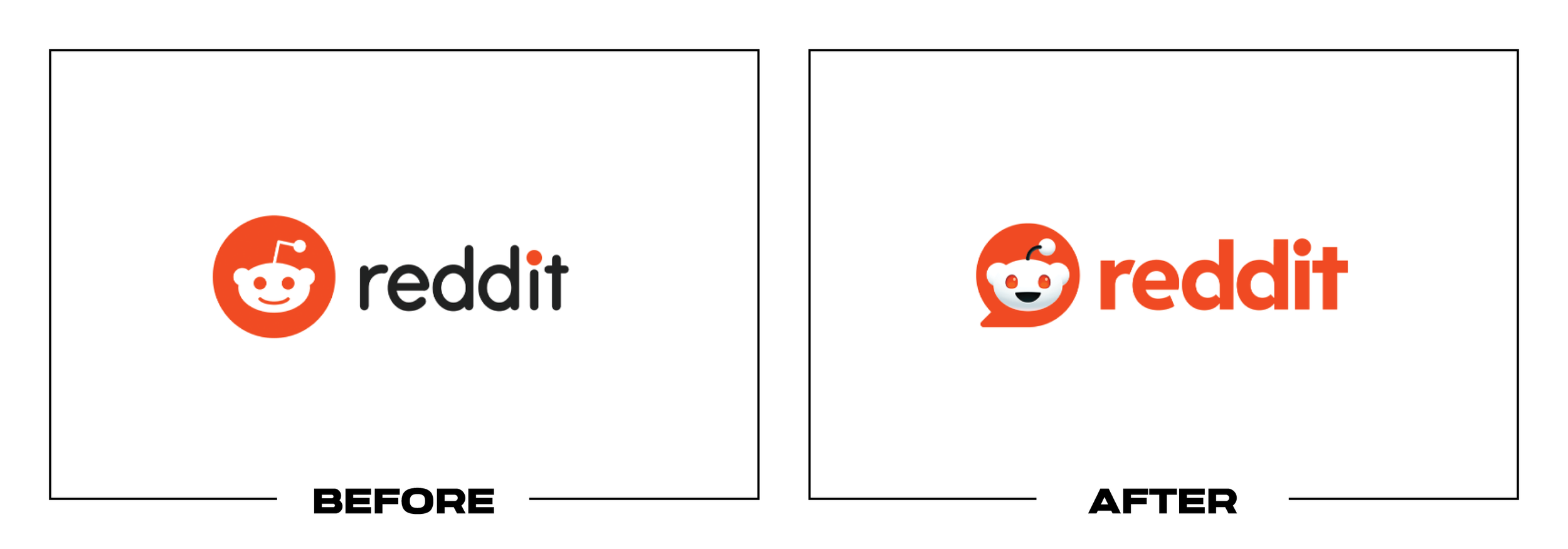
Reddit refreshed its identity in November 2023 as it expanded globally and prepared a coherent foundation for users, moderators, advertisers, and developers. Pentagram formalized Snoo, added conversation bubbles, custom type, motion, and color.
Why It Made the List:
Placing Snoo inside a conversation bubble makes the community idea clear, but pairing it with bubble-shaped counters in the wordmark repeats the concept. The doubled metaphor adds explanation where one strong device could have been enough.
A three-dimensional Snoo gains expression and opposable thumbs, yet the added shading and poses make the mascot harder to govern than the flat head users knew. The logo now depends more on one rendering among thousands of community variations.
Reddit's official identity announcement explains global growth, accessibility, custom type, bubbles, and Snoo's new form. The system solves fragmentation, but the logo concentrates too many of those visual ideas too tightly in one lockup.
The Tradeoff:
Reddit Display, Reddit Sans, a reduced palette, and codified motion give the company consistency while leaving room for communities. The central logo feels busier, with mascot, container, and conversational typography competing for attention.
What Businesses Can Learn:
A system can solve many problems without putting every solution into the logo. Choose the strongest identifier, let typography and motion perform their own roles, and test whether repeating the metaphor improves understanding or creates clutter.

17. Burberry
Why Did the Logo Change?
Burberry introduced Daniel Lee's first expression in February 2023, replacing the 2018 sans serif and reviving the archival Equestrian Knight Design. A new serif wordmark and bright blue reconnected the fashion house with British heritage.
Why It Made the List:
Restoring the Equestrian Knight recovers valuable history, but its horse, rider, shield, lance, banner, and lettering contain too much detail for many small digital and product uses. It works better as a rich emblem than an all-purpose logo.
The new serif wordmark is more distinctive than the 2018 version, yet its thin strokes and fashion proportions require careful reproduction. The emblem and wordmark also have very different visual densities when used side by side.
Burberry's official 2023 introduction documents the archive-inspired logo and revised Equestrian Knight. The heritage return is strong, but the system still needs clear rules for when the intricate emblem should yield to simpler assets.
The Tradeoff:
This is one of the most conceptually grounded projects on the list, and Burberry has continued using the Equestrian Knight as a major heritage asset. Its weakness is practical in tiny uses: the most ownable piece is also the least scalable.
What Businesses Can Learn:
A heritage emblem and everyday logo do not have to be the same asset. Preserve detail where craft and storytelling benefit from it, then create simplified signatures and clear size rules for screens, labels, hardware, and embroidery.

18. Linksys
Why Did the Logo Change?
Linksys worked with Bruce Mau Design on a broad 2023 identity intended to make networking feel more human and benefit-led. The refresh introduced a unistroke L symbol, a new wordmark, brighter blue, electric accents, icons, voice, and packaging.
Why It Made the List:
The unistroke symbol can read as an L, wireless signal, or abstract path, but pairing it tightly with the name creates an accidental extra letter. Instead of clarifying Linksys, the lockup can appear to say LLinksys at first glance.
The dot over the i and the nearby symbol compete at small sizes, while the long wordmark still limits compact use. The system solves the icon need separately, yet the primary lockup does not establish enough distance between icon and name.
Bruce Mau Design's Linksys case study explains the refreshed blue, benefit-led voice, product naming, and unistroke icon family. The toolkit has merit, but the primary mark should not require viewers to decide whether it says Linksys.
The Tradeoff:
The rebrand gives Linksys a cohesive voice, strong packaging, and a friendlier visual world for technology that often feels opaque. Its core icon is flexible and relevant, yet the combined lockup needs more separation to avoid duplicating the L.
What Businesses Can Learn:
Always read a symbol and wordmark as one object before approving either part. Test unintended letters, words, and shapes at reading speed, then adjust spacing, scale, or lockup rules so a useful icon does not alter the name beside it.

19. SiriusXM
Why Did the Logo Change?
SiriusXM unveiled a new consumer brand in November 2023 alongside a redesigned streaming app, pricing, and programming. The identity replaced radio waves with an S-shaped form, a central star for Sirius, and a puppy mascot named Stella.
Why It Made the List:
The star is a meaningful reference to Sirius, the Dog Star, but placing it inside the S interrupts the letter's most recognizable curve. The result can read as two opposing shapes before it reads as the first letter of SiriusXM.
Removing the radio waves helps the company move beyond satellite hardware, yet those waves explained audio and transmission immediately. The replacement asks a celestial story and mascot to rebuild recognition the old mark already carried.
SiriusXM's November announcement connects the star, night-sky palette, and Stella to an app and audience strategy. The story is documented, but placing an isolated S inside the star slows recognition for a service with a compound name.
The Tradeoff:
The identity creates a richer consumer world and gives streaming a fresh start beyond the dashboard. Night-sky colors and Stella can support campaigns, but the logo abandons a direct audio cue for a concept that takes longer to explain.
What Businesses Can Learn:
A symbol can tell a clever origin story and still fail its first identification job. Test whether someone sees the intended letter before learning the rationale, then keep or adapt category cues that continue to explain what the business does.

20. MadeForMed
Why Did the Logo Change?
MadeForMed became a mission-driven company in 2023 and asked Graphéine to build an identity around its work for general practitioners. The redesign replaced a generic heart-and-cross mark with a deliberately illegible doctor's-handwriting logo.
Why It Made the List:
The joke is sharply targeted and memorable, but only MFM remains remotely legible in the scribble. A B2B audience may understand it immediately, yet referrals, partners, patients, and search contexts still need to read the company name.
An asterisk carries the spelled-out name and URL as a corrective device. That solution acknowledges the logo's clarity problem, but also means the primary mark cannot reliably identify the company without an attached explanatory footnote.
Graphéine's MadeForMed case study openly describes the logo as nearly incomprehensible and explains why general practitioners are the target. The intent is unusually clear, but intentional illegibility remains a production risk.
The Tradeoff:
The identity has a rare, ownable point of view and avoids sterile healthcare conventions. Custom handwriting, human photography, and connected blocks carry the doctor-patient idea well. The logo pays for that originality with basic readability.
What Businesses Can Learn:
An inside joke can create recognition within a niche, but the name still has to travel beyond insiders. Test referral, search, invoice, sponsorship, and small-screen contexts, then decide where a provocative mark needs a clear companion.

21. Patreon
Why Did the Logo Change?
Patreon introduced its third major identity in October 2023 alongside a redesigned app and a broader focus on creator communities. The static P became a motion-first, dimensional form intended to adapt to the work of different creators.
Why It Made the List:
The flexible symbol can be filled, warped, and animated, but its default silhouette barely suggests a P. Without motion or the wordmark, it resembles an abstract object whose connection to Patreon must be learned from the beginning.
Adaptability sounds creator-friendly, yet endless treatments can prevent one stable form from accumulating recognition. A logo designed to become anything risks giving audiences too little consistent shape to remember between encounters.
Patreon's official redesign story describes a motion-first, digital-first identity built to adapt for creators. That rationale fits the platform, but the core mark still needs a dependable static state for icons, invoices, and small screens.
The Tradeoff:
The identity is creator-centered and appropriate for a platform that lives online. In motion and image, the symbol can feel alive. In its simplest state, it gives up the immediate letter and patron-creator relationship the former P provided.
What Businesses Can Learn:
Flexibility should expand recognition, not replace it. Define a stable silhouette, color, and default state before creating endless variations, then test whether someone can identify the brand from the version used in the smallest placement.

22. Microsoft Copilot
Why Did the Logo Change?
Microsoft introduced a multicolor Copilot mark in September 2023 as it began unifying AI assistants across Windows, Microsoft 365, Edge, and Bing. By November, Bing Chat also became Microsoft Copilot under the same ribbon-like identity.
Why It Made the List:
The looped ribbon is polished and adaptable, but offers little clue about the word Copilot, assistance, or Microsoft's existing product language. Its generic AI gradient must rely on placement and repetition to establish meaning.
Using one symbol across copilots can create coherence, yet the names, entitlements, and product relationships remained difficult to parse. A shared icon cannot repair architecture when customers still need to ask which Copilot they are using.
Microsoft's September 2023 announcement called Copilot an AI companion before Bing Chat took the same name. The symbol marked a real platform shift, but a shared logo arrived before Microsoft had made product relationships easy to understand.
The Tradeoff:
The mark is compact and works across Microsoft interfaces without borrowing one Office application's icon. Its abstract gradient fits many AI products, while the larger brand architecture asks one attractive symbol to carry too much complexity.
What Businesses Can Learn:
Do not use visual consistency to hide naming inconsistency. Map products, audiences, access levels, and relationships first, then choose whether a shared symbol clarifies the family or makes distinct tools look deceptively interchangeable.

23. X
Why Did the Logo Change?
Twitter became X in July 2023 as Elon Musk pursued an "everything app" spanning conversation, video, payments, and other services. The bird and Twitter name disappeared rapidly, replaced by a black-and-white X based on an existing type glyph.
Why It Made the List:
The Twitter bird was one of the most recognized digital symbols, with a name that supported verbs such as tweet and retweet. Replacing both at once discarded visual and verbal equity before the broader X product promise was ready.
An X can represent crossing, closure, multiplication, or an empty field, and appears across countless brands and interfaces. The chosen glyph may be stark, but it gives the platform very little visual territory it can own by shape alone.
AP’s 2023 retrospective documents Twitter's abrupt switch, including removal of the bird and a public type glyph. It establishes a clear 2023 redesign while showing how fast the platform discarded recognition before its product promise changed.
The Tradeoff:
The X mark is scalable and broad enough for a brand that no longer wants to be defined by short posts. Its generality supports expansion, but the transition traded a specific, ownable identity for a common symbol and an unfinished story.
What Businesses Can Learn:
Brand equity lives in names, symbols, language, and customer habits together. If a company must signal a larger future, phase the transition, explain what has changed in the product, and preserve assets until the new promise has substance.

24. OMSI
Why Did the Logo Change?
The Oregon Museum of Science and Industry refreshed its identity in 2023 as part of a long-term vision around regional programming, inclusion, and access. Gensler created unique letterforms, Oregon-inspired colors, illustration, and photography.
Why It Made the List:
The oversized OMSI acronym dominates while the full museum name becomes tiny supporting copy. Local families may know the shorthand, but tourists and regional audiences should not need prior familiarity to understand what the institution is.
Irregular letterforms express exploration and difference, yet their playful construction can resemble a children's activity brand before a major science institution. The idea needs typography and context to balance curiosity with authority.
Gensler's OMSI case study explains the community input, unique letters, open-source type, and Oregon thunderegg colors. Those choices create an inclusive visual world, but the logo still gives the full museum name too little authority.
The Tradeoff:
The identity is colorful, accessible, and built with input from communities across Oregon. Illustration and photography broaden representation effectively. The main lockup still treats the acronym as if every potential visitor already knows it.
What Businesses Can Learn:
Familiarity inside a region can hide confusion outside it. Test acronyms with visitors, partners, donors, and search audiences, then give the full name enough scale and contrast to explain the organization wherever local context is absent.

25. JLR
Why Did the Logo Change?
Jaguar Land Rover became JLR in June 2023 as the company adopted a house-of-brands structure for Range Rover, Defender, Discovery, and Jaguar. The new corporate monogram was intended to unify the business and signal modern luxury.
Why It Made the List:
The light, interlocking letters resemble a law, property, or luxury-services monogram more than an automotive company. Abbreviation removes the two famous names, while the mark adds no mechanical, geographic, or product cue of its own.
JLR said the identity would clarify its house of brands, yet coverage had to explain that Land Rover would remain on vehicles and retail sites. A corporate mark should not create uncertainty about which customer-facing brands still exist.
JLR's official June 2023 release documents the house-of-brands structure and confirms Land Rover would remain visible. Jaguar's 2024 overhaul is separate; this review concerns only the corporate JLR monogram unveiled the year before.
The Tradeoff:
The monogram is refined, compact, and separate from badges on vehicles. It gives the parent company one neutral signature across four brands, but its restraint makes the corporate identity feel less distinctive than the marques it organizes.
What Businesses Can Learn:
A parent-company logo should clarify structure without competing with brands, but neutrality is not the same as anonymity. Show the hierarchy, define where each name appears, and give the corporate layer enough character to remain credible.
What the Worst Logos of 2023 Have in Common
The weakest decisions from 2023 did not share a single style. Nokia reduced legibility to signal transformation. X discarded enormous visual and verbal equity before its new promise was clear. Patreon and Reddit asked flexible systems to do too much inside their core marks. JLR and Zoho created shorthand that still depended heavily on the full name.
The recurring problem is a mismatch between priority and solution. A redesign may improve motion, architecture, global consistency, or campaign range while making the name harder to read or the brand less ownable. Stronger projects preserve the audience's most useful cue, then let the wider system solve everything the logo should not carry.
For a contrasting set of solutions, read The 25 Best Logos of 2023.
Logos and trademarks shown belong to their respective owners and are included for identification, criticism, and commentary. No endorsement or affiliation is implied.
Thanks for Reading The 25 Worst Logos of 2023
Thanks for reading our annual Worst Logos of the Year article. It really means a lot to me. I also want to thank every designer, studio, in-house team and client who brought this year’s work to life. I may have opinions about the results, but this series would not exist without people willing to take creative risks in public.
For the other half of this year’s series, read The 25 Best Logos of 2023. You can also browse the blog for earlier Best and Worst Logos of the Year articles and more logo design reviews.
Does your business need a new logo? We provide logo design and brand identity services for businesses that need something new or have outgrown what they already use. Fill out the form below and tell us your story. We would love to help forge a new identity for your brand that connects with your customers, tells your story, and lands you at the top of next year’s Best Logos of the Year article.
Legal Disclaimer: This content is provided for educational and informational purposes and is intended as commentary and criticism; all product names, logos, and trademarks are the property of their respective owners, and any copyrighted materials shown are used under the principles of fair use solely to identify the subjects discussed and to support analysis, with only the limited portions reasonably necessary displayed; no sponsorship, endorsement, affiliation, or partnership is implied, and nothing on this page constitutes legal, financial, or other professional advice.
