
Welcome to The 25 Best Logos of 2023, one of two articles in my annual Best and Worst Logos of the Year series. Every year, I look back at the rebrands that caught my attention and share what businesses can learn from them. Here, we are going to take a look at some of this year’s strongest work. Looking for The 25 Worst Logos of 2023? Read the companion article to learn about rebrands that may have missed the mark.
Below, I break down The 25 Best Logos of 2023. For each one, I look at why the business rebranded, where the new identity succeeds, what it gives up, and what your business can learn before starting a rebrand of its own.
A quick note before I get into the list: I have respect for every designer, studio, in-house team and client represented here. Putting a new identity into the world is hard. These reviews focus on the finished work, but the point is not criticism for criticism’s sake. This series is here to help business owners and brand teams understand why companies rebrand, learn from the choices behind the work and make better decisions when it is their turn. The entries are numbered to make the article easy to follow, but they are not presented in any particular order. Design is subjective, and I do not expect everyone to agree with every choice. That is part of what makes these articles fun to write and discuss.
But when it does come time for you to discuss a new logo, Parker Lee Creative is an award-winning, independent creative studio specializing in logo design and brand identity. We help businesses build new identities and refresh the ones they have outgrown. Our process starts with what the logo needs to communicate, then tests the work everywhere customers will see it. If you are considering a rebrand, contact us and tell us your story. We would love to help you create something worthy of next year’s Best Logos of the Year article.
1. Pepsi
Why Did the Logo Change?
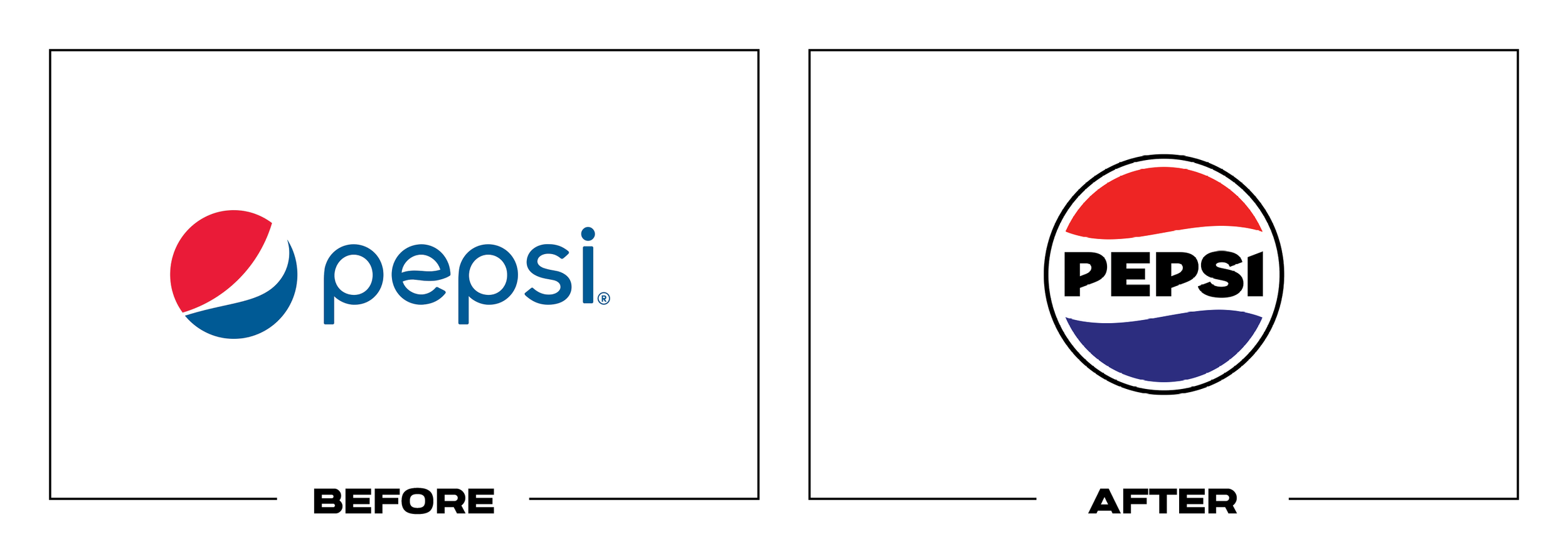
Pepsi was approaching its 125th anniversary with a globe that had been separated from its name since 2008. The company reunited both elements, added black to support Pepsi Zero Sugar, and built a more energetic system for packaging and screens.
Why It Made the List:
The new globe restores a familiar structure without reproducing an old logo verbatim. A centered wordmark, stronger contrast, and a bolder silhouette make the brand easier to identify on cans, coolers, fountains, and small screens.
Black, electric blue, and the pulse pattern give Pepsi a useful bridge between its heritage and its zero-sugar priority. The palette supports products, music, food, and motion while leaving the red, white, and blue globe unmistakably Pepsi.
Pepsi planned the launch as a staged system, not a single reveal. Its official 2023 announcement set a North American rollout for fall 2023 and a global rollout for 2024, establishing how different markets would adopt the work over time.
The Tradeoff:
The design leans heavily into nostalgia, and the black wordmark can feel more forceful than refreshing. That is a risk for a mass brand, but the surrounding motion and photography must keep the identity from becoming a heritage replay.
What Businesses Can Learn:
A redesign can move forward by recovering useful equity. Identify the version customers remember, separate its ideas from dated execution, and rebuild those ideas for the products, channels, and business priorities the identity must serve now.

2. Bit-O-Honey
Why Did the Logo Change?
Spangler acquired Bit-O-Honey in 2020 and found that the candy was not recruiting new buyers. The 2023 refresh clarified its honey and almond ingredients, strengthened shelf presence, and aimed the brand at adults as well as nostalgic fans.
Why It Made the List:
The custom lettering keeps the cheerful, awkward personality of a legacy candy while becoming easier to control across bags, bars, and small flavor labels. It feels specific to Bit-O-Honey rather than borrowed from a generic retro toolkit.
Bright yellow packaging makes honey the immediate cue, while ingredient photography and a busier supporting palette add appetite and variety. The package tells shoppers what the candy is before asking them to study a heritage story.
Young & Laramore based the work on research into new adult and health-conscious candy buyers. Its brand identity case study shows how the bee, product photography, typography, and campaign voice operate as one practical shelf system.
The Tradeoff:
The refreshed packaging carries more competing elements than the old bag, and the bee character can pull attention from the product name. Strong hierarchy is essential when the system expands across small packs, displays, and seasonal variants.
What Businesses Can Learn:
Nostalgia can open the door, but it is not a complete growth strategy. Keep the cues buyers recognize, then explain the product to someone seeing it for the first time through clearer ingredients, hierarchy, and a more useful package system.

3. Eddie Bauer
Why Did the Logo Change?
Eddie Bauer had accumulated multiple marks, and younger customers did not always read its script easily. The company introduced a custom block wordmark, a flying goose, and a 1920 reference to unify its outdoor history across markets.
Why It Made the List:
The flying goose creates a compact symbol that can work on garment labels, buttons, patches, and digital icons where a long script cannot. It connects to the outdoors without relying on another mountain, compass, or literal founder portrait.
A sturdy, all-cap wordmark improves cross-language recognition while the Outdoor Outfitters line and 1920 date preserve context. The result broadens the system without pretending the company became a different kind of outfitter overnight.
The redesign was public across digital channels in 2023, while products were scheduled for fall 2024. Rollout reporting makes that distinction clear, so the identity can be judged without misstating when shoppers saw it on merchandise.
The Tradeoff:
Replacing the signature sacrifices a recognizable expression of the founder's name. The block letters are more legible, but also more common in outdoor apparel, so the goose and consistent product application must supply the missing character.
What Businesses Can Learn:
Legibility is a business requirement when a brand crosses languages, sizes, and materials. Do not discard a distinctive asset casually, but build a compact symbol and clear wordmark when the existing signature cannot perform across the system.

4. Bolthouse Farms
Why Did the Logo Change?
Bolthouse Farms needed a clearer, contemporary presence across juices, smoothies, dressings, and plant-based products. The 2023 package refresh introduced expressive lettering and a visual hierarchy while keeping the farm name intact.
Why It Made the List:
The loose script brings human energy to a category crowded with clinical wellness claims. Its rising angle and brushlike rhythm feel active and optimistic, yet the package gives the lettering enough space to remain the primary brand cue.
Bold fields, ingredient imagery, and product-specific colors create stronger navigation across a broad range. The identity can move from a green juice to ranch dressing without forcing every item into the exact same visual composition.
The project was publicly documented as a new logo and package system in January 2023. UnderConsideration's record helps separate this consumer refresh from the later Bolthouse Fresh Foods corporate identity created after a business split.
The Tradeoff:
The script gains warmth but loses some of the authority and immediate clarity of a wordmark. Its angle and connected strokes can soften at small sizes, so simplified lockups and disciplined contrast matter on caps and digital thumbnails.
What Businesses Can Learn:
A broad product portfolio needs recognizable structure without making every package identical. Set a role for the logo, then use color, imagery, product names, and layout to help customers move through the range without losing the master brand.

5. Propel
Why Did the Logo Change?
Propel had grown as a zero-sugar fitness water, but its link to Gatorade science was not obvious at a glance. The 2023 refresh moved the orange bolt into the wordmark and rebuilt packaging around exercise, electrolyte function, and movement.
Why It Made the List:
Placing the Gatorade bolt at the center of Propel turns parent-brand equity into a clear proof point. It is not a decorative endorsement tucked into a corner. The relationship becomes part of the name customers read on the bottle.
Electric blue, neon accents, silver, and ticker-tape flavor bands give the portfolio energy while improving variant navigation. The design borrows from fitness apparel without turning every package into a noisy imitation of sportswear.
PepsiCo Design's Propel case study explains that Vault49 helped connect the brand to Gatorade and reposition it as fitness-led hydration. That documented brief makes the logo decision easier to evaluate on its intended terms and use.
The Tradeoff:
The Gatorade bolt adds authority, but it also makes Propel feel less independent. If the parent cue dominates, customers may read the product as a Gatorade extension rather than a distinct hydration choice with its own personality and audience.
What Businesses Can Learn:
A parent brand can lend trust when the relationship explains a real product benefit. Decide whether that endorsement should lead or support, then make the hierarchy deliberate so the brand gains credibility without surrendering its identity.

6. Wise
Why Did the Logo Change?
Wise had changed its name from TransferWise in 2021 and expanded beyond money transfers. Its 2023 identity completed that transition with a bolder global system designed to work consistently across products, countries, scripts, and languages.
Why It Made the List:
The flag-arrow symbol carries forward the movement in Wise's former mark while becoming simpler and more decisive. It can suggest sending, receiving, travel, and forward progress without trapping the company inside one payment feature.
A vivid green palette breaks from the navy conventions of financial technology, while lettering and graphic references to currencies and places support a global voice. The system feels energetic without making the interface less serious.
Wise explained that the redesign needed to reflect new products and the people using them after its 2021 name change. Its help page also addresses rollout and phishing risk, a detail many rebrands overlook when trust is central to the product.
The Tradeoff:
The green and assertive typography give Wise distinction, but they can also feel loud inside a task built around calm financial decisions. The expressive system needs careful restraint in security, support, and transaction-confirmation moments.
What Businesses Can Learn:
When a name change begins a larger transition, the identity should catch up to the business customers now use. Build distinction at the brand level, then define quieter interface states for the moments where clarity and confidence matter most.

7. U.S. Army
Why Did the Logo Change?
The U.S. Army faced recruiting challenges and a fragmented public identity. Its March 2023 refresh returned to "Be All You Can Be," removed the box around the star, and introduced a more flexible visual system for a new generation of recruits.
Why It Made the List:
Removing the enclosing box gives the five-point star more room and improves reproduction across uniforms, profiles, event signs, and recruiter materials. The change is modest, but it fixes a practical limitation in a heavily used symbol.
Black and gold carry institutional authority, while a custom typeface and expanded palette provide more range for people, careers, technology, and service stories. The system can speak broadly without turning the star into a different emblem.
The Army's official brand announcement connects research, recruiting, and the return of "Be All You Can Be." That evidence gives the refresh a defined recruiting purpose and shows how the identity supports communication beyond a visual update.
The Tradeoff:
The star is cleaner, but it is also a military and civic symbol that depends on the wordmark for ownership. The broader campaign must do the work of distinguishing Army service rather than expecting the simplified icon to carry every message.
What Businesses Can Learn:
A familiar symbol may need space, rules, and a better system more than a dramatic replacement. Simplify the parts that block production, preserve recognition, and connect the refresh to a message that the audience can understand and remember.

8. Davidson College
Why Did the Logo Change?
Davidson College had separate visual languages across academics, athletics, and campus life. Its first major identity update in roughly 35 years created an interlocking DC, refreshed the wildcat, and connected both to institutional history.
Why It Made the List:
The interlocking DC draws from campus architecture and historic uniforms, giving a monogram evidence of place. Its geometry works on stationery, screens, uniforms, and merchandise without requiring a different institutional logo each time.
A redesigned wildcat preserves an expressive athletics asset while aligning its construction with the wider identity. Davidson did not force one mark into every role. It built related tools for academic authority and competitive energy.
Davidson's official identity announcement documents an eight-month process and explains the historical references behind the DC. That record keeps the review grounded in the college's stated problem rather than a guessed design story.
The Tradeoff:
Interlocking initials are common in collegiate branding, so Davidson's mark can lose ownership when context is absent. Color, typography, and the supporting wildcat are necessary to keep the system from blending into its category.
What Businesses Can Learn:
One organization can need more than one mark without becoming inconsistent. Define the jobs each symbol must perform, build them from shared visual logic, and give audiences a recognizable relationship between formal and expressive parts.

9. Zevia
Why Did the Logo Change?
Zevia wanted to move from a niche natural-soda position toward a broader zero-sugar audience. Its 2023 refresh created one portfolio system, raised ingredient and flavor cues, and gave the plant-based brand a more confident presence.
Why It Made the List:
The scalloped wordmark combines leaflike edges with enough typographic mass to hold a package. It signals plant ingredients without adding a separate leaf icon, allowing the name itself to carry the central visual idea at shelf distance.
Cleaner flavor names, stronger fruit imagery, and coordinated colors make the range easier to scan across soda, energy, tea, and mixers. The system communicates variety while keeping every can recognizably part of Zevia at a glance.
Zevia's official rebrand announcement names Turner Duckworth and states the goal of bringing its mission-driven offer to a mainstream audience. That brief explains why cohesion and shelf presence mattered rather than style alone.
The Tradeoff:
The scallops are distinctive at display size, but their leafy meaning becomes less obvious when the wordmark is small. The playful form can soften the authority of health and ingredient claims if the package hierarchy is not carefully managed.
What Businesses Can Learn:
Moving from niche to mainstream does not require erasing the values that built the brand. Express the central idea in one ownable asset, then make product names, ingredients, and variants easier for a first-time customer to understand.

10. Fanta
Why Did the Logo Change?
Fanta used different logos and packages across markets, which weakened consistency for a flavor portfolio. Its 2023 identity removed orange-specific details, introduced one global wordmark, and built a system flexible enough for every flavor.
Why It Made the List:
The upright custom lettering has the bounce and irregularity Fanta needs without tying the logo to one fruit. Removing the orange and leaf lets grape, pineapple, strawberry, and regional products use the same master mark honestly.
Strong color blocks, playful illustration, and motion give each flavor a distinct personality while the logo remains fixed. That balance allows local range without making the worldwide portfolio look like unrelated soft-drink brands.
Design Week's JKR identity report identifies Coca-Cola Design, JKR, and Colophon as partners in the work. Unifying once-separate market identities was the core assignment, so consistency is part of the design result, not an afterthought.
The Tradeoff:
Removing the orange and leaf makes the logo more honest across flavors, but it also removes two product cues many customers associated with Fanta. Flavor recognition now depends more heavily on package color, imagery, and local labeling.
What Businesses Can Learn:
A global master brand should not visually promise one product when the portfolio has moved far beyond it. Protect the personality customers recognize, then shift product-specific information into the parts of the system designed to change.

11. Oregon Zoo
Why Did the Logo Change?
Oregon Zoo needed an identity that could represent more than a visitor attraction. The 2023 system connected animals, Pacific Northwest place, conservation, education, and its "Together for Wildlife" mission under one flexible visual language.
Why It Made the List:
The circular O becomes a simple container for animal silhouettes and habitats. That structure gives the zoo a recognizable master shape while allowing species and programs to appear without producing a new unrelated logo for each one.
Northwest colors, bold type, illustration, and patterns make room for both scientific information and family energy. The system can move from donor communications to a child's activity sheet without losing its core construction.
Studio DAD's Oregon Zoo case study shows how the identity supports architecture, campaigns, and the "Together for Wildlife" position. The case explains that work began in 2019, paused during the pandemic, and resumed before the 2023 launch.
The Tradeoff:
An O filled with an animal can resemble other zoo and conservation identities, especially when the species changes. Recognition depends on consistent type, color, and composition, not on assuming the circular container is unique by itself.
What Businesses Can Learn:
A mission-driven organization needs a system broad enough for programs, audiences, and fundraising, yet simple enough to recognize. Choose one repeatable structure, then let content vary inside rules that keep the organization visible.
12. Chicago Ornithological Society
Why Did the Logo Change?
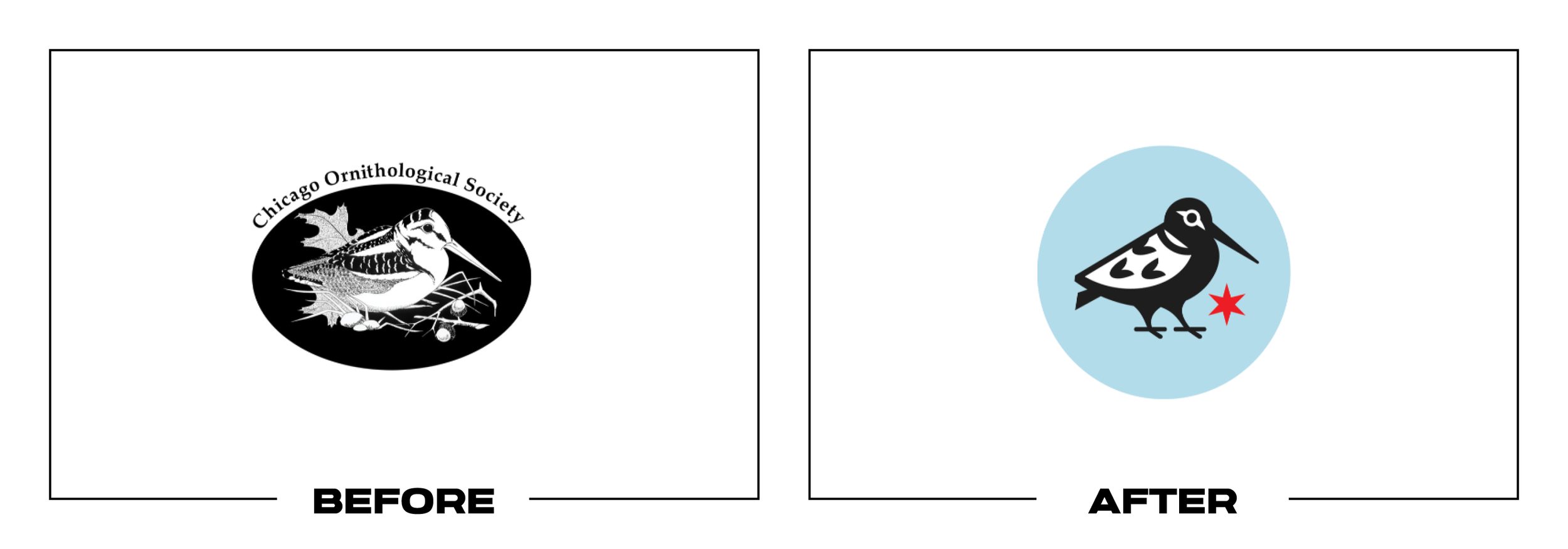
The Chicago Ornithological Society had used a detailed woodcock mark since 1989. Its 2023 redesign kept the bird members loved, reduced the drawing for modern reproduction, and added a Chicago star and blue field to clarify place.
Why It Made the List:
The American woodcock remains the unmistakable center of the identity, preserving the humor and affection built around the old mark. Simplified feathers and shapes make the bird more usable without turning it into a generic silhouette.
A single red Chicago star gives the organization a direct local cue, while the blue field creates stronger contrast and a reliable badge shape. The result can work on patches, social avatars, event materials, and field guides on sight.
The society's conversation with designer Alex Tomlinson explains how scale, personality, and Chicago references shaped the woodcock. Publishing that rationale does more than show the mark; it lets readers understand the decisions behind it.
The Tradeoff:
The simplified woodcock is easier to reproduce, but it loses some eccentric detail that made the 1989 drawing feel handmade. Because Chicago stars appear widely, the bird must remain the mark's leading source of ownership and character.
What Businesses Can Learn:
Modernization does not require replacing the character people already love. Identify what the audience would miss, simplify only what prevents real use, and add place or purpose cues that make the mark clearer to someone outside the group.

13. Tai Pei
Why Did the Logo Change?
Tai Pei needed distinction in a crowded frozen-food aisle and a package that could organize a growing range. Its 2023 refresh introduced a bolder wordmark, darker premium fields, a dragon, and clearer product photography and flavor hierarchy.
Why It Made the List:
The compact wordmark gains presence without imitating brush calligraphy. Its strong vertical strokes, framed construction, and gold treatment create an anchor that can hold beside vivid food photography and dense preparation information.
Black and gold establish a consistent master palette, while ingredient imagery and color accents make individual meals easier to distinguish. The system feels more deliberate across cartons, bowls, appetizers, and single-serve products.
Truly Creative's redesign was documented in 2023 as a new logo and package system. UnderConsideration's project record supplies a dated before-and-after comparison, grounding this review in the artwork instead of speculative launch claims.
The Tradeoff:
Black and gold can imply premium quality, but they are familiar shortcuts in packaged food and can make the range feel heavier than its convenience offer. The dragon adds energy, yet risks becoming decoration if it lacks a consistent role.
What Businesses Can Learn:
Packaging has to establish the brand and help someone choose in seconds. Build one strong master cue, then use photography, color, and hierarchy to explain the product, distinguish the variety, and make the complete range easier to shop.

14. Temple University
Why Did the Logo Change?
Temple's detailed athletics owl had become difficult to reproduce and felt disconnected from the university's T. The 2023 secondary mark introduced a cleaner owl built around a diamond and hidden T while leaving the primary Temple T intact.
Why It Made the List:
The owl's eyes, head, and diamond silhouette read quickly at small sizes, a real requirement for uniforms, score graphics, merchandise, and social profiles. The mark gains aggression without relying on excessive feathers or facial detail.
Integrating a T into the owl connects athletics to the institution more directly. Temple wisely kept its primary T rather than presenting the new mascot as a wholesale university replacement, which protects recognition and clarifies hierarchy.
Temple's official introduction credits Joe Bosack & Co., Tyler School students, focus groups, and concept testing. That process supports the decision to simplify a roughly 30-year-old secondary mark before the new mark entered use.
The Tradeoff:
Angular owl heads are common in college sports, so the mark can feel familiar before the Temple details are noticed. The hidden T is clever, but it should not become an explanation the logo needs every time it appears without a wordmark.
What Businesses Can Learn:
Not every symbol should replace the primary logo. A secondary mark can solve a specific need when its role, relationship, and applications are defined. Preserve the master brand, then give specialized audiences a tool built for their context.

15. Industrial Light & Magic
Why Did the Logo Change?
Industrial Light & Magic had used the same identity for nearly two decades while expanding across effects, animation, and immersive work. Its 2023 system reconnected with the original gear-and-light idea and organized a growing brand family.
Why It Made the List:
The gear and lightbulb work through negative space, combining industrial craft with imaginative invention in one compact symbol. A small spark adds magic without relying on a wand, stars, or another literal cinematic effect in motion.
A customized serif wordmark gives the technical icon warmth and history, while related lockups make room for divisions such as ILM Immersive. The family feels connected without forcing every capability into one crowded corporate name.
ILM's official identity announcement credits Hoodzpah, a 14-month process, and input from more than 1,000 employees. Those details show the system was tested against internal culture, public recognition, and the needs of a global studio.
The Tradeoff:
The negative-space gear and bulb are conceptually rich, but their relationship can blur at very small sizes. The serif wordmark also asks for careful spacing in long division names, making alternate lockups and production rules essential.
What Businesses Can Learn:
When a company expands, brand architecture becomes part of logo design. Return to the clearest founding idea, simplify it for current media, and create related names and marks before new divisions begin improvising identities of their own.

16. Stella Artois
Why Did the Logo Change?
Stella Artois wanted a more flexible global identity that could move beyond formal beer advertising into food, fashion, and social occasions. Its 2023 refresh simplified the lockup while expanding typography, illustration, and the horn symbol.
Why It Made the List:
A horizontal wordmark and crest make the core identity easy to place across bottles, glasses, menus, signs, and digital media. The logo keeps the cartouche, star, and heritage cues without requiring every application to carry equal detail.
Two custom type families give the system range between elegance and practical information. Elevating the horn as a supporting asset creates a recognizable device for patterns, photography, and events where the full crest would be too formal.
JKR's work is documented in Dieline's 2023 identity review, including Alec Tear's redrawn emblem and custom type from Pangram Pangram. That reporting shows the project was a full brand-world refresh, not only a package tweak and rollout.
The Tradeoff:
The simplified lockup is more flexible, but the crest still contains enough fine detail to weaken at small sizes. A fashion-led visual world can also drift away from beer and hospitality if the product and occasions stop anchoring the story.
What Businesses Can Learn:
A heritage logo does not have to carry every expression of the brand. Refine the core mark for production, then build type, symbols, imagery, and motion that can change tone while keeping the product and its recognizable history in view.

17. Philharmonie Luxembourg
Why Did the Logo Change?
Philharmonie Luxembourg needed a clearer umbrella for its venue, orchestra, artists, and programming, plus a way to welcome younger and broader audiences. The 2023 identity turned the building's 823 columns into an adaptable musical system.
Why It Made the List:
Vertical lines reference the architecture without drawing a literal concert hall. They can expand, contract, and react to sound, giving the identity a distinctive relationship to both the building people visit and the music performed inside.
A generative tool allows the visual language to respond to audio and programming while retaining shared rules. That makes digital motion a structural part of the identity rather than a decorative animation added after the logo was approved.
NB Studio's project is detailed in It's Nice That's 2023 report, including Patrik Hübner's coding work and the building's 823 columns. The source connects the system directly to audience and architecture rather than assumed design intent.
The Tradeoff:
The column concept is strongest in motion and large compositions. Reduced to a static wordmark or tiny avatar, much of the musical behavior disappears. The identity therefore depends on access to tools, templates, and skilled implementation.
What Businesses Can Learn:
A physical place can inspire an identity without becoming a literal illustration. Find a repeatable principle in the experience, then build tools that let it respond to content while preserving enough structure for teams to use it consistently.

18. 1Password
Why Did the Logo Change?
1Password had grown from a password manager into a broader security company, while its corporate logo and product icon were too closely tied. The 2023 refresh separated their jobs and introduced a flexible keyhole-led brand system.
Why It Made the List:
Separating the company wordmark from the unchanged product icon removes a common architecture problem. The app can retain a familiar lock-shaped cue while the corporate brand gains room to represent security products beyond one interface.
The keyhole works as a portal for photography, illustration, and motion, giving the system a recognizable frame without forcing every message through a literal lock. A custom Agile Sans improves scaling and brings subtle ownership to the name.
1Password published an in-house brand refresh story covering the logo split, keyhole, type, and cross-functional process. That transparency makes it possible to evaluate both the strategic decision and how the assets were intended to work.
The Tradeoff:
Removing the lock from the corporate wordmark makes the name cleaner, but less immediately connected to security when seen alone. The keyhole is also common category language, so consistent type, color, and behavior must create ownership.
What Businesses Can Learn:
The company logo and product icon do not always need to be the same asset. Map where each appears, protect interface recognition, and give the parent brand enough range to grow when the business becomes larger than its original product.

19. Minute Maid
Why Did the Logo Change?
Minute Maid had different expressions across more than 100 markets and related brands including Cappy and del Valle. Its 2023 refresh created the first shared global system while keeping fruit, freshness, and everyday optimism at the center.
Why It Made the List:
A softer serif wordmark adds warmth without imitating hand lettering, while the black arch suggests a hill, horizon, or smile. That simple geometry gives packages a consistent top anchor across languages, sizes, and beverage formats.
Fruit-led colors, large ingredient imagery, and an animated droplet create a flexible system around the stable logo. The identity can support orange juice, tropical blends, and products without pretending every market sells the same range.
Coca-Cola's official Minute Maid announcement confirms the first global rebrand and names its agency partners. It explains how "Filled with Life" creates a common idea for Minute Maid, Cappy, and del Valle across more than 100 markets.
The Tradeoff:
The black arch is distinctive in the full package, but abstract when isolated and easy to over-explain as a hill, smile, or horizon. The wordmark itself is restrained, so color and fruit imagery carry much of the brand's shelf energy.
What Businesses Can Learn:
Global consistency should create a foundation, not erase regional reality. Fix the elements that must stay recognizable, then design the rest of the system so local teams can express flavors, languages, and formats without fragmenting the brand.

20. The Cigna Group
Why Did the Logo Change?
Cigna Corporation became The Cigna Group in 2023 as its portfolio expanded around Cigna Healthcare and Evernorth Health Services. The new architecture clarified the parent company while giving the tree a more integrated, contemporary role.
Why It Made the List:
Integrating the tree around the lowercase i makes the symbol part of the name rather than an emblem floating beside it. The structure preserves a long-used cue while creating a crisp mark for reports, recruiting, and investor communication.
The architecture distinguishes the parent organization from Cigna Healthcare and Evernorth, helping each name carry a defined role. That clarity matters more than forcing every audience to see one logo on every service or document.
The company's February 2023 brand announcement explains the move to The Cigna Group and how Cigna Healthcare and Evernorth sit beneath it. That architecture is the correct frame for judging whether the parent mark adds useful clarity.
The Tradeoff:
The integrated tree is more compact, but placing detail around the i can become fragile at small sizes. The lowercase wordmark also feels approachable at the cost of some institutional authority, especially beside the stronger Evernorth name.
What Businesses Can Learn:
When a portfolio expands, employees need naming clarity before visual novelty. Define the parent, operating brands, and service relationships, then use identity to show that structure without making every part look or sound identical.

21. LG
Why Did the Logo Change?
LG wanted its long-used face symbol to feel more dynamic for younger audiences and digital touchpoints. The 2023 update flattened the mark, introduced Active Red, expanded the palette, and gave the symbol eight expressive motion behaviors.
Why It Made the List:
Removing the dimensional gloss improves clarity on screens while preserving the L, G, face, and circular construction people recognize. The update changes production and behavior without discarding one of electronics' more distinctive marks.
Nods, spins, and winks turn the face embedded in the symbol into a usable digital personality. Because the motion grows from existing geometry, it feels like an extension of the logo's idea rather than animation applied to a static badge.
LG's official identity announcement documents eight logo motions, Active Red, gradients, and new Life's Good lettering. It connects those tools to the goal of reaching younger audiences across countries, screens, and campaigns worldwide.
The Tradeoff:
Most of the update appears in motion, so static packaging and hardware may look nearly unchanged. Frequent winking or dancing can also feel frivolous in premium products or support situations, making behavioral rules as important as logo rules.
What Businesses Can Learn:
An established logo can evolve through behavior as well as shape. Protect the asset customers know, remove effects that no longer help, and define when motion adds warmth, when it should stay quiet, and how the static mark still performs.

22. 7UP
Why Did the Logo Change?
7UP had not completed an international identity update in more than seven years. Its 2023 refresh introduced a stronger dimensional wordmark, brighter citrus colors, and an "UPliftment" platform designed for packaging, campaigns, and screens.
Why It Made the List:
The angled wordmark and layered shadow create upward movement without making the letters difficult to recognize. The red dot remains a strong inherited cue, while the white type gains more separation from green cans and digital backgrounds.
Lemon and lime shapes, bubbles, gradients, and brighter greens expand the identity beyond a single lockup. Those assets can support flavor and refreshment messages while the central mark stays consistent across international markets.
PepsiCo's 2023 international announcement connects the visual system to "UPliftment" and credits the in-house design team. The source gives the upward geometry a documented purpose, so the choice can be judged against its intended job.
The Tradeoff:
The dimensional shadow adds energy, but also more layers to reproduce in small or one-color uses. Citrus graphics are appropriate yet common in the category, so the red dot, numeral, and disciplined green palette still carry most recognition.
What Businesses Can Learn:
A campaign idea can strengthen an identity when it grows from the product and visual form. Build the logo to perform without effects, then use color, dimension, imagery, and motion as flexible layers rather than permanent requirements.

23. Nickelodeon
Why Did the Logo Change?
Nickelodeon had used its clean 2009 wordmark for 14 years, but lost the splat that generations associated with the network. Its 2023 identity restored a simplified splat and rebuilt the system for broadcast, streaming, products, and places.
Why It Made the List:
Restoring the splat recovers a distinctive asset without copying one fixed shape from the past. The circular-grid construction gives Nickelodeon a hero mark and related splats that can stay unruly while sharing recognizable visual logic.
The existing wordmark protects continuity, while cel animation, 3D type, slime tools, and expanded color give current teams far more range. The system can feel nostalgic to parents and immediate to children without choosing only one audience.
Roger's Nickelodeon case study shows how the splat works as a portal, attribution device, and modular center across platforms. That production detail explains why a familiar symbol was more useful than another new wordmark on screen.
The Tradeoff:
Nostalgia is powerful, but the identity can become self-referential if every message leans on 1990s memories. Multiple splats and expressive type need governance, or the flexibility meant to support creativity can recreate the inconsistency.
What Businesses Can Learn:
Distinctive assets often outlive the systems that first used them. Bring one back when the audience still recognizes it and the business has a current job for it, then rebuild its geometry and tools instead of treating nostalgia as the strategy.

24. Western Union
Why Did the Logo Change?
Western Union had shifted far beyond telegrams into a digital, multilingual money-movement network. Its 2023 identity introduced a WU monogram and friendlier wordmark designed to travel across apps, retail locations, languages, and markets.
Why It Made the List:
The interlocking W and U compress the company name into a compact directional symbol. Its angled strokes suggest exchange and movement, giving Western Union a practical app icon and useful shorthand without relying on a currency sign.
Retaining yellow and black protects the brand's most visible retail equity, while the updated type softens a previously rigid corporate presence. The system can feel more accessible without losing contrast in crowded storefront environments.
Designer Darrin Crescenzi's Western Union project record credits the work with Love Street & Company and shows how the monogram, type, and visual language scale. That case helps distinguish intended movement from decorative angles.
The Tradeoff:
The WU construction is compact, but not instantly readable to everyone and can resemble two arrows or a generic fintech monogram. Western Union still needs the full name in unfamiliar markets until repetition builds reliable recognition.
What Businesses Can Learn:
A shorthand mark is earned through use, not declared at launch. Build it from the name and a relevant behavior, pair it with the full wordmark where recognition is weak, and retain distinctive assets that customers already use to find you.

25. Stir
Why Did the Logo Change?
Match Group launched Stir for single parents in 2022, then refined the young brand in 2023 as its product and community grew. The update added a more fluid logo, warmer colors, and an interface and campaign system built around levity.
Why It Made the List:
The compact stir-shaped symbol feels active and flexible without turning parenthood into a child icon or family-tree cliché. Its soft loops can work as an app avatar, pattern, and motion device while keeping the service adult-focused.
Purple, brown, orange, and yellow create warmth without defaulting to the bright primary palette often used for parenting products. The combination gives profiles and photography a calmer frame while preserving enough energy for dating.
Match Group's official 2023 campaign release documents the refreshed identity and "Break Every Single Rule" platform. That source clarifies how The Working Assembly's visual changes supported a broader product and audience position.
The Tradeoff:
The fluid symbol is pleasant but abstract, and little about it immediately says dating or single parents. Recognition depends on the Stir name and repeated app use, while the muted palette can lose visibility beside louder dating competitors.
What Businesses Can Learn:
Category clichés are not the only route to relevance. Build the identity around the emotional tone customers need, then make sure the name, product experience, and messaging supply the clarity an abstract symbol cannot provide alone.
What the Best Logos of 2023 Have in Common
The best redesigns of 2023 did not chase one visual trend. They protected something useful, solved a documented problem, and built enough supporting structure to survive outside a launch presentation. Pepsi and Nickelodeon recovered familiar equity. Fanta and Cigna clarified larger systems. LG and Philharmonie Luxembourg made behavior part of the identity.
The common thread is disciplined expansion. A good logo creates recognition, but typography, color, imagery, motion, hierarchy, and usage rules determine whether that recognition holds across products and channels. The strongest work knows what the central mark must do and what should be left to the rest of the system.
For examples of changes that created larger problems, read The 25 Worst Logos of 2023.
Logos and trademarks shown belong to their respective owners and are included for identification, criticism, and commentary. No endorsement or affiliation is implied.
Thanks for Reading The 25 Best Logos of 2023
Thanks for reading our annual Best Logos of the Year article. It really means a lot to me. I also want to thank every designer, studio, in-house team and client who brought this year’s work to life. I may have opinions about the results, but this series would not exist without people willing to take creative risks in public.
For the other half of this year’s series, read The 25 Worst Logos of 2023. You can also browse the blog for earlier Best and Worst Logos of the Year articles and more logo design reviews.
Does your business need a new logo? We provide logo design and brand identity services for businesses that need something new or have outgrown what they already use. Fill out the form below and tell us your story. We would love to help forge a new identity for your brand that connects with your customers, tells your story, and lands you at the top of next year’s Best Logos of the Year article.
Legal Disclaimer: This content is provided for educational and informational purposes and is intended as commentary and criticism; all product names, logos, and trademarks are the property of their respective owners, and any copyrighted materials shown are used under the principles of fair use solely to identify the subjects discussed and to support analysis, with only the limited portions reasonably necessary displayed; no sponsorship, endorsement, affiliation, or partnership is implied, and nothing on this page constitutes legal, financial, or other professional advice.
