
Welcome to The 10 Worst Logos of 2018, one of two articles in my annual Best and Worst Logos of the Year series. Every year, I look back at the rebrands that caught my attention and share what businesses can learn from them. Here, we are going to take a look at some of this year’s rebrands that may have missed the mark. Looking for The 10 Best Logos of 2018? Read the companion article to learn about some of this year’s strongest work.
Below, I break down The 10 Worst Logos of 2018. For each one, I look at why the business rebranded, where the new identity falls short, what it gives up, and what your business can learn before starting a rebrand of its own.
A quick note before I get into the list: I have respect for every designer, studio, in-house team and client represented here. Putting a new identity into the world is hard. These reviews focus on the finished work, but the point is not criticism for criticism’s sake. This series is here to help business owners and brand teams understand why companies rebrand, learn from the choices behind the work and make better decisions when it is their turn. The entries are numbered to make the article easy to follow, but they are not presented in any particular order. Design is subjective, and I do not expect everyone to agree with every choice. That is part of what makes these articles fun to write and discuss.
But when it does come time for you to discuss a new logo, Parker Lee Creative is an award-winning, independent creative studio specializing in logo design and brand identity. We help businesses build new identities and refresh the ones they have outgrown. Our process starts with what the logo needs to communicate, then tests the work everywhere customers will see it. If you are considering a rebrand, contact us and tell us your story. We would love to help you create something worthy of next year’s Best Logos of the Year article.
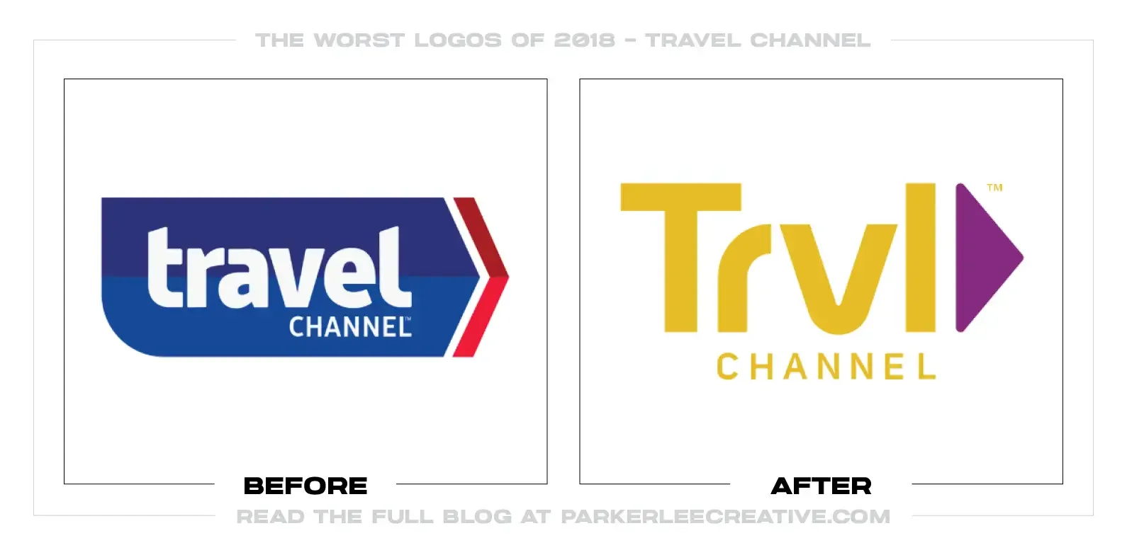
1. Travel Channel / TRVL Channel
Why Did the Logo Change?
Travel Channel introduced a new identity as Discovery shifted the network toward paranormal, mystery, and horror programming. Radley Studios shortened the on-screen name to TRVL Channel and launched the package during Ghostober, giving the network a darker and more flexible broadcast look.
Why It Made the List:
• Removing two vowels makes a familiar name slower to read without solving the larger problem: the programming had moved away from travel. The Washington Post’s later account documents both the 2018 rebrand and the category disconnect viewers continued to notice.
• The compact TRVL block works as a television bug, but it resembles a travel app, streetwear label, or airport code more than a network about ghosts and unexplained events. The logo preserves the old promise while the schedule makes a different one.
• A strong motion package can make the abbreviation look energetic, yet the static mark depends on context. On a guide screen or social avatar, it says neither where viewers will go nor what kind of stories they will find.
The Tradeoff:
The rebrand accompanied a commercially successful programming shift, and the shorter form is easy to place on screen. The failure is not that the logo lacked polish. It is that a cosmetic name edit avoided a truthful conversation about what the channel had become.
What Businesses Can Learn:
When the offer changes, test the name against the current customer promise before redesigning its letters. A cleaner logo cannot reconcile a category mismatch. Decide whether equity is helping recognition or keeping the business attached to an obsolete expectation.
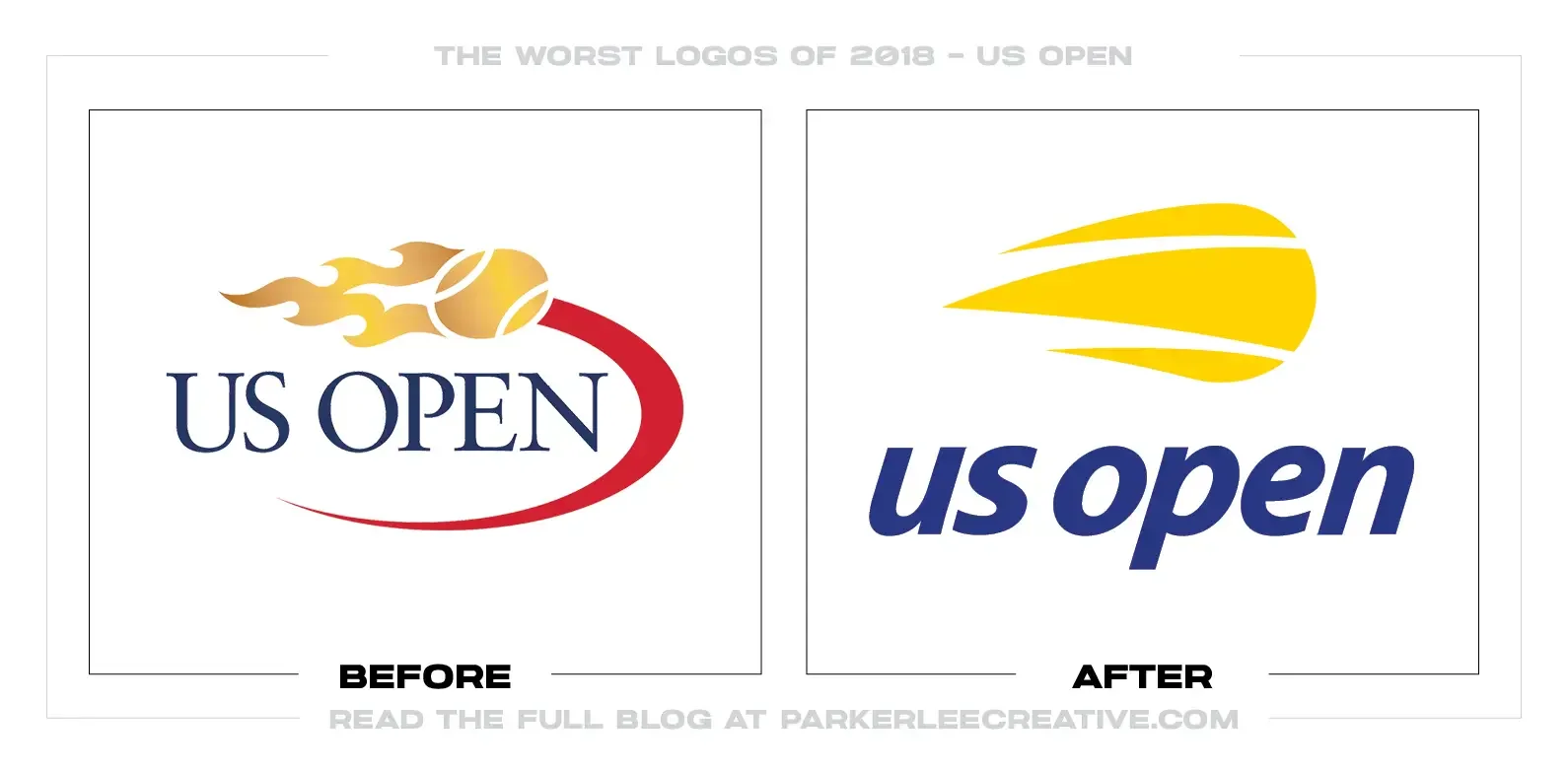
2. US Open
Why Did the Logo Change?
The USTA marked the fiftieth anniversary of the Open Era with a new identity for the US Open. Chermayeff & Geismar & Haviv simplified the flaming tennis ball introduced in 1997, removed gradients and surrounding arcs, and paired it with a lowercase italic wordmark.
Why It Made the List:
• The old mark was complicated, but it combined flame, ball, and premium tournament typography in one memorable signature. The new pieces feel disconnected: a floating flame-ball beside a generic italic name. The tournament’s announcement explains the intent, but not the weakened relationship.
• Lowercase lettering and a steep slant create speed at the cost of stature. Contemporary commenters repeatedly compared the result to delivery and logistics brands, a useful warning when an identity pursues energy through familiar category-neutral cues.
• The flame reproduces more cleanly in digital media, but its simplified geometry can read as a comet or abstract swoosh without the name. A major sporting event needs a compact symbol that remains specific when separated from the lockup.
The Tradeoff:
The redesign is easier to embroider, animate, and scale, and it retained the tournament’s best-known idea. The problem is not simplification itself. It is that improved production came with a less premium wordmark and a symbol that feels less integrated.
What Businesses Can Learn:
Do not judge a redesign only by whether it is simpler than what came before. Test the relationship among symbol, typography, category, and tone. Production improvements should strengthen the brand’s position, not exchange it for generic speed.
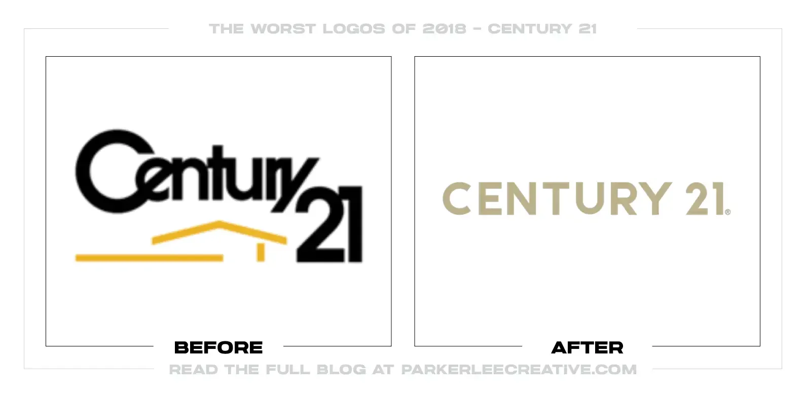
3. Century 21
Why Did the Logo Change?
Century 21 wanted to shake off a dated real-estate image and support a new “Defy Mediocrity” platform. MullenLowe replaced the familiar house-and-sun symbol with a minimal C21 monogram, muted the gold, and developed a more fashion-conscious system for agents and offices.
Why It Made the List:
• The old logo was cluttered, but it clearly signaled property and carried decades of recognition on yard signs. The replacement removes the house while preserving only fragments of the name. Century 21’s launch release frames that loss as sophistication.
• The C and 21 share strokes so aggressively that the monogram can look unfinished or misprinted. That ambiguity becomes more expensive across thousands of independently operated offices where signs are seen quickly from moving cars.
• Black and muted gold give individual agents a cleaner stage, but the visual language leans toward luxury regardless of market or property. A franchise system needs flexibility without implying that ordinary homes and first-time buyers are secondary.
The Tradeoff:
The redesign modernized a visibly aging system and created better templates for digital, social, and office use. The C21 shorthand can become familiar through repetition. The cost is a primary mark that withholds both the full name and its most useful category cue.
What Businesses Can Learn:
Before removing literal imagery, measure what it helps customers identify. Then test the new mark at driving speed, on inexpensive production, and through inconsistent local execution. A franchise logo must survive reality, not only the launch presentation.
4. Animal Planet
Why Did the Logo Change?
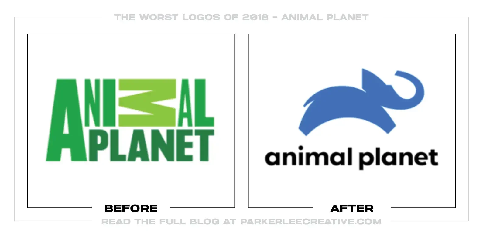
Animal Planet needed one identity that could work across countries, languages, broadcast packages, and digital services. Chermayeff & Geismar & Haviv replaced the awkward 2008 typographic M with a blue leaping elephant and a simpler lowercase wordmark.
Why It Made the List:
• Bringing back an animal is strategically sensible, but the drawing is ambiguous. Its reduced body, raised trunk, and unusual angle have been read as a dog, puppy, or abstract blob. LogoWatch’s contemporary review captures the identification problem directly.
• An elephant represents wildlife, yet it narrows a channel about the complete animal world to one familiar safari icon. Without the name, the mark could belong to conservation, a zoo, a children’s product, or an insurance company.
• The wider on-air system crops and animates the elephant effectively, but those treatments make the logo package more interesting than the static symbol. A primary mark should not require motion to clarify which end of the animal the viewer is seeing.
The Tradeoff:
The new identity is far more coherent and globally deployable than the previous sideways M, and the elephant has warmth. Its simplicity gives broadcast designers useful material. The missed opportunity was a clearer silhouette with a broader relationship to the channel’s subject.
What Businesses Can Learn:
Test an abstracted symbol with people who have not read the brief. Ask what they see first, then show it small, in one color, and without the name. If the intended object appears only after explanation, refine the silhouette before building the system around it.
5. Celine
Why Did the Logo Change?
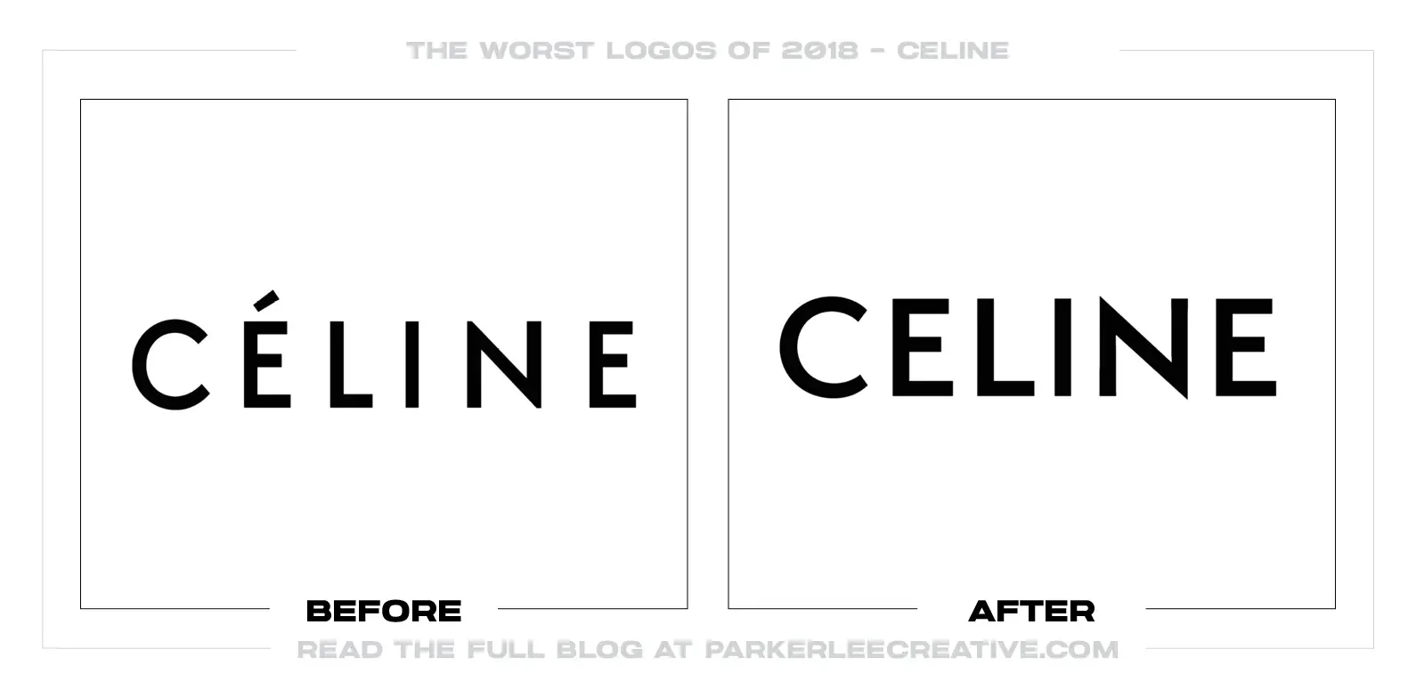
Hedi Slimane introduced a new Celine logo as he took creative control of the fashion house after Phoebe Philo. The redesign removed the accent from Céline, tightened the spacing, and referenced a version of the wordmark used during the 1960s.
Why It Made the List:
• Removing the accent made the name easier to reproduce internationally, but it also discarded a distinctive detail customers associated with the house. W Magazine’s launch report records how quickly that tiny change became the symbol of a much larger cultural break.
• The all-caps sans serif treatment joins a long line of luxury fashion houses using similar typography. Precision and spacing are strong, but at a glance the wordmark does little to distinguish Celine from the category Slimane had already helped shape at Saint Laurent.
• Erasing the Instagram archive before revealing the logo amplified the message that the Philo era was being replaced rather than evolved. Public reaction was not only about an accent; it reflected anxiety that a valuable point of view was being standardized.
The Tradeoff:
The design is based on Celine history, reproduces beautifully, and supported a commercially expansive new era. It is not badly drawn. It made this list because its most visible decisions carried more authorship from the incoming director than continuity for the brand’s audience.
What Businesses Can Learn:
A small typographic detail can hold disproportionate emotional equity. Before removing it, understand what customers believe it represents. A leadership change may require a new direction, but the identity should distinguish institutional history from one person’s signature style.
6. BuzzFeed News
Why Did the Logo Change?
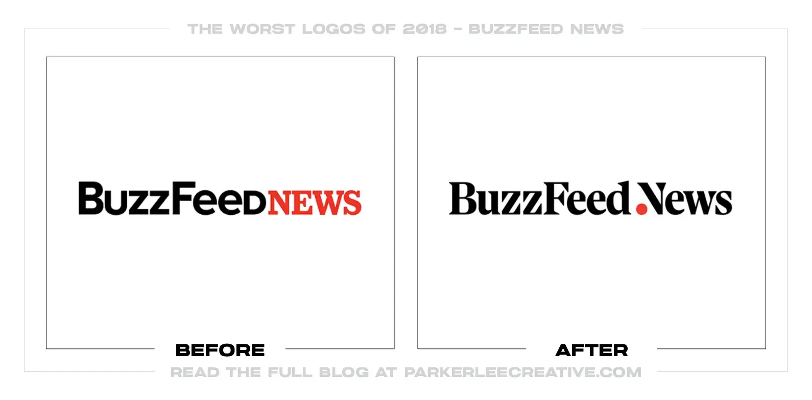
BuzzFeed News launched a standalone website to clarify that its investigative and breaking-news operation was distinct from the parent company’s entertainment content. The new identity introduced a black serif wordmark, a red punctuation-like device, and the line “Reporting to You.”
Why It Made the List:
• The redesign overcorrects for credibility by borrowing the conventional visual language of legacy newspapers. AIGA Eye on Design’s review notes how sharply the restrained serif name departs from BuzzFeed’s familiar red, sans-serif energy.
• A red detail inside the wordmark provides a small bridge to the parent brand, but it is too subtle to reconcile two opposing identities. Readers arriving from social media may see an unfamiliar news outlet rather than a clearly differentiated part of BuzzFeed.
• The scrolling Trending News Bar acknowledges how people encounter stories across sources, yet it competes with the masthead for attention. The most original part of the system behaves like interface furniture instead of strengthening the primary signature.
The Tradeoff:
Serif typography creates useful editorial hierarchy, and the separate site gave serious reporting room to breathe. BuzzFeed News needed distinction. The issue is assuming that visual restraint produces trust while leaving behind the irreverence that could have made its journalism identity unmistakable.
What Businesses Can Learn:
When a sub-brand needs credibility, do not reach automatically for category conventions. Identify which parent assets support trust, which create confusion, and what the sub-brand uniquely believes. Differentiation works best when the relationship remains visible.
7. Qualcomm
Why Did the Logo Change?
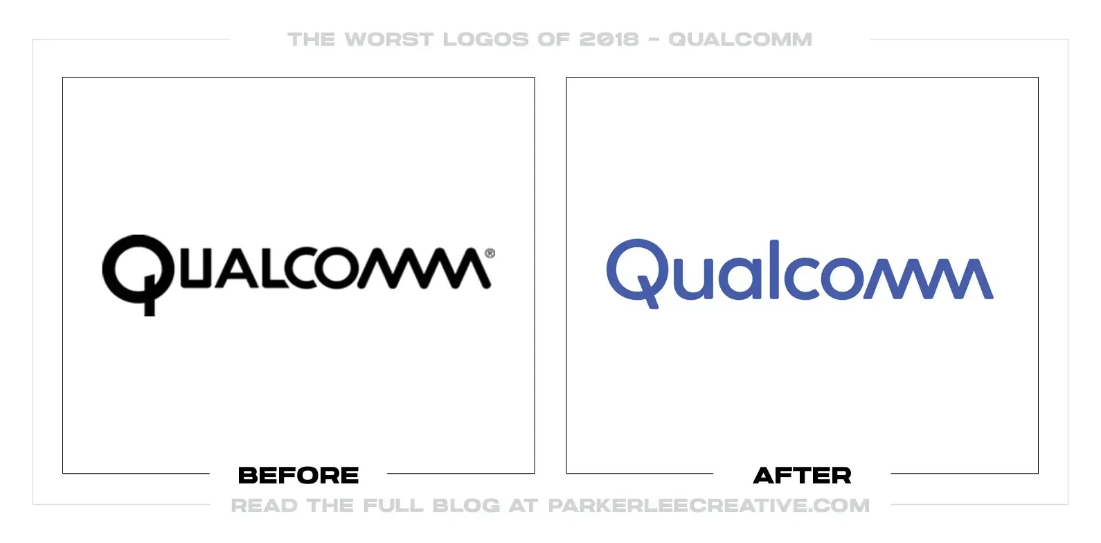
Qualcomm was preparing for 5G while extending its technology into automotive, connected devices, computing, and other categories beyond phones. Its 2018 identity introduced a custom mixed-case wordmark and a more prominent Q intended to unify a complicated portfolio.
Why It Made the List:
• The custom lettering adds cuts, joins, and geometric details that compete rather than form one clear construction rule. The result looks engineered, but several letters ask to be noticed at once, making the name less effortless to read.
• The standalone Q is compact, yet its circular form and detached tail can resemble a power button, search icon, or generic technology glyph. A documented history of the 2018 redesign connects the work to Interbrand and the company’s effort to pull Snapdragon recognition toward the parent brand.
• That architecture problem remains unresolved. Consumers recognize Snapdragon while Qualcomm operates across business-to-business relationships, and a visual resemblance cannot by itself explain when each name should lead or how their product families fit together.
The Tradeoff:
The new system is cleaner than the old all-caps signature and feels appropriate for a company entering a major technology transition. The Q works well as a compact corporate endorsement. The weakness is typographic complexity where the portfolio needed verbal clarity.
What Businesses Can Learn:
Do not ask a logo to solve brand architecture silently. Define the relationship among company, product, platform, and ingredient brands in words first. Then give the identity one repeatable visual rule rather than several details competing to express innovation.
8. Melbourne Storm
Why Did the Logo Change?
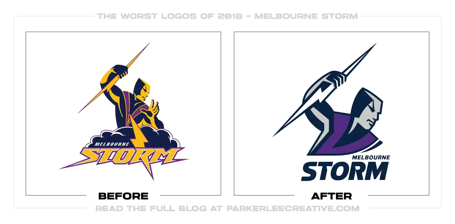
Melbourne Storm introduced a special twentieth-anniversary mark for the 2018 season, then revealed another evolution for 2019. Both versions retained the Storm Man and lightning bolt while WiteKite adjusted the drawing, typography, and purple, navy, and gray palette.
Why It Made the List:
• Two closely related logo launches within roughly a year make the transition harder to understand. The NRL’s 2018 announcement calls the second mark a natural evolution, but supporters still had to learn which version was permanent.
• The Storm Man, ball, lightning bolt, shield, wordmark, and layered outlines create a dense signature. These elements carry history, yet together they lose clarity on jersey embroidery, broadcast graphics, and small merchandise.
• Purple remains a strong and ownable club color, but navy and gray reduce its impact. The palette feels more severe while the detailed mascot still belongs to a highly illustrative sports-logo tradition, creating tension rather than a clean evolution.
The Tradeoff:
The redraw preserves the club’s distinctive character and avoids the generic shield-and-initial solution common in sports. Supporters can still identify the Storm Man immediately. The problem is that preservation was treated as keeping nearly every component.
What Businesses Can Learn:
Heritage does not require equal emphasis for every historic detail. Rank the assets fans recognize, choose a primary silhouette, and move supporting elements into secondary marks. Plan anniversary and permanent identities together so the handoff feels intentional.
9. Miami Marlins
Why Did the Logo Change?
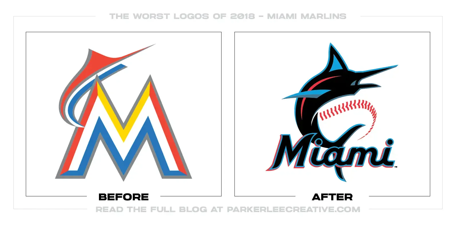
The Miami Marlins introduced a new logo, uniforms, and colors after the ownership group led by Bruce Sherman and Derek Jeter took control. The identity replaced the bright orange-era M with a black-based system using Miami Blue, Caliente Red, Slate Gray, and a leaping marlin.
Why It Made the List:
• The color names promise Miami energy, but the primary mark places thin blue and red strokes against black, where much of that energy disappears at normal viewing size. MLB’s launch report explains the local inspiration more clearly than the logo displays it.
• The marlin and baseball seam are rendered with fine, sweeping lines that look elegant in a presentation but become fragile on caps, broadcasts, and small merchandise. The fish is least visible in the applications where a team symbol should be fastest.
• Moving away from the loud 2012 identity was understandable, yet the new palette also pushed aside the teal equity fans connected to the franchise’s Florida history. The result feels darker and safer during a period when ownership was already asking supporters to accept major change.
The Tradeoff:
The custom lettering is more refined, the marlin has graceful motion, and the system avoids cartoonish tropical clichés. It can look excellent at large scale. The trade is visibility: the identity’s most locally specific colors and its central animal are too restrained to lead.
What Businesses Can Learn:
Test a sports identity from the cheap seats, on television, and in one-color embroidery. A palette is not owned because it appears in a brand story. The important colors and shapes must remain visible under the exact conditions fans will encounter them.
10. USL
Why Did the Logo Change?
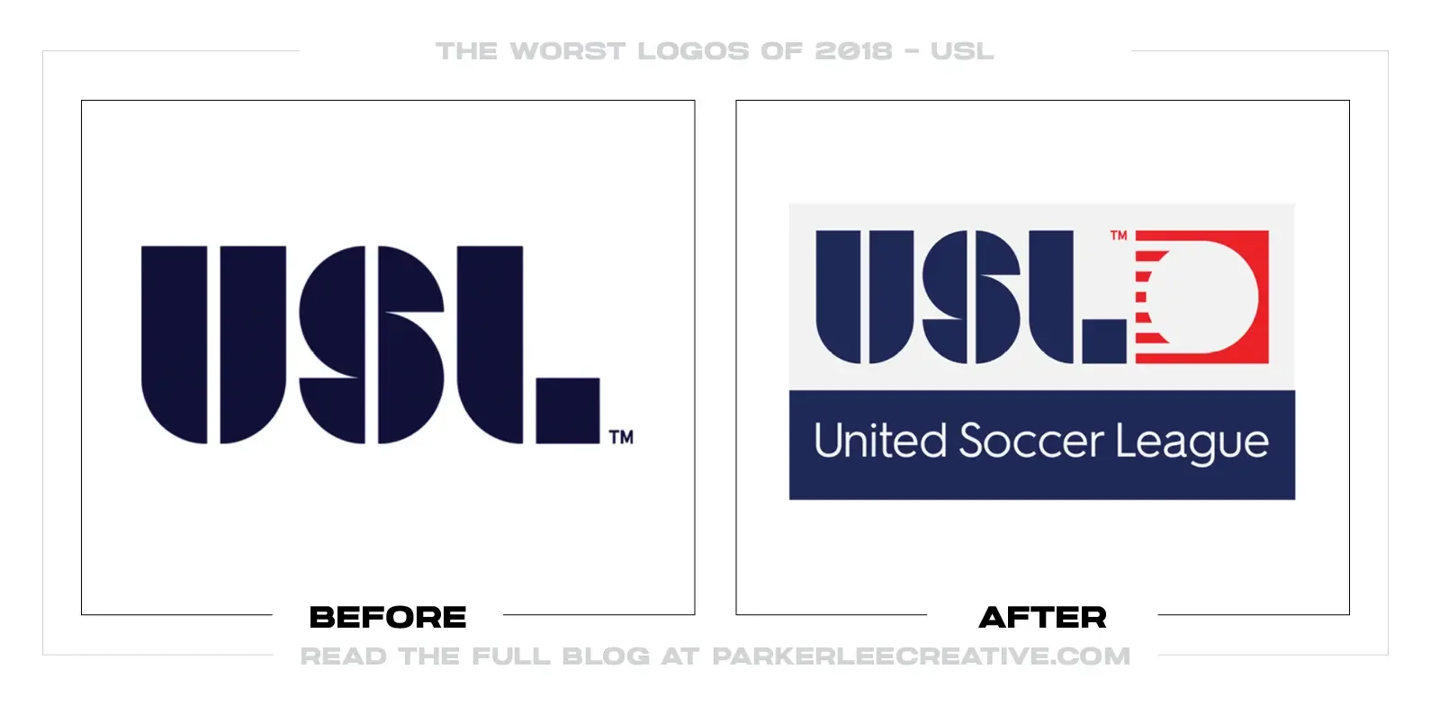
The United Soccer League reorganized around one USL master brand and three competition levels: USL Championship, USL League One, and USL League Two. The redesign introduced related black-and-white marks intended to make the expanding North American soccer structure easier to understand.
Why It Made the List:
• The architecture is rational on an organization chart but awkward in language. “USL Championship,” “League One,” and “League Two” borrow European hierarchy without matching the wider American league system, making status harder for casual supporters to decode.
• The league marks share a clean geometric vocabulary, yet the differences among them are modest. USL’s official structure announcement explains the roles in paragraphs that the names and symbols cannot communicate quickly.
• Black-and-white consistency gives clubs room to lead with local color, but it also makes the organizing brand feel anonymous. A rapidly growing soccer organization needed a recognizable endorsement, not only neutral labels for its divisions.
The Tradeoff:
The redesign brought valuable order to a fragmented set of leagues and created a system that can extend. The shared marks reproduce well beside dozens of club identities. The cost is a naming and visual hierarchy that feels imported rather than naturally understood.
What Businesses Can Learn:
Brand architecture must be tested in conversation, search, standings, broadcasts, and customer service—not only diagrams. Ask unfamiliar people to explain the levels back to you. If the system needs repeated narration, naming should be solved before visual consistency.
What the Worst Logos of 2018 Have in Common
The weakest choices were not simply ugly marks. They created distance between what the organization was and what the identity communicated. TRVL kept a travel promise while changing the programming. BuzzFeed News borrowed seriousness rather than defining its own. USL organized its leagues without making the hierarchy natural to say. Qualcomm expected visual details to clarify an architecture problem.
Several projects also confused simplification with improvement. US Open gained production clarity but lost some stature. Century 21 removed its category cue. Animal Planet replaced a bad old mark with an ambiguous new animal. Celine and the Marlins demonstrated how a tiny detail or familiar color can carry more customer equity than leadership expects.
For the stronger side of the year, read The 10 Best Logos of 2018. That list examines identities that protected recognition, solved operating problems, and gave their organizations useful room to grow.
Logos and trademarks are the property of their respective owners and are shown for identification, commentary, and criticism. No endorsement or affiliation is implied.
Thanks for Reading The 10 Worst Logos of 2018
Thanks for reading our annual Worst Logos of the Year article. It really means a lot to me. I also want to thank every designer, studio, in-house team and client who brought this year’s work to life. I may have opinions about the results, but this series would not exist without people willing to take creative risks in public.
For the other half of this year’s series, read The 10 Best Logos of 2018. You can also browse the blog for earlier Best and Worst Logos of the Year articles and more logo design reviews.
Does your business need a new logo? We provide logo design and brand identity services for businesses that need something new or have outgrown what they already use. Fill out the form below and tell us your story. We would love to help forge a new identity for your brand that connects with the people who matter.
