
Welcome to The 10 Best Logos of 2018, one of two articles in my annual Best and Worst Logos of the Year series. Every year, I look back at the rebrands that caught my attention and share what businesses can learn from them. Here, we are going to take a look at some of this year’s strongest work. Looking for The 10 Worst Logos of 2018? Read the companion article to learn about rebrands that may have missed the mark.
Below, I break down The 10 Best Logos of 2018. For each one, I look at why the business rebranded, where the new identity succeeds, what it gives up, and what your business can learn before starting a rebrand of its own.
A quick note before I get into the list: I have respect for every designer, studio, in-house team and client represented here. Putting a new identity into the world is hard. These reviews focus on the finished work, but the point is not criticism for criticism’s sake. This series is here to help business owners and brand teams understand why companies rebrand, learn from the choices behind the work and make better decisions when it is their turn. The entries are numbered to make the article easy to follow, but they are not presented in any particular order. Design is subjective, and I do not expect everyone to agree with every choice. That is part of what makes these articles fun to write and discuss.
But when it does come time for you to discuss a new logo, Parker Lee Creative is an award-winning, independent creative studio specializing in logo design and brand identity. We help businesses build new identities and refresh the ones they have outgrown. Our process starts with what the logo needs to communicate, then tests the work everywhere customers will see it. If you are considering a rebrand, contact us and tell us your story. We would love to help you create something worthy of next year’s Best Logos of the Year article.
1. American Express
Why Did the Logo Change?
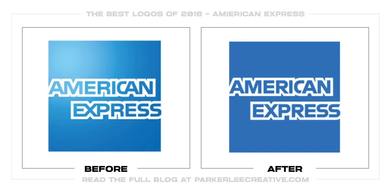
American Express needed one coherent identity for cards, travel, merchants, mobile products, advertising, and an increasingly international business. Pentagram refined the Blue Box, redrew its lettering, and built a wider system around the idea of “Powerful Backing.”
Why It Made the List:
• The redesign protects the Blue Box introduced in 1975 instead of replacing a symbol that already carries enormous recognition. Pentagram’s project account shows how carefully the familiar letters were reconstructed for clearer reproduction.
• A cropped AMEX wordmark gives the company a bolder asset for small screens, sponsorships, and places where the full Blue Box would feel formal or cramped. It expands the toolkit without pretending the shorthand is a separate brand.
• The identity solves practical hierarchy problems across consumer, merchant, and service communications. Stronger type, disciplined blues, illustration, and photography let American Express vary its tone while still looking like one organization.
The Tradeoff:
Most customers would struggle to describe what changed, and the cropped AMEX treatment can feel more fashionable than financial. That subtlety is also the point: the work improves performance without spending decades of recognition for a launch-day reaction.
What Businesses Can Learn:
A valuable logo does not need to look new to work better. Audit where the existing mark fails, redraw what production has weakened, and add only the assets the business actually needs. Maintenance can be more strategic than reinvention.
2. Mailchimp
Why Did the Logo Change?
Mailchimp had grown from an email tool into a broader marketing platform, while its product and brand experience had begun moving in different visual directions. COLLINS and Mailchimp’s in-house team created a system with enough order to support that growth without sanding away its personality.
Why It Made the List:
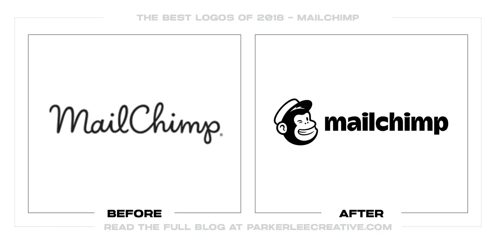
• Freddie remains the central symbol, redrawn with a weight that can finally sit beside the wordmark. Mailchimp’s launch explanation is unusually clear about protecting the weird, lovable equity customers already knew.
• Replacing the delicate script with a sturdier wordmark makes the name easier to use across product screens and campaigns. Changing “MailChimp” to “Mailchimp” also treats the name as an established brand rather than a literal description of a mail-delivering chimp.
• Cavendish yellow, Cooper Light, candid photography, and rotating hand-drawn illustration create controlled variety. The pieces are intentionally imperfect, but the color, typography, and editorial structure keep the system from becoming random.
The Tradeoff:
The old script had charm, and the new ingredients can look chaotic when teams copy the surface without understanding the rules. Expressiveness requires stronger art direction than a conventional software identity, especially as contributors and channels multiply.
What Businesses Can Learn:
Consistency is not making every asset look identical. Decide which elements must stay fixed, which can change, and what idea holds the variation together. A recognizable system can leave room for surprise without losing control.
3. Rotten Tomatoes
Why Did the Logo Change?
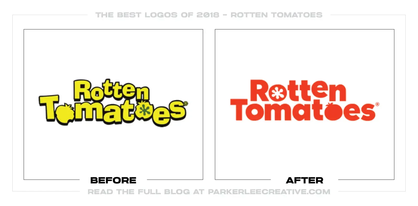
Rotten Tomatoes had spent nineteen years becoming a familiar shorthand for movie opinion while its logo, rating icons, and website evolved unevenly. The 2018 refresh rebuilt the tomato, splat, and Tomatometer language as one family for editorial, video, social, and mobile use.
Why It Made the List:
• The new tomato keeps the brand’s immediate category cue while gaining a clearer silhouette and more expressive face. Adweek’s launch coverage documents the first major visual overhaul in the site’s history.
• Fresh and rotten ratings become parts of the same drawing system rather than unrelated clip-art badges. That consistency matters because customers often encounter the icons on posters, streaming screens, and search results without the full wordmark.
• The identity understands that Rotten Tomatoes is both a utility and an entertainment publisher. Chunky lettering and imperfect forms feel opinionated, but the scoring hierarchy remains simple enough to scan quickly.
The Tradeoff:
Cleaning up the drawings removes some of the odd early-web character that made the brand feel scrappy. The system also has to work hard to distinguish editorial voice from the authority audiences sometimes assign to a numerical score.
What Businesses Can Learn:
If customers use several symbols to navigate a product, redesign them as a family. Match their construction, scale, tone, and behavior, then test whether each one still communicates alone. The logo cannot repair a fragmented icon system by itself.
4. Rolling Stone
Why Did the Logo Change?
Rolling Stone was reconsidering its print magazine after Penske Media became its majority owner. A larger trim size, heavier paper, new editorial structure, and a refined logo were meant to restore the publication’s physical presence without abandoning its rock-and-roll history.
Why It Made the List:
• The team treated the wordmark as brand DNA, not dated decoration. AIGA Eye on Design’s report records the early decision that replacing it outright would have been a mistake.
• Jesse Ragan’s redrawing clarifies spacing, serifs, and internal shapes while preserving the hand-lettered rhythm readers recognize. The result feels sharper at cover scale without turning Rolling Stone into another austere fashion masthead.
• The logo was judged as part of an editorial object. Its proportions work with more deliberate cover photography, fewer competing teases, and a format designed to feel collectible in an era of disposable feeds.
The Tradeoff:
The streamlined treatment loses some dimensional swagger, and later versions would revisit shading. A heritage masthead will always sit between preservation and performance; every cleanup risks removing the friction that made it memorable.
What Businesses Can Learn:
When a signature asset carries history, study its construction before modernizing it. Correct the parts that fail in current use, preserve the gestures customers recognize, and evaluate the mark inside the experience it is supposed to lead.
5. Uber
Why Did the Logo Change?
Uber needed a clearer identity after leadership upheaval, rapid global growth, and a 2016 symbol few riders could identify. Wolff Olins, the Uber brand team, and MCKL replaced the abstract “bit” icon with a direct wordmark and a system designed for mobility across languages and cities.
Why It Made the List:
• The new signature simply says Uber. After years of asking people to learn an unexplained symbol, that directness is useful. Fast Company’s report describes the nine-month process behind the wordmark and custom Uber Move typeface.
• Uber Move extends recognition into navigation, safety messages, driver materials, and product interfaces. The company does not have to place a logo beside every instruction because the typography carries a consistent voice.
• Black and white provide global consistency while locally commissioned imagery and Safety Blue handle context. The system makes room for different places without rebuilding the company’s visual identity country by country.
The Tradeoff:
A black sans-serif wordmark is not inherently distinctive, and the redesign can feel like retreat after the overexplained 2016 experiment. Its strength depends on disciplined typography, photography, and product behavior rather than a memorable standalone icon.
What Businesses Can Learn:
If customers cannot identify a symbol, simplicity may mean using the name. Build distinctiveness through the complete experience—type, color, language, imagery, and interaction—then add a symbol only when it improves recognition rather than complicating it.
6. Houzz
Why Did the Logo Change?
Houzz wanted its mark to communicate home more directly and perform better across app stores, partner badges, print, and digital layouts. Its design team worked with Paula Scher to simplify a three-dimensional architectural H into a brighter, flatter roofline form.
Why It Made the List:
• The new icon still reads as an h, but the angled top makes the home reference immediate. Houzz’s announcement explains the goal without inventing a complicated metaphor customers must be taught.
• Removing the three-dimensional folds produces a stronger silhouette at app-icon size and in one color. The brighter green also creates a more useful recognition cue against photography and marketplace content.
• Horizontal and stacked lockups give the identity practical range, while the redrawn wordmark is larger and easier to read. The update solves common placement problems instead of forcing every format around one rigid signature.
The Tradeoff:
Flattening the icon removes some architectural depth, and a roof-shaped letter is not exclusive territory. Houzz has to own the mark through consistent color, product presence, and repetition rather than relying on novelty.
What Businesses Can Learn:
A simplification should have a job description. Identify the formats, sizes, colors, and backgrounds causing trouble, then compare the old and new marks under those exact conditions. “Cleaner” is useful only when it produces measurable flexibility or clarity.
7. Affirm
Why Did the Logo Change?
Affirm was expanding its consumer shopping tools and needed an identity that felt approachable without hiding the seriousness of borrowing. Mackey Saturday redrew the wordmark and added a blue arc intended to express optimism and connect the name’s visual elements.
Why It Made the List:
• The wordmark is legible at small sizes, a critical improvement for checkout buttons, merchant pages, disclosures, and mobile interfaces. Affirm’s launch release ties the visual change to real product expansion.
• The arc gives the otherwise restrained name an ownable gesture without resorting to a credit card, dollar sign, or shopping bag. Its upward motion suggests possibility while remaining abstract enough to travel across categories.
• Black lettering gives financial information a stable foundation, while blue retains continuity with the earlier identity. The balance feels optimistic without pretending every purchase decision is lighthearted.
The Tradeoff:
An upward arc is a familiar financial and technology motif, and its meaning depends heavily on the company’s explanation. The flourish also needs careful spacing so it does not become a decorative eyebrow floating above the name.
What Businesses Can Learn:
In a trust-sensitive category, personality should support comprehension. Make the name readable first, preserve a useful cue from the old identity, and let one distinctive gesture add emotion without interfering with prices, terms, or decisions.
8. Rakuten
Why Did the Logo Change?
Rakuten needed one global signature across ecommerce, finance, communications, media, and sports partnerships. The 2018 wordmark introduced a red underline derived from the Japanese character for one, or ichi, and extended it into a new symbol for the group’s services.
Why It Made the List:
• The ichi line gives a global Roman-letter wordmark a specific connection to the company’s Japanese origin. Rakuten’s announcement connects it to a new start, speed, and a unified group rather than treating it as decoration.
• Replacing an isolated Circle R with a device drawn from the primary logo improves the relationship among parent and service brands. Apps can use a compact symbol without teaching customers an unrelated visual idea.
• The simple red-and-black construction travels across jerseys, screens, cards, stores, and dense marketplace environments. It is confident enough to remain recognizable without competing with the many products and partners it must endorse.
The Tradeoff:
The underline can look like emphasis added in a document, and the “one” meaning will not be obvious to many international customers. Ownership depends on scale, placement, and repetition across an unusually large portfolio.
What Businesses Can Learn:
A global identity does not have to erase where a company comes from. Find a culturally grounded idea that can survive simple geometry, then test whether it organizes the portfolio in practice. Meaning matters most when it improves the system.
9. Chicago Sky
Why Did the Logo Change?
The Chicago Sky had used the same identity since entering the WNBA in 2006. After moving games into Wintrust Arena, the team worked with David Day Associates on its first full redesign, introducing a more city-focused mark and adding black and gray to its blue and yellow.
Why It Made the List:
• The identity makes Chicago part of the story instead of treating “Sky” as a generic atmosphere theme. The WNBA’s official reveal documents a year-long process and the organization’s goal of representing the next generation of the team.
• Stronger geometry improves the logo’s performance on uniforms, center court, tickets, social avatars, and merchandise. The mark feels built for a professional sports system rather than adapted from an event illustration.
• Retaining blue and yellow provides continuity, while black and gray give the club more contrast and flexibility. The palette can feel unmistakably Sky without requiring every application to use the same bright combination.
The Tradeoff:
City references and circular sports badges occupy crowded territory, and darker colors can overpower the lightness suggested by the team’s name. The system has to keep blue and yellow visible enough to remain distinct within Chicago sports.
What Businesses Can Learn:
Local identity should do more than paste a landmark into a badge. Decide which civic cues supporters genuinely recognize, preserve the colors or symbols that already belong to the organization, and test the result everywhere fans will wear and see it.
10. Squarespace
Why Did the Logo Change?
Squarespace wanted its identity to express a more dynamic design platform and a stronger connection to New York. Its in-house team collaborated with DIA and type designer François Rappo to redraw the interlocking S, create Clarkson, and build a motion system around isometric space.
Why It Made the List:
• The sharper symbol keeps the layered S customers know while improving its relationship to an isometric grid. DIA’s project archive shows how the mark becomes a starting point for movement rather than a static stamp.
• Clarkson gives the company a proprietary typographic voice across product explanations, campaigns, and editorial content. Naming it after the headquarters address roots a digital platform in a real place without turning the logo into a skyline.
• Motion is structural, not an effect added after approval. Frames rotate, stack, and shift in a way that supports the square-and-space name while letting customer work remain the visual subject.
The Tradeoff:
Sharper corners make the symbol feel less friendly, and a highly kinetic launch can imply more change than customers experience in the product. The system also requires governance so animation does not become constant movement for its own sake.
What Businesses Can Learn:
Design motion with the identity, not after it. Start with a behavior related to the name, product, or customer experience, then define the static frames, pacing, and reduced-motion alternatives that allow it to work across real channels.
What the Best Logos of 2018 Have in Common
The strongest 2018 redesigns did not share one style. They made good decisions about equity. American Express, Rolling Stone, Rotten Tomatoes, Houzz, and Chicago Sky kept recognizable ideas while rebuilding how those ideas worked. Mailchimp and Squarespace created systems with room for expression. Uber chose directness after an abstraction customers never learned. Rakuten used one small device to organize a sprawling portfolio.
Several also show why a logo must be judged in its operating environment. Affirm lives inside checkout decisions. Uber works in moving vehicles and urgent interfaces. Chicago Sky has to survive uniforms, broadcast, and merchandise. Squarespace needs to frame its customers’ work without overpowering it. The mark matters, but the system determines whether recognition holds.
For the opposite side of the year, read The 10 Worst Logos of 2018. That list examines projects where strategy, symbolism, hierarchy, timing, or execution created avoidable problems.
Logos and trademarks are the property of their respective owners and are shown for identification, commentary, and criticism. No endorsement or affiliation is implied.
Thanks for Reading The 10 Best Logos of 2018
Thanks for reading our annual Best Logos of the Year article. It really means a lot to me. I also want to thank every designer, studio, in-house team and client who brought this year’s work to life. I may have opinions about the results, but this series would not exist without people willing to take creative risks in public.
For the other half of this year’s series, read The 10 Worst Logos of 2018. You can also browse the blog for earlier Best and Worst Logos of the Year articles and more logo design reviews.
Does your business need a new logo? We provide logo design and brand identity services for businesses that need something new or have outgrown what they already use. Fill out the form below and tell us your story. We would love to help forge a new identity for your brand that connects with the people who matter.
