
Welcome to The 20 Worst Logos of 2020, one of two articles in my annual Best and Worst Logos of the Year series. Every year, I look back at the rebrands that caught my attention and share what businesses can learn from them. Here, we are going to take a look at some of this year’s rebrands that may have missed the mark. Looking for The 20 Best Logos of 2020? Read the companion article to learn about some of this year’s strongest work.
Below, I break down The 20 Worst Logos of 2020. For each one, I look at why the business rebranded, where the new identity falls short, what it gives up, and what your business can learn before starting a rebrand of its own.
A quick note before I get into the list: I have respect for every designer, studio, in-house team and client represented here. Putting a new identity into the world is hard. These reviews focus on the finished work, but the point is not criticism for criticism’s sake. This series is here to help business owners and brand teams understand why companies rebrand, learn from the choices behind the work and make better decisions when it is their turn. The entries are numbered to make the article easy to follow, but they are not presented in any particular order. Design is subjective, and I do not expect everyone to agree with every choice. That is part of what makes these articles fun to write and discuss.
But when it does come time for you to discuss a new logo, Parker Lee Creative is an award-winning, independent creative studio specializing in logo design and brand identity. We help businesses build new identities and refresh the ones they have outgrown. Our process starts with what the logo needs to communicate, then tests the work everywhere customers will see it. If you are considering a rebrand, contact us and tell us your story. We would love to help you create something worthy of next year’s Best Logos of the Year article.
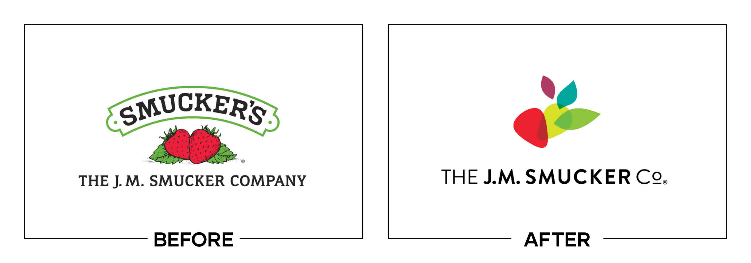
1. The J.M. Smucker Co.
Why Did the Logo Change?
The J.M. Smucker Co. had grown beyond jam into coffee, pet food, snacks, and household products. Its fruit-and-leaf seal no longer represented the portfolio, so the company introduced an abstract mark intended to signal connection and growth.
Why It Made the List:
The new symbol combines vague curved forms that the company connects to ingredients, relationships, and momentum, but none reads without explanation. Smucker’s announcement provides the strategy, while the mark offers little immediate meaning.
Removing the berries makes sense for a diversified parent company, yet the replacement abandons warmth and provenance without adding a more ownable idea. The symbol could suit healthcare, consulting, agriculture, or logistics just as easily.
The lowercase wordmark feels approachable, but its rounded neutrality does not match the authority of a company managing major consumer brands. Color supplies energy, while the core shape and typography struggle to build memory alone.
The Tradeoff:
The identity is easier to animate and broad enough for a portfolio. It also gives product brands room to lead. The problem is not abstraction itself, but choosing an abstract form with too many explained meanings and too little visual ownership.
What Businesses Can Learn:
A parent-company logo does not need to illustrate every product, but it still needs one focused idea. Write the meaning in a sentence, remove explanations that compete with it, and test whether a viewer can describe the symbol after one glance.
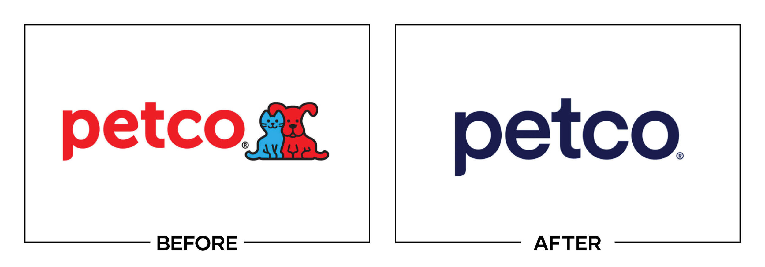
2. Petco
Why Did the Logo Change?
Petco was repositioning itself as a health and wellness company for pets, supported by expanded veterinary care and the end of electronic shock-collar sales. The redesign introduced a plain blue wordmark and removed the red cat-and-dog mascots.
Why It Made the List:
Ruff and Mews connected the Petco name to pets before a customer read a single word. Removing them left a clean but ordinary retail signature. Petco’s launch release explains the stronger wellness strategy better than the logo in stores.
The lowercase geometric letters resemble many services and direct-to-consumer startups, offering little category or emotional distinction. A health position did not require making a business built around animals feel clinically anonymous.
Blue is practical for healthcare credibility, but dropping red and the mascots removed the most memorable parts at once. Store signs can rely on the Petco name, while app icons, social avatars, and small sponsorships lose a visual shortcut.
The Tradeoff:
The wordmark is legible and easier to reproduce than the mascot lockup. It may feel calmer beside veterinary services. A stronger solution could have simplified Ruff and Mews without treating pet character and medical credibility as opposites.
What Businesses Can Learn:
When repositioning, separate the equity that causes the problem from the equity that looks old. Update the tone and execution, but preserve any symbol that explains the category, carries affection, or helps customers recognize the business.

3. Dave & Buster’s
Why Did the Logo Change?
Dave & Buster’s wanted a campaign and visual language centered on the lift of playing, eating, and winning. Mother Design replaced the familiar arcade-like badge with a stretched wordmark built to flex through energetic campaign graphics.
Why It Made the List:
The prior circular badge behaved like an arcade button and carried venue recognition. The new condensed lettering removes that game cue. The company’s campaign release describes a lively platform, but the logo alone feels oddly restrained.
Distorted letter sizes create movement in large advertisements, yet they make the two names less comfortable to read at small sizes. What looks playful across a wall can become cramped on a mobile offer, power card, or location listing.
Orange and blue preserve a familiar palette, while the graphic system has noise, depth, and energy. The issue is hierarchy: supporting effects deliver most of the arcade personality, leaving the primary signature dependent on its surroundings.
The Tradeoff:
The wordmark is more flexible than a fixed badge and can stretch across motion, photography, or immersive spaces. That versatility serves campaigns. It is less convincing as a sign customers need to identify from a road or shopping center.
What Businesses Can Learn:
A campaign identity can be loud, temporary, and responsive. A primary logo needs a steadier job. Test the mark without photography, motion, texture, or a tagline before deciding that the energy of the presentation belongs to the logo itself.
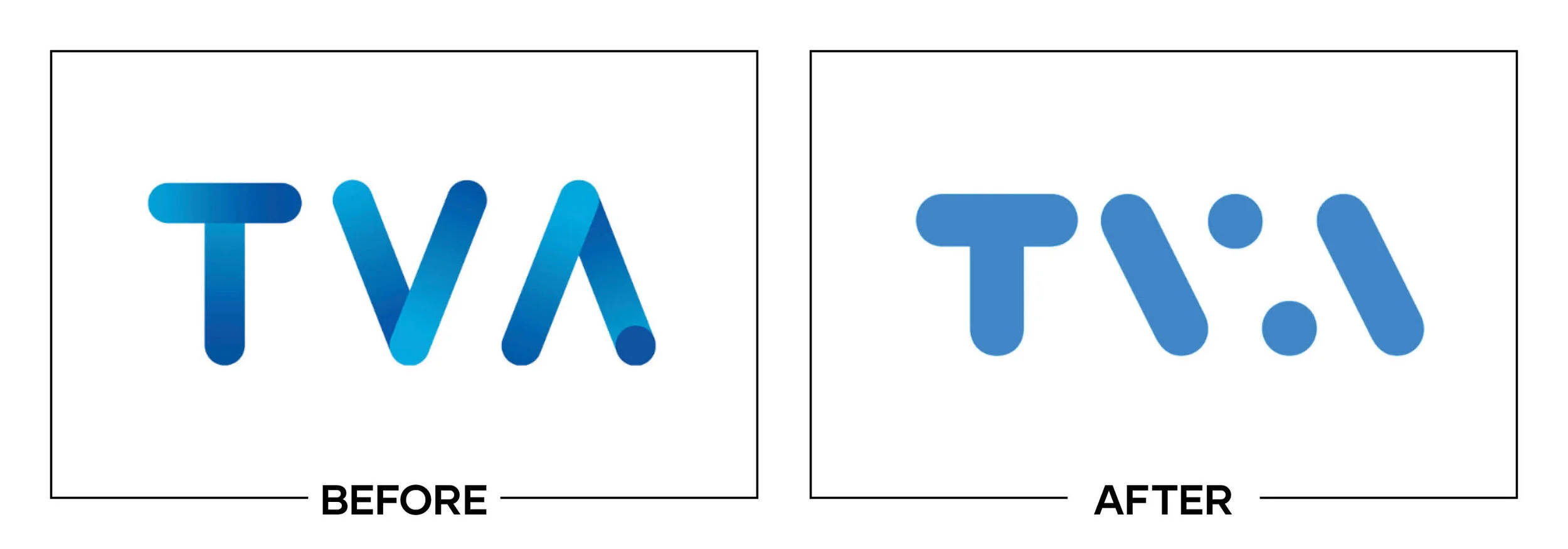
4. TVA
Why Did the Logo Change?
Quebec broadcaster TVA launched a digital platform and refreshed the network’s identity to create a unified experience across television, news, and online viewing. The update simplified its lettermark into a sharper geometric signature.
Why It Made the List:
The angular construction makes the T, V, and A share so much structure that the name takes extra effort to decode. TVA Nouvelles’ launch report explains the digital expansion, but a broadcast bug should identify the channel instantly.
A slanted line brings motion, yet it also makes the letterforms feel mechanically assembled. The mark gains contemporary polish while losing some of the visual warmth and straightforward readability associated with a mass-audience network.
TVA’s broadcast package can animate the geometry into energetic screens, which helps in promos and openings. Static uses such as listings, affiliate lockups, sponsorships, and social icons expose the logo’s compressed reading problem.
The Tradeoff:
The form is compact and suited to motion across television and digital. Shared angles give the package a consistent visual language. The missed opportunity was asking reduced letter shapes to carry recognition without enough separation.
What Businesses Can Learn:
Monograms have to be read before their construction can be admired. Show an unfamiliar viewer the mark for one second, ask what letters appeared, and test the smallest broadcast or interface size before investing in a motion system around it.
5. LL Flooring
Why Did the Logo Change?
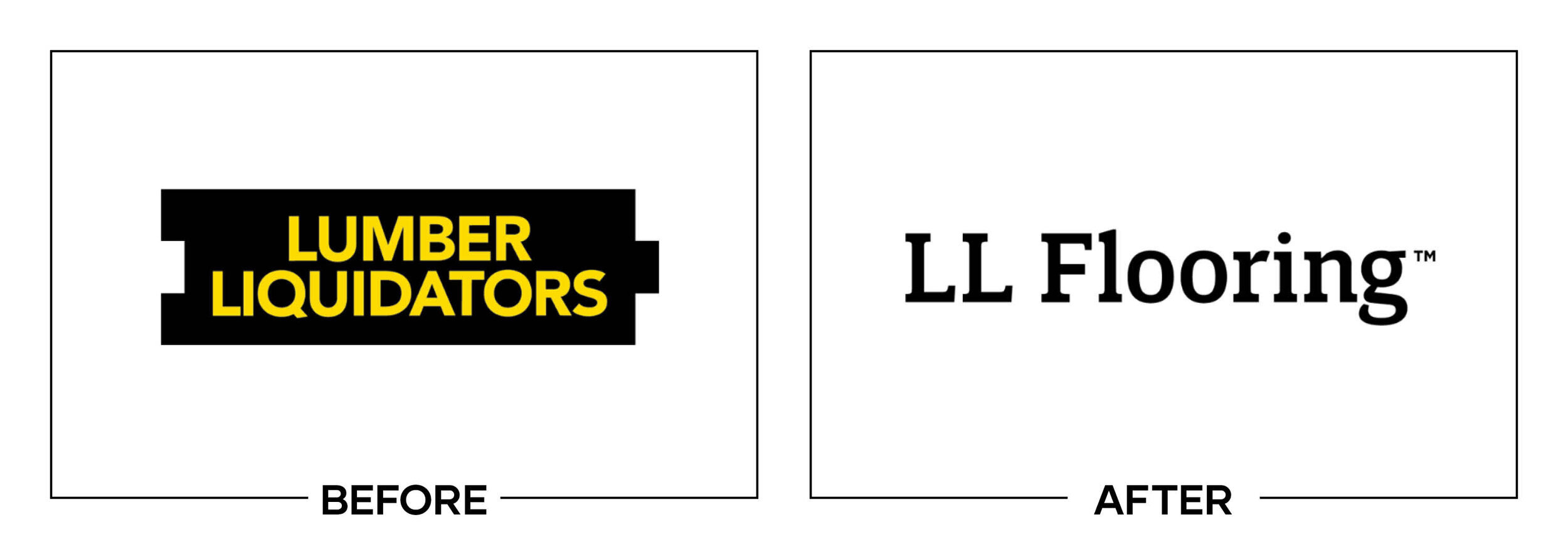
Lumber Liquidators adopted the customer-facing name LL Flooring as it expanded beyond hardwood and worked to leave earlier reputational baggage behind. The identity needed a broader category, a shorter name, and a cleaner retail presentation.
Why It Made the List:
“Flooring” accurately broadens the offer, but “LL” removes the familiar full name without creating a memorable replacement. Hardwood Floors’ report records the July launch and phased rollout across stores, digital channels, and advertising.
The red LL symbol resembles two bent planks, yet the mirrored geometry is easy to mistake for arrows, brackets, or a generic construction icon. It describes material vaguely without becoming a signature customers can name or sketch.
A short neutral name may reduce old associations, but it surrenders search and word-of-mouth clarity built over decades. After the 2024 bankruptcy sale, surviving stores returned to Lumber Liquidators, exposing the transition’s short life.
The Tradeoff:
The revised name covered vinyl, tile, laminate, and surfaces more accurately than Lumber Liquidators. The signage was easier to standardize. Those operational gains could not give two initials the recognition or character of the full name.
What Businesses Can Learn:
A shorter name can remove a constraint, but it may also discard the language customers remember and search. Measure recognition before abbreviating, model the cost of teaching the new term, and make sure the replacement earns the lost equity.
6. Cheshire Phoenix
Why Did the Logo Change?
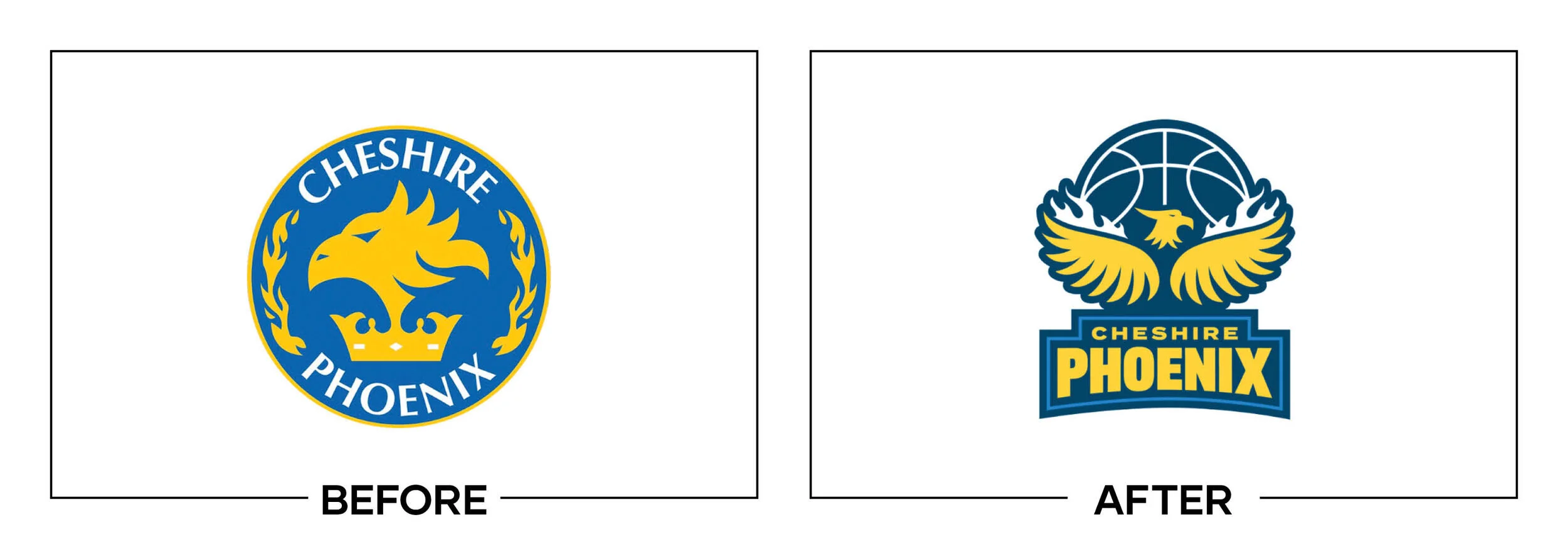
Cheshire Phoenix wanted to raise the profile of its men’s, junior, and wheelchair basketball programs with one identity. The club replaced a detailed flaming bird with an angular phoenix designed for merchandise, media, and league competition.
Why It Made the List:
The simplified bird is easier to reproduce, but its sharp blue and yellow pieces resemble a generic esports mascot. The club’s announcement explains the ambition to elevate British basketball, while the mark follows a crowded global style.
Flame, wing, head, and basketball cues compete inside a tight silhouette, making the phoenix difficult to parse at small sizes. The old mark had excess detail, but simplification should strengthen the central image rather than compress clues.
The custom wordmark adds cohesion to uniforms and social graphics, yet the crest could belong to almost any team named Phoenix. Cheshire receives little visual emphasis, leaving geography to supporting type and repeated local use.
The Tradeoff:
One identity across every team is an improvement, and the symbol is practical on merchandise. Its aggressive angles fit competition. The concern is distinction, not competence: the mark solves production while entering a mascot template.
What Businesses Can Learn:
Sports logos need more than aggression and clean vectors. Search the league, neighboring sports, esports, and merchandise categories for similar silhouettes, then build one local, historical, or verbal cue competitors cannot borrow.
7. AirAsia Digital Platform
Why Did the Logo Change?
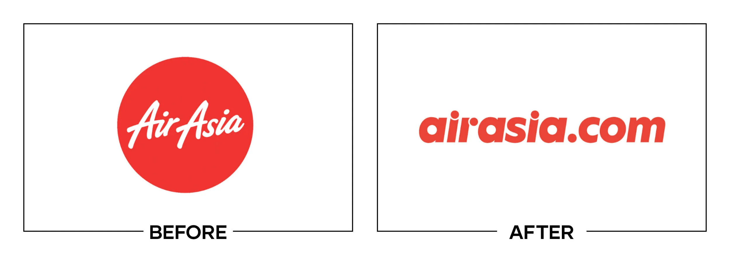
AirAsia.com was becoming a super app for travel, shopping, delivery, and financial services. The 2020 digital-platform identity adopted a lowercase italic wordmark to signal an offer broader than flights, without replacing the airline livery.
Why It Made the List:
The lowercase italic signature feels faster, but it weakens the hand-painted character associated with AirAsia’s airline wordmark. The company’s super-app release establishes the platform scope, which the logo barely communicates.
Using nearly the same name for an airline and a marketplace creates an architecture problem a typographic shift cannot solve. Customers must infer whether AirAsia refers to flights, food, shopping, payments, or the ecosystem from context.
Red preserves powerful recognition, yet the simplified script feels more like a temporary product label than a durable platform asset. The digital service was renamed AirAsia MOVE in 2024, replacing this identity after a relatively short run.
The Tradeoff:
Keeping AirAsia prominent gave the platform awareness and reduced the cost of launching an unknown name. The italic wordmark also worked cleanly in interfaces. Clarity suffered because borrowed airline equity had to explain too many services.
What Businesses Can Learn:
Before extending a trusted name into a new category, map how customers will distinguish the parent, product, and service. Typography can signal a difference, but naming and architecture must carry the distinction when the offers overlap.
8. Ottawa Senators
Why Did the Logo Change?
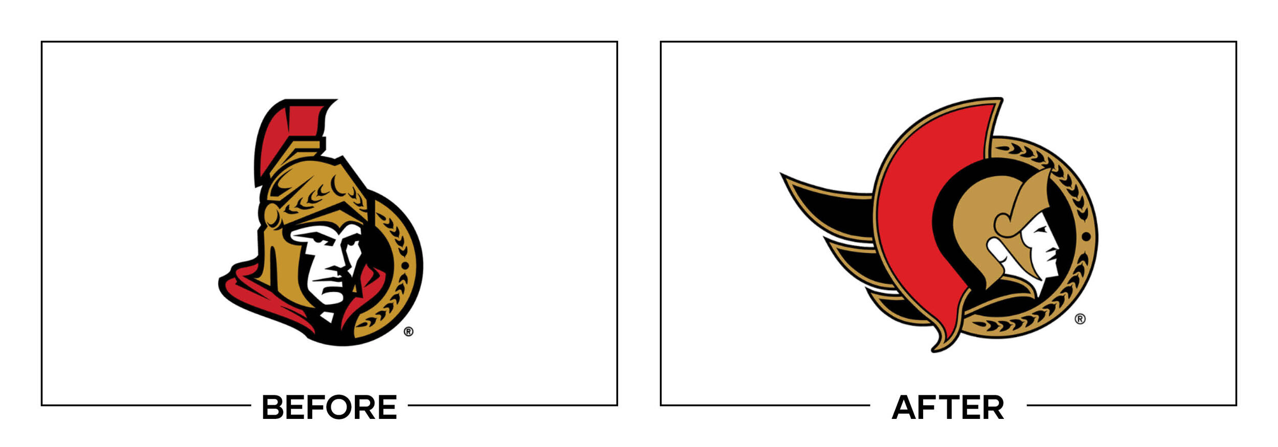
The Ottawa Senators restored an updated version of their original two-dimensional centurion after years of fan requests to move away from a three-dimensional profile. The club wanted to reconnect its uniforms and identity with its early NHL era.
Why It Made the List:
Returning to a symbol was sensible, but the redraw is so close to the 1992 mark that it feels more restored than reconsidered. The Senators’ announcement explains the history and research, while offering little evidence of a new visual idea.
The centurion remains recognizable, yet its helmet, face, cape, and circular frame create a dense patch at small digital sizes. A careful evolution could have preserved the profile while improving negative space, expression, and reduction.
Nostalgia solved an immediate relationship problem with supporters, but the club missed a chance to build a fuller Ottawa-specific language around the mark. The Roman theme still explains Senators broadly, not this city or current team.
The Tradeoff:
Fans received the identity many had requested, and the crest works better on jerseys than the previous three-dimensional head. Continuity has value. The ranking reflects the limited design ambition of the update, not the wisdom of listening.
What Businesses Can Learn:
Customer demand can identify an asset worth restoring, but restoration still deserves design rigor. Redraw for sizes, production, and context, then add a distinctive layer that moves the organization forward instead of stopping at familiarity.
9. Gmail
Why Did the Logo Change?
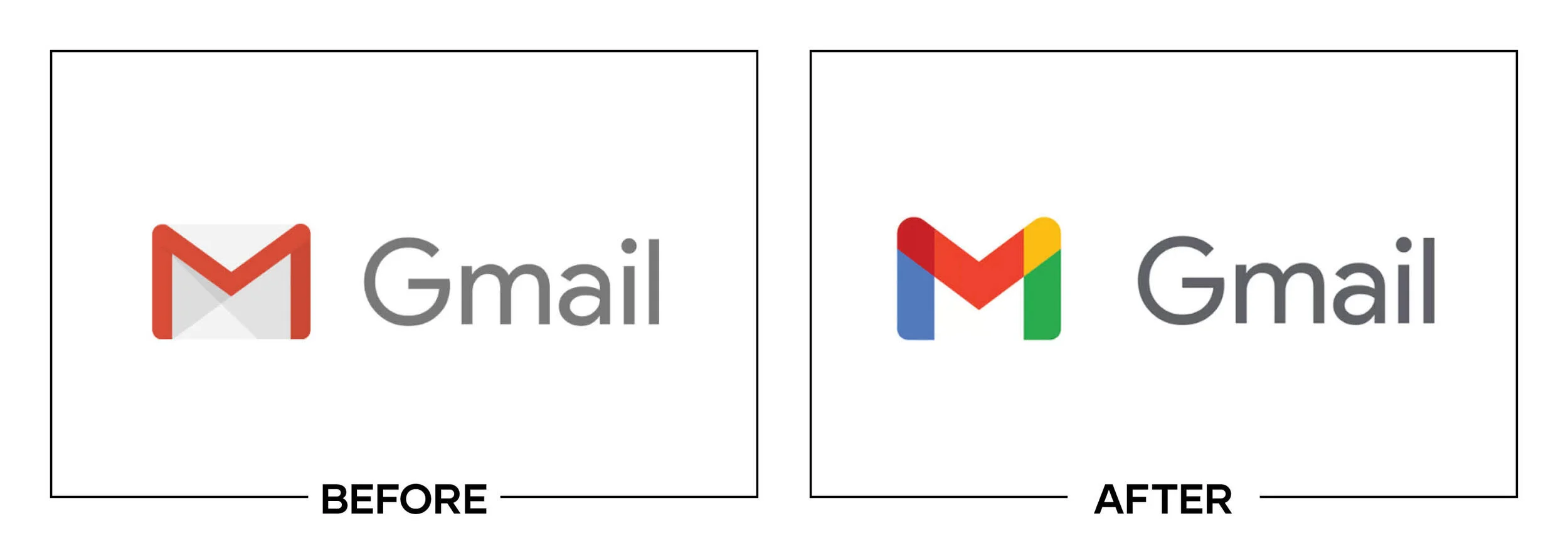
Google introduced Workspace as a more integrated suite spanning Gmail, Calendar, Drive, Meet, and productivity tools. Gmail’s envelope became a multicolor M so its icon would match the shared Google palette and signal closer product connection.
Why It Made the List:
The red envelope communicated email before the user read a label. The new M retains an envelope outline only indirectly. Google’s Workspace announcement explains integration, but the icon sacrifices a direct product cue for family resemblance.
Red, blue, green, and yellow now appear across several Workspace icons, reducing the color distinction that helped users scan a crowded dock or browser tab. Consistency at the portfolio level creates confusion at the product level.
Overlapping color segments become muddy at favicon size and in peripheral vision, exactly where Gmail is used most often. The mark looks polished when enlarged, but the interface test reveals slower recognition than the single red envelope.
The Tradeoff:
The multicolor family makes Workspace look coordinated and gives Google ownership across the suite. The Gmail M is also compact and clean. The problem is treating visual sameness as integration when each tool still needs rapid identification.
What Businesses Can Learn:
Portfolio consistency should not erase product wayfinding. Give related tools shared construction, type, or motion, but preserve a distinct silhouette or color for each item customers must locate quickly in a dock, menu, shelf, or dashboard.
10. Sailor Pen
Why Did the Logo Change?
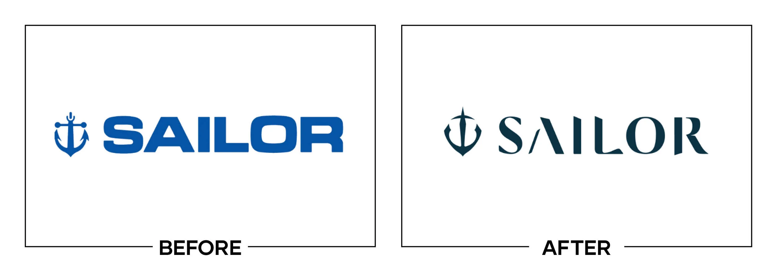
Sailor Pen introduced a new corporate identity ahead of its 110th anniversary, seeking to connect craft heritage with technology and Japanese aesthetics. The company retained an anchor motif, redrew the wordmark, and introduced Sailor Blue-Dawn.
Why It Made the List:
Keeping the anchor was the right strategic move, but the new version compresses it into a symmetrical geometric emblem. Sailor’s identity explanation supplies rich meaning about trust and hope that the reduced shape does not convey alone.
The symbol is technically refined, yet it can resemble a star, crest, or mechanical part before it reads as an anchor. Simplifying heritage becomes counterproductive when the object carrying that heritage is harder to identify on pens.
The redrawn wordmark references early company lettering and the blue has a story tied to Kure before dawn. Those strong supporting decisions expose the missed opportunity: the primary emblem feels less human than the craft it represents.
The Tradeoff:
The logo is reproducible and suited to engraving on pen components. It keeps a symbol with genuine company history. Greater optical clarity in the anchor could have preserved those production gains without turning recognition into a puzzle.
What Businesses Can Learn:
A heritage symbol can be simplified until its story disappears. Test the silhouette with people who have not heard the rationale, especially at the manufacturing size, and preserve the irregular details that make the object recognizable.
11. UScellular
Why Did the Logo Change?
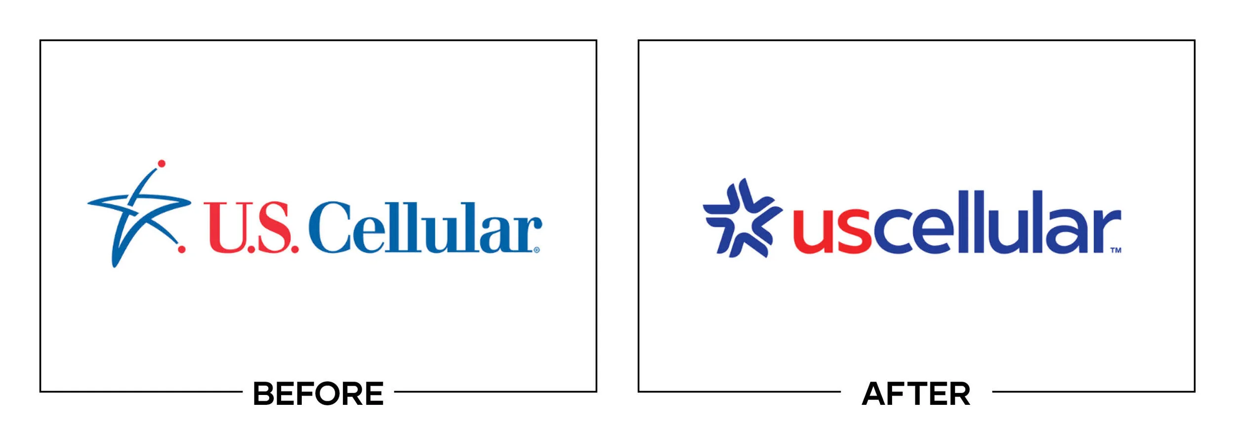
U.S. Cellular updated its name styling and identity to emphasize human connection and modern technology. The periods disappeared, “US” gained emphasis, and a cluster of red lines replaced the five-point star used by the carrier since 1999.
Why It Made the List:
Emphasizing “US” creates a useful message about community, but the typography makes the name read unevenly between the two parts. LBB’s project report explains the connection idea better than the lockup communicates it at a glance.
The burst is meant to show individuals joining for positive change, yet it also resembles a loading spinner, signal error, or broken asterisk. That ambiguity is especially risky for a wireless carrier whose customers notice network problems.
Red and blue preserve continuity, but the star’s crisp national and directional associations are gone. The wireless business was acquired by T-Mobile in 2025, while the remaining public company became Array Digital Infrastructure.
The Tradeoff:
Removing punctuation made the name more compact, and the new symbol is easier to animate than a fixed star. The human-connection strategy was sensible. The execution introduced an accidental technology metaphor that works against the service.
What Businesses Can Learn:
Search for unintended meanings before launch, especially in the category where the symbol will appear. A rotating burst may signal energy in one context and failure in another. Test motion, still frames, loading states, and error screens.
12. GrubStreet
Why Did the Logo Change?
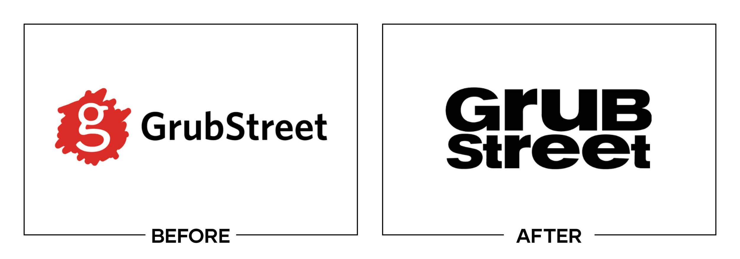
Boston writing center GrubStreet adopted a new stacked signature as it prepared for a creative-writing center and programming. The identity needed to welcome writers at different stages while working across education, events, and publishing.
Why It Made the List:
The stacked GRUB and STREET lettering creates a strong block, but spacing and shifting letter widths make the name feel less assured than the organization’s voice. The trademark record confirms first use on July 13 and documents the lockup.
“Center for Creative Writing” supplies essential category context, yet it becomes tiny under the oversized name. The hierarchy favors an unusual title while making the explanation hardest to read in social, event, and partner placements.
Expressive type is appropriate for a writing organization, but the primary signature has to support many genres and audiences. The irregular construction feels like one editorial voice imposed on a community built around varied voices.
The Tradeoff:
The bold stack is memorable in environmental applications and gives GrubStreet more presence than a conventional nonprofit wordmark. Contemporary project documentation is limited, so criticism is confined to the recorded mark and visible uses.
What Businesses Can Learn:
An unusual name may need its descriptor more than a familiar one does. Test the full lockup at the smallest partner and social sizes, then give category language enough weight to help a first-time viewer understand the organization.
13. Nissan
Why Did the Logo Change?
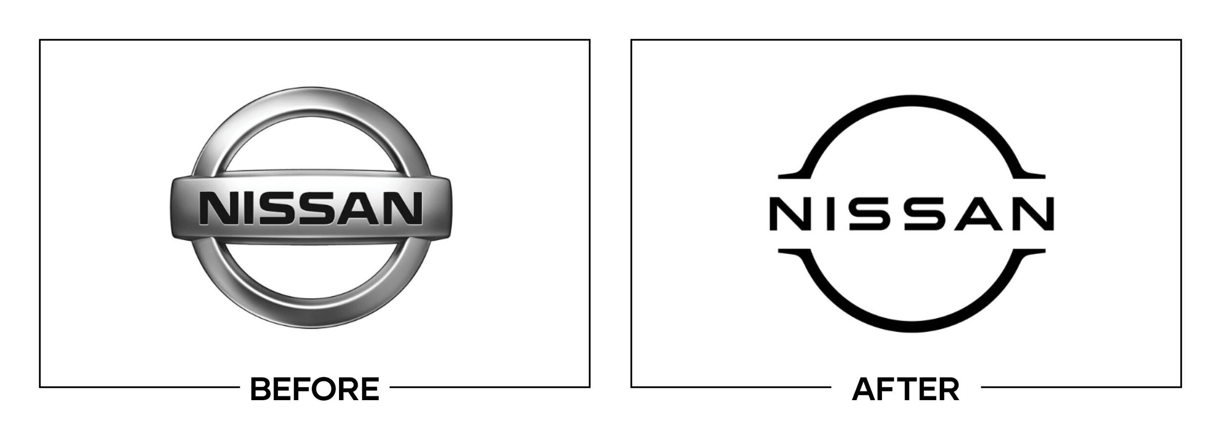
Nissan needed a mark designed for digital displays, illuminated vehicle surfaces, dealerships, apps, and an electric-product strategy. The company flattened its chrome badge, opened the circle, and refined the name within a lighter frame.
Why It Made the List:
Removing simulated chrome makes practical sense, but the extremely thin outer lines lose authority beside the heavy NISSAN wordmark. Nissan’s design story describes extensive testing, while the static balance still feels unresolved.
Opening the ring creates space and supports illumination, yet it weakens the strong badge silhouette built over decades. On a screen or sign without lighting, the mark can appear unfinished rather than intentionally open for drivers.
The central name remains recognizable, so the redesign did not abandon all equity. The unresolved issue was optical: a substantial frame could have delivered digital simplicity while retaining the weight expected from an automotive emblem.
The Tradeoff:
The mark adapts to animation, interfaces, and electric vehicles far better than a rendered metal badge. Its illuminated form can look elegant on a grille. The criticism applies to the thin static version, not the entire application strategy.
What Businesses Can Learn:
A logo may need different production forms, but each form requires optical balance. Test ink, pixels, light, metal, embroidery, and distance, then adjust line weight so the concept survives rather than forcing identical geometry everywhere.
14. Los Angeles Rams
Why Did the Logo Change?
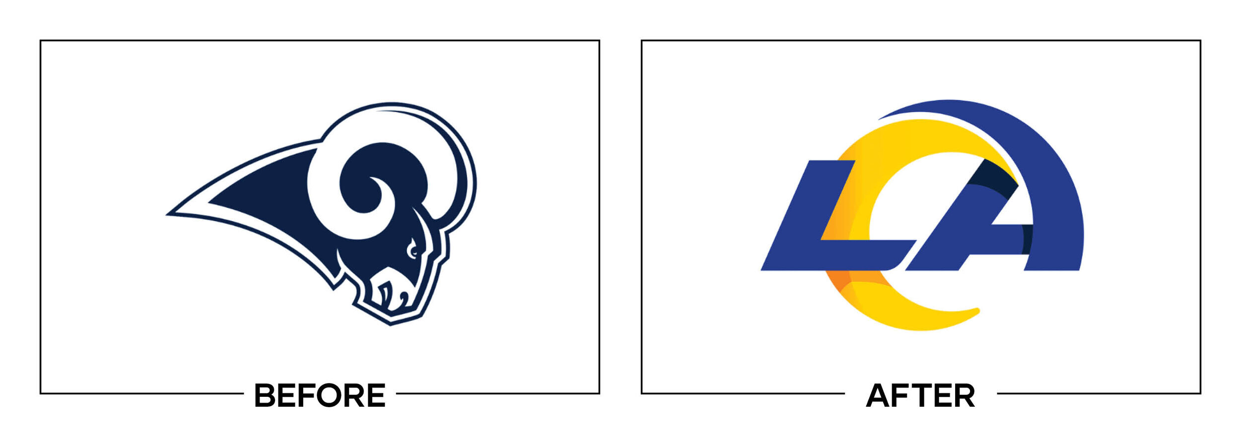
The Los Angeles Rams wanted an identity tied to their return, new stadium, and Southern California market. The primary mark became an LA monogram with a curling horn, supported by a separate ram head and brighter Royal and Sol colors.
Why It Made the List:
The horn inside the A is supposed to suggest a ram horn, football spiral, and ocean wave, but those ideas compete. The Rams’ announcement explains the construction, while many viewers first saw an unrelated lightning-like flourish.
Making LA dominant strengthens place, yet the monogram resembles a generic event or media logo more than a football team. The secondary ram head carries the animal, aggression, and sport more effectively than the designated primary mark.
Royal blue and Sol yellow restore energy and improve uniforms, merchandise, and stadium graphics. The strong palette proves that the wider identity has useful assets, which makes the weak primary-logo choice more frustrating at scale.
The Tradeoff:
The LA mark is compact, easy to place, and directly claims the market after the franchise’s return. It also animates well. A better hierarchy could have made the ram head primary and used the monogram as a location or stadium signature.
What Businesses Can Learn:
When a system contains several marks, assign prominence to the one that communicates fastest, not the one with the most hidden meanings. Test each candidate without explanation and compare what unfamiliar viewers see first in testing.
15. Molson Coors
Why Did the Logo Change?
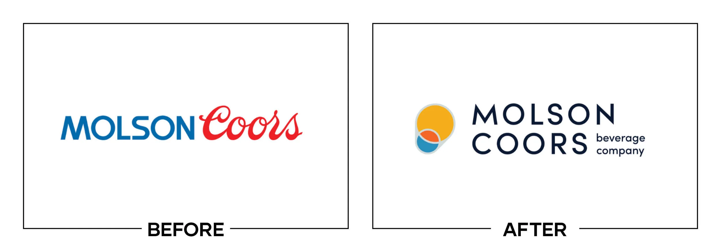
Molson Coors Brewing Company became Molson Coors Beverage Company as it reorganized and expanded beyond beer. The new corporate identity gave both family names equal weight and retained an evolved pint-glass cue from MillerCoors as a bridge.
Why It Made the List:
Equal prominence solves a political naming issue, but the thin uppercase wordmark feels more like a legal header than a beverage company. Molson Coors’ announcement explains the portfolio shift, while the type adds little character.
The abstract orange and blue pint is meant to connect heritage with an optimistic future, yet its circles can read as people, bubbles, or a diagram. Multiple interpretations do not automatically create a memorable symbol for customers.
Adding “Beverage Company” clarifies the strategic expansion, but it sits as a small line under an already light signature. The hierarchy makes the most important business change the least visible information at many practical sizes.
The Tradeoff:
The logo balances the Molson and Coors names, unifies the company after restructuring, and avoids favoring one product brand. Neutrality has value. The result still needed a warmer, more confident visual expression of beverage expertise.
What Businesses Can Learn:
Internal fairness can shape a merger or parent identity, but customers should not receive a committee diagram. Resolve naming politics first, then design one clear external idea with enough presence to represent the combined organization.
16. Shipt
Why Did the Logo Change?
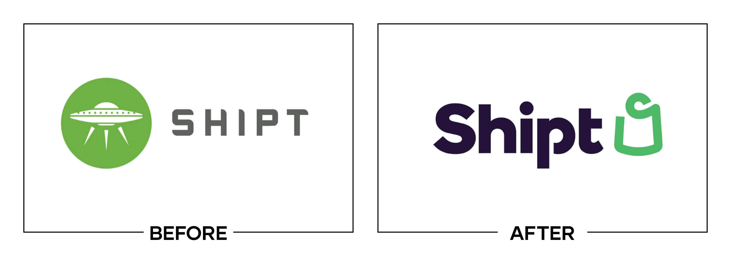
Shipt was expanding beyond grocery delivery into retail categories after Target acquired the service. The company replaced its playful spaceship with a green shopping-bag symbol intended to feel approachable, practical, and people centered.
Why It Made the List:
The spaceship gave an ordinary delivery category speed, surprise, and a direct tie to the Shipt name. The bag replacement explains shopping but not this company. Supermarket News’ report documents the broader retail strategy behind the change.
A bag is one of the most common retail and delivery symbols, appearing across stores, marketplaces, and pickup services. The small loop detail does not create enough ownership to replace an asset customers could already connect with Shipt.
Keeping green and the lowercase wordmark preserves some recognition, while the wider campaign feels friendly. The redesign solves category expansion by choosing a symbol so broad that it no longer gives the service a memorable point of view.
The Tradeoff:
The bag immediately communicates shopping and scales better than the detailed spaceship. It also works across grocery, electronics, and household goods. The clarity came at the cost of distinctiveness that competitors could not easily copy.
What Businesses Can Learn:
Literal category symbols help comprehension but rarely build ownership by themselves. If an existing metaphor is recognizable, broaden its meaning through message and behavior before replacing it with an icon every competitor can use.
17. Sonic Drive-In
Why Did the Logo Change?
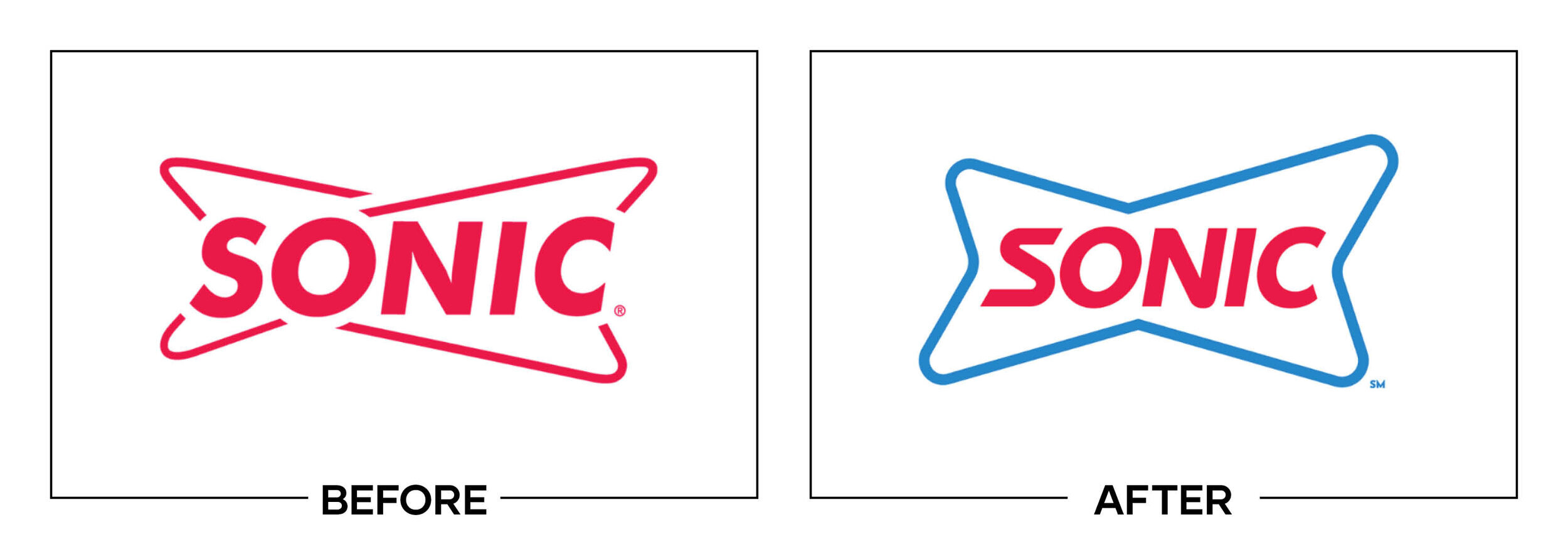
Sonic Drive-In wanted one identity for a more personal advertising platform and a redesigned restaurant experience. The refresh retained its red and blue double-delta arrows but flattened the enclosure and introduced condensed custom lettering.
Why It Made the List:
Keeping the double delta protects an asset tied to signs, movement, and history. The execution compresses the wordmark until the letters feel squeezed between the arrows. ChangeUp’s case study shows the restaurant concept behind the update.
Flattening the badge improves reproduction, yet it removes much of the midcentury roadside character that separated Sonic from ordinary fast food. The new shape feels sporty and efficient when the business experience is playful and leisurely.
Red and blue maintain instant recognition, and the restaurant prototype introduces color, canopies, and patio elements. Those environmental assets have more personality than the primary logo, which behaves like a cleaned-up sponsor lockup.
The Tradeoff:
The mark is bold, scalable, and easier to apply across screens and signs than the older outlined badge. Its horizontal shape suits a drive-in canopy. More breathing room and warmer lettering could have preserved those gains with greater charm.
What Businesses Can Learn:
Production problems can be fixed without stripping away the character customers associate with an experience. Identify which awkward detail hurts use and which awkward detail feels human, then simplify selectively instead of uniformly.
18. BMW
Why Did the Logo Change?
BMW introduced a flatter, transparent roundel for online and offline communications as part of a more open brand presentation. The 2020 design did not replace the physical badge on vehicles, a distinction lost in much early public reaction.
Why It Made the List:
Removing the black outer ring lets imagery or color show through, but it also removes the contrast that held the roundel together. BMW’s official clarification confirms this was a communications logo rather than a new vehicle badge.
Transparent space can feel flexible on a controlled photograph, yet the perimeter changes with every background. A premium signature should not become weaker, busier, or less recognizable because an image behind it has the wrong value.
The flatter blue and white center works well on screens and preserves the core quadrants. The issue sits around it: thin outlines and missing black reduce the visual weight that made the familiar badge feel complete and engineered.
The Tradeoff:
The mark is lighter, digital-ready, and capable of integrating with imagery. BMW retained the physical vehicle emblem, reducing the practical risk. The scope was sensible, but the transparent outer ring requires unusually careful art direction.
What Businesses Can Learn:
If a logo depends on transparency, test it across light, dark, detailed, and user-generated backgrounds. Define fallback containers and contrast rules before launch, and explain clearly whether a new mark replaces or supplements existing forms.
19. Skillshare
Why Did the Logo Change?
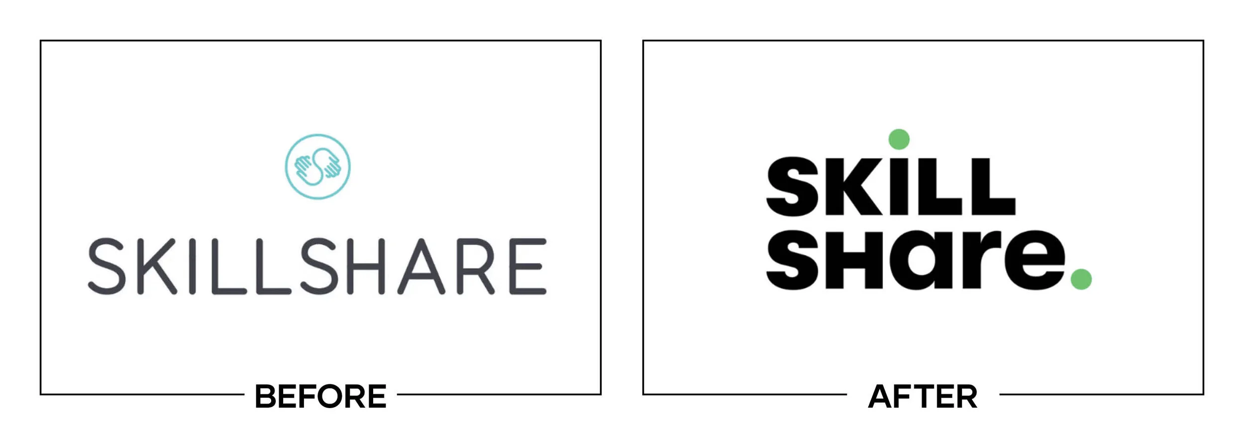
Skillshare entered its second decade with millions of learners and a creative-course community. The platform removed its joined-hands symbol, introduced a custom wordmark and Wander Green, and added lines meant to represent a creative journey.
Why It Made the List:
The symbol communicated people learning together, an idea for a community platform. The new wordmark carries no comparable concept by itself. Creative Review explains the creative-journey rationale, which lives mainly in supporting squiggles.
Unusual letter widths make the name recognizable, but shapes feel intentionally awkward without improving readability or meaning. The wordmark appears more like a typographic experiment than a confident signature for creative education.
Wander Green and the loose line system bring energy to lessons, campaigns, and social content. The strongest personality sits outside the logo, leaving the mark dependent on decorations that may not appear in an app icon or partner lockup.
The Tradeoff:
Its wordmark is more legible than a complex symbol-name lockup and works in one color. The broader system reflects exploration better than an education icon. The lost opportunity was turning that expressive idea into a stronger primary asset.
What Businesses Can Learn:
Supporting graphics can make a presentation feel original while the logo remains weak. Review the signature alone, at required sizes and without campaign devices, then decide whether the central idea belongs inside the mark or around it.
20. GoDaddy
Why Did the Logo Change?
GoDaddy wanted to move beyond the provocative advertising and cartoon character associated with its earlier growth. The company introduced the GO, a looping symbol intended to combine a G, O, heart, entrepreneur, and sense of possibility.
Why It Made the List:
The GO carries so many intended meanings that none becomes obvious. A viewer may see a heart, abstract person, or tangled loop before the initials. GoDaddy’s announcement explains the symbolism more clearly than the symbol can at first.
Rounded lettering softens a name that can sound aggressive, but the symbol and wordmark use different visual rhythms. The loose loop feels handmade while the heavy type feels compact, leaving the lockup less cohesive than either piece alone.
Teal gives the company distance from the orange and green of earlier identities and supports a helpful tone. The change in voice was necessary, yet an empowerment symbol does little to explain websites, domains, commerce, or business tools.
The Tradeoff:
The GO is friendlier than the former character and flexible enough for motion, illustration, and community stories. It gives the business a platform. The limitation is compression: a loop cannot visibly carry every strategic idea assigned to it.
What Businesses Can Learn:
A logo is not a container for every brand value. Choose the meaning customers should receive first, then let naming, copy, imagery, and experience express the rest. If the symbol needs a paragraph to decode, simplify the strategic brief.
What the Worst Logos of 2020 Have in Common
The weakest 2020 redesigns often solved a real strategic problem with a visually generic answer. Smucker, Molson Coors, and GoDaddy tried to express broad portfolios or missions through symbols burdened with explanations. Petco, Shipt, and Dave & Buster’s removed recognizable category or experience cues. Gmail and UScellular created avoidable interface associations.
Context also changes the verdict. BMW’s transparent roundel was a communications logo, not a replacement vehicle badge. AirAsia’s mark belonged to a digital super app, not the airline livery. LL Flooring later reverted after a bankruptcy sale, and the AirAsia platform became AirAsia MOVE. Fair criticism starts by identifying what was released, where it had to work, and what happened next.
For stronger decisions from the same year, read The 20 Best Logos of 2020. That list examines projects that protected useful equity, clarified a complicated offer, or built a practical system around one focused idea.
Logos and trademarks are the property of their respective owners and are shown for identification, commentary, and criticism. No endorsement or affiliation is implied.
Thanks for Reading The 20 Worst Logos of 2020
Thanks for reading our annual Worst Logos of the Year article. It really means a lot to me. I also want to thank every designer, studio, in-house team and client who brought this year’s work to life. I may have opinions about the results, but this series would not exist without people willing to take creative risks in public.
For the other half of this year’s series, read The 20 Best Logos of 2020. You can also browse the blog for earlier Best and Worst Logos of the Year articles and more logo design reviews.
Does your business need a new logo? We provide logo design and brand identity services for businesses that need something new or have outgrown what they already use. Fill out the form below and tell us your story. We would love to help forge a new identity for your brand that connects with your customers, tells your story, and lands you at the top of next year’s Best Logos of the Year article.
Legal Disclaimer: This content is provided for educational and informational purposes and is intended as commentary and criticism; all product names, logos, and trademarks are the property of their respective owners, and any copyrighted materials shown are used under the principles of fair use solely to identify the subjects discussed and to support analysis, with only the limited portions reasonably necessary displayed; no sponsorship, endorsement, affiliation, or partnership is implied, and nothing on this page constitutes legal, financial, or other professional advice.
