
Welcome to The 20 Best Logos of 2020, one of two articles in my annual Best and Worst Logos of the Year series. Every year, I look back at the rebrands that caught my attention and share what businesses can learn from them. Here, we are going to take a look at some of this year’s strongest work. Looking for The 20 Worst Logos of 2020? Read the companion article to learn about rebrands that may have missed the mark.
Below, I break down The 20 Best Logos of 2020. For each one, I look at why the business rebranded, where the new identity succeeds, what it gives up, and what your business can learn before starting a rebrand of its own.
A quick note before I get into the list: I have respect for every designer, studio, in-house team and client represented here. Putting a new identity into the world is hard. These reviews focus on the finished work, but the point is not criticism for criticism’s sake. This series is here to help business owners and brand teams understand why companies rebrand, learn from the choices behind the work and make better decisions when it is their turn. The entries are numbered to make the article easy to follow, but they are not presented in any particular order. Design is subjective, and I do not expect everyone to agree with every choice. That is part of what makes these articles fun to write and discuss.
But when it does come time for you to discuss a new logo, Parker Lee Creative is an award-winning, independent creative studio specializing in logo design and brand identity. We help businesses build new identities and refresh the ones they have outgrown. Our process starts with what the logo needs to communicate, then tests the work everywhere customers will see it. If you are considering a rebrand, contact us and tell us your story. We would love to help you create something worthy of next year’s Best Logos of the Year article.

1. Adler Planetarium
Why Did the Logo Change?
For its 90th anniversary, Adler wanted to challenge the formal, distant image people often associate with science museums. The new identity had to feel curious, welcoming, and unmistakably connected to space without relying on predictable stars.
Why It Made the List:
The logo turns the lowercase d into a small planet passing through the wordmark, creating a smart spatial event inside the name. Adler’s launch story explains how the mark grew from a broader effort to define the museum’s purpose.
Yellow rejects the dark blue and black palettes that dominate space branding. Paired with bold type and direct language, it makes astronomy feel optimistic and open rather than technical, exclusive, or intimidating to a first-time visitor.
Hand-drawn staff and volunteer illustrations form an Adlerverse around the core mark. That choice gives the institution a flexible supply of human details for exhibitions, education, merchandise, social posts, and its redesigned website.
The Tradeoff:
The small planetary d can look like a misplaced dot when the wordmark is reduced too far or seen quickly. Yellow also needs careful contrast on light backgrounds, so the system depends on disciplined sizing and accessible color combinations.
What Businesses Can Learn:
Category conventions are useful until every competitor adopts them. Identify the shortcut customers expect, then decide whether a more relevant idea is available. A surprising color or symbol works best when strategy, not novelty, explains it.

2. WTA
Why Did the Logo Change?
The WTA needed one identity for athletes, fans, media, partners, and a newly simplified tournament structure. Its former serving-player silhouette felt dated and difficult to use, while the organization wanted a more progressive global voice.
Why It Made the List:
The new WTA monogram incorporates the path of a tennis ball without drawing a racquet or player. The association’s announcement shows how that compact gesture supports both the logo and an energetic motion language across event screens.
A custom typeface and purple palette give the tour a recognizable voice across graphics, venues, editorial content, social video, and sponsorship. The look can frame individual athletes without forcing every player into one symbolic pose.
Renaming tournaments as WTA 1000, 500, 250, and 125 events made the competitive structure easier to compare. The identity supports that hierarchy with a consistent naming system instead of asking decorative badges to explain event importance.
The Tradeoff:
The monogram is efficient, but its ball path is subtle and may not read without motion or tennis context. The wide W and compressed letterforms also need generous spacing so venue signage and small broadcast graphics remain legible.
What Businesses Can Learn:
When a service has multiple levels, naming and hierarchy matter as much as the logo. Simplify how customers compare the offer, then use typography, color, and motion to make every level feel related without erasing meaningful differences.

3. Colorado College
Why Did the Logo Change?
Colorado College athletics had accumulated inconsistent tiger art, lettering, and team marks that failed across uniforms and media. The school needed one identity that could honor its history, distinguish its teams, and reproduce cleanly.
Why It Made the List:
The redrawn tiger head preserves the fierce frontal pose associated with Colorado College while replacing uneven details with stronger geometry. The college’s release documents the research and campus input behind the evolution.
A separate CC monogram gives teams a compact mark for helmets, caps, social avatars, and small team merchandise. It shares angles and line weight with the tiger, so the two assets feel related instead of competing for attention.
The system accounts for varsity programs, club teams, and college use rather than treating one jersey as the entire brief. Clear colors, wordmarks, and lockups reduce the improvised variations that had weakened recognition across sports.
The Tradeoff:
The polished tiger enters a crowded category filled with aggressive feline mascots. Its connection to Colorado College depends heavily on the CC monogram, school colors, and consistent pairing rather than an entirely unique animal silhouette.
What Businesses Can Learn:
A redesign should solve the versions people use, not just redraw the primary mark. Inventory uniforms, signs, documents, merchandise, and digital placements first, then build a family of assets with distinct jobs and shared construction.

4. Copper
Why Did the Logo Change?
Copper was building a banking and debit product for teenagers and families, an audience poorly served by childish graphics or traditional financial imagery. The identity needed to make money feel understandable, capable, and worth discussing.
Why It Made the List:
A compact C shaped like a coin gives Copper a direct symbol without using a bank column, dollar sign, or piggy bank. Siren’s case study shows a visual language that respects teenagers, explains money directly, and never talks down to them.
Purple and mint move the product away from institutional blue while keeping enough seriousness for financial decisions. The palette feels youthful in an app, yet it can still support parents, educational content, cards, and account materials.
Plainspoken messaging treats financial confidence as a learned skill, not a lecture. The logo, rounded type, illustrations, and interface work together to make the product approachable without promising that managing money is effortless.
The Tradeoff:
The coin-like C is neat but not ownable by itself, especially among fintech apps built from rounded initials. Copper’s teen banking and debit products ended in 2024; the company remained active through its financial education product, Earn.
What Businesses Can Learn:
Designing for a younger audience does not require making the company look juvenile. Respect what customers are trying to learn, remove intimidating category cues, and keep enough structure to reassure every person involved in the decision.
5. Lifetime
Why Did the Logo Change?
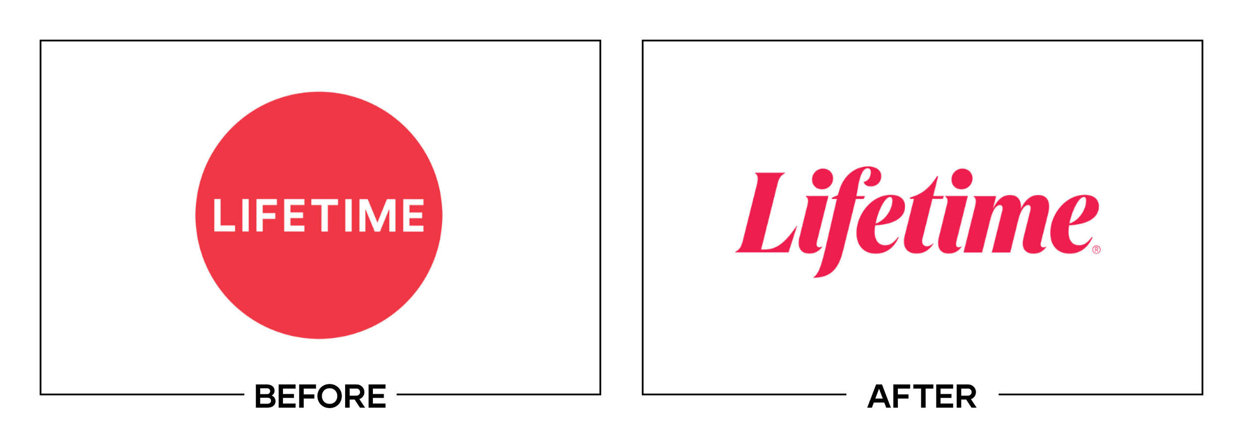
Lifetime wanted to reclaim a stronger voice as a network centered on modern women and movies. The previous circular L was tidy but anonymous, leaving the channel with little personality across promotions, streaming menus, and on-screen graphics.
Why It Made the List:
The italic serif wordmark brings back the dramatic confidence associated with earlier Lifetime identities. Leroy & Clarkson’s case study shows how the mark anchors a broadcast package rather than functioning as a detached corporate signature.
A custom L can crop, stretch, and frame talent across motion graphics, creating behavior for promos and channel navigation. The identity feels editorial and expressive while preserving enough consistency for viewers to identify the network.
“Your Life. Your Time.” gives the visual shift a clear point of view tied to the audience, not a vague promise of better entertainment. The line, typography, and pacing support stories led by women without reducing the brand to one genre.
The Tradeoff:
The high-contrast italic lettering can lose thin strokes in small or compressed video placements. Its fashion-editorial tone also risks feeling mannered if every program receives the same dramatic treatment, regardless of subject.
What Businesses Can Learn:
A familiar wordmark can carry more personality than a generic symbol. Choose typography for the voice customers should hear, then test it in the fastest, smallest, and least forgiving application instead of judging only a large static lockup.

6. Popeyes
Why Did the Logo Change?
Popeyes was expanding while its restaurants, packaging, and communications lacked a consistent expression of the food and Louisiana roots. The redesign needed to make the chain easier to recognize, easier to operate, and more appetizing.
Why It Made the List:
The simplified Popeyes wordmark keeps its rounded rhythm while removing the outline and tilted letters that hurt reproduction. Branding in Asia’s report details how the project connected New Orleans character with a scalable global system.
Orange becomes an unmistakable primary color across signs, boxes, cups, uniforms, and digital ordering. Its warm saturation suits fried food and creates consistency without depending on a complicated mascot or a long Louisiana Kitchen lockup.
Type, playful icons, and confident food photography supply personality around the cleaner mark. The system feels lively without turning Southern culture into a collection of decorative clichés that international locations could apply badly.
The Tradeoff:
Removing the outlined bounce makes the wordmark easier to use, but it also smooths away some scrappy charm. Because orange carries so much of the recognition, inconsistent color reproduction could make the identity feel far less distinctive.
What Businesses Can Learn:
Operational consistency is a design problem. Build a mark that survives signs, packaging, uniforms, menus, apps, and franchise production, then create supporting assets that local teams can use without inventing a new personality each time.

7. Iron City Beer
Why Did the Logo Change?
Iron City Beer needed to reconnect with Pittsburgh drinkers after inconsistent packaging and weak local presence. The refresh had to recover genuine brewery history while making the lager look confident beside regional and national competitors.
Why It Made the List:
The rebuilt castle and crown badge turns real brewery heritage into a sturdy, ownable centerpiece. Top Hat’s project report documents how the team refined familiar elements rather than manufacturing a vintage story from scratch.
Warm red, gold, black, and cream give cans and cartons immediate shelf presence while feeling connected to Pittsburgh industry and sport. The palette is bold enough for a billboard, yet practical across labels, tap handles, apparel, and print.
Strong condensed type and a checkerboard pattern create a toolkit beyond the crest. The pieces can flex between heritage-led flagship packaging and louder promotions without making Iron City look like a different beer in every channel.
The Tradeoff:
Castle, crown, dates, and supporting type can become dense when the complete badge is reduced. The identity needs simplified lockups for small uses so its heritage detail remains an asset rather than turning into an unreadable seal.
What Businesses Can Learn:
Heritage works when it can be verified and used. Search archives for symbols, stories, packaging, and places customers still recognize, then rebuild the strongest evidence with modern production rules instead of applying artificial distress.

8. Little League
Why Did the Logo Change?
Little League had separate oval marks for baseball, softball, and Challenger programs, weakening the sense of one organization. Its emblem also needed to work across thousands of local leagues, volunteers, uniforms, patches, and digital tools.
Why It Made the List:
The unified keystone returns to a shape connected with founder Carl Stotz while streamlining it for current use. Little League’s brand story records the June 6 launch and explains how one emblem now represents every division equally.
Baseball, softball, and Challenger programs retain distinct colors and signatures without receiving separate brands. That architecture respects participants while making the parent organization visible across tournaments and communities.
Local-league templates address a problem organizations often ignore: thousands of volunteers will apply the mark with limited time and tools. Practical guidance protects recognition better than a beautiful standards deck nobody can use.
The Tradeoff:
The keystone is meaningful within Little League history, but unfamiliar viewers may read it as a generic sports shield. The red and blue palette is also common, placing more pressure on the internal line work and disciplined naming.
What Businesses Can Learn:
If partners, chapters, or franchisees create public materials, they are part of the design audience. Give them approved lockups, simple templates, and enough flexibility for local information before inconsistency becomes the default system.
9. Bojangles
Why Did the Logo Change?
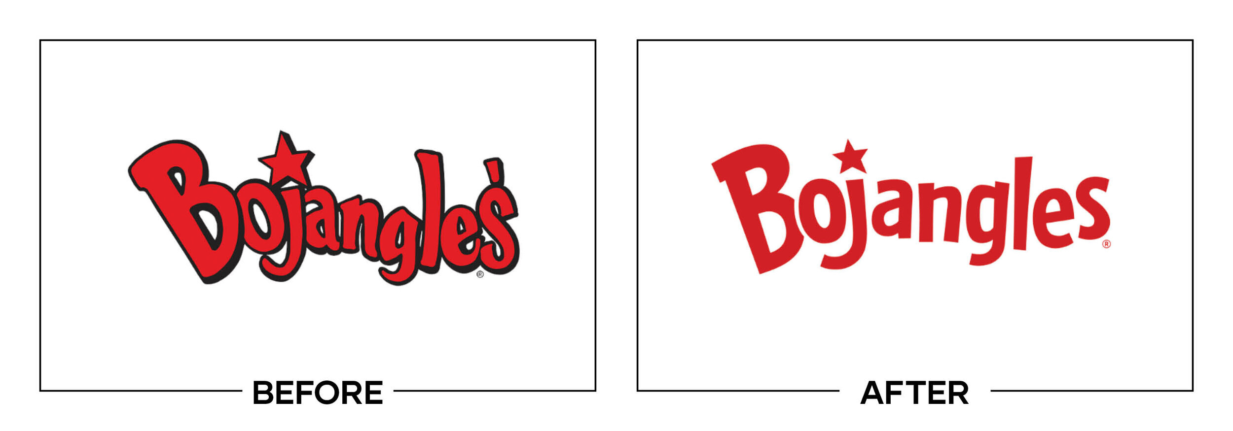
Bojangles was preparing for growth beyond its Southern base and wanted a cleaner name, restaurant look, and advertising platform. The update removed the apostrophe and “Chicken ’n Biscuits” descriptor while preserving red-and-yellow equity.
Why It Made the List:
The simplified wordmark keeps the approachable rhythm and colors customers already recognize. Bojangles’ announcement connects the visual update to restaurants, packaging, menu boards, and expansion rather than presenting a logo in isolation.
Dropping the long descriptor gives the name room to read on roadside signs, mobile ordering screens, cups, and sponsorships. The business can still lead with chicken and biscuits in messaging without forcing every product into the logo.
The refreshed chicken character and supporting graphics keep enough warmth around the cleaner signature. The system feels organized, but it does not erase the regional energy that makes the chain different from a generic quick-service concept.
The Tradeoff:
Removing the descriptor assumes more recognition in markets where Bojangles is unfamiliar. The wordmark may travel better, but expansion advertising must clearly establish what the restaurant sells before the shortened logo can stand alone.
What Businesses Can Learn:
A descriptor earns space only when it helps customers choose. Test whether it remains readable at real sizes, whether the name already carries the category, and whether messaging can explain the offer more effectively than a line of tiny type.

10. Avon
Why Did the Logo Change?
One year after a short-lived serif update, Avon needed a fuller identity for a direct-selling business seeking younger customers and representatives under Natura &Co. The work had to feel current without discarding global name recognition.
Why It Made the List:
The redrawn wordmark references the curve and contrast of historic Avon lettering while improving digital reproduction. The company’s campaign release positions the change as part of a wider effort to update how the business speaks and sells.
A gradient gives beauty content more range than a single corporate color and performs well in social, video, packaging, and representative materials. Its flowing form adds movement without competing with products, faces, or editorial imagery.
The “Watch Me Now” platform addresses outdated assumptions about both the company and its sales model. Instead of pretending Avon had no history, the system reframes experience as proof that the organization can continue changing.
The Tradeoff:
Gradients can date and reproduce unevenly in production. Avon International later moved from Natura &Co to Regent, while Latin American operations remained with Natura. The 2020 identity belongs to an ownership structure that has since split.
What Businesses Can Learn:
An established company should name the perception it needs to change before redrawing anything. Preserve the assets that still carry trust, then use message, imagery, color, and customer experience to challenge the outdated part of the story.

11. Tecate
Why Did the Logo Change?
Tecate wanted national appeal in the United States without losing its Mexican origin or the assertive tone of its packaging. The core eagle and wordmark had become cluttered, limiting impact across cans, multipacks, and sponsorship.
Why It Made the List:
The redrawn eagle becomes a stronger black silhouette with cleaner wings and a more integrated T. Brewbound’s project report explains how Elmwood retained the established symbol while removing details that disappeared at small sizes.
A custom wordmark and brighter red improve shelf recognition without making the beer look imported only for special occasions. The signature remains assertive, but better spacing and contrast allow it to work across multiple package formats.
Secondary graphics draw from Mexican craft and the eagle’s geometry rather than applying fiesta decoration. That distinction gives campaigns cultural texture while keeping the core identity focused enough for sports and music partnerships.
The Tradeoff:
The simplified eagle is more functional, but it loses some of the engraved character that made older packaging feel storied. Heavy black and red can also appear severe unless photography, material, and copy add warmth in crowded coolers.
What Businesses Can Learn:
Cultural relevance requires research, not decoration. Keep the symbol customers recognize, remove only what blocks performance, and build supporting patterns or stories from specific origins instead of borrowing broad category stereotypes.

12. Casey’s
Why Did the Logo Change?
Casey’s had grown from a convenience store into a major retailer known for prepared food, especially pizza. Its old barn-shaped logo carried useful history but felt cramped and inconsistent with upgraded stores, digital ordering, and expansion.
Why It Made the List:
The red barn roof remains, but the wordmark gains space, weight, and a cleaner silhouette. Casey’s announcement shows a refresh that protects rural roots while improving signs, packaging, uniforms, app use, and roadside visibility.
Removing “General Store” reflects what customers call the chain and leaves the identity broad enough for fuel, groceries, pizza, and delivery. The change updates perception without pretending Casey’s began as an entirely different business.
Warm red, cream, and black support a more appetizing food presentation while keeping the practical directness of a neighborhood store. Custom icons and layouts help pizza marketing belong to the same company as fuel and everyday essentials.
The Tradeoff:
The cleaner barn can resemble a house-shaped retail badge, especially without the full name. Losing “General Store” also removes instant category context for new markets, so location design and advertising must explain the offer quickly.
What Businesses Can Learn:
Customer shorthand can reveal the strongest version of a name. Before changing it, study what people say, search, and place on directions, then preserve any visual cue that helps existing customers recognize the transition immediately.

13. Waze
Why Did the Logo Change?
Waze had a speech-bubble car icon, but its wider visual language lacked the emotional range of a community-powered navigation app. The refresh needed to organize product icons, express driver moods, and remain legible inside busy interfaces.
Why It Made the List:
The simplified Wazer keeps the wheels, speech bubble, and friendly face while gaining a cleaner outline. Pentagram’s case study shows how the symbol remains recognizable in an app icon, map pin, social post, or tiny navigation prompt.
Moods turn real driver emotions into a useful set of expressive icons instead of adding personality as decoration. The characters help the product communicate traffic frustration, focus, calm, and community without changing its central mark.
Road-like graphic forms, a brighter palette, and flexible layouts create consistency from interface elements to large campaigns. The result feels lively but still leaves maps, alerts, and directions enough space to perform practical jobs.
The Tradeoff:
The smoother Wazer loses a little of the hand-drawn oddness that made the original feel spontaneous. A large library of moods can also fragment recognition if expressive characters appear more often than the primary logo in navigation.
What Businesses Can Learn:
Personality can become functional when it reflects a real product behavior. Build supporting assets around what customers experience, assign each asset a role, and keep one stable signature visible enough to hold the variety together.

14. Fisher-Price
Why Did the Logo Change?
Fisher-Price wanted its identity to speak to both children and the adults choosing toys, while restoring the playful confidence of its history. The previous mark had become mechanically tidy, and its larger language lacked a consistent idea.
Why It Made the List:
The awning returns with three scallops instead of four, a small change that creates a subtle reference to the brand’s three founders. Pentagram’s case study shows how that detail connects history to a broader system built for play.
A custom wordmark restores bounce through uneven baselines and letterforms while remaining easier to reproduce than earlier versions. The hyphen becomes a smile-like element that can animate and connect moments across packaging and media.
“Let’s Be Kids” gives photography, copy, sound, and motion one organizing thought that invites adults back into active everyday play. The identity can feel nostalgic to parents without trapping new products in one generation’s childhood.
The Tradeoff:
The polished irregularity risks feeling overly designed when applied too perfectly. Because the system borrows from retro Fisher-Price cues, new products still need fresh photography and behavior to keep nostalgia from dominating innovation.
What Businesses Can Learn:
Small historical details can carry more meaning than a complete retro revival. Find an element worth restoring, explain why it matters, and redraw it for current production while letting contemporary content move the company forward.

15. Field Roast
Why Did the Logo Change?
Field Roast had not completed a brand refresh since 1997 as plant-based food expanded and its range grew. It needed clearer shelf hierarchy, stronger appetite appeal, and one voice across roasts, sausages, deli slices, and cheese.
Why It Made the List:
The redrawn badge keeps the established name and craft framing while improving hierarchy on crowded refrigerated shelves. Refrigerated & Frozen Foods’ report details the first visual refresh in more than two decades, built for retail.
Illustrated landscapes and bold product photography communicate ingredients, craft, and flavor without making meat-free food look medicinal. Distinct package colors help shoppers navigate the range while the badge maintains family recognition.
“Make Taste Happen” leads with the result diners care about rather than treating plant-based status as the entire story. A chef partnership and recipe content gave that promise useful proof across retail, foodservice, and digital channels.
The Tradeoff:
Badges, landscapes, product names, claims, and photography create a busy package system that requires strict hierarchy. If a retailer adds stickers or a new claim, the craft richness can quickly become visual noise in a retail case.
What Businesses Can Learn:
Packaging has to sell, explain, and organize at once. Rank the information shoppers need in the first second, group products with consistent architecture, and reserve detailed storytelling for spaces where it will not interfere with choice.
16. The Athletic
Why Did the Logo Change?
The Athletic had grown into a subscription sports publication, but its identity did not match the depth or quality of its journalism. The redesign needed to distinguish reporting from quick highlights while flexing across teams and leagues.
Why It Made the List:
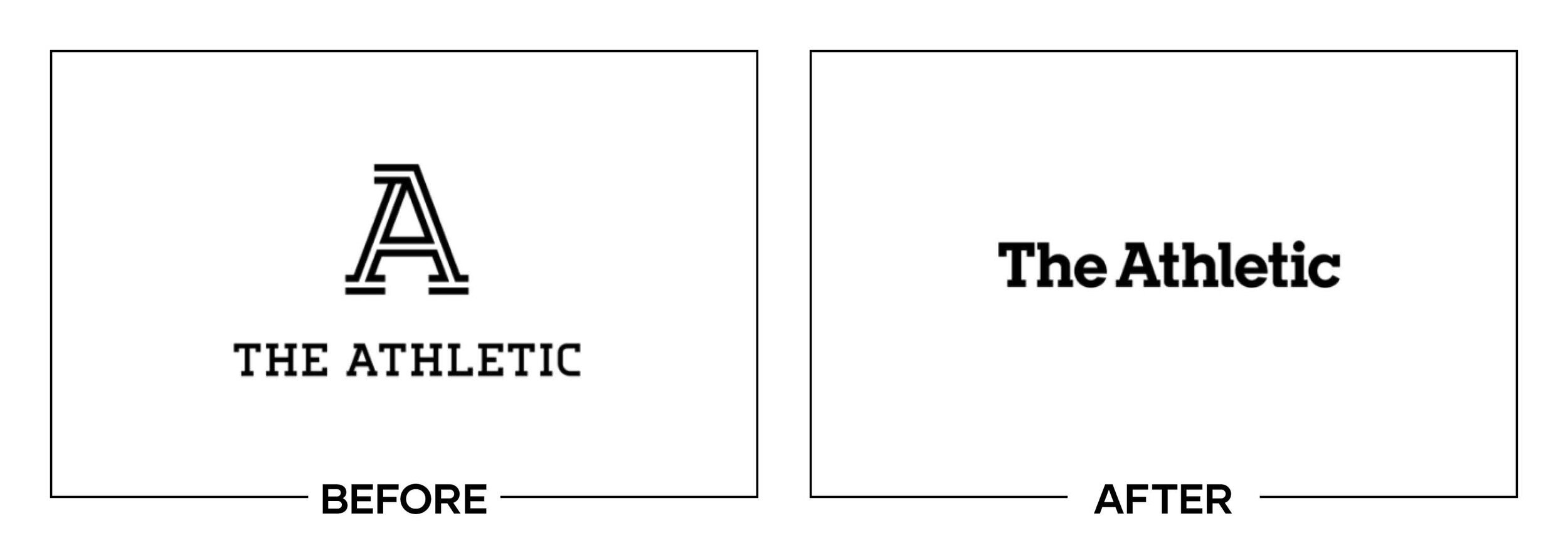
The inline A remains the recognizable starting point, then expands into a custom display typeface used across headlines. Gretel’s case study shows how one existing detail became a repeatable signature instead of being discarded for novelty.
Warm grays create a stable editorial foundation while secondary colors can respond to a team or sport. That balance gives coverage local relevance without allowing every section to become a separate branded publication for every team.
Slab-serif lettering evokes classic sports pages, yet the large inline forms feel built for screens, motion, and social promotion. The identity communicates depth and authority without imitating the visual noise of live-score media.
The Tradeoff:
The custom inline type is distinctive at display sizes but can become visually heavy when overused. Team colors also need careful control so a club’s palette supports an article without making The Athletic look like an official fan outlet.
What Businesses Can Learn:
An existing detail may contain the seed of a larger identity. Before replacing everything, identify the asset customers already notice and ask whether it can guide type, layout, motion, or imagery across the full customer experience.

17. HelloFresh
Why Did the Logo Change?
HelloFresh had expanded into 14 markets and a broader meal selection, making its previous illustrated lime feel less flexible. The refresh needed a signature that could support packaging, recipes, apps, delivery boxes, and local campaigns.
Why It Made the List:
The lime becomes a clean shape rather than a textured illustration, preserving the most recognizable asset while improving small digital use. HelloFresh’s launch story documents its October rollout across channels and customer materials.
A friendlier lowercase wordmark creates a more conversational tone without relying on handwritten type. Lime green stays tied to freshness, while additional colors let meals and local campaigns vary without losing the family look.
The simpler logo leaves visual space for food photography, recipe titles, dietary labels, and delivery information. That restraint matters because the customer encounters HelloFresh within a package or interface carrying many decisions.
The Tradeoff:
Flattening the lime improves utility but removes the tactile, produce-like texture of the older icon. The result can look like a generic leaf or citrus shape when separated from the name, especially at tiny sizes on a crowded screen.
What Businesses Can Learn:
Simplification earns its place when it solves a production problem. Identify where detail fails, preserve the recognizable silhouette, and test the revision inside the real layout before deciding that a cleaner icon is automatically better.

18. Afterpay
Why Did the Logo Change?
Afterpay was expanding internationally and needed a unified identity for merchants and customers across checkout, stores, apps, and partner materials. The previous stacked arrows communicated exchange but felt technical and difficult to own.
Why It Made the List:
The new symbol connects two loops in a continuous form, suggesting a relationship between shopper and retailer without illustrating a payment card. Afterpay’s announcement explains the identity’s role across its growing global platform.
Bondi Mint gives the service an immediate color cue at checkout, where recognition and reassurance have to happen quickly. Black and white versions remain simple enough for merchant sites that cannot accommodate a bright brand panel.
The rounded wordmark and flexible badge system make the service feel more approachable than traditional credit branding. Partner lockups help stores explain availability without improvising how Afterpay should sit beside a retailer’s identity.
The Tradeoff:
The loop symbol shares visual territory with infinity marks, links, and other fintech icons. Its meaning is not self-evident, so Bondi Mint and repeated checkout placement must do substantial work to make it unmistakably Afterpay.
What Businesses Can Learn:
Partnership brands need rules for appearing beside someone else’s logo. Design the smallest badge, monochrome version, spacing, and merchant lockup early, then test whether customers can recognize it during a fast, trust-sensitive decision.

19. 10 Tampa Bay
Why Did the Logo Change?
WTSP wanted to be known as more than a traditional local newscast, so it adopted the public-facing name 10 Tampa Bay and an editorial position. The identity needed to connect deeper reporting, community programming, and its channel number.
Why It Made the List:
Concentric lines form both the 1 and 0, suggesting signals and layers of information in one compact idea. Matchstic’s case study explains how the name and mark grew from a promise of deeper dives and sharper insight for viewers.
Green separates the station from the red and blue palette common in local news while connecting naturally to Florida’s landscape. A pattern extends the logo’s lines into broadcast graphics, promos, digital stories, and community events.
Leading with 10 Tampa Bay gives viewers a name that matches the market and channel rather than a set of call letters. The identity can cover news, weather, sports, lifestyle, and programming without pretending every segment is breaking news.
The Tradeoff:
Closely spaced rings can create visual vibration or a moiré effect on certain screens and at small sizes. The mark needs careful rendering and simplified uses so a clever signal metaphor does not interfere with comfortable viewing.
What Businesses Can Learn:
A name can clarify positioning before the logo appears. Choose language customers can remember and repeat, then build a visual idea that supports the promise without compromising legibility on the devices and surfaces that matter most.

20. King Arthur Baking Company
Why Did the Logo Change?
King Arthur Flour had become a broader baking resource selling ingredients, tools, recipes, education, and community support. The company changed its name to King Arthur Baking Company and needed a mark that welcomed every kind of baker.
Why It Made the List:
The wheat crown connects the King Arthur name to baking without relying on a medieval knight illustration. The company’s brand story explains how the symbol represents both agricultural ingredients and the achievement of baking something well.
Removing “Flour” from the company name makes room for tools, classes, recipes, mixes, and future products while keeping King Arthur prominent. The change broadens the offer without hiding the flour business that built its reputation.
A circular badge feels at home on bags, jars, pans, aprons, recipes, and digital education. Purple preserves recognition, while warmer photography and illustration make the employee-owned company feel practical rather than royal or distant.
The Tradeoff:
The wheat crown needs explanation before its dual meaning becomes clear, and circular food badges are common. Retiring the knight also removes a highly literal name cue, so consistent purple and strong storytelling carry more responsibility.
What Businesses Can Learn:
When a name limits how customers understand the offer, expand it without abandoning earned trust. Keep the strongest words, replace the narrow descriptor, and choose a symbol that can connect heritage with the business customers use now.
What the Best Logos of 2020 Have in Common
The strongest 2020 redesigns protected something useful before adding something new. Little League, Fisher-Price, Casey’s, Iron City Beer, and King Arthur Baking Company found better ways to use history. WTA, The Athletic, and 10 Tampa Bay turned a clear operating idea into visual structure. Popeyes and HelloFresh improved systems customers meet through packaging and screens.
These projects also show that a logo is rarely the whole solution. Architecture made WTA events and Little League divisions easier to understand. Packaging carried Field Roast and Tecate. Motion expanded Lifetime and Waze. Guidelines helped thousands of Little League volunteers protect consistency. The mark succeeds when it makes the complete identity easier to use.
For the other side of the year, read The 20 Worst Logos of 2020. That list examines projects where useful equity, clarity, context, or execution was lost during the redesign.
Logos and trademarks are the property of their respective owners and are shown for identification, commentary, and criticism. No endorsement or affiliation is implied.
Thanks for Reading The 20 Best Logos of 2020
Thanks for reading our annual Best Logos of the Year article. It really means a lot to me. I also want to thank every designer, studio, in-house team and client who brought this year’s work to life. I may have opinions about the results, but this series would not exist without people willing to take creative risks in public.
For the other half of this year’s series, read The 20 Worst Logos of 2020. You can also browse the blog for earlier Best and Worst Logos of the Year articles and more logo design reviews.
Does your business need a new logo? We provide logo design and brand identity services for businesses that need something new or have outgrown what they already use. Fill out the form below and tell us your story. We would love to help forge a new identity for your brand that connects with your customers, tells your story, and lands you at the top of next year’s Best Logos of the Year article.
Legal Disclaimer: This content is provided for educational and informational purposes and is intended as commentary and criticism; all product names, logos, and trademarks are the property of their respective owners, and any copyrighted materials shown are used under the principles of fair use solely to identify the subjects discussed and to support analysis, with only the limited portions reasonably necessary displayed; no sponsorship, endorsement, affiliation, or partnership is implied, and nothing on this page constitutes legal, financial, or other professional advice.
