
Welcome to The 10 Best Logos of 2017, one of two articles in my annual Best and Worst Logos of the Year series. Every year, I look back at the rebrands that caught my attention and share what businesses can learn from them. Here, we are going to take a look at some of this year’s strongest work. Looking for The 10 Worst Logos of 2017? Read the companion article to learn about rebrands that may have missed the mark.
Below, I break down The 10 Best Logos of 2017. For each one, I look at why the business rebranded, where the new identity succeeds, what it gives up, and what your business can learn before starting a rebrand of its own.
A quick note before I get into the list: I have respect for every designer, studio, in-house team and client represented here. Putting a new identity into the world is hard. These reviews focus on the finished work, but the point is not criticism for criticism’s sake. This series is here to help business owners and brand teams understand why companies rebrand, learn from the choices behind the work and make better decisions when it is their turn. The entries are numbered to make the article easy to follow, but they are not presented in any particular order. Design is subjective, and I do not expect everyone to agree with every choice. That is part of what makes these articles fun to write and discuss.
But when it does come time for you to discuss a new logo, Parker Lee Creative is an award-winning, independent creative studio specializing in logo design and brand identity. We help businesses build new identities and refresh the ones they have outgrown. Our process starts with what the logo needs to communicate, then tests the work everywhere customers will see it. If you are considering a rebrand, contact us and tell us your story. We would love to help you create something worthy of next year’s Best Logos of the Year article.

1. Auto Trader
Why Did the Logo Change?
Auto Trader had been digital-only since 2013, yet many people still pictured a print magazine aimed at middle-aged men. The marketplace needed a friendlier, broader identity built for the mobile product customers were actually using.
Why It Made the List:
The revised wordmark keeps the familiar red and blue relationship while making the name clearer and more comfortable on a screen. It feels like an evolution customers can recognize, not a digital company wearing an unrelated new badge.
Design Week's launch report shows that Studio Output worked beside Auto Trader's design and UX teams. That collaboration matters because the identity was shaped around product behavior instead of being handed to the interface afterward.
Expanded color, warmer photography, practical illustration, motion, and a robust type family give each communication tool a distinct job. The result can explain insurance or part exchange without asking the logo to carry every message alone.
The Tradeoff:
The roundel and straightforward lettering are not radically distinctive by themselves. Much of the personality lives in image, motion, voice, and color, so inconsistent execution could leave Auto Trader looking like an ordinary classified site.
What Businesses Can Learn:
Rebranding a business should involve people who build its product. Start with the misconception that needs correcting, preserve the recognition customers use, and create rules that can guide interface, content, support, and marketing together.

2. Canada Snowboard
Why Did the Logo Change?
Canada Snowboard needed one identity for first-time riders, athletes, coaches, staff, and provincial organizations. The challenge was to feel unmistakably Canadian without falling back on a maple leaf pasted onto a generic sports badge.
Why It Made the List:
The central shape earns its complexity. It can be read as a mountain, a maple leaf, a black-diamond trail rating, and an upward route. Those meanings come from the sport and place, so the mark rewards attention without depending on a slogan.
Canada Snowboard's brand explanation grounds the logo in a collaborative internal process, with athlete and staff input, and credits Hulse & Durrell. That record makes the symbolism more than hindsight added by a design critic after launch.
Strong black fields, sharp cuts, and condensed lettering give the identity enough force for boards, uniforms, event graphics, and small social icons. A provincial system extends the visual logic without making every local group identical.
The Tradeoff:
Four readings inside one symbol create an idea, but not every viewer will find all of them. At very small sizes the interior cuts can merge, which means the organization still needs simpler production rules for embroidery and rough printing.
What Businesses Can Learn:
Layered symbolism works when every layer belongs to the organization. Build from the audience, place, and activity instead of forcing initials into a shape. Then test whether the mark still succeeds for people who notice only its silhouette.

3. Carl's Jr. and Hardee's
Why Did the Logo Change?
CKE Restaurants was moving both chains away from provocative advertising and toward a food-led story about burger history and quality. The visual update had to remove years of glossy effects while keeping the shared Happy Star recognizable.
Why It Made the List:
Flattening the star, removing the red container, and simplifying the script immediately improved reproduction. The names and symbol gained air to work on packaging, signs, menus, and screens without layers of outlines fighting each other.
The launch announcement tied the new look to a campaign about the food instead of treating clean graphics as the whole strategy. The logo became a visible marker for a wider change in what the restaurants wanted customers to notice.
The two chains retained a shared visual language while keeping their names. That is useful portfolio design: customers can recognize common ownership and standards without pretending Carl's Jr. and Hardee's are one undifferentiated brand.
The Tradeoff:
Removing the star's face also removed a useful piece of character, and the company restored a face later in 2017. The short-lived choice shows that stripping away dated effects is smart, but stripping away emotion can cross the line.
What Businesses Can Learn:
Separate outdated decoration from genuine brand equity. Shadows, outlines, and clutter may be expendable, but a familiar expression or mascot still carries warmth. Test each removal on its own instead of treating every old detail as one problem.
4. Chobani
Why Did the Logo Change?
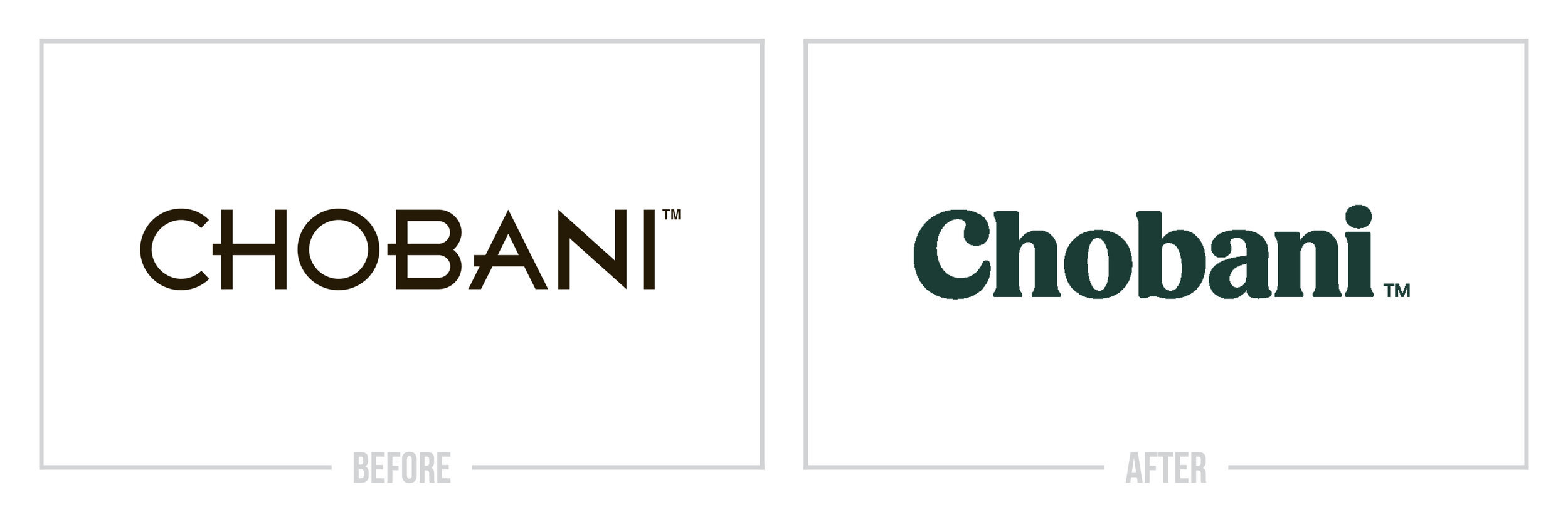
At its tenth anniversary, Chobani was preparing to stretch beyond Greek yogurt toward a broader food and wellness position. It needed packaging and a voice that could feel nourishing, generous, and handmade without surrendering shelf clarity.
Why It Made the List:
The soft serif wordmark feels rich and edible, an unusually apt quality for yogurt. Rounded terminals and compact rhythm give Chobani a recognizable voice without using a farm illustration or a generic leaf to announce natural ingredients.
Chobani's launch release documents more than a year of in-house work and a nationwide rollout across packaging and campaigns. The identity came from a team close to the product and supported a stated move toward food-focused wellness.
Olive green, warm cream, folk-art fruit, and carefully framed photography build a world around the wordmark. Flavor changes remain easy to find, but the range feels collected and human rather than assembled from one rigid package template.
The Tradeoff:
The palette and storybook imagery can drift toward preciousness, especially as the portfolio expands beyond yogurt. Chobani has to balance warmth with enough structure that shoppers can compare products quickly and trust nutrition details.
What Businesses Can Learn:
Design for the physical sensation and emotional expectation of the product, not only its category. An ownable wordmark can hold recognition while color, illustration, and photography build appetite, range, and a larger company story around it.

5. Hyundai
Why Did the Logo Change?
Hyundai wanted a consistent global identity as it shifted from a vehicle manufacturer toward a mobility and lifestyle story. Chrome effects and fragmented regional materials were poor tools for screens, campaigns, and a unified customer journey.
Why It Made the List:
Flattening the familiar H into a navy treatment improved clarity without discarding the emblem customers knew. The move respected recognition while removing a metallic effect that depended on lighting, rendering, and large reproduction.
Transform's report on the 18-month program connects the mark to Hyundai Sans, Korean material references, photography, and sound. That breadth shows a coordinated brand identity, not a flat-logo trend presented as transformation.
The restrained mark gives vehicles and human stories room to lead. A corporate signature should not compete with a grille, dashboard, dealer sign, and piece of lifestyle photography, and this one creates a stable anchor across those contexts.
The Tradeoff:
Navy and flat geometry are practical, but the look can feel cooler and more corporate than the chrome emblem drivers met on vehicles. Distinctiveness therefore depends on Hyundai Sans, image direction, sound, and disciplined global application.
What Businesses Can Learn:
Simplification is useful when it removes a production problem and protects recognition. Keep the silhouette, strip away effects that cannot travel, and invest in the type, imagery, motion, and sound that give a quiet logo a specific voice.

6. Little Wolf
Why Did the Logo Change?
Little Wolf needed a coherent identity for coffee bags, subscriptions, a café, merchandise, and online sales. The young roaster also wanted specialty coffee to feel inviting, giving careful sourcing and preparation a friendlier public face.
Why It Made the List:
River, the founder's Siberian Husky, gives the business a character, not a borrowed coffee trope. The dog can guide a story across bags and merchandise while the restrained wordmark keeps the company name from becoming a mascot logo.
Sprudge's interview with the owner explains how country colors and two clear flavor notes help repeat buyers find coffees quickly. The packaging is charming, but its details are also practical choices for finding and understanding coffee.
Icy blue linework, monospaced information, and playful instructions such as “sit” balance storybook warmth with a roaster's method. The contrast makes technical knowledge feel accessible instead of turning expertise into an austere badge.
The Tradeoff:
A friendly dog and pale line drawing can be mistaken for a pet business when the coffee context is absent. The low-contrast palette also relies on good materials and printing, so small or inexpensive applications need stronger hierarchy.
What Businesses Can Learn:
Personal details become identity assets when they support the customer experience. Use the founder's story to create recognition, then pair it with product information so personality helps people choose instead of merely decorating a package.

7. Minnesota Timberwolves
Why Did the Logo Change?
The Minnesota Timberwolves wanted a new-era identity that could anchor uniforms, a court, merchandise, and a stronger franchise story. It needed to acknowledge earlier wolf marks while expressing Minnesota and a more competitive pack mentality.
Why It Made the List:
The howling wolf gives the team a focused action rather than another snarling animal head. Its muzzle points toward the North Star, turning a familiar Minnesota symbol into a rallying point and a clear visual part of the composition.
The team's process story explains how RARE Design began with research and a written mission before drawing. That sequence matters because the final geometry can be traced to a specific idea about the pack, not styling added without direction.
A circular field, basketball seams, midnight blue, gray, and green form a sports badge that reads on center court, a cap, or a broadcast bug. The old identity remains visible in the wolf, while the new one feels built for a broader system.
The Tradeoff:
Round animal badges are common in professional sports, and the palette invited comparisons with Seattle teams. The logo stays distinctive through the wolf's pose and North Star, but those elements must remain clear whenever the mark is reduced.
What Businesses Can Learn:
Write the idea before drawing the symbol. A short statement about behavior, place, and audience gives design choices something to answer. For a heritage brand, carry forward the recognizable subject while changing its posture and role.

8. HuffPost
Why Did the Logo Change?
The Huffington Post adopted the shorter name its readers already used and rebuilt a site designed for mobile and social news habits. The identity needed to make that conversational name official while giving a busy publisher a faster signature.
Why It Made the List:
“HuffPost” removes six syllables and turns everyday reader language into the formal brand. That makes headlines, app labels, social avatars, and verbal references easier without inventing an abbreviation nobody outside the company would use.
Press Gazette's launch coverage records the first major redesign in twelve years and Work-Order's involvement. The compressed name, brighter green, and rebuilt site arrived as one editorial product decision for mobile and social use.
The forward-slash forms give the wordmark motion and recall the syntax of a web address without making the name hard to read. The green field also creates a strong block for article cards, video, mobile navigation, and social distribution.
The Tradeoff:
Forward slashes and italic letterforms can suggest speed, but they can also make a news organization feel permanently urgent. The visual energy needs calm typography and disciplined page hierarchy around it so every story does not shout.
What Businesses Can Learn:
Pay attention to the name customers already say. A short, natural version can improve recall and applications more than a fabricated brand word. Make the change official only after checking legal, search, architecture, and audience implications.

9. Tinder
Why Did the Logo Change?
Tinder was refreshing its app and no longer needed the full wordmark to establish recognition. The flame that once dotted the name had become strong enough to lead, giving the service a compact icon for phones, profiles, and social media.
Why It Made the List:
Promoting the flame is a confident equity decision. Tinder removed the less distinctive lettering and kept the element tied to heat, attraction, and the app's existing memory, allowing one recognizable shape to do the primary work.
Design Week's report credits DesignStudio and describes the wider, rounder form with a pink-to-orange gradient. The refinement made an existing asset warmer and more balanced for use at app size rather than inventing a new metaphor.
The icon reads quickly at the size that matters most: one tile among many apps on a phone. It also scales into profile controls and campaign graphics, proving that the strongest digital signature may be the symbol people already tap every day.
The Tradeoff:
Gradient flames are easy to imitate, and a symbol without a name asks the audience to supply meaning. Tinder can carry that risk because recognition was already high, but a newer or less visible service could not assume the same result.
What Businesses Can Learn:
Before creating a new icon, audit which piece customers recognize at a glance. A supporting detail may be ready to lead. Test it without the wordmark, at app size, in one color, and beside competitors before making the separation permanent.

10. YouTube
Why Did the Logo Change?
YouTube had grown from one desktop website into a service used across phones, televisions, consoles, apps, and virtual reality. Its signature needed to adapt when the full wordmark was too wide and remain recognizable on the smallest screens.
Why It Made the List:
Moving the red container away from “Tube” fixed a long-standing reading quirk and turned it into a clear play button. The complete name now reads as one word, while the icon can stand alone without pretending that only half the name matters.
YouTube's official announcement states the clear practical goal directly: one cleaned-up wordmark and icon for a multi-screen world. The change answers device constraints instead of using responsiveness as an abstract design claim.
The architecture gives YouTube a clear hierarchy for every scale. Full signatures work in navigation and partnerships, the play icon handles apps and tiny screens, and consistent red connects both without forcing one rigid lockup everywhere.
The Tradeoff:
Separating the icon makes the logo more flexible, but it also produces a familiar play-button shape that many video services can use. YouTube's scale and red ownership make it distinctive; smaller brands would need another proprietary cue.
What Businesses Can Learn:
Design a logo family around real size constraints. Define when the full name appears, when a symbol can replace it, and how both stay related. Responsive identity is not automatic shrinking; it is a change in how much information gets shown.
What the Best Logos of 2017 Have in Common
The best logo redesigns of 2017 solved more than a style problem. Auto Trader corrected a dated perception. Canada Snowboard built a national sport symbol from genuine references. Chobani translated product character into typography and packaging. YouTube reorganized established assets around the screens where the service lived.
The shared lesson is restraint with purpose. Preserve the pieces customers already know, give each supporting element a defined job, and make every visible change answer a real communication or production need. A good logo does not carry the entire strategy, but it should make that strategy easier to recognize and apply.
For the other side of the year, read The 10 Worst Logos of 2017.
Logos and trademarks belong to their respective owners and are shown for identification, criticism, and commentary. No sponsorship, endorsement, affiliation, or partnership is implied.
Thanks for Reading The 10 Best Logos of 2017
Thanks for reading our annual Best Logos of the Year article. It really means a lot to me. I also want to thank every designer, studio, in-house team and client who brought this year’s work to life. I may have opinions about the results, but this series would not exist without people willing to take creative risks in public.
For the other half of this year’s series, read The 10 Worst Logos of 2017. You can also browse the blog for earlier Best and Worst Logos of the Year articles and more logo design reviews.
Does your business need a new logo? We provide logo design and brand identity services for businesses that need something new or have outgrown what they already use. Fill out the form below and tell us your story. We would love to help forge a new identity for your brand that connects with your customers, tells your story, and lands you at the top of next year’s Best Logos of the Year article.
Legal Disclaimer: This content is provided for educational and informational purposes and is intended as commentary and criticism; all product names, logos, and trademarks are the property of their respective owners, and any copyrighted materials shown are used under the principles of fair use solely to identify the subjects discussed and to support analysis, with only the limited portions reasonably necessary displayed; no sponsorship, endorsement, affiliation, or partnership is implied, and nothing on this page constitutes legal, financial, or other professional advice.
