
Welcome to The 10 Worst Logos of 2019, one of two articles in my annual Best and Worst Logos of the Year series. Every year, I look back at the rebrands that caught my attention and share what businesses can learn from them. Here, we are going to take a look at some of this year’s rebrands that may have missed the mark. Looking for The 10 Best Logos of 2019? Read the companion article to learn about some of this year’s strongest work.
Below, I break down The 10 Worst Logos of 2019. For each one, I look at why the business rebranded, where the new identity falls short, what it gives up, and what your business can learn before starting a rebrand of its own.
A quick note before I get into the list: I have respect for every designer, studio, in-house team and client represented here. Putting a new identity into the world is hard. These reviews focus on the finished work, but the point is not criticism for criticism’s sake. This series is here to help business owners and brand teams understand why companies rebrand, learn from the choices behind the work and make better decisions when it is their turn. The entries are numbered to make the article easy to follow, but they are not presented in any particular order. Design is subjective, and I do not expect everyone to agree with every choice. That is part of what makes these articles fun to write and discuss.
But when it does come time for you to discuss a new logo, Parker Lee Creative is an award-winning, independent creative studio specializing in logo design and brand identity. We help businesses build new identities and refresh the ones they have outgrown. Our process starts with what the logo needs to communicate, then tests the work everywhere customers will see it. If you are considering a rebrand, contact us and tell us your story. We would love to help you create something worthy of next year’s Best Logos of the Year article.

1. Basecamp
Why Did the Logo Change?
Basecamp redesigned its website and wanted to leave outdoor-brand conventions and a smiling mountain that no longer matched the company's sharper voice. An in-house team revived a paperclip-like mountain and adopted black, white, and yellow.
Why It Made the List:
The Happy Camper was friendly, memorable, and specific to the product's history. Replacing its face with a continuous outline removed the most human feature while keeping enough mountain geometry to remain inside the crowded Basecamp metaphor.
The outline can read as a paperclip, droplet, or map pin before it reads as a mountain. Ambiguity is not always a flaw, but these interpretations do not clearly express project organization or the opinionated company voice behind the software.
Basecamp's own podcast transcript explains that the team wanted change, disliked outdoor sameness, and treated the logo as part of a website reset. That candor helps, but a casual process does not recover the character the old mascot supplied.
The Tradeoff:
The simple line reproduces cleanly, animates well, and fits the black-and-white site better than the gradient mascot. Yellow adds a fresh accent. The concern is the choice to exchange a recognizable personality for an ambiguous outline.
What Businesses Can Learn:
A logo can be a small part of a redesign and still carry valuable memory. Before removing a mascot or expressive detail, test what customers recall first. Simplify production around that feature unless it conflicts with the new position.
2. Reebok
Why Did the Logo Change?
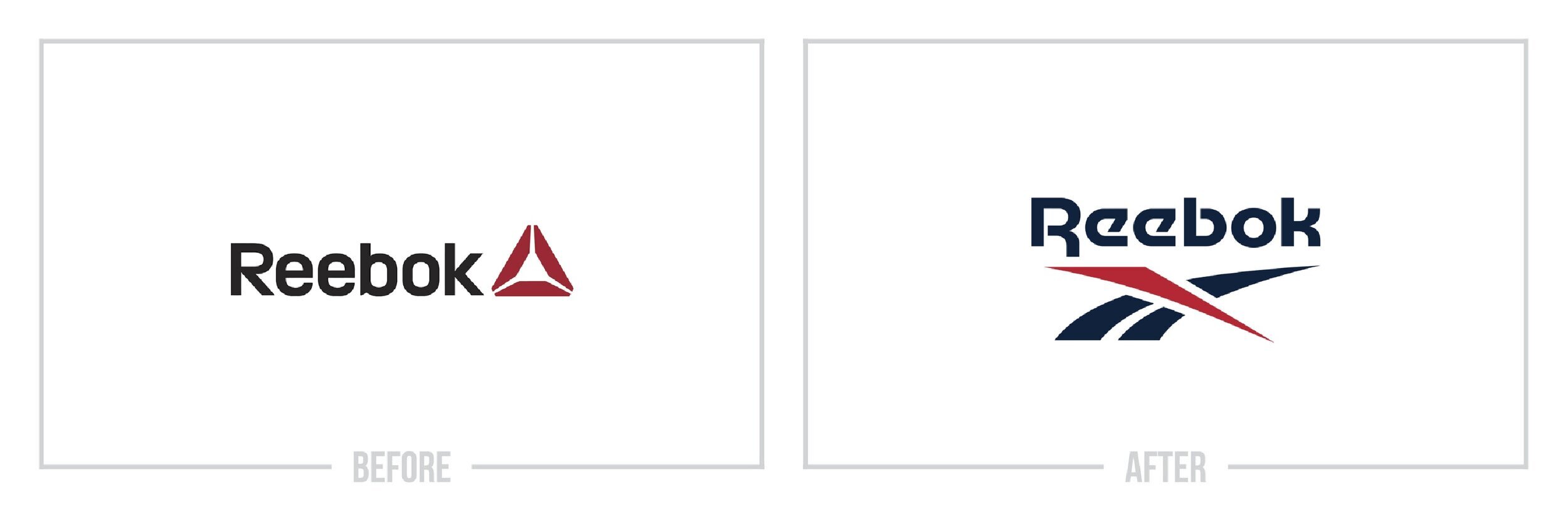
Reebok wanted one identity across performance and lifestyle products after years of splitting the Vector and Delta symbols. The 2019 announcement restored a refined Vector and drop-R wordmark for 2020 use while retaining Delta on selected lines.
Why It Made the List:
Returning to the Vector recovers heritage and strong recognition, but presenting it as unification while Delta survives on CrossFit and UFC products leaves the architecture partly unresolved. Customers encounter two primary-looking systems.
The Vector is thinner and cleaner, yet its changes add little value beyond formalizing the asset already used on Classics. The launch makes a portfolio decision sound like a new logo solution when the strongest move is simply restoration.
Reebok's 2019 press-release record states that one logo and wordmark would unify its story, then preserves Delta for some products. That exception exposes the gap between promised clarity and the system customers still had to navigate.
The Tradeoff:
The Vector is more distinctive and culturally connected than the Delta, so the direction is defensible. Reebok also protected active partnerships. The weakness is calling a partial transition unified before its visible exceptions were resolved.
What Businesses Can Learn:
Do not promise one identity while publishing exceptions in the same launch. Map every product, endorsement, contract, and transition first, then name the architecture honestly and provide a date when legacy marks will leave ordinary use.

3. Staples
Why Did the Logo Change?
Staples repositioned itself as a Worklife fulfillment company with broader workplace services and new private labels. Its April 2019 redesign pulled the staple out of the L and turned it into a separate icon that could also suggest a desk.
Why It Made the List:
The prior bent L made the product idea part of the name, creating a quick visual joke customers could understand while reading Staples. Separating that idea into a U-shaped object weakens the wordmark and forces the icon to explain itself.
The symbol can be a staple, table, doorway, or paperclip depending on context. That flexibility helped graphics, but its meanings are too generic to identify a Worklife company, while the lowercase wordmark adds little character without it.
Retail Dive's April 2019 report connects the logo to Worklife, five private labels, and a broader service strategy. The business change is substantial, but a more literal standalone staple does not communicate those expanded capabilities.
The Tradeoff:
The icon is reproducible and useful as a container for workplace imagery. Moving it outside the word gives Staples a compact asset. The trade is a clever, integrated name for a symbol that requires more context to become recognizable.
What Businesses Can Learn:
An integrated letterform may carry more ownership than a standalone icon. Before separating it from the name, compare recognition in storefront, app, label, and one-color tests. More applications do not help if the central idea becomes generic.

4. Sam's Club
Why Did the Logo Change?
Sam's Club introduced a simplified identity in 2019 as the warehouse retailer expanded digital tools and new formats. The design replaced its layered diamond with two bracket-like strokes, moved to lowercase lettering, and centered a muted blue.
Why It Made the List:
The open diamond resembles code brackets or navigation arrows, pushing the club toward a technology look rather than membership, value, or retail. The previous overlapping diamonds were imperfect, but they created a more substantial badge.
Lowercase type and softened blue make the company feel accessible, yet the visual language could easily belong to a direct-to-consumer app. The symbol and letters share a minimalist tone, but neither gives the other stronger meaning.
A contemporary 2019 design review found no published launch rationale and visually documented the digital-looking brackets. That absence matters because assumed technology strategy should not be treated as a stated business brief.
The Tradeoff:
The 2019 mark was cleaner in apps, communications, and small formats than the layered predecessor. Its parts were easy to reproduce. Sam's Club replaced it in 2026 with a bolder identity, but that later choice does not by itself prove failure.
What Businesses Can Learn:
Minimalism cannot substitute for a specific idea. If a badge must be simplified, identify what customers recognize inside it and preserve that structure. Test the result beside technology, retail, and membership competitors before launch.

5. Avon
Why Did the Logo Change?
Avon introduced a heavier serif wordmark in March 2019, describing it as a confident twist on the company's 1970s heritage. The update replaced a light sans serif and arrived first through social channels without a complete identity system.
Why It Made the List:
Returning to serif lettering gives Avon more authority, but the extreme contrast and tightly fitted capitals create uneven dark spots. The diagonal A, V, and tilted O counter add motion without resolving into one clear typographic rhythm.
The company described fun, confidence, and heritage, yet the reveal offered little evidence of how the logo would work on catalogs, cosmetics, representative tools, and digital commerce. A wordmark cannot demonstrate a full position by itself.
Brandemia's 2019 report preserves Avon's launch language and the before-and-after artwork. It also notes that no broader visual system or process detail accompanied the reveal, limiting the strategic claims the logo can support.
The Tradeoff:
The wordmark has more presence than the thin predecessor and references Avon's archive. It was short-lived, giving way to another identity in 2020. That replacement is a status fact, not evidence that the 2019 drawing caused a business problem.
What Businesses Can Learn:
A heritage reference needs more than an old type category. Study the proportions and personality that made the source memorable, redraw spacing for current uses, and show enough applications to prove the idea can guide a living identity.

6. Volkswagen
Why Did the Logo Change?
Volkswagen launched "New Volkswagen" at the Frankfurt motor show as it shifted toward electric vehicles, digital services, and a more open corporate posture. The program flattened the VW roundel, thinned its strokes, and added sound and motion.
Why It Made the List:
Removing chrome and depth makes the emblem easier to animate and display, but the thin ring and letters lose authority on vehicles and signs. A mark built for industrial surfaces should not be judged by how lightly it sits in an interface.
The W no longer touches the outer circle, solving a visual pinch while changing its construction. That space improves digital use, yet the reduced weight can make the badge feel like a wireframe of Volkswagen rather than the finished object.
Volkswagen's official launch article ties the 2D mark to electric mobility, digital use, a sound logo, and a global rollout. The strategy is coherent; my objection is how much physical presence was traded for digital neutrality.
The Tradeoff:
The flat emblem is flexible, clear in one color, and adapts across screens, dealers, and markets. It supported animation and an audio identity. The problem is not simplification, but a line weight that feels fragile in automotive contexts.
What Businesses Can Learn:
Test digital simplification on the physical object that made the brand known. A screen-ready version may need production specifications for badges and signs. Consistency should protect recognition, not force one line weight into every material.

7. Chicago Fire FC
Why Did the Logo Change?
Chicago Fire FC was returning to Soldier Field under new ownership and wanted a badge for a broader citywide chapter. The club introduced the Fire Crown in November 2019, combining mirrored flames, a crown, and dark navy, red, and gold.
Why It Made the List:
The mirrored crown-and-flame device needs explanation before its references become visible. At a glance it can resemble a decorative star or insect, while the badge omits stronger Chicago cues such as the flag colors and six-pointed stars.
Dark navy and gold moved the club away from the light blue and red supporters associate with Chicago's flag. The round format works for soccer, but the central symbol did not provide enough local ownership to distinguish it from other crests.
The club's 2019 announcement explains the crown and Great Fire concept. Supporter criticism led to a community process and a replacement unveiled in 2021, establishing the 2019 crest's status without turning reversal into the only critique.
The Tradeoff:
The badge is symmetrical and useful on uniforms. It attempted to frame the Great Fire as renewal, not destruction. The problem was a concept that required interpretation while overlooking visual language supporters already considered Chicago's.
What Businesses Can Learn:
Local identity cannot be built from strategy language alone. Test symbols and colors with the people who live with them, separate historical explanation from immediate recognition, and show what audience input changed before final approval.

8. Papa John's
Why Did the Logo Change?
Papa John's was rebuilding trust after founder John Schnatter left leadership. In 2019, the chain updated the lettering to Italian Plate and enlarged the Pizza ribbon while retaining the apostrophe, arched container, and red-green palette.
Why It Made the List:
The wider sans serif improves legibility, but fitting it inside the old arched frame creates awkward compression and spacing. The name, ribbon, outline, and slogan still compete, so the update changes type without repairing the hierarchy.
Retaining the possessive name and shell protected recognition, but it did little to separate the company from the founder behind its reputation problem. A visual change should not imply strategic distance that the name does not provide.
UnderConsideration's dated record clearly shows the interim mark in public use during 2019. It is not the 2021 "Better by Design" identity, which later removed the apostrophe, ribbon, green outline, and this transitional wordmark.
The Tradeoff:
Quiet evolution reduced rollout cost and kept thousands of restaurants recognizable during a difficult period. The interim mark may have been temporary. That practicality does not make its mixed old-and-new construction a resolved identity.
What Businesses Can Learn:
An interim logo should still have a defined job and end date. State what can change now, what must wait, and which equity needs protection. Avoid presenting a typographic patch as a complete answer to a deeper naming or reputation problem.

9. Hull City
Why Did the Logo Change?
Hull City needed to restore its name after a 2014 crest reduced the badge to a tiger head with "1904." Following supporter consultation, the club placed the tiger, Hull City, and founding year inside a traditional amber-and-black shield.
Why It Made the List:
Restoring the club name corrects a recognition problem, but the curved lettering is cramped against the shield and tiger. Several small elements compete for space, making the badge feel assembled around requirements rather than one hierarchy.
The detailed tiger has personality at large size, yet its stripes and features become dense on shirts, social avatars, and broadcast tables. The enclosing shield adds another heavy contour without simplifying what must survive inside it.
ITV's February 2019 report documents the supporter consultation and the return of Hull City to the badge. The process solved a real omission, but participation did not remove the need to test type spacing and detail at match-day size.
The Tradeoff:
The crest restores the full name, keeps the tiger, and respects amber and black, all improvements over the nameless predecessor. The issue is density. Too many correct ingredients can still produce a weak mark when hierarchy is not decisive.
What Businesses Can Learn:
Consultation can identify what belongs in a logo, but it cannot make every element equally prominent. Establish recognition priorities, simplify the most detailed asset, and test the complete badge at the smallest place supporters will see it.

10. The Atlantic
Why Did the Logo Change?
The Atlantic redesigned its December 2019 magazine to feel more elegant and urgent under creative director Peter Mendelsund. A custom red A became the dominant cover mark, while the full 162-year-old title moved to much smaller supporting type.
Why It Made the List:
The custom A is beautifully drawn, but a single initial carries less ownership than The Atlantic name at a newsstand or in a shared image. Many publishers and institutions can claim an A, while few possess this complete title and its history.
Enlarging one letter creates confident covers and room for art, yet reducing the full name asks readers to supply recognition before reading. That choice works for subscribers but creates friction for occasional or international audiences.
Design Week's 2019 report documents the elegance-and-urgency brief, custom type, and reduced cover lines. The editorial system is disciplined, but the primary cover signature gives away more verbal equity than the layout requires.
The Tradeoff:
The red A is bold, flexible, and unmistakable within an Atlantic cover system. Minimal cover lines give journalism and imagery more authority. The tradeoff appears when the monogram leaves that context and must identify the publication alone.
What Businesses Can Learn:
A monogram is strongest when it has earned recognition and travels with context. Test it in search results, thumbnails, social crops, and unfamiliar markets, then retain the full name wherever the initial cannot identify the business alone.
What the Worst Logos of 2019 Have in Common
The weakest logo redesigns of 2019 often began with a reasonable business goal. Staples needed a broader Worklife story, Reebok wanted a unified portfolio, and Volkswagen needed digital flexibility. The trouble appeared when the core mark became more generic, fragile, or dependent on explanation than the asset it replaced.
The lesson is not to avoid change. It is to define what the logo must identify, preserve the equity that still works, and test the result where customers actually meet it. A wider system can add voice and flexibility, but it cannot permanently compensate for a weak name, symbol, or hierarchy.
For a contrasting set of stronger decisions, read The 10 Best Logos of 2019.
Logos and trademarks belong to their respective owners and are shown for identification, criticism, and commentary. No sponsorship, endorsement, affiliation, or partnership is implied.
Thanks for Reading The 10 Worst Logos of 2019
Thanks for reading our annual Worst Logos of the Year article. It really means a lot to me. I also want to thank every designer, studio, in-house team and client who brought this year’s work to life. I may have opinions about the results, but this series would not exist without people willing to take creative risks in public.
For the other half of this year’s series, read The 10 Best Logos of 2019. You can also browse the blog for earlier Best and Worst Logos of the Year articles and more logo design reviews.
Does your business need a new logo? We provide logo design and brand identity services for businesses that need something new or have outgrown what they already use. Fill out the form below and tell us your story. We would love to help forge a new identity for your brand that connects with your customers, tells your story, and lands you at the top of next year’s Best Logos of the Year article.
Legal Disclaimer: This content is provided for educational and informational purposes and is intended as commentary and criticism; all product names, logos, and trademarks are the property of their respective owners, and any copyrighted materials shown are used under the principles of fair use solely to identify the subjects discussed and to support analysis, with only the limited portions reasonably necessary displayed; no sponsorship, endorsement, affiliation, or partnership is implied, and nothing on this page constitutes legal, financial, or other professional advice.
