
Published October 28, 2026. Updated October 29, 2026.
Welcome to the second of my two annual self-improvement articles. Every year, I look back at the best and worst rebrands that caught my attention to see what we can learn.
This little article right here contains my picks for the 26 Worst Logos of 2026. But let's talk “worst” for a second. It means something a little different around here. We’re not handing out awards, though I’ll absolutely give someone their flowers when they crush it. We’re not here to put anyone down, either. Design is hard work, and sometimes a solution serves an unseen purpose.
Both articles share the same global goal: helping YOU think through the best and worst paths forward for YOUR brand. A logo on the best list might still have problems. One on the worst list might get plenty right. MY job is to look at why each brand changed, sniff out what works (or doesn't), identify what it gives up, and explore what those decisions can teach us.
I have the utmost respect for every designer, studio, freelancer, in-house team, client, and logo represented here. Putting a new identity into the world is hard and often pretty scary. These reviews focus on the finished work and the decisions businesses can learn from. Design is subjective, and I don’t expect everyone to agree with every choice. That’s part of what makes these articles fun to write and discuss.
Looking for the other side of this proverbial verbal coin? Read The 26 Best Logos of 2026.
Have a Logo in Mind? Jump Right in with a Click!
The rebrands below are listed alphabetically. The numbers are to help you find your place; they aren’t rankings. It's not a competition. Sorry...
Athletic Works · Calendly · eToro · Gilcrease Museum · Google Fiber · Harley-Davidson · Instagram · Jergens · KFC · McLaren · New York Lottery · Peacock · Pirate’s Booty · RAKBANK · Rothfield · Schweppes · Semrush · Tecate · Threads · TIEN · Tinder · Tostitos · Udi’s · Utah Tourism · Vermont · Welsh National Opera
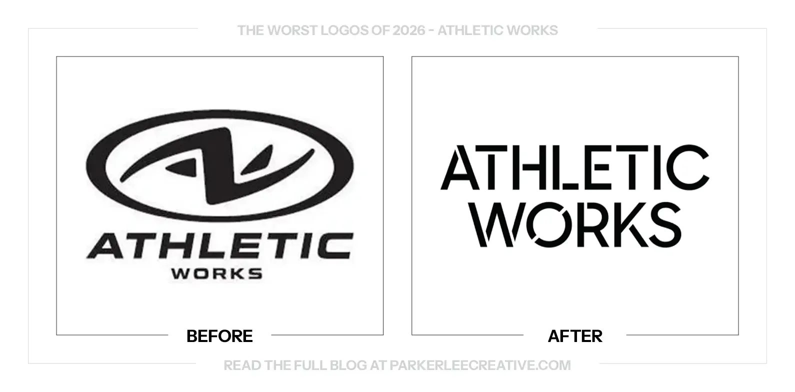
1. Athletic Works
Why Did the Logo Change?
Walmart’s Athletic Works needed an identity to match a refreshed product range across clothing, footwear and equipment. Transport New York built a system around everyday movement, with a wordmark inspired by stenciled utility lettering and a shared approach to packaging.
Why It Made the List:
The breaks in the lettering create activity without giving me a clear visual idea to hold onto. I can see the stencil reference, but the gaps feel disconnected across the name. They add a reading step where an everyday activewear brand could be more direct.
Removing the old symbol gives up a separate asset for shoes, labels and small placements. A wordmark can certainly do that job, but this one spreads its character across two lines. The name has become more elaborate as the compact identifying shape disappears.
The wider system may be more consistent, but the main mark feels less memorable to me. Utility lettering is a reasonable starting point; the question is what makes this version belong to Athletic Works. The construction does not give me a strong enough answer.
The Tradeoff:
The new system has a clearer, more contemporary presentation across a large range. The old logo was hardly without problems. My concern is that the refresh trades a recognizable compact symbol for a wordmark whose interruptions demand more attention than they repay.
What Businesses Can Learn:
Before removing a symbol, test the replacement in every small placement that symbol handled. A good-looking name at presentation size may not solve a shoe label, zipper pull or equipment tag. The new identity should cover the old mark’s useful jobs.
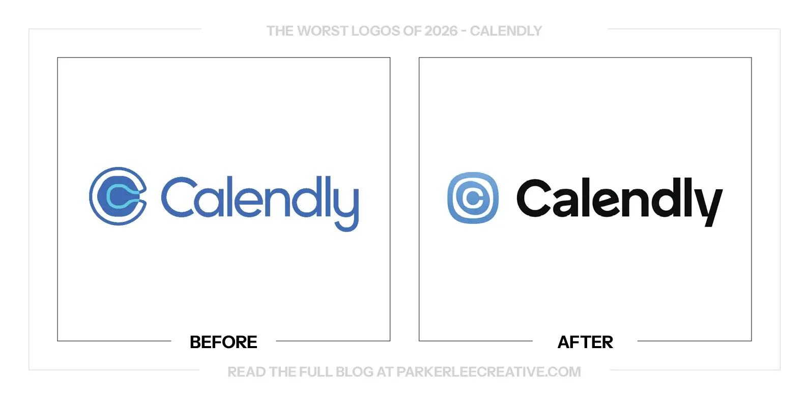
2. Calendly
Why Did the Logo Change?
Calendly’s expanding role around meetings called for an identity that could support more than scheduling links. The refresh gives the name a stronger wordmark and revisits the C icon as the business introduces tools for preparation, notes and follow-up.
Why It Made the List:
The new icon is tidier, but it still feels like a symbol being worked around rather than resolved. The nested C and enclosing shape create another layer to interpret. I would rather see a clearer identifying idea than another adjustment to the same visual puzzle.
The heavier wordmark is easier to see, yet the icon does not feel equally settled beside it. The name is direct; the symbol is still busy. That mismatch makes the lockup feel less confident than a scheduling tool with such a familiar name could be.
A simple C or a well-considered calendar reference would give this brand plenty to work with. Instead, the refresh keeps asking a more complicated form to become recognizable. To me, this is a case where restraint would help more than another clever contour.
The Tradeoff:
There is a real improvement in the wordmark’s presence, and continuity with the previous C avoids starting recognition from scratch. Keeping that connection also preserves the part I find least convincing. The system is cleaner, but the central idea still feels unresolved.
What Businesses Can Learn:
A second revision should start by asking whether the underlying idea is right. Refining an awkward symbol can make it more polished without making it clearer. Compare it with a deliberately simple alternative before committing to another round of small adjustments.
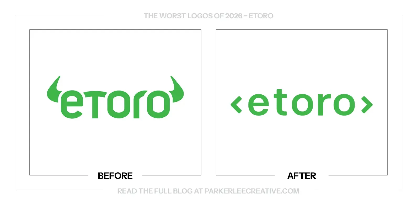
3. eToro
Why Did the Logo Change?
eToro refreshed its identity around a broader investing platform and its changing relationship with technology and users. The new wordmark replaces the bull-horn ends with outward brackets, moving the presentation toward a more open, digitally oriented visual language.
Why It Made the List:
The bull horns gave the old name an immediate connection to investing. Replacing them with brackets makes the mark feel more like a technology platform. That may reflect part of the business, but it gives up a useful piece of category recognition along the way.
The brackets put the wordmark in an uncomfortable middle ground for me. They suggest code, framing or exchange without settling on one clear reading. The result feels less distinctive than the horns, even though the simpler lettering is easier to manage.
The green keeps a familiar cue, but color cannot carry all of the personality the old mark supplied. The new name is quieter and more neutral. I would have liked a stronger connection between the cleaner construction and the particular investing community behind it.
The Tradeoff:
The brackets and simpler type may work more comfortably across digital layouts and a broader product range. The cost is a less specific identity. The old horns were not subtle, but they gave people something memorable that the new treatment needs time to replace.
What Businesses Can Learn:
When an identifying detail already connects your business to its category, treat removing it as a real tradeoff. Put the old and new marks beside competing brands. Check whether the replacement has gained flexibility by giving away the thing that made it recognizable.
4. Gilcrease Museum
Why Did the Logo Change?
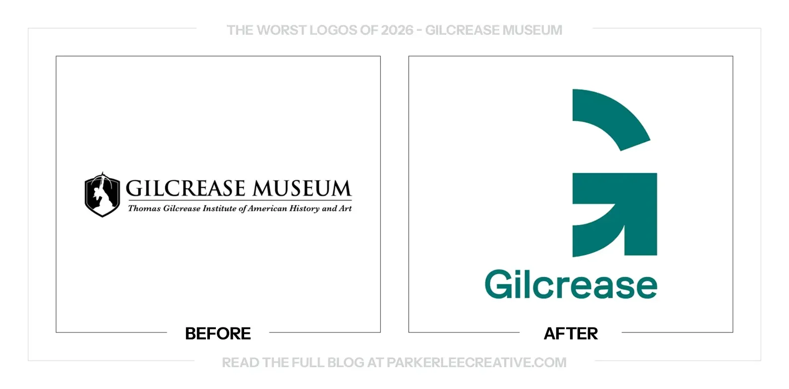
Gilcrease worked with Ologie on an identity that reflects the breadth of its art, historical materials and cultural objects. The museum describes the new G and layered system as an invitation for visitors to bring their own perspectives to an unfinished story.
Why It Made the List:
The G is clear as an abstract symbol, but it does very little to introduce a museum. Without the supporting explanation, I could place it in software, finance or education just as easily. The mark feels further from the institution’s particular collections than I would like.
Removing Museum from the main signature makes that introduction harder. Gilcrease is familiar to people who already know it; a new visitor has less help. A cleaner name is useful only if the surrounding identity consistently tells people what they are being invited to experience.
The layered-story concept has a good reason to exist, but the logo alone does not communicate that richness. Its open construction asks for interpretation before giving much context. I would want the name and applications to do more of that introductory work immediately.
The Tradeoff:
The old lockup was small and crowded, and the new G is much easier to place. The wider identity also has room to show the collection. My concern is the first encounter, when a visitor sees a generic-looking symbol before learning why this particular museum matters.
What Businesses Can Learn:
Do not remove a useful descriptor simply because the shorter name looks cleaner. Test the identity with someone outside your existing audience. If they cannot tell what the business is, decide exactly where that missing context will appear in ordinary use.
5. Google Fiber
Why Did the Logo Change?
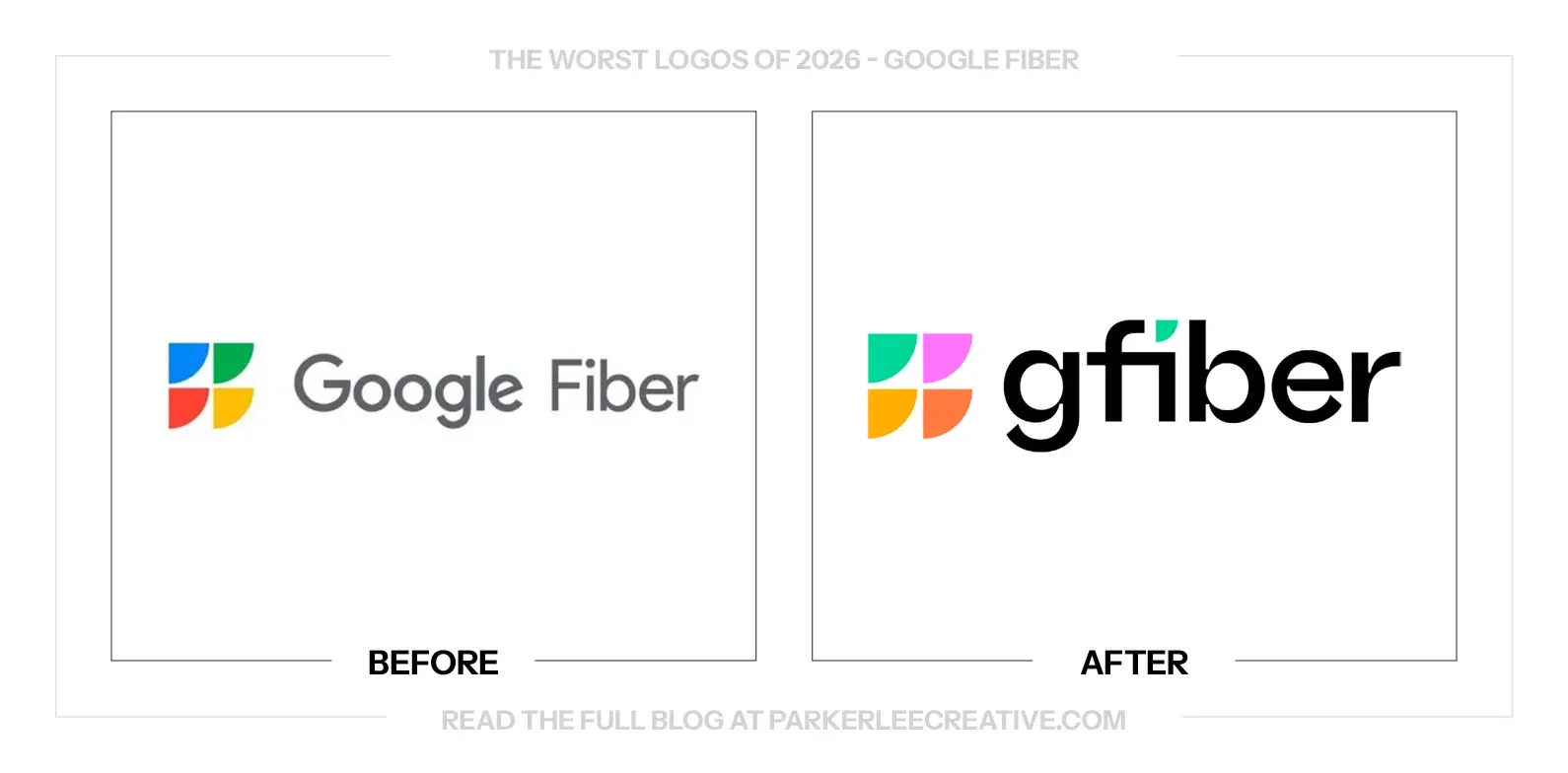
Google Fiber formally adopted the GFiber name in 2026 after using it as a primary name for more than a year. The business said the shorter name reflects its focus on the internet experience, with a refreshed visual identity accompanying that evolution.
Why It Made the List:
The tight spaces in the lettering make the new name feel more crowded than it needs to be. The g, b, e and r have different amounts of breathing room, which gives the wordmark an uneven density. A simpler name should have been an opportunity to make reading easier.
The connection between the f and i adds another point of congestion. It is a small detail, but it sits where the eye is already working through a compact name. The custom treatment feels more noticeable than helpful when a straightforward wordmark would do the job.
The new color arrangement feels less connected to the Google recognition the old mark borrowed. A more independent identity could make sense, but it needs a compelling character of its own. Here, the brighter symbol and compressed name do not quite feel resolved together.
The Tradeoff:
A shorter name and more independent visual identity give the provider room to build recognition beyond the Google wordmark. That is a reasonable goal. The tighter typography makes the change feel less clear than the business’s promise of a simple, dependable internet experience.
What Businesses Can Learn:
Custom lettering still needs ordinary breathing room. Check the counters, joins and spacing at the sizes customers will actually see. If a shorter name becomes harder to read after refinement, revisit the construction before adding more personality around it.
6. Harley-Davidson
Why Did the Logo Change?
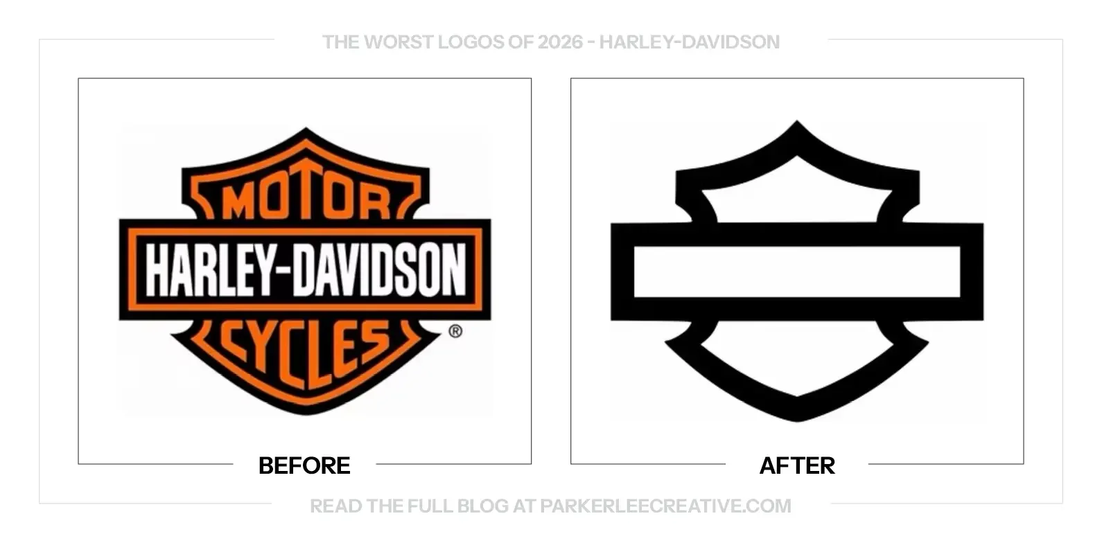
Harley-Davidson introduced a renewed brand direction around RIDE, using its familiar bar-and-shield shape in a more stripped-back way. The approach puts greater emphasis on the silhouette and the riding experience while connecting the brand with its next chapter.
Why It Made the List:
The empty bar and shield asks recognition to do almost all the work. Longtime riders may fill in the missing name immediately, but a new audience gets far less help. The outline is familiar; removing the words also removes the most direct introduction to Harley-Davidson.
The heavy black bar changes the emotional reading for me. It can feel closer to a memorial-style badge than a motorcycle brand full of movement and independence. That is a visual association, but it is one I would want to test before making this the lead expression.
The old mark named both the company and the product category. The new shape is bolder and simpler, yet it communicates less on its own. Reaching a new generation should make the brand easier to enter, not depend entirely on recognition that audience may not have.
The Tradeoff:
The stripped-back silhouette is easy to reproduce and can act as a strong badge on merchandise. It also has genuine history behind it. The difficulty is deciding when that familiarity is enough and when the full name needs to return to make the brand unmistakable.
What Businesses Can Learn:
A symbol can stand alone only when the audience has learned what it represents. Test recognition beyond loyal customers before removing the name. Keep a complete lockup for introductions instead of assuming that a familiar shape will communicate equally well to everyone.
7. Instagram
Why Did the Logo Change?
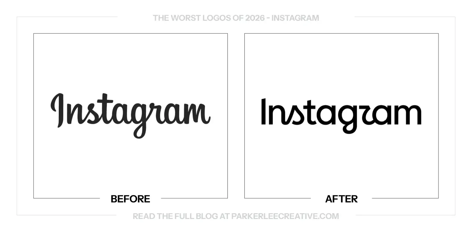
Instagram introduced a new wordmark and wider identity in 2026, moving from its familiar script toward a more contemporary lettering system. The update changes how the platform presents its name while retaining recognition through its established product and app identity.
Why It Made the List:
The old script had awkward moments, but its connected rhythm gave the name a recognizable voice. The replacement moves between connected and separated letters in a way that feels less settled to me. The reading is cleaner in places, but the personality is less coherent.
The wordmark feels more corporate at the point where I would want Instagram to feel creative. It is a platform built around people expressing themselves, and the new lettering gives me less of that invitation. The refinement has taken away some useful character.
A wider family resemblance may help organize related products, but Instagram still needs its own reason to look the way it does. The new treatment feels caught between a familiar signature and a neutral platform name. I would have preferred a more confident commitment to one direction.
The Tradeoff:
A simpler wordmark can be easier to manage across languages, layouts and digital applications. The old script was not universally practical. The cost is a less distinctive signature, and the replacement needs enough individual character to justify moving away from something people knew.
What Businesses Can Learn:
Do not make related brands resemble one another without deciding what each one should keep. A shared system can organize a portfolio while preserving different voices. Identify the recognizable behavior of the existing lettering before replacing it with a more neutral family style.
8. Jergens
Why Did the Logo Change?
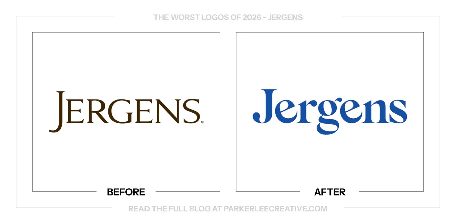
Jergens refreshed its identity around its 125th anniversary while working to reach younger consumers. The rollout included a Joy Club tour, creators and product experiences, presenting the new logo as part of a wider attempt to bring a new generation into the brand.
Why It Made the List:
The angled details in the e feel more like a visual trick than a lasting reason to recognize the brand. There is room for personality in a lotion identity, but this particular treatment pulls my attention away from the calm assurance I associate with the product.
The softer, more playful name makes a noticeable jump from the old heritage presentation. That can invite new customers, but it also changes the relationship with existing ones. I would have liked a clearer bridge between the established brand and its younger tone.
The new blue and friendlier lettering are approachable, yet the overall effect feels more novelty-led than sophisticated. The issue is not that Jergens should stay old-fashioned. It is whether this specific personality gives a long-running care brand enough staying power.
The Tradeoff:
The refresh gives Jergens a more visible, accessible role in social content and live experiences. That can be useful when reaching younger shoppers. The challenge is retaining the reassurance of an established care brand while introducing a much more playful visual voice.
What Businesses Can Learn:
When trying to reach a younger audience, define what should change and what should remain reassuring. A new tone can invite people in without discarding the reasons existing customers trust the brand. Test that bridge rather than assuming a younger-looking logo is enough.
9. KFC
Why Did the Logo Change?
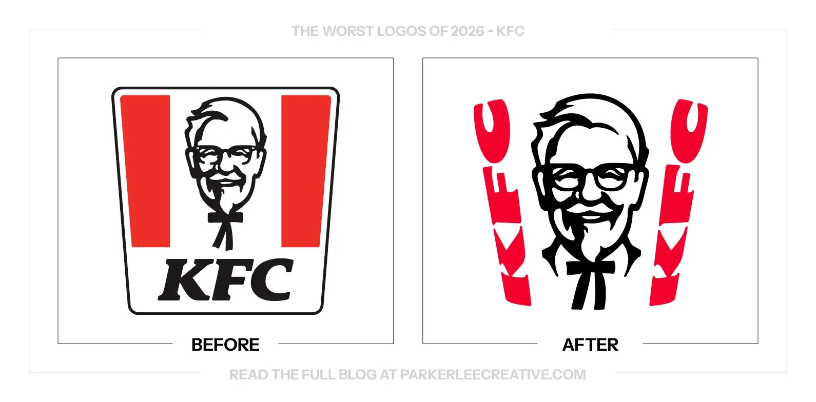
KFC rebuilt parts of its identity around the bucket, refreshed Colonel Sanders and introduced a stripes-as-type approach in 2026. The system extends familiar assets into packaging, advertising, digital work and restaurant environments while giving the brand more expressive options.
Why It Made the List:
Turning the stripes into lettering makes the name harder to read in the comparison. The bucket is a useful asset, but the typographic treatment asks the viewer to decode it first. A fast-food signature should not need that much time before it says who is serving dinner.
The angular construction feels closer to an edgy technology launch than the warmth of the Colonel beside it. Those two voices compete instead of supporting each other. The portrait has familiarity and character; the surrounding lettering feels determined to pull in another direction.
There are several strong assets here, but the combination feels overworked. The bucket, portrait, stripes and name all want to be the main idea. The system would feel more confident to me if one led clearly and the others were allowed to do simpler supporting jobs.
The Tradeoff:
Using the bucket as a broader design device gives KFC useful recognition across packaging and campaigns. The refreshed Colonel also preserves a distinctive asset. My concern is the most compressed lockup, where the expressive lettering makes a familiar name less immediate.
What Businesses Can Learn:
Give established brand assets a hierarchy before combining them. If the portrait already identifies the company and the container already suggests the product, the lettering may be most useful when it reads plainly. Every element does not need its own reveal.
10. McLaren
Why Did the Logo Change?
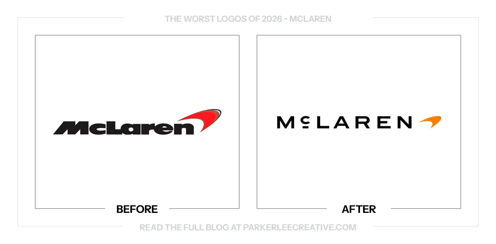
McLaren introduced a shared identity across Automotive and Racing in September 2026. The new wordmark draws on the sign above Bruce McLaren’s family service station, while the Speedmark, papaya color and other historic references connect the system to the brand’s origins.
Why It Made the List:
The new lettering feels closer to a luxury fashion signature than a racing name. Wider spacing and restrained capitals create polish, but much of the old wordmark’s forward movement has disappeared. The result feels less connected to the energy I expect from McLaren.
The small underline beneath the c draws attention without earning a clear role in the finished mark. A detail can have an archival reason and still feel awkward in use. Here, it interrupts the otherwise restrained lettering rather than making the name feel more resolved.
Keeping the Speedmark preserves an important identifying asset, but it also exposes how neutral the new lettering feels beside it. The symbol still suggests movement. The wordmark feels comparatively static, so the two parts are no longer telling quite the same visual story.
The Tradeoff:
The quieter lettering can support a wider luxury offering, and its connection to the family service station gives it a real source. That history is worth explaining. It does not automatically make the finished relationship between the letters and Speedmark more convincing.
What Businesses Can Learn:
An archive can provide a strong starting point without supplying the final answer. Test a historic reference against the business people recognize today. Keep the story, then refine the drawing until it feels right in the present as well as meaningful in the past.
11. New York Lottery
Why Did the Logo Change?
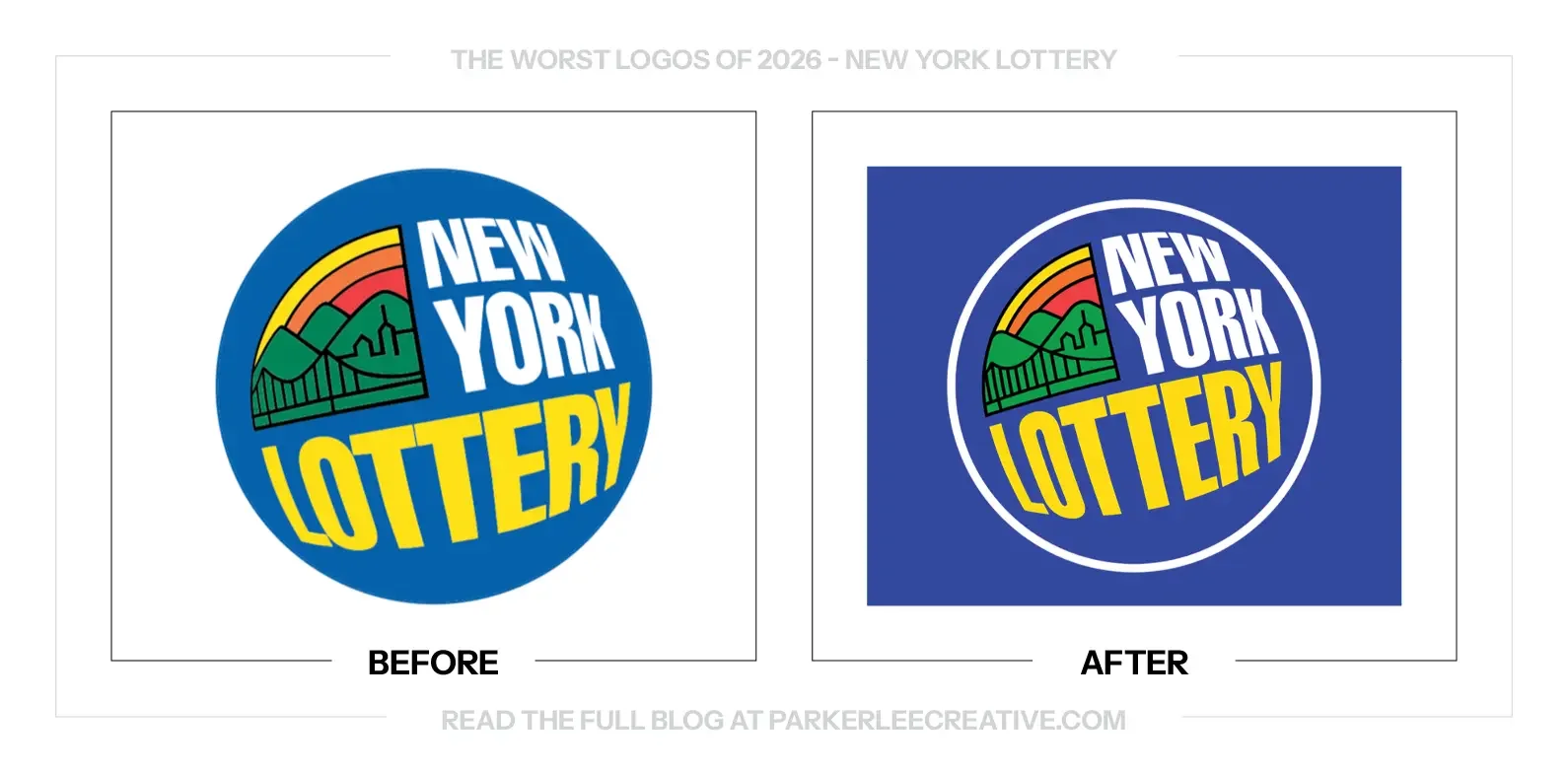
The New York Lottery introduced a refreshed identity alongside its Can You Imagine? platform in 2026. The work aims to reconnect the brand with the possibilities people associate with playing, using a revised logo and a campaign with a stronger role for motion.
Why It Made the List:
The lettering is cleaner, but the overall change feels too small to settle the badge’s bigger problems. There is still a lot of information competing inside a compact circle. I would have liked the refresh to make the name and illustration work together more clearly.
The resemblance between the two versions creates a practical rollout question. A vendor or employee could easily mistake an old file for the new one. That does not mean confusion has happened, but the small differences put more responsibility on careful asset management.
The motion work gives the identity more life than the still mark does on its own. That is useful for advertising, but a lottery also lives on printed tickets, signs and retail materials. The basic logo should feel equally convincing when none of the movement is available.
The Tradeoff:
Keeping the familiar badge protects recognition, and a quiet update does not automatically need to be dramatic. The problem is whether the refinement has done enough practical work. The new identity still has to justify the effort of replacing physical assets with something so similar.
What Businesses Can Learn:
Plan the rollout while refining the logo. If the change is subtle, make old and new files unmistakable to the people placing them. Clear naming, a single asset source and simple replacement guidance can prevent a careful refresh from becoming a mixed collection of versions.
12. Peacock
Why Did the Logo Change?
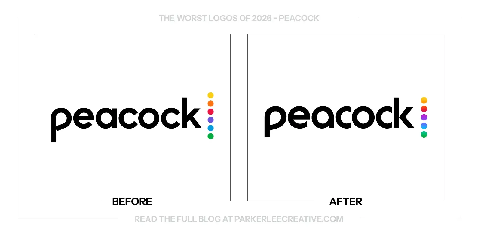
Peacock updated its wordmark and color-dot treatment in 2026, refining the presentation of its streaming brand. The comparison shows a quieter lettering adjustment alongside a more noticeable change in the colored signature that connects the name to its peacock reference.
Why It Made the List:
The name has been cleaned up, but the update leaves me wondering why some details were changed while others remain awkward. The e still does not feel fully resolved within the wordmark. A subtle refresh should make those small relationships feel especially deliberate.
Reducing the color sequence weakens the connection I associate with the NBC peacock. Those individual colors were doing useful recognition work. A smoother gradient may feel current, but it changes a familiar reference without giving me a stronger replacement for it.
Because the business is digital, the change is easier to distribute than a physical packaging overhaul. That does not remove the need for a clear design reason. The new version is close enough to invite comparison, and the improvements do not feel consistent across the mark.
The Tradeoff:
A simpler color treatment and refined lettering may be easier to manage across screens. The familiar name remains intact. The cost is losing some of the discrete color recognition that made the old signature feel connected to its parent brand and namesake.
What Businesses Can Learn:
For a small refresh, list exactly what each change improves. If a recognizable color sequence is being simplified, test what that sequence was communicating first. A smoother finish is not automatically more useful than the clear associations customers already learned.
13. Pirate’s Booty
Why Did the Logo Change?
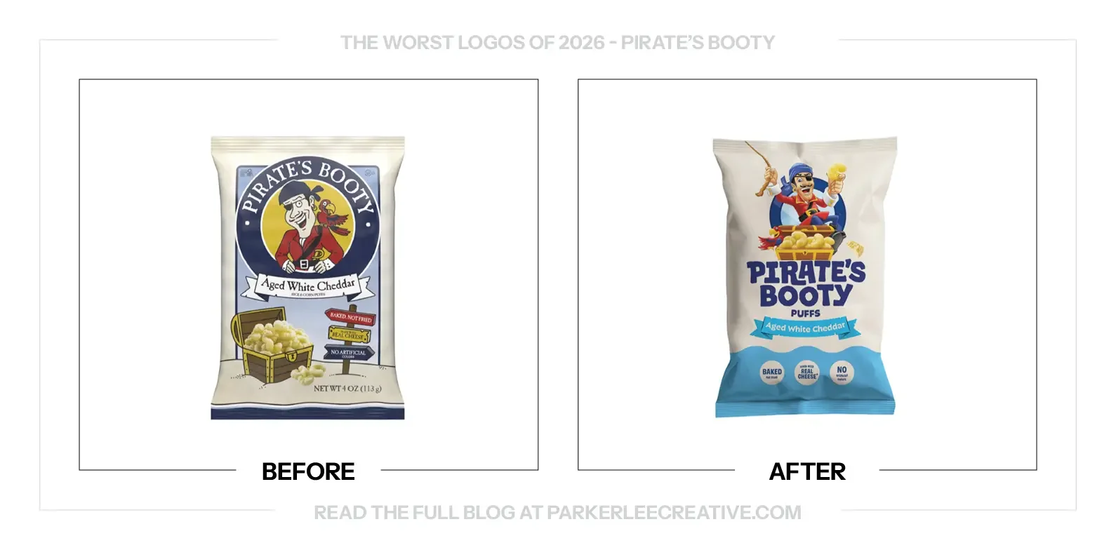
Pirate’s Booty refreshed its packaging, pirate character and wordmark in 2026. The new presentation reorganizes the bag around a more prominent character and product name, moving away from the older illustrated badge toward a smoother, more contemporary package system.
Why It Made the List:
The old pirate was awkward, but the awkwardness gave the package a character of its own. The new drawing feels much smoother and safer. It is cleaner, yet the unusual little details that made the brand recognizable have been polished away with the rough edges.
The new lettering is friendly and easy to place, but it feels less particular to this snack. A children’s brand has room to be a little weird. The name and character could have become clearer without moving so far toward the visual comfort of the rest of the aisle.
The bag has a more organized hierarchy, but the overall personality feels less alive to me. Everything has been rounded and made agreeable. For a brand called Pirate’s Booty, I want a little more mischief than a tidy character sitting above a very safe wordmark.
The Tradeoff:
The updated package is easier to organize and gives the product name more presence. Those are real advantages. My concern is that the cleanup treats eccentricity as clutter, when some of that eccentricity was the reason the old bag could be recognized so quickly.
What Businesses Can Learn:
Before smoothing out a mascot, identify which awkward details give it character. A clearer drawing should still belong to the same brand. Compare it with the rest of the shelf and ask whether the cleanup has made it more recognizable or merely more agreeable.
14. RAKBANK
Why Did the Logo Change?
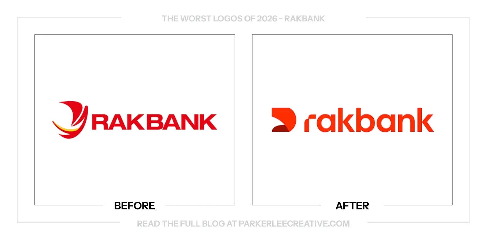
RAKBANK worked with Koto around its 50th anniversary to connect digital convenience with personal service. The refresh includes a simplified dhow-inspired symbol, a new wordmark and a shared system across its banking businesses, physical locations and digital experience.
Why It Made the List:
The folded shape has an appealing idea behind it, but its overlapping planes depend on subtle differences to read clearly. At small sizes or in restricted production, that relationship becomes less obvious. I would want a stronger flat silhouette before relying on the dimensional effect.
The dhow reference connects the symbol to a regional story, yet it is not an immediate reading without the explanation. The form feels abstract first. That is not automatically a problem, but the wider system has to work harder to make the idea belong to this bank.
The friendlier lowercase name feels more approachable, but the symbol still has a sharp, folded quality beside it. Those two voices do not quite meet for me. The promise of a human touch is clearer in the language than in the main lockup’s visual relationship.
The Tradeoff:
The refresh brings a more consistent experience across a complicated banking business, and the retained red protects familiarity. Those improvements matter. My concern is the core symbol, where the dimensional construction asks more of reproduction and interpretation than I would prefer.
What Businesses Can Learn:
Test a dimensional symbol as a flat, one-color shape before approving it. If the idea depends on a fold, gradient or overlap, define how that relationship survives in small and restricted uses. The explanation should add depth to a mark that already works.
15. Rothfield
Why Did the Logo Change?
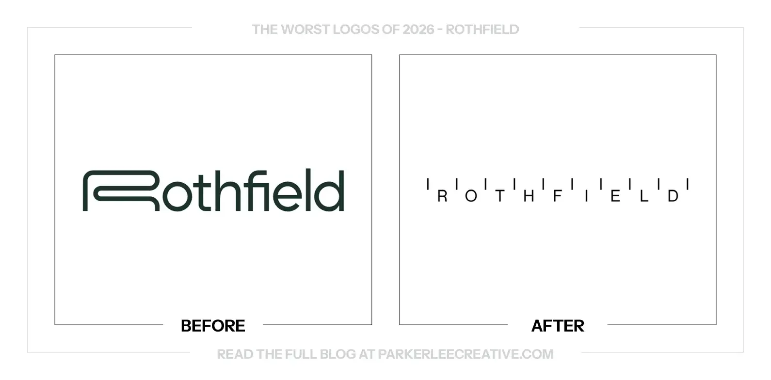
Rothfield’s business had expanded beyond its roots in print management, promotional products and logistics. Julius and strategy partner Stake Reputation built a new identity around calibration, using measurement, markers and precision to express the company’s wider procurement, technology and production work.
Why It Made the List:
The calibration idea is understandable, but the name becomes something to decode. Thin letters spread beneath a row of markers lose the easy reading the old wordmark had. The visual concept takes the lead before the business has clearly introduced itself.
The fine lines and wide spacing make the signature fragile at ordinary small sizes. A large presentation gives every detail room; a proposal footer or mobile header does not. The system’s precision needs to help the name stay visible, rather than make it feel more delicate.
Rothfield has a useful story about careful production, yet the wordmark makes that care feel unnecessarily complicated. The markers could have carried the idea elsewhere in the identity. Putting so much of the concept into the name reduces the clarity of its most basic asset.
The Tradeoff:
The calibration system gives Rothfield a distinct visual language across layouts and motion. It is more specific than generic logistics imagery. The cost is a much less immediate wordmark, which needs a clearer small-use option if the identity is to feel practical day to day.
What Businesses Can Learn:
A visual idea does not have to appear in every part of the identity. If a graphic device already communicates precision, let the name read plainly. Test the smallest routine placement before deciding that the signature should also carry the full conceptual story.
16. Schweppes
Why Did the Logo Change?
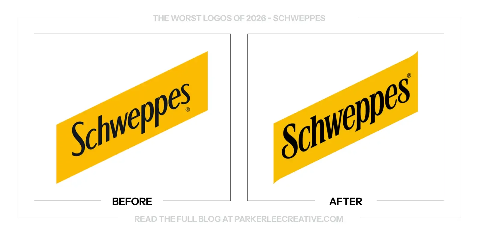
Schweppes revisited its heritage as part of a refreshed global identity and packaging system. The work retains the yellow ribbon and black lettering while refining their character, using familiar assets to support a more considered presentation across the range.
Why It Made the List:
The lettering has real character, but the relationship with the yellow ribbon still feels uneasy. The word’s visual rise and the band’s diagonal do not appear to move together. In a mark this restrained, that small disagreement becomes one of the first things I notice.
The refresh preserves the familiar ingredients without fully resolving how they sit together. That is frustrating because the name and color already have so much recognition. I would rather see the effort go into their exact relationship than into a change that remains so close.
The new drawing may be more polished in isolation, but the finished logo still asks the ribbon to hold lettering that feels differently angled. That is the detail I would want to settle before expanding the system across packaging. Familiarity should make refinement more exacting.
The Tradeoff:
There is plenty to like in the typography and the decision to keep the yellow ribbon. The identity does not need wholesale reinvention. My reservation is about the optical fit between those assets, which remains more noticeable than the refinements are rewarding.
What Businesses Can Learn:
Check the relationship between a wordmark and its container as carefully as the lettering itself. Matching numerical angles is not enough on its own; the whole mark has to look balanced. Use guides, then make the optical adjustments that ordinary viewing reveals.
17. Semrush
Why Did the Logo Change?
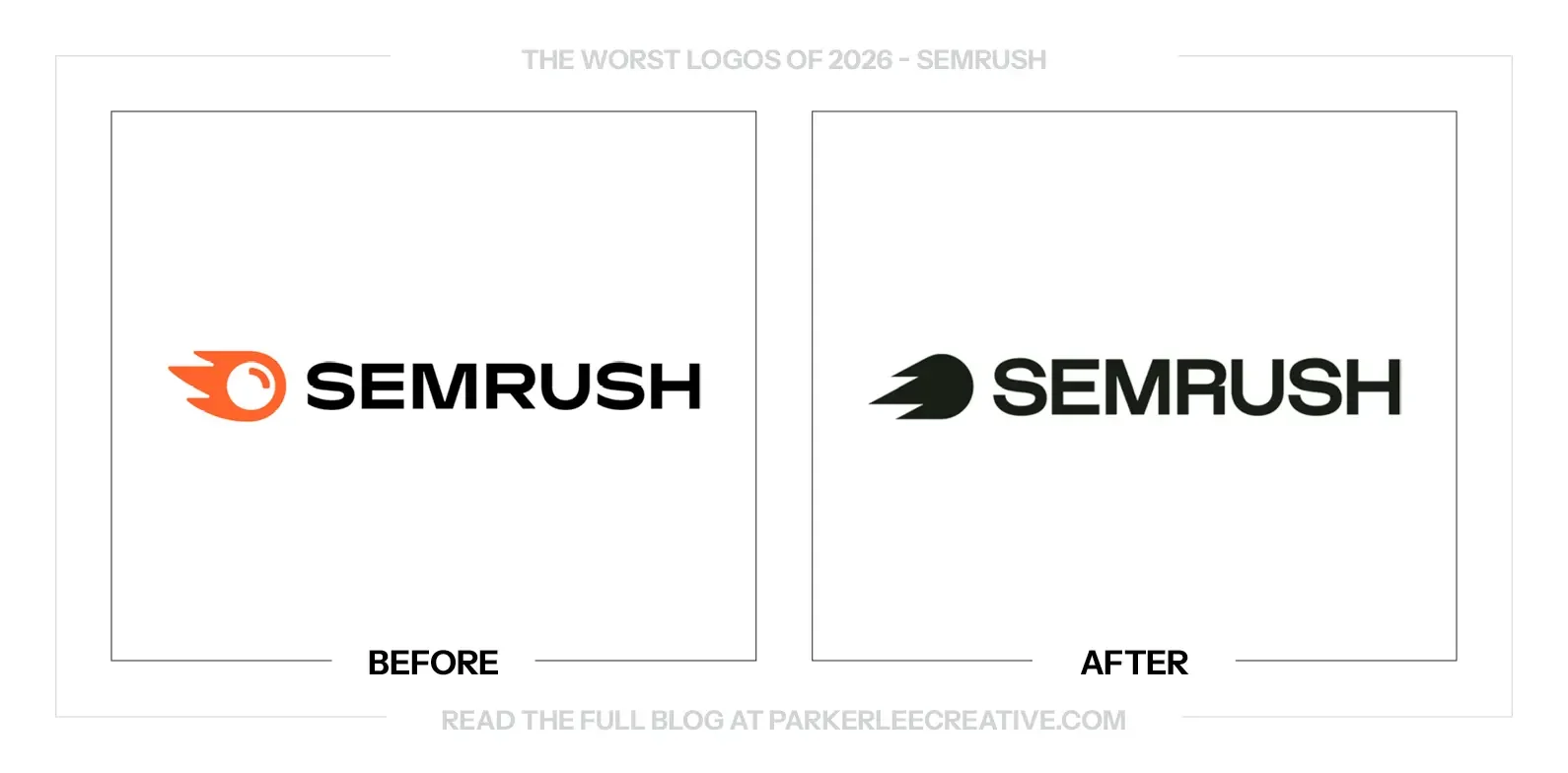
Semrush refreshed its brand as its offering expanded around changing ways people find information online. The updated identity simplifies the familiar symbol and wordmark, presenting a broader search-visibility business with a more restrained visual system.
Why It Made the List:
The symbol is simpler, but the simplification removes some of the character that made the old mark easy to recognize. The eye and fuller shape gave it a particular personality. The replacement feels more like a speed device than something only Semrush would use.
The wordmark is very close to what came before, so the change asks to be judged on small refinements. Those details do not give me a convincing new reason to notice it. The result feels quieter without becoming noticeably clearer or more distinctive.
The old orange supplied an immediate cue in a crowded software category. The restrained treatment shown here gives that cue less responsibility, but the new form does not offer an equally memorable substitute. It feels like less brand, rather than a more focused expression of it.
The Tradeoff:
A simpler mark can be easier to place across a wider software offering, and the familiar silhouette preserves some continuity. The challenge is that the removed character was useful recognition. The broader system needs to demonstrate what the quieter signature gains in return.
What Businesses Can Learn:
Small changes still need a clear objective. Before removing a memorable detail or color, decide what practical limitation it creates. If the old asset works well, improving the surrounding product and communication system may be more valuable than making the logo less specific.
18. Tecate
Why Did the Logo Change?
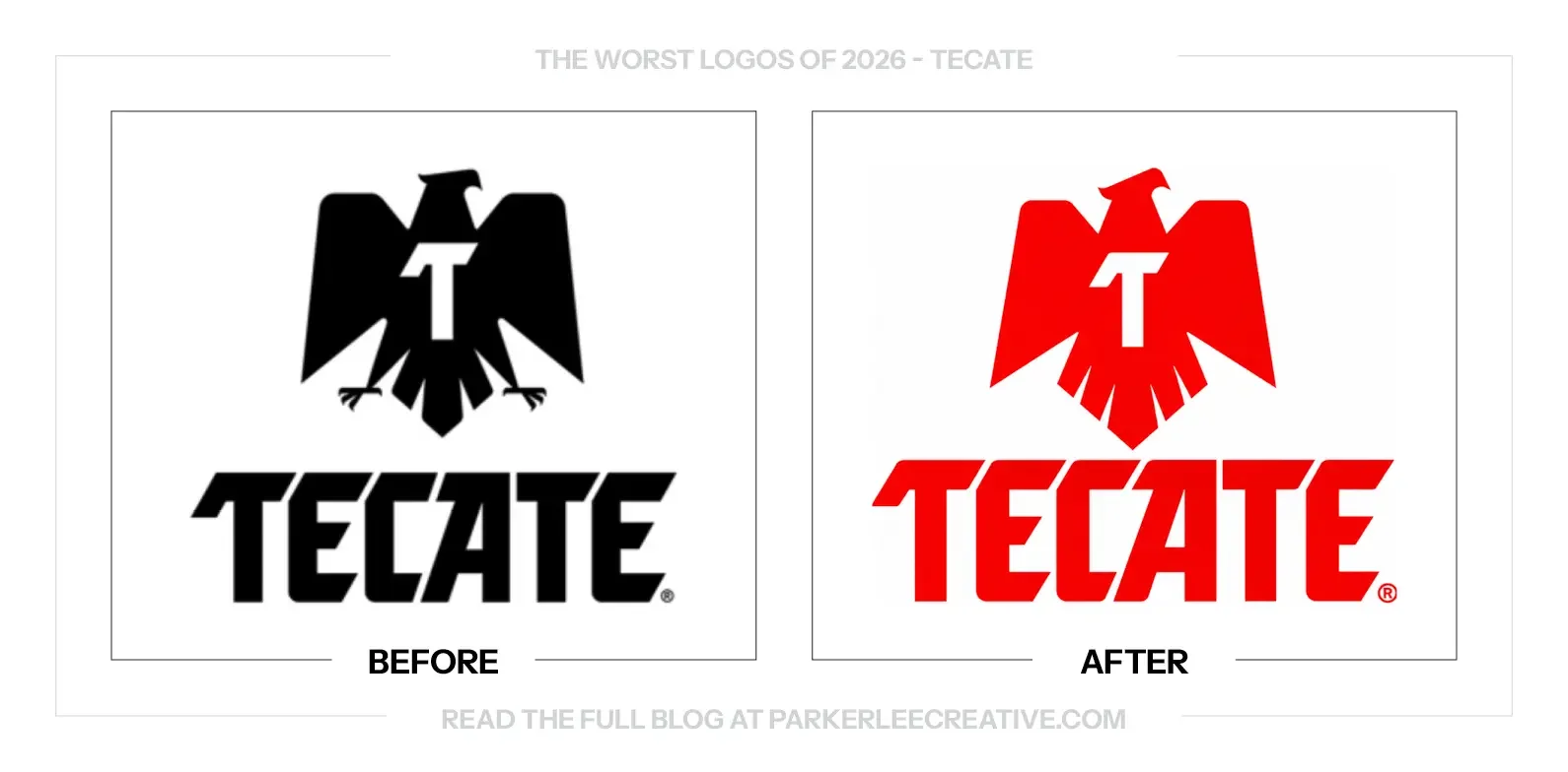
Tecate worked with Bulletproof on a refreshed identity following research into its history and consumers. The 2026 system keeps the eagle, familiar colors and an archival ingot reference, aiming to strengthen the beer’s connection with younger drinkers while retaining its established character.
Why It Made the List:
The eagle has become bigger and simpler, but removing the feet also takes away some of its character. The stronger silhouette is useful; I am less convinced that every removed detail was a problem. The new bird feels more standardized than the one it replaces.
The lettering moves between sharp cuts and softer shapes in a way that feels unresolved. Those decisions can coexist, but they need a clearer rhythm. Here, the name seems to pull between two different personalities instead of making the contrast feel deliberate.
The white T inside the eagle draws attention to how the symbol balances. Its position does not feel comfortably centered to me, which makes a very simple construction harder to settle. Enlarging the mark has made that relationship more prominent rather than more convincing.
The Tradeoff:
The new eagle has a stronger shape for large packaging and reduced digital uses, and the red is unmistakably Tecate. Those are useful gains. My concern is the final optical balance, where simplification has made the remaining proportions and letter relationships more exposed.
What Businesses Can Learn:
The fewer elements a logo has, the more responsibility each one carries. After simplifying, revisit spacing and optical balance from the beginning. A cleaner outline can reveal a proportion problem that was less noticeable when the mark had more detail around it.
19. Threads
Why Did the Logo Change?
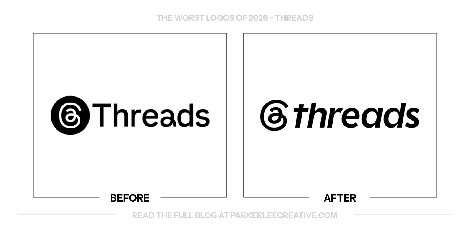
Threads updated its branding in 2026 with a more expressive wordmark and a wider visual system. The name moves from a straightforward upright treatment toward a heavier, slanted presentation, while the familiar thread-like symbol remains a point of recognition.
Why It Made the List:
The slant adds movement, but movement alone does not give Threads a clearer personality. The new name feels like an existing platform style pushed forward rather than a distinct idea. I would want the lettering to say something more particular about the experience.
The heavier lowercase treatment brings a more casual voice, yet the relationship with the symbol feels less settled. The icon has its own tight, looping energy; the name moves in a different way. Together, they feel more assembled than naturally connected.
A platform built around conversation has plenty of material to draw from. The wordmark could express exchange, rhythm or the way a thread develops. The treatment shown here feels more like a stylistic update than a clear visual expression of any of those qualities.
The Tradeoff:
The new lettering is more energetic and can support expressive digital layouts. Keeping the existing symbol also protects recognition. The question is whether the added attitude helps the brand feel more individual or simply gives a familiar name another fashionable treatment.
What Businesses Can Learn:
Do not confuse a change in posture with a stronger identity. Italics, weight and lowercase lettering can alter a tone quickly. Define the behavior or idea the brand should own first, then decide whether those typographic choices actually express it.
20. TIEN
Why Did the Logo Change?
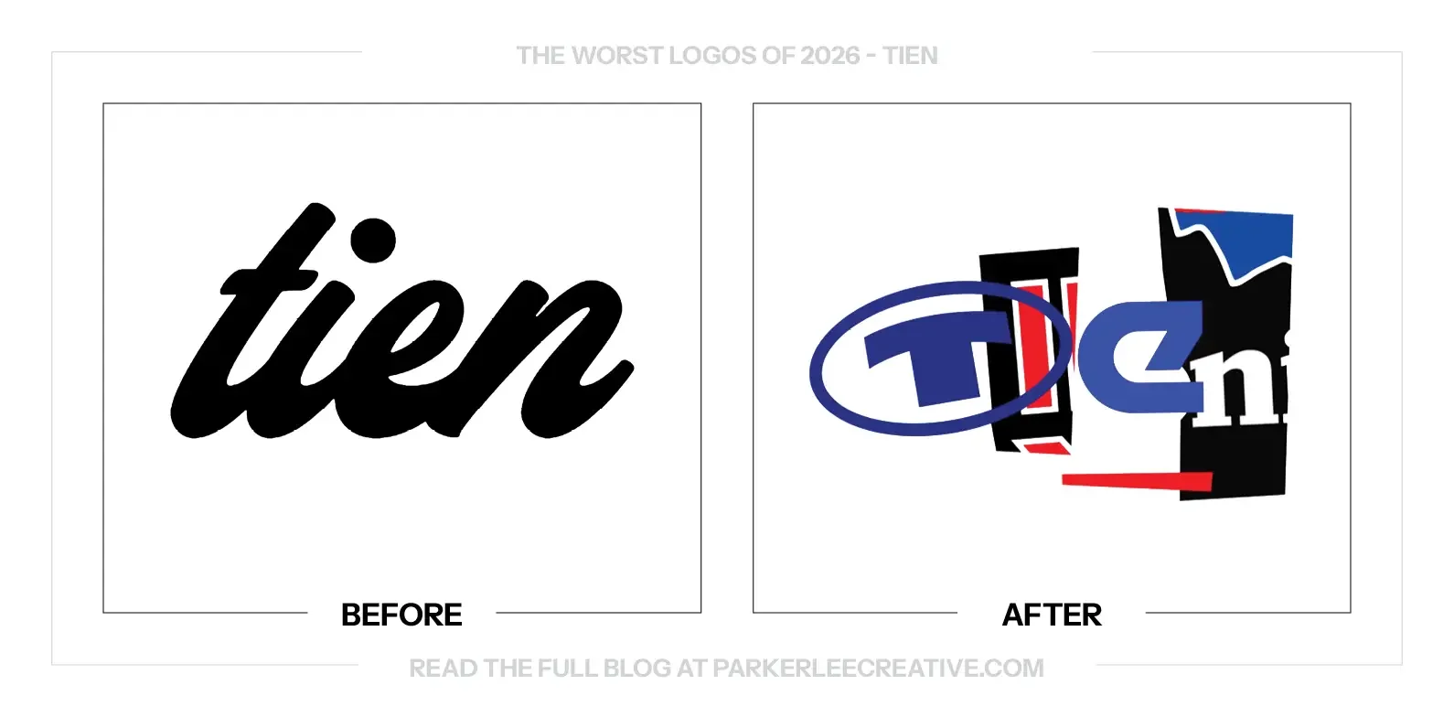
TIEN’s identity takes the thrift-store idea of reuse literally. FCKLCK built the name from fragments of existing clothing labels, creating changing combinations rather than a single fixed wordmark. The visual concept mirrors a business built around giving discarded items another life.
Why It Made the List:
The reuse idea is clever, but the name is hard to read. Overlapping fragments bring their original shapes and habits with them, so the four letters do not form a dependable sequence. The concept arrives before the basic information a first-time customer needs.
A changing collage can be entertaining in a presentation and still be difficult on a sign. The version shown makes me work to separate letters from decoration. I would want a clearer everyday signature before giving the system permission to become this visually unpredictable.
The borrowed fragments carry associations from other brands, which can compete with TIEN’s own recognition. That is part of the concept, but it is also a cost. The store needs people to remember its name, not only the familiar pieces they spotted inside the composition.
The Tradeoff:
The identity has a memorable premise and a direct connection to secondhand clothing. Its variations can be interesting campaign material. The weakness is the primary reading task, where the same flexibility makes the name harder to learn and reproduce consistently.
What Businesses Can Learn:
Stress-test the concept outside the case study. Put it on a small sign, a receipt and a mobile header, then ask an unfamiliar person to read the name. Keep the expressive version where it helps, and provide a clear signature for ordinary introductions.
21. Tinder
Why Did the Logo Change?
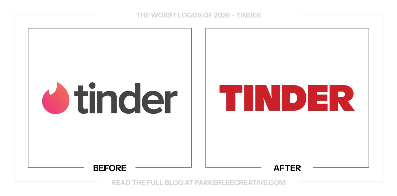
Tinder worked with PORTO ROCHA on a refreshed identity intended to bring more play and human connection into the brand. The update moves beyond a small app signature into a wider system of bold lettering, color, photography and expressive communications.
Why It Made the List:
The new wordmark makes me think of actual tinder: something I might buy for a camping trip. The broad, sturdy capitals feel more at home selling outdoor equipment than introducing a dating app. The name is easy to read, but the emotional signal feels off.
Removing the flame from the main wordmark gives up the most immediate link to the product people already know. The icon still exists in the wider brand, but the standalone name has to work harder. The block lettering does not supply an equally specific replacement.
The heavier treatment is confident, yet it loses some of the warmth and lightness that dating needs. The wider system can bring that back through people and language. I would rather see the main wordmark contribute to that invitation instead of leaving so much of it elsewhere.
The Tradeoff:
The strong capitals work well as large campaign typography, and separating the flame gives layouts more flexibility. The cost is a standalone name with less immediate category recognition and a more rugged tone. The surrounding identity has to reconnect those pieces for the audience.
What Businesses Can Learn:
Test the emotional associations of a new type direction before approving it. A wordmark can be perfectly legible and still suggest the wrong experience. Show it without the campaign explanation and ask what kind of product or service people expect to find behind it.
22. Tostitos
Why Did the Logo Change?
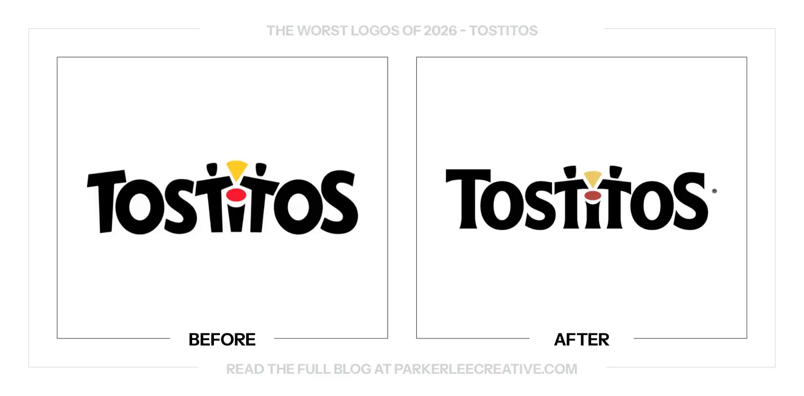
Tostitos refreshed its packaging and identity in 2026 around its ingredients, craft and the experience of sharing chips. The update preserves the familiar people-and-salsa idea while revising the lettering and wider presentation across the product range.
Why It Made the List:
The first T stands more comfortably now, which is a useful improvement. The rest of the name does not feel equally resolved. The two people, surrounding letters and salsa bowl create an uneven rhythm where the old mark’s looser construction felt more connected.
The space around the salsa bowl feels less balanced in the new version. That small scene is the identifying idea inside the name, so its relationships matter. The two figures should feel like they are sharing a moment, not being fitted into leftover gaps between letters.
The small trademark symbol beside the final S feels awkwardly placed. It is a production detail, but a refresh is exactly when those details should be settled. The mark has gained a more upright structure without making all of its spacing feel equally intentional.
The Tradeoff:
The updated lettering has more stability, and the familiar sharing idea remains a valuable asset. The problem is the final fit between the pieces. A recognizable concept can survive a refresh while still becoming less comfortable in the way it is drawn.
What Businesses Can Learn:
When a symbol is built into a wordmark, refine the whole composition together. Fixing one letter can change the space around the illustration and every neighboring form. Include the trademark placement in the final artwork review instead of treating it as an afterthought.
23. Udi’s
Why Did the Logo Change?
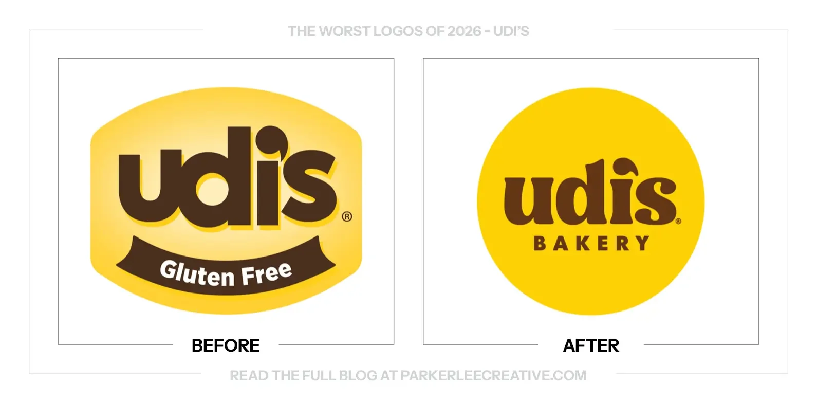
Udi’s refreshed its identity and packaging under the Udi’s Bakery name, replacing the older Gluten Free-led logo with a broader bakery presentation. The change gives the brand a warmer food identity, but it also changes where shoppers encounter its defining dietary information.
Why It Made the List:
Combining the i and apostrophe is a clever construction that does not read comfortably to me. The detail becomes something to work out inside a short name. I would rather have a straightforward relationship between the letters than a small visual trick that interrupts them.
Replacing Gluten Free with Bakery changes the first thing the logo tells a shopper. Bakery is welcoming, but it does not explain the dietary reason many people seek out Udi’s. That information needs an equally obvious place on the package, not a quieter supporting role.
The warmer lettering is a reasonable direction, yet the overall change feels like a missed opportunity to make the brand’s promise clearer. The old mark was not elegant, but it was direct. The new one has more charm and less immediate explanation of why this product is different.
The Tradeoff:
A broader bakery identity can lead with appetite appeal instead of a restriction, which is a sensible goal. The difficulty is preserving the reassurance people rely on. Moving Gluten Free out of the logo should not mean making that information harder to locate on the product.
What Businesses Can Learn:
If customers choose your product for a dietary requirement, treat that information as part of the shopping task. It does not have to live inside the logo, but it must remain easy to find and understand. Test the full package with the people who depend on that cue.
24. Utah Tourism
Why Did the Logo Change?
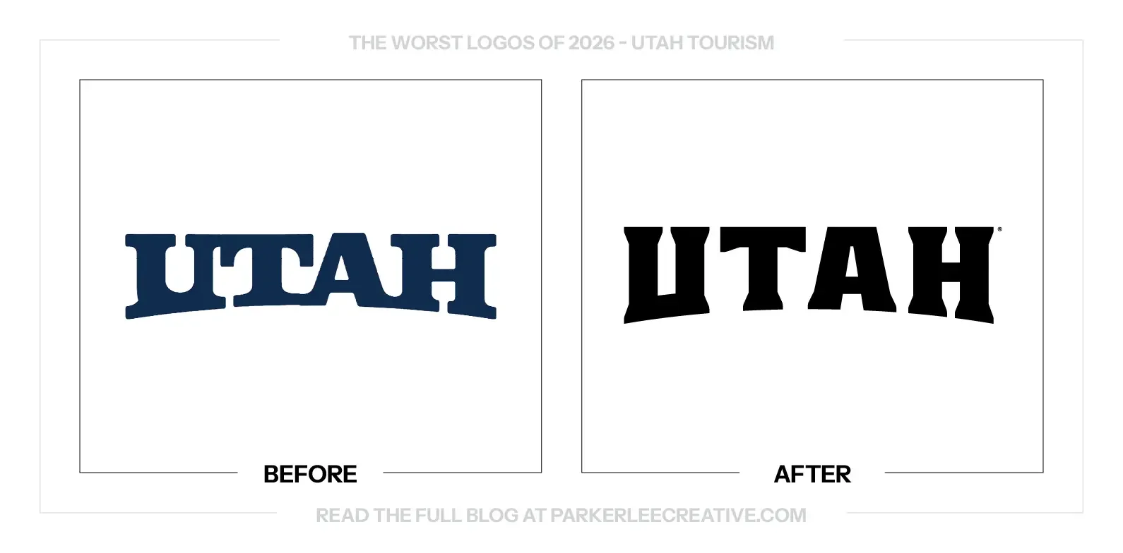
Utah’s tourism identity uses a revised wordmark within its Life Elevated brand. The comparison moves from the earlier curved lettering toward a more upright, angular name, changing how the destination presents itself while retaining the state name as the central identifying asset.
Why It Made the List:
The new wordmark is stronger than the old one, but that is not the same as making the most of the opportunity. Utah has distinctive geography and a recognizable state shape. The lettering feels more forceful without giving me an equally clear connection to the destination.
The sharp cuts add character, yet they do not tell me much about the experience being offered. A tourism mark does not need to illustrate every landmark. I still want a detail that feels particular to Utah instead of a style that could be applied to another short place name.
The logo has to work with imagery and a clear invitation to visit. On its own, the heavier lettering feels more like a statement of place than a reason to choose it. The wider brand needs to supply the excitement that the wordmark leaves relatively open.
The Tradeoff:
The new name has more weight and a clearer silhouette, which can help across signs and campaign layouts. My concern is what it contributes beyond that improvement. A tourism identity should give the destination a distinct role, even when photography carries much of the story.
What Businesses Can Learn:
For a destination brand, start with why someone would choose the trip. Then decide what the mark can contribute without trying to become a travel brochure. Stronger lettering is useful, but it should support a specific promise that the rest of the campaign can prove.
25. Vermont
Why Did the Logo Change?
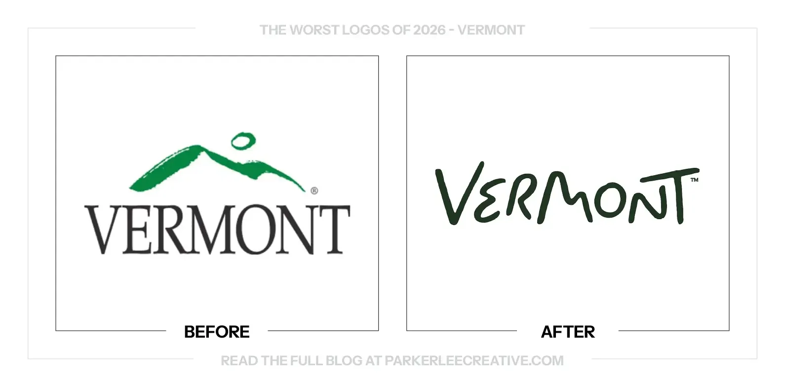
Vermont launched its first dedicated tourism brand in July 2026, separate from the state’s government identity. DNCO developed State of Inspiration around research showing strong appeal but weaker spontaneous intent to visit, with hand-lettering and a wider system rooted in local culture.
Why It Made the List:
I like the drawing. The hills and handmade character make the name feel warm and particular to Vermont. My reservation is about its job as a tourism identity: a beautiful place name still needs to help turn admiration into a reason to plan a visit.
State of Inspiration is pleasant, but it is an open invitation almost any destination could make. The primary mark shown here does not include that line, either. The identity needs the surrounding message and imagery to be much more specific about what someone should come to do.
Vermont’s research found 79% of travelers rated it appealing, while only 15% spontaneously named it as a place they intended to visit. A logo cannot close that gap alone. I would want the campaign to make the experience feel more urgent and distinctive than general natural beauty.
The Tradeoff:
The lettering captures a thoughtful, handcrafted side of Vermont, and a tourism identity can reasonably differ from a government mark. The difficulty is conversion from liking the place to choosing the trip. The attractive signature needs a concrete destination story around it.
What Businesses Can Learn:
Separate being liked from being chosen. If people already think positively about your business, a more attractive identity may not address the actual problem. Find out what stops the next action, then make the offer and message specific enough to help someone take it.
26. Welsh National Opera
Why Did the Logo Change?
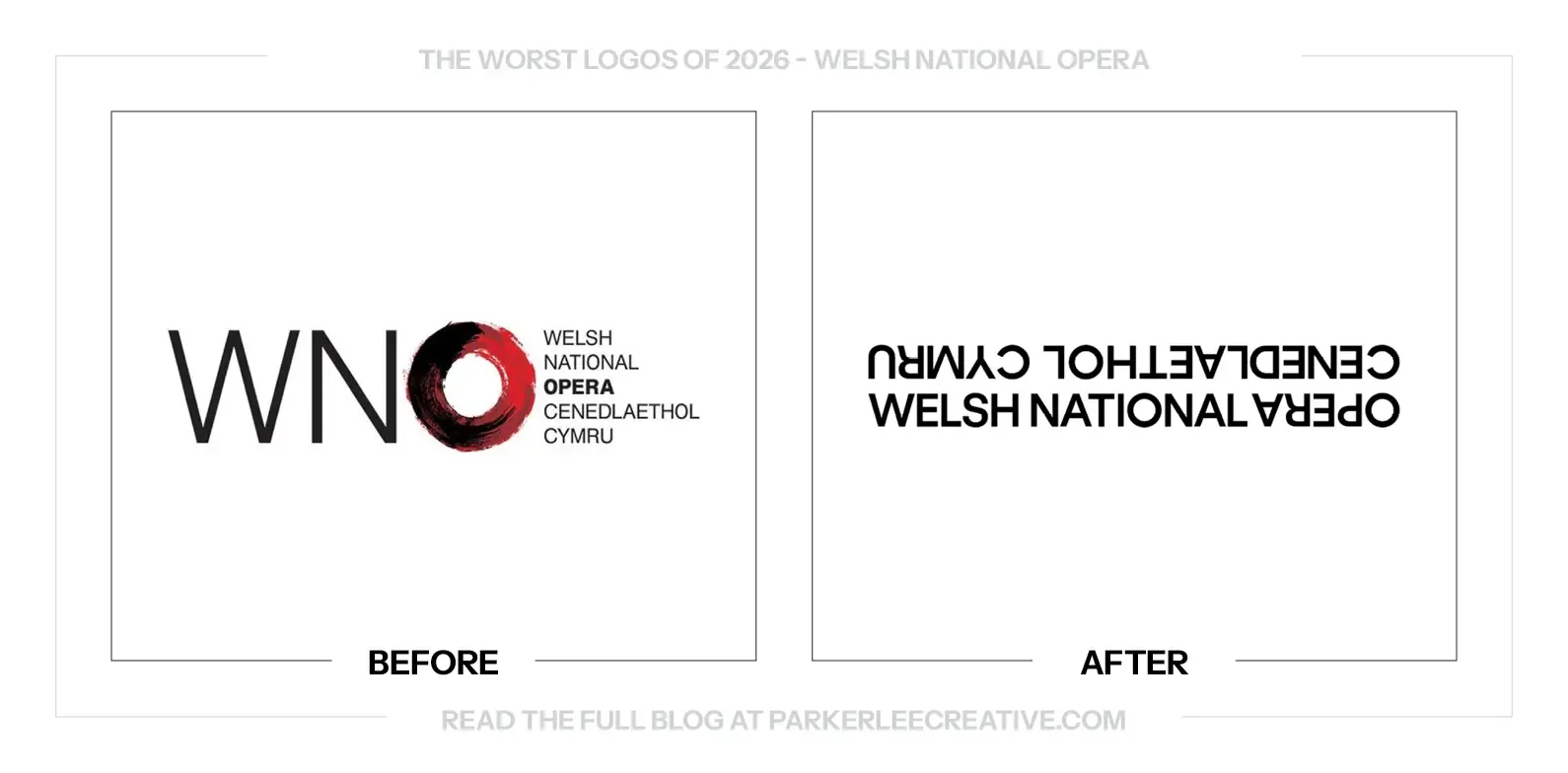
Welsh National Opera introduced a renewed identity and season presentation around its 80th anniversary and 2026–27 program. The wider work aims to make opera feel contemporary, distinctly Welsh and open to new audiences, with a bilingual name at the center of the signature.
Why It Made the List:
The upside-down construction makes the name harder to read before it does anything else. A bilingual signature already has a lot of information to manage. Turning part of it over adds another obstacle at the exact moment a new audience needs a clear introduction.
The tight arrangement gives both languages a place, but it does not give either an easy reading path. The viewer has to rotate, separate and reconstruct the words. That may create a memorable graphic, yet it asks too much of an ordinary first encounter with the company.
The wider campaign has color, people and theatrical energy to offer. The main signature does not need to carry all of the experimentation as well. A clearer name could let those images be adventurous while making the organization behind them easier to recognize.
The Tradeoff:
The construction is distinctive and gives Welsh and English a connected visual relationship. Those are worthwhile aims. The cost is legibility, particularly for someone unfamiliar with the company. A more open invitation to opera should make the name easier to approach, too.
What Businesses Can Learn:
Give bilingual typography a clear reading order before introducing a visual twist. Test both languages with readers who do not already know the name. The identity can be expressive while the basic introduction remains straightforward, especially when the goal is reaching new audiences.
You Read My Whole Blog? You Like Me! You Really Like Me!
Thank You for Reading The 26 Worst Logos of 2026
But most importantly, thank you to the designers, studios, freelancers, in-house teams, and, above all else, the clients brave enough to say "yes" to new work.
For the other half of this year’s series, read The 26 Best Logos of 2026.
Fun Fact: Did you know you can read all of The Worst Logos of Every Year or The Best Logos of Every Year in two sets of convenient hyperlinks? If I were you, I'd head right over!
Time for Your Own Rebrand?
They say knowledge is power. Now it’s time to put it to work. If you have a brand of your own and need a hand making sure your logo looks its best, I’d love to help.
For over 16 years, I’ve worked with clients ranging from mom-and-pop shops just getting started to architectural conglomerates navigating acquisitions, helping bring over 225 rebrands to life.
Get to know my design process and find answers to your questions, then say hello. I believe loyalty begins with identity, and I’d love to help you build one worth sticking with.
Legal Disclaimer: This content is provided for educational and informational purposes and is intended as commentary and criticism; all product names, logos, and trademarks are the property of their respective owners, and any copyrighted materials shown are used under the principles of fair use solely to identify the subjects discussed and to support analysis, with only the limited portions reasonably necessary displayed; no sponsorship, endorsement, affiliation, or partnership is implied, and nothing on this page constitutes legal, financial, or other professional advice.
