
Published October 28, 2026. Updated October 29, 2026.
Welcome to the first of my two annual self-improvement articles. Every year, I look back at the best and worst rebrands that caught my attention to see what we can learn.
This little article right here contains my picks for the 26 Best Logos of 2026. But let's talk “best” for a second. It means something a little different around here. We’re not handing out awards, though I’ll absolutely give someone their flowers when they crush it. We’re not here to put anyone down, either. Design is hard work, and sometimes a solution serves an unseen purpose.
Both articles share the same global goal: helping YOU think through the best and worst paths forward for YOUR brand. A logo on the best list might still have problems. One on the worst list might get plenty right. MY job is to look at why each brand changed, sniff out what works (or doesn't), identify what it gives up, and explore what those decisions can teach us.
I have the utmost respect for every designer, studio, freelancer, in-house team, client, and logo represented here. Putting a new identity into the world is hard and often pretty scary. These reviews focus on the finished work and the decisions businesses can learn from. Design is subjective, and I don’t expect everyone to agree with every choice. That’s part of what makes these articles fun to write and discuss.
Looking for the other side of this proverbial verbal coin? Read The 26 Worst Logos of 2026.
Have a Logo in Mind? Jump Right in with a Click!
The rebrands below are listed alphabetically. The numbers are to help you find your place; they aren’t rankings. It's not a competition. Sorry...
Bob’s Red Mill · BrickLink · Bubblegum Stuff · Carter’s · Cowboy Space Corp · Danimals · Denny’s Canada · Etsy · Findem · Ford Racing · GoFundMe · GoodPop · Great Value · Hippeas · Intuit · Jif · Labatt Blue · Magic Spoon · Minnesota Timberwolves · Sam’s Club · San Francisco Running Company · Snapple · Sol · Stir Friday Night · Tennessee Titans · WeightWatchers
1. Bob’s Red Mill
Why Did the Logo Change?
Bob’s Red Mill needed its range of more than 200 products to be easier to recognize and shop. Its in-house team and Turner Duckworth rebuilt the packaging around clearer categories, stronger lettering and familiar details from the brand’s history.
Why It Made the List:
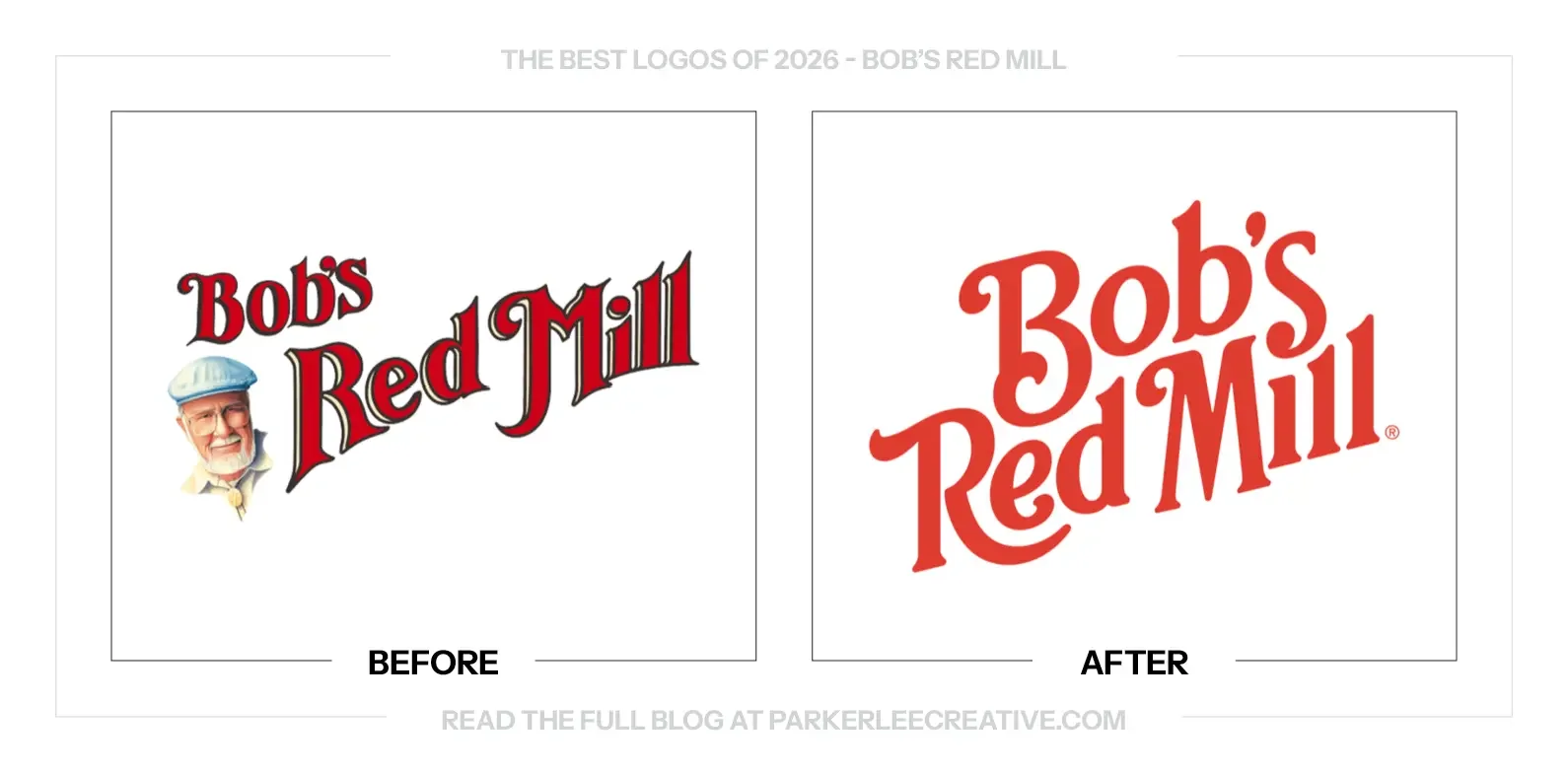
One color does the work that outlines, shading and a portrait once shared. The new lettering has enough character to stand on its own, and enough weight to stay useful when the logo gets smaller. That is a practical improvement.
Moving Bob out of the main signature gives the name room to breathe. He still appears on packaging as a quality seal, so the refresh can simplify the logo without quietly removing the person who made the brand recognizable.
The lettering fits together instead of feeling assembled from separate parts. Its close connections, rising rhythm and hand-painted character give the name a shape worth noticing. The craft comes through without needing another decorative layer.
The Tradeoff:
The old logo’s busyness was part of its homemade appeal. This version feels more deliberate and easier to manage, but the founder’s portrait and mill illustration need to remain visible elsewhere so the cleaner signature keeps its connection to the company.
What Businesses Can Learn:
Separate recognition from clutter before removing either. A founder’s portrait can remain a valuable brand asset without living inside every logo. Give each familiar detail a clear role, then test whether the package still feels like the same business.
2. BrickLink
Why Did the Logo Change?
BrickLink refreshed its identity alongside work to make the website easier to navigate on smaller screens. The wordmark and coordinated service icons were intended to help visitors distinguish the marketplace, community, Designer Program and Studio within one system.
Why It Made the List:
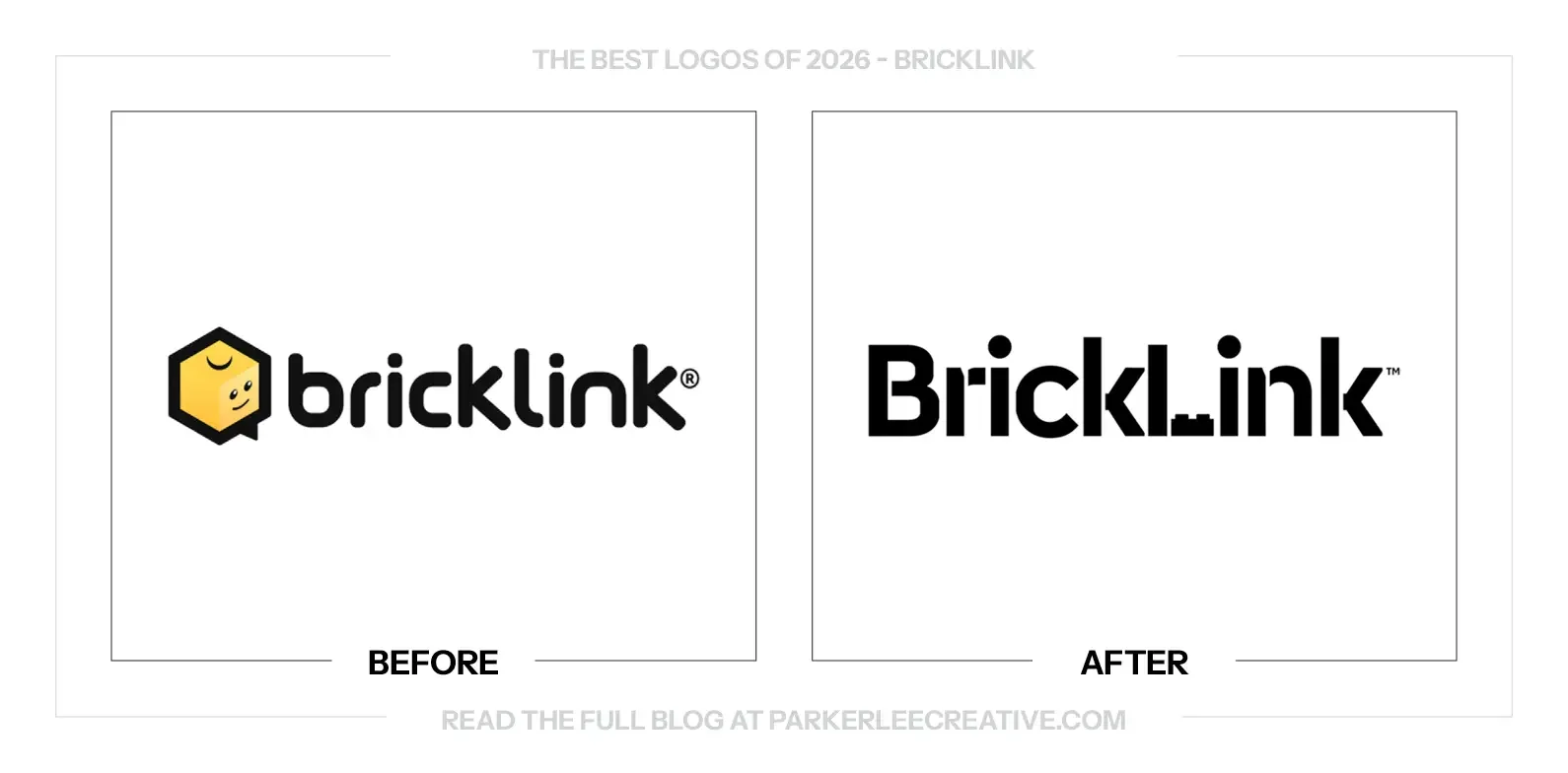
Removing the smiling brick gives the name a more compact, grown-up signature. BrickLink can now lead with the wordmark without asking a separate character to carry its personality. The result feels better suited to a serious building hobby.
The L still does something very BrickLink. Two stacked plates turn the letter into a quiet reference to the product, keeping the building idea inside the name. You get the connection without needing a miniature illustration beside every use.
A cleaner main mark leaves room for the community’s personality elsewhere. The coordinated icons and returning parrots carry that story through the website. Simplifying the signature works better when the wider identity still has something to say.
The Tradeoff:
The smiling brick made the old logo immediately friendly. The new wordmark gives up that easy warmth, and its constructed L can briefly interrupt reading. The supporting characters and clearer service icons matter because the name alone is more restrained.
What Businesses Can Learn:
A mascot does not have to remain attached to the wordmark to remain part of the brand. Decide where the character helps people connect and where a simpler signature helps them navigate. Those are different jobs, and both deserve attention.
3. Bubblegum Stuff
Why Did the Logo Change?
Bubblegum Stuff wanted to grow from a supplier of gifts and games into a brand shoppers would seek out directly. Studio Chong replaced its restrained identity with a louder visual and verbal system built around the company’s deliberately silly products.
Why It Made the List:
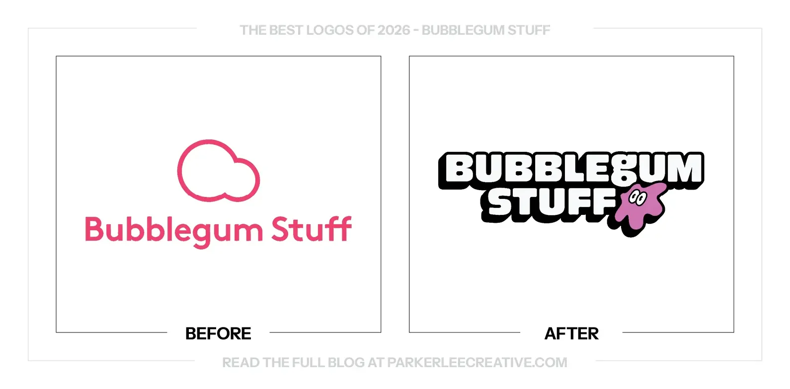
The little character finally looks like it belongs to a company selling oddball gifts. It can wobble, look around and join the joke in motion. That personality gives digital work a starting point while the printed logo still holds together.
The heavy outline gives the white lettering a dependable edge. On a package, sticker or busy background, the name has a shape of its own instead of disappearing into the surface. The treatment is playful, but its job is practical.
The logo makes the same promise as the products: this should be fun. Rounded lettering, the offbeat mascot and a deliberately exaggerated silhouette replace the old restraint. A novelty brand should give you a reason to smile before opening the box.
The Tradeoff:
This much personality will not suit every placement. At small sizes, the mascot’s face and tight spaces need care, and the surrounding graphics can easily become too loud. The strongest applications let the character be entertaining without making the name harder to read.
What Businesses Can Learn:
Show people what the experience will feel like before asking them to buy it. For a gift company, humor belongs in the identity itself. Build a character that works in a still image first, then use motion to give it more range.
4. Carter’s
Why Did the Logo Change?
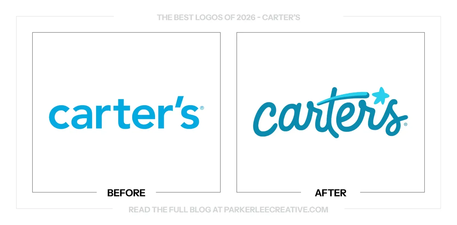
Carter’s refreshed its identity around a promise to encourage children’s individuality. Research with parents and a look through the brand’s own history informed the new script, shooting-star apostrophe and Watch Them Glow campaign, with a phased rollout across channels.
Why It Made the List:
The script brings a sense of childhood back into the name. It feels more personal than the old lowercase lettering without pretending Carter’s is a new company. Looking to earlier logos gives the change a connection to its own history.
The shooting star gives the apostrophe a reason to stand out. It connects the logo to the idea of letting each child’s light shine, so the detail can support a campaign instead of existing as a cute flourish with no further purpose.
The thinking goes beyond putting a friendlier logo on the same material. Research into how today’s parents value individuality shaped the promise and campaign. That gives the visual change a useful direction and something the business can act on.
The Tradeoff:
The script and star create a warmer introduction, but they are less neutral than the previous lettering. Small labels and embroidery will need careful testing. More importantly, a promise about individuality has to show up in the products and experience too.
What Businesses Can Learn:
A heritage brand can find its next direction in its own archive. Start with what current customers need, then look for an earlier visual quality that still fits. Bringing that quality forward can feel more convincing than borrowing a fashionable new style.
5. Cowboy Space Corp
Why Did the Logo Change?
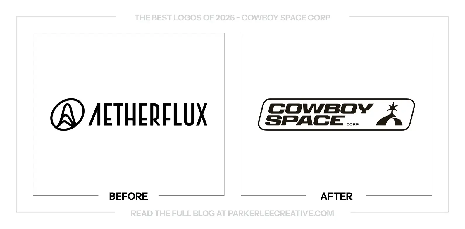
Aetherflux became Cowboy Space Corp as its plans expanded into orbital computing and launch infrastructure. Smith & Diction created an initial identity for that announcement, giving the new name a visual language that connects a Western reference with a space business.
Why It Made the List:
The symbol earns a second look. A spur becomes a sun above the Earth’s horizon, connecting Cowboy to the company’s solar ambitions without illustrating an entire mission. The first impression is strong, and the extra meaning rewards closer attention.
The wide, forward-leaning lettering has the velocity the name needs. Its squared construction feels technical, while the badge keeps it grounded in something you could put on equipment. The Western and space references feel deliberately connected.
There is a useful physical quality to this identity. Patches, warm colors and equipment-like labels make an unfamiliar business feel tangible. The presentation gives an orbital idea something people can picture, without relying on another generic ring around a planet.
The Tradeoff:
The name has enough attitude to distract from what the business actually does. Some case-study applications are exploratory mockups, not deployed materials. The identity is compelling, but the company still has to explain its plans clearly and demonstrate the technology.
What Businesses Can Learn:
Use metaphor to make an unfamiliar business easier to remember, then use plain language to explain it. A symbol can connect two ideas in a second. It should invite the explanation, not become a substitute for saying what customers or investors need to understand.
6. Danimals
Why Did the Logo Change?
Danimals introduced a new look alongside a reformulated recipe in 2026. The brand wanted to keep the appeal children recognize while giving parents a clearer reason to consider the product, with packaging and communications supporting that change.
Why It Made the List:
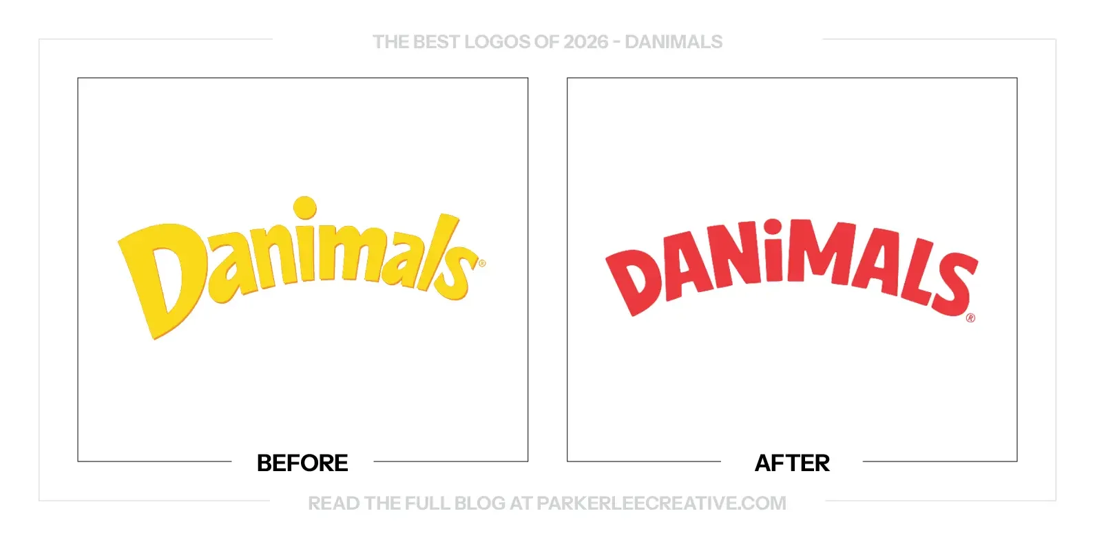
The lettering has grown up without becoming unfriendly. Firmer shapes and a more controlled rhythm make Danimals easier to take seriously, while the raised i keeps a small moment of personality. It still feels like a brand made for children.
The packaging feels less like a sugary treat shouting for attention. Stronger hierarchy gives the product and its benefits a clearer place, which matters when a parent is deciding what belongs in the cart. The design supports that decision.
Replacing the older visual noise with richer, quieter detail gives the brand more confidence. The new look can be bold without feeling cheap or generic. It is a useful reminder that simplifying a children’s brand does not mean draining its energy.
The Tradeoff:
The cleaner presentation gives up some of the old brand’s unruly playfulness. That can help parents understand the product, but the characters and packaging still need to give children something to enjoy. The two audiences should not have to compete for attention.
What Businesses Can Learn:
When the buyer and the user are different people, design for both. Give parents a clear product story and give children something they want to pick up. Better hierarchy can make those messages work together without turning the package into two separate brands.
7. Denny’s Canada
Why Did the Logo Change?
After Northland Properties acquired full Canadian rights to Denny’s, the business worked with Full Punch on Familiar. Made Fresh. The identity was part of a wider effort to present a contemporary Canadian diner while keeping the familiar food and welcome.
Why It Made the List:
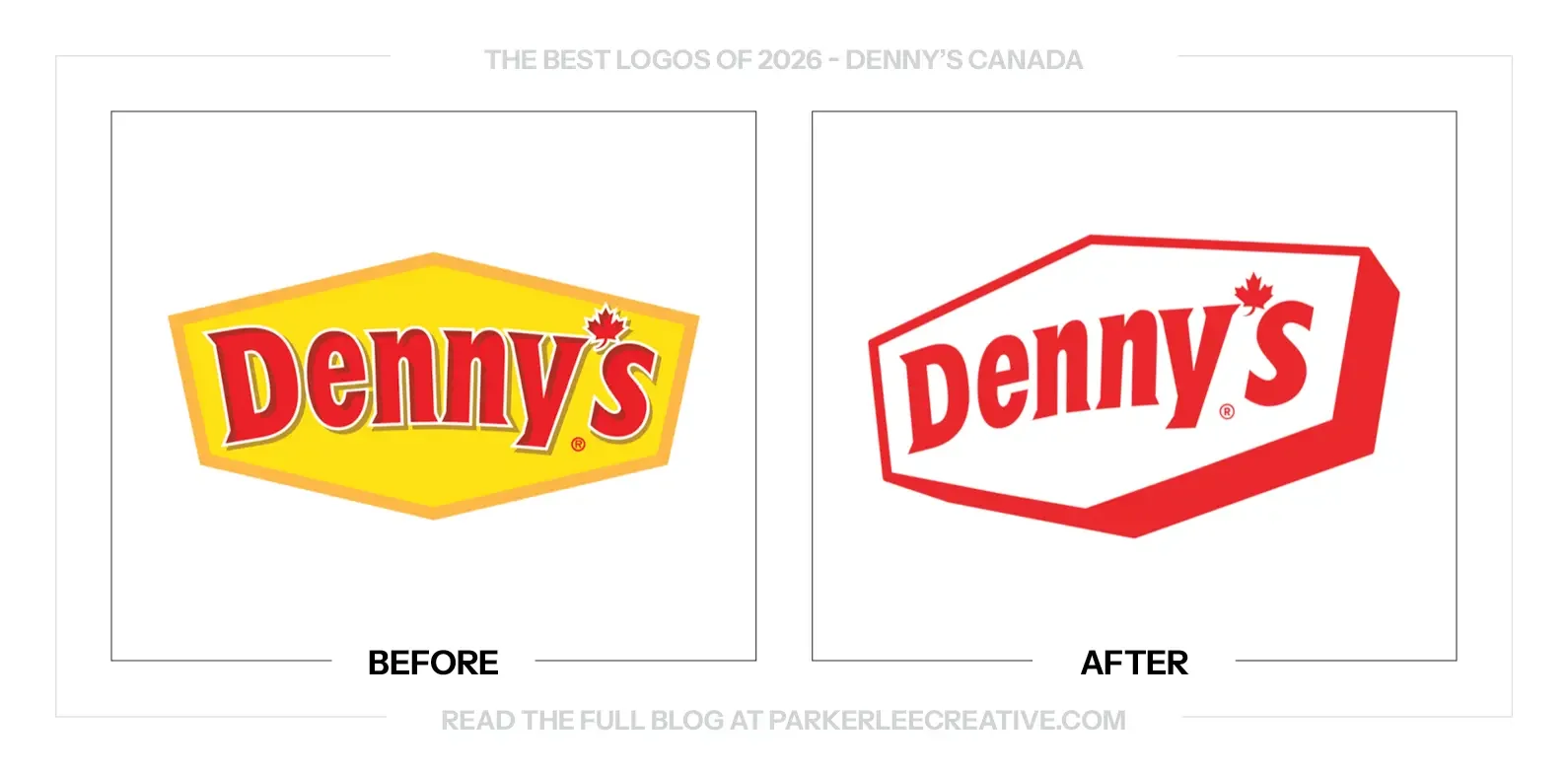
The angled sign feels like you are approaching Denny’s after a long night out. Its perspective gives the familiar shape more presence without needing extra shading. The logo has the scale and confidence of the place you are about to walk into.
Leading with red makes the Canadian identity feel immediate. The maple leaf still does its job, but the simpler color treatment gives it better company. Removing the yellow field lets the name and sign shape carry more of the recognition.
The restrained logo leaves room for the writing to have fun. Lines such as “100% Canadian beef, 0% bull” give the wider identity its diner personality. The design and copy share the work instead of both trying to be the loudest part.
The Tradeoff:
The old red-and-yellow sign carried decades of roadside familiarity. Red on its own feels sharper and more local, but the brand needs to keep that warmth in its photography, language and restaurant experience so refinement does not become distance.
What Businesses Can Learn:
Decide where the personality should live. A familiar logo can become simpler when the writing and imagery are ready to carry more of the tone. Review those elements together before deciding that the mark needs another clever detail.
8. Etsy
Why Did the Logo Change?
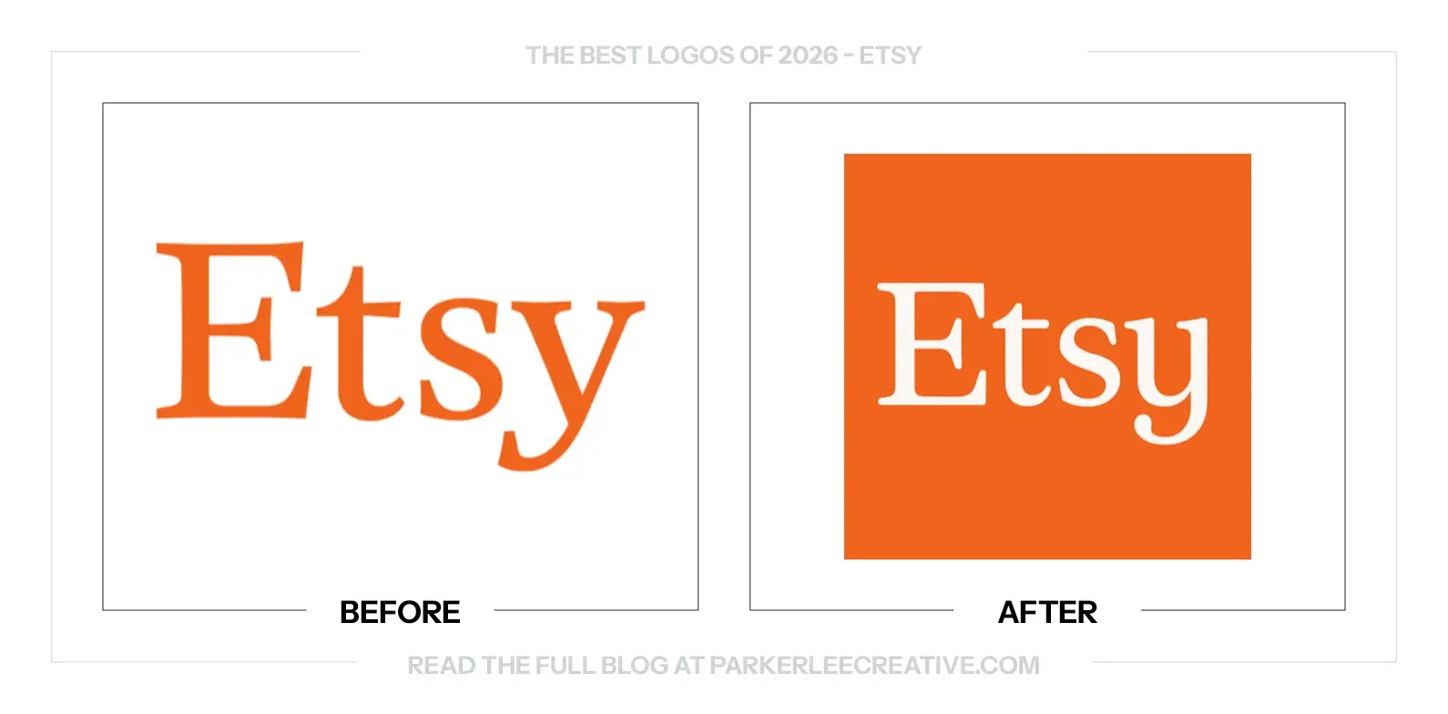
Etsy wanted to become a place people visit for discovery, rather than only when they already know what to buy. SYLVAIN and Upstatement connected the refreshed identity with the digital product around the idea of a starting point for special.
Why It Made the List:
The orange square gives Etsy a more definite presence. To me, it feels almost like a shield around a marketplace with two groups to look after: the people making things and the people buying them. The familiar color keeps that change grounded.
The softer y makes a small but valuable difference. Its curve feels less like a name simply typed out and more like lettering made for this particular business. That touch of care belongs in a marketplace built around things with a human hand.
The wider identity gives the products room to be different. Shapes, imagery and a warmer voice make the platform feel like a helpful host rather than another endless grid. That is a better setting for the individuality Etsy wants people to discover.
The Tradeoff:
A strong container can organize a varied marketplace, but too much consistency could make its sellers feel interchangeable. Etsy’s own visual polish should help people discover the work, while leaving enough room for each maker’s character to come through.
What Businesses Can Learn:
If your business brings other people’s work together, build a recognizable frame without forcing everything inside it to look alike. The identity should help customers understand who is hosting the experience and still let them notice what makes each offering different.
9. Findem
Why Did the Logo Change?
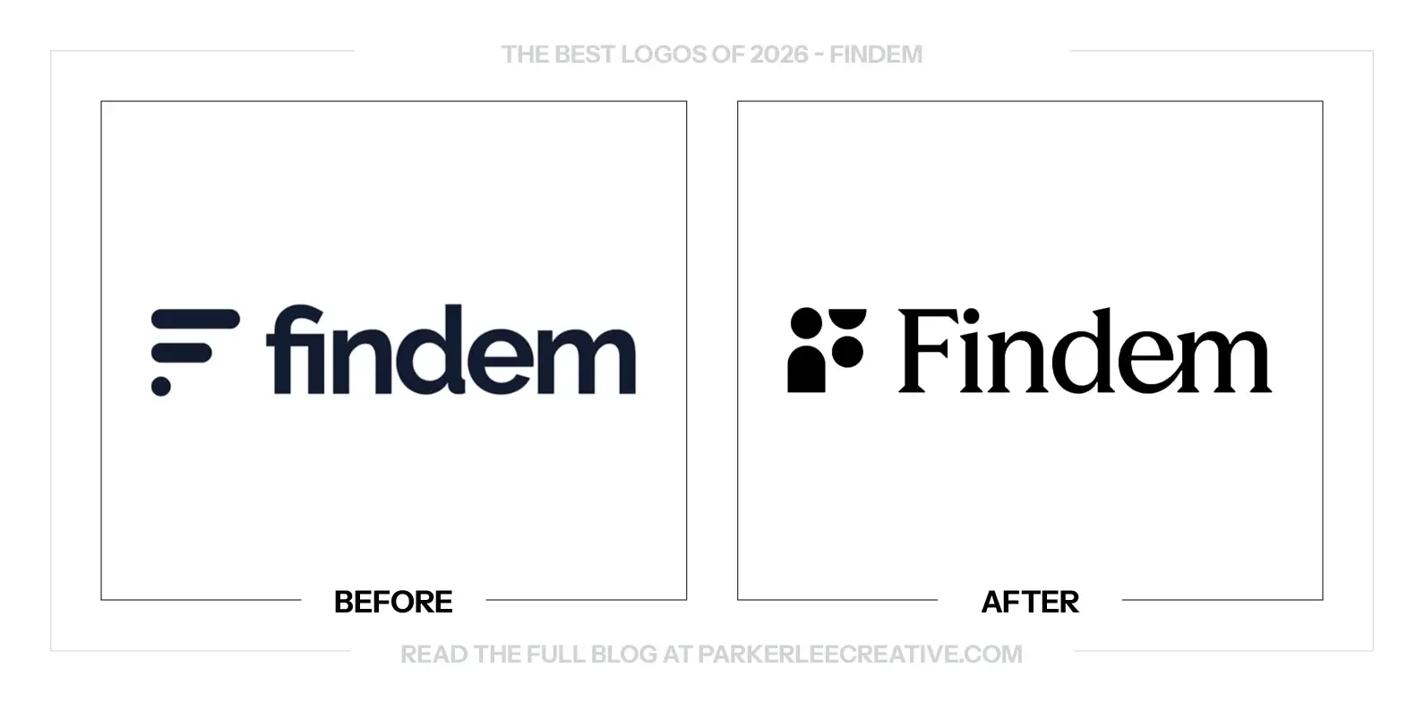
Findem said its original identity no longer reflected a platform that had grown beyond sourcing candidates into understanding people in context. The new Illuminate system puts that idea into the mark, palette, imagery and language around the business.
Why It Made the List:
In a category crowded with blue and purple gradients, black feels refreshingly confident. Findem pairs it with yellow and off-white, giving the business a clearer visual position without needing another futuristic effect to prove that it works in technology.
The F does more than repeat the first letter. Its simple shapes suggest people seen from different perspectives, which connects directly to Findem’s work understanding careers, experience and networks. The concept gives the monogram something specific to say.
The brand puts people back into a category that often hides them behind abstract diagrams. The serif wordmark, warmer imagery and simpler forms make the technology feel more approachable. That is an appropriate direction for decisions about someone’s career.
The Tradeoff:
A warmer identity can make the business easier to approach, but it cannot demonstrate that its hiring technology is fair or effective. Those claims need evidence. The visual system works best when it introduces clear explanations instead of standing in for them.
What Businesses Can Learn:
Look at the visual conventions your competitors share before choosing your own. You do not need to reject every category cue. Find one useful way to stand apart, then connect it to what the business actually does and the people it serves.
10. Ford Racing
Why Did the Logo Change?
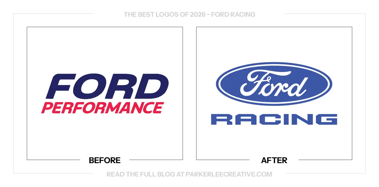
Ford announced the return from Ford Performance to Ford Racing in September 2025, with its wider racing-season launch following in 2026. The change brought racing and road-car development closer together under a name connected to the company’s competitive history.
Why It Made the List:
The Ford oval is back where it belongs. It gives the racing division an immediate connection to the parent brand and its history. That sounds obvious, but keeping an established recognition asset in the right place is a smart design decision.
The racing lettering looks like racing. Its broad proportions and deliberate construction give the name the right character without competing with the oval above it. Sometimes the most useful answer is the one that does not need a long explanation.
The return feels comfortable with the brand’s own history. Ford does not have to invent a separate visual personality to make its motorsport work credible. Bringing the familiar oval and a direct name together gives the division a clear starting point.
The Tradeoff:
Racing is a more focused name than Performance, which also covered road cars, off-road activity and parts. The new identity makes the competitive purpose clearer, but supporting communications still need to show how that work benefits the wider product range.
What Businesses Can Learn:
Do not overlook a useful asset because your business has used it before. An established symbol can carry more recognition than a new standalone mark. Revisit what already belongs to the company and decide whether it still solves the current problem.
11. GoFundMe
Why Did the Logo Change?
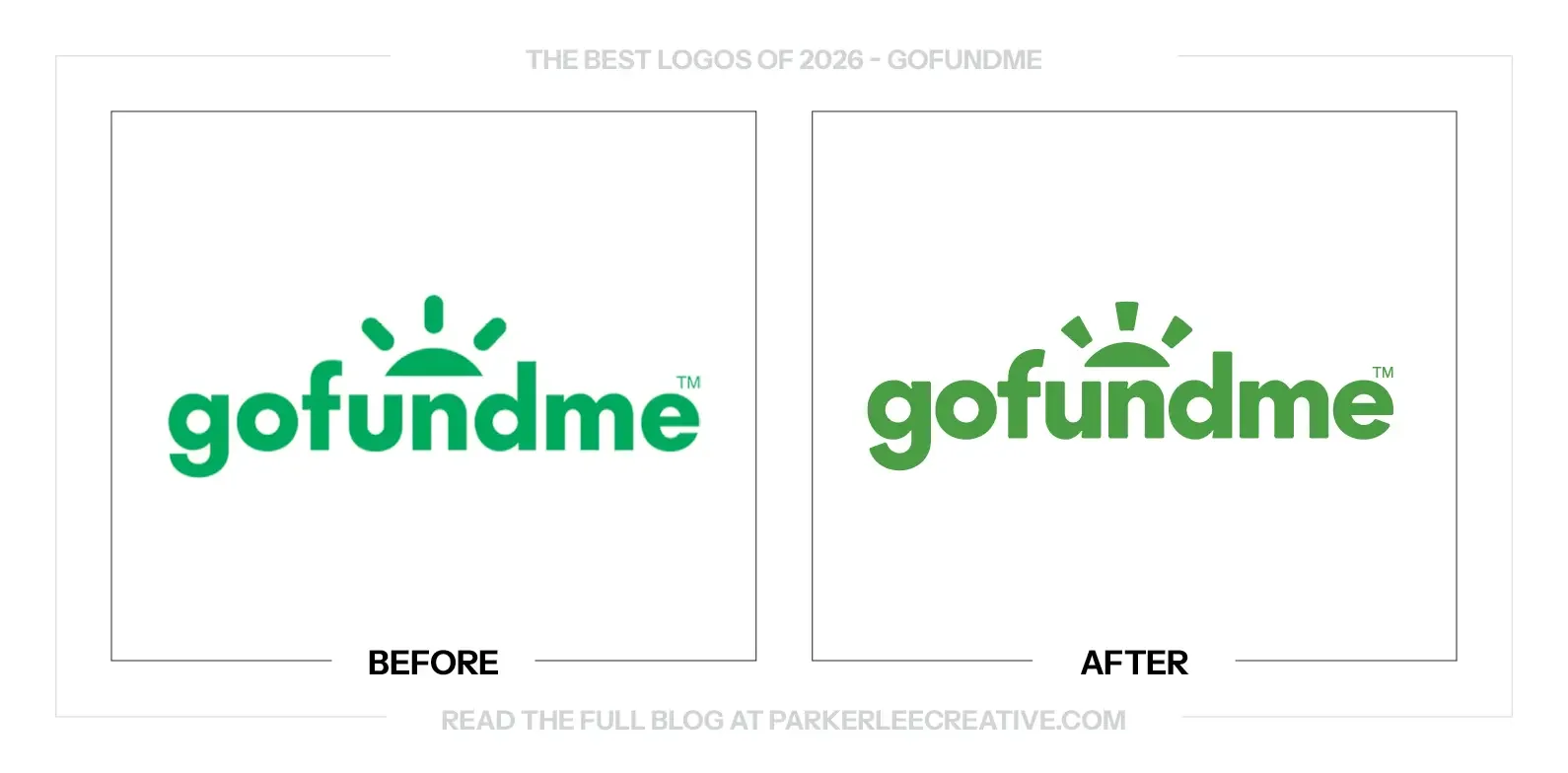
GoFundMe’s move into a broader fundraising offering, including GoFundMe Pro, needed a more connected brand and product experience. Koto developed Help Adds Up around a Progress Circle, extending a familiar fundraising cue into typography, interfaces, imagery and motion.
Why It Made the List:
The logo did not need a dramatic reinvention. Cleaner lettering and firmer rays give the familiar sun a more controlled presence. The change respects recognition while making the mark feel better connected to the product people use every day.
The useful work reaches into the interface. A clearer color approach and shared progress language help the brand show up where donations happen. That matters more than a reveal graphic, particularly for people using the platform under difficult circumstances.
GoFundMe Sans gives the platform a voice that belongs to it. Its rounded forms connect with the Progress Circle and keep the experience approachable. The type has a practical role across the product, rather than existing only to decorate a campaign.
The Tradeoff:
The familiar sun and green help preserve trust, but a broader system can become visually busy if every curve, pattern and image treatment appears at once. Fundraising pages still need to put the person, purpose and donation process ahead of brand expression.
What Businesses Can Learn:
If customers primarily meet your business through a digital product, include that product in the rebrand from the start. Test color, type and hierarchy inside real tasks. A cleaner corporate logo will not fix a confusing form or a difficult donation flow.
12. GoodPop
Why Did the Logo Change?
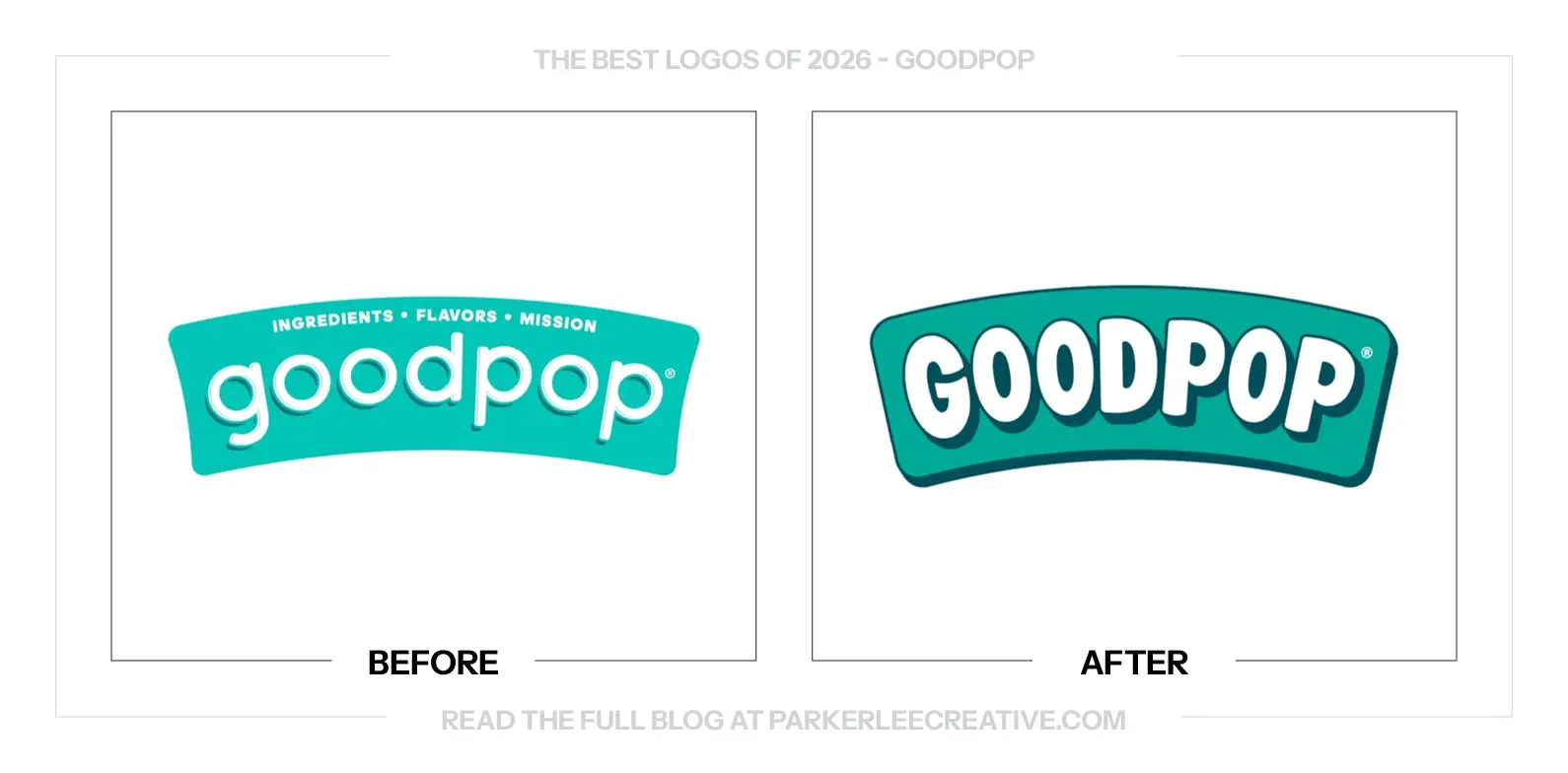
GoodPop’s in-house team refreshed the brand to bring more joy and appetite appeal to the freezer aisle. The update combines a stronger logo, brighter color and a new order for ingredient claims while preserving the company’s existing product philosophy.
Why It Made the List:
The heavier white lettering finally has the presence to compete through a freezer door. Its dark edge creates a background of its own, so the name stays together on a busy box. The logo feels active without depending on fine detail.
The G and P bring little flashes of personality into the name. Their playful shapes feel like part of the same cheerful world as the products. Those small decisions make the mark more inviting without asking a separate mascot to do all the work.
The packaging leads with something people want to eat. The better ingredients still matter, but the visual emphasis has moved toward craving the treat itself. That is a useful shift for a brand competing with plenty of less restrained options nearby.
The Tradeoff:
The layered color treatment is more involved than a one-color signature. It works naturally on packaging because the logo supplies its own field, but small merchandise and restricted print jobs will need a simpler version that keeps the same character.
What Businesses Can Learn:
Do not make customers choose between a product that sounds sensible and one that looks appealing. Lead with the reason they want to try it, then make the supporting benefits easy to find. The package should make a treat feel like a treat.
13. Great Value
Why Did the Logo Change?
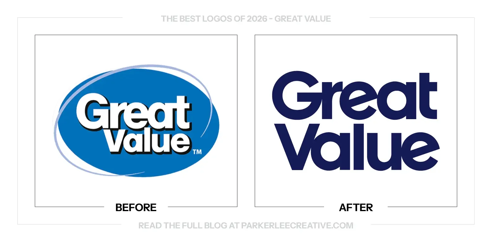
Walmart introduced Great Value’s first full refresh in more than a decade to make its range easier to shop in stores and online. The phased rollout covers nearly 10,000 items, with clearer product cues and more consistent placement of information.
Why It Made the List:
Affordable does not have to look apologetic. Removing the oval, shading and outlines gives Great Value a more confident place on the package. The brand can still signal a low price without looking like the design was treated as the least important part.
The new name has enough weight to act as a consistent anchor across very different products. That is valuable for a range this large. Shoppers should be able to recognize the house brand before working out which flavor or format they need.
This earns its place as a step in the right direction, not flawless typography. The tight connections are not equally comfortable throughout the name. Still, the overall move away from the old badge gives the packaging a cleaner foundation to build on.
The Tradeoff:
The lettering is stronger, but its tight spacing creates uneven relationships between touching and separated forms. I would refine those details further. A more confident presentation also needs to keep product names and practical shopping cues easy to locate.
What Businesses Can Learn:
A budget position is a pricing decision, not a requirement to look poorly considered. Give everyday products clear hierarchy and a dependable identity. Customers should be able to choose the affordable option without feeling as though the design is warning them away.
14. Hippeas
Why Did the Logo Change?
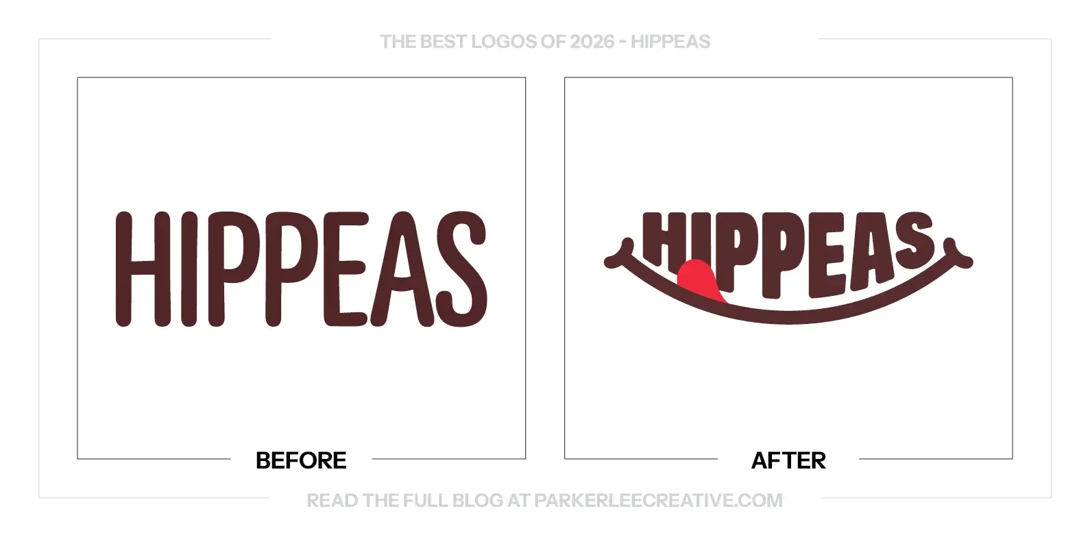
Hippeas worked with LOVE to make its identity and packaging express more of the pleasure of eating the product. The refresh builds around its chickpea ingredient, familiar yellow and playful personality, with a new mascot and stronger emphasis on flavor.
Why It Made the List:
The name looks like it belongs to something delicious. Heavier lettering and the lip-licking smile make the brand feel more appetizing before you read a claim. The logo gives the snack a personality that the old straight wordmark did not carry alone.
The packaging brings the product into the same cheerful world as the lettering. Color, appetite appeal and the chickpea character reinforce one another instead of feeling like separate additions. The whole bag feels considered, not just the logo at the top.
The brand has found a useful way to be playful about its main ingredient. The chickpea is part of the character and the product story, so the humor has a reason to be there. It feels specific to Hippeas rather than borrowed snack-brand energy.
The Tradeoff:
The smile, mascot and bright packaging create plenty of activity. They need a clear order so the flavor and product format remain easy to find. The system is strongest when the playful details support the snack instead of crowding it out.
What Businesses Can Learn:
Find a product detail that can give the identity its own personality. An ingredient, process or familiar ritual can be more useful than a generic claim about fun. Build the visual idea around something the customer can actually connect to the product.
15. Intuit
Why Did the Logo Change?
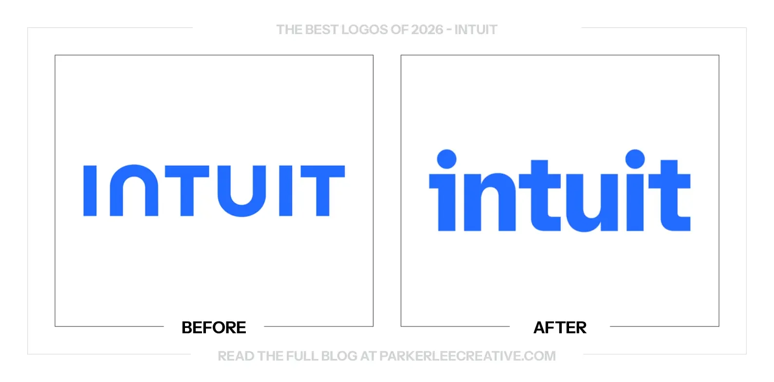
Intuit wanted customers to recognize the connection between its company and products such as TurboTax, QuickBooks, Credit Karma and Mailchimp. JKR developed a shared identity around One Intuit, making a more connected platform visible through the wordmark and wider system.
Why It Made the List:
The lowercase lettering brings a more human tone to the parent company. The previous capitals felt distant and corporate beside products people use for personal financial decisions. This is a more approachable introduction to the business behind those familiar names.
The i gives the system a simple point of connection. It can become an icon and take on different roles across the experience without leaving the wordmark behind. That relationship makes the smaller asset feel like part of the same identity.
The brand has more room to feel helpful rather than intimidating. Type, imagery and clearer connections between products can make a complicated business easier to understand. The logo sets that tone without trying to explain the entire portfolio inside one mark.
The Tradeoff:
A more visible parent identity can help connect the products, but it must not blur the distinctions customers rely on. People still need to know which service they are using, what it does and whether they are interacting with software or a human expert.
What Businesses Can Learn:
If customers know your products better than your company, decide what connecting them should help people understand. A shared mark has to clarify a real relationship. Keep the product cues people rely on while making the larger business easier to recognize.
16. Jif
Why Did the Logo Change?
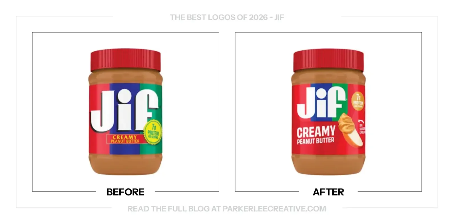
Jif refreshed its branding to reflect uses beyond the traditional peanut-butter-and-jelly sandwich. The 2026 update keeps the familiar lettering and three-color banner while changing the package hierarchy, removing the drop shadow and adding imagery around everyday snacking.
Why It Made the List:
This is a packaging refresh that shows how much can change around a familiar logo. Jif still looks like Jif, but the cleaner presentation gives the name a stronger place on the jar. The brand did not need a new identity to use its existing one better.
Removing the drop shadow lets the lettering and familiar color blocks do their job. The extra effect was taking attention without adding much recognition. The flatter treatment feels clearer, and the jar keeps the cues people already know how to find.
Showing peanut butter on an apple slice gives the package something useful to suggest. The product is still creamy peanut butter, but the image introduces another occasion for eating it. The design makes the same familiar food feel more versatile.
The Tradeoff:
A quieter refresh is easy to overlook, and the new hierarchy still has several messages to manage. That is not a reason to force a bigger logo change. The package needs to show new uses while keeping the variety and essential product information clear.
What Businesses Can Learn:
The best logo for your next package may be the one you already own. Before replacing it, test the surrounding hierarchy, effects, imagery and product story. You may be asking the mark to solve a problem that belongs to the rest of the label.
17. Labatt Blue
Why Did the Logo Change?
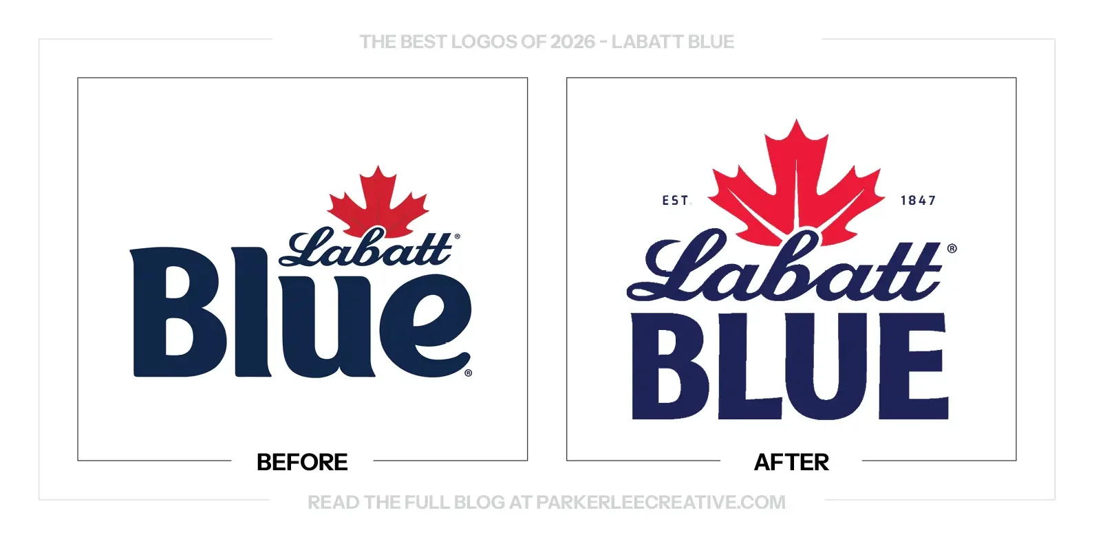
Labatt’s U.S. refresh was intended to give the brewery name more presence while keeping the familiar Blue identity recognizable. Sister Mary and the FIFCO USA team used the Canadian heritage, maple leaf and a clearer package structure to connect those two jobs.
Why It Made the List:
The centered arrangement gives the whole mark a dependable balance. Labatt, the maple leaf and BLUE now feel like parts of one signature rather than a small brewery name sitting above a much louder product. The hierarchy is easier to follow.
The contrast between the script and the broad capitals gives each line its own job. Labatt brings the signature and history; BLUE supplies the foundation. That relationship feels deliberate, with enough difference to create character without making the mark feel divided.
Red, blue and white do not need much explanation here. The larger maple leaf makes the Canadian connection immediate, while the stronger lettering gives the package more presence. It is familiar material handled with enough care to feel newly considered.
The Tradeoff:
Putting Labatt first changes a hierarchy people have known for years. Customers who primarily ask for a Blue still need that name to be easy to find. The new balance is stronger, but consistency across variants and packaging will matter during the transition.
What Businesses Can Learn:
When a product name becomes better known than the company behind it, decide whether that helps or limits the business. Adjust the hierarchy to build the recognition you need next, while keeping the familiar ordering cue easy for existing customers to spot.
18. Magic Spoon
Why Did the Logo Change?
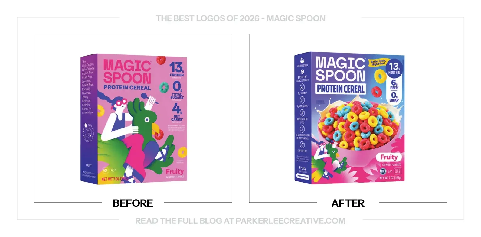
Magic Spoon’s expanding product range needed a more consistent package system for physical retail. Hart Brands kept the recognizable logo, gradient and illustrated world, but gave them clearer roles and brought the food itself forward so the range would be easier to recognize.
Why It Made the List:
The cereal finally gets the biggest invitation on the box. A generous bowl of the product tells you what is inside and makes the flavor feel worth trying. That matters when a brand moves from an online explanation to a quick shelf decision.
The new package still understands that cereal should be fun. The color and illustrated characters have not disappeared; they have been given a different role. Even a product sold to adults can keep the energy of a Saturday-morning breakfast.
Keeping the familiar logo was the right call. Most of the improvement comes from how the box organizes the brand, food and benefits around it. This is another example where better packaging can do more useful work than a dramatic new wordmark.
The Tradeoff:
A more consistent range can be easier to recognize, but a shared color system may make individual flavors less distinct. The food image and flavor label have to do that sorting. The character art also needs enough room to keep the brand from becoming ordinary.
What Businesses Can Learn:
Design for the place where the product is being sold now. A package built for a website may need a different order of information on a crowded shelf. Keep the assets customers recognize, then make the product and flavor understandable at a glance.
19. Minnesota Timberwolves
Why Did the Logo Change?
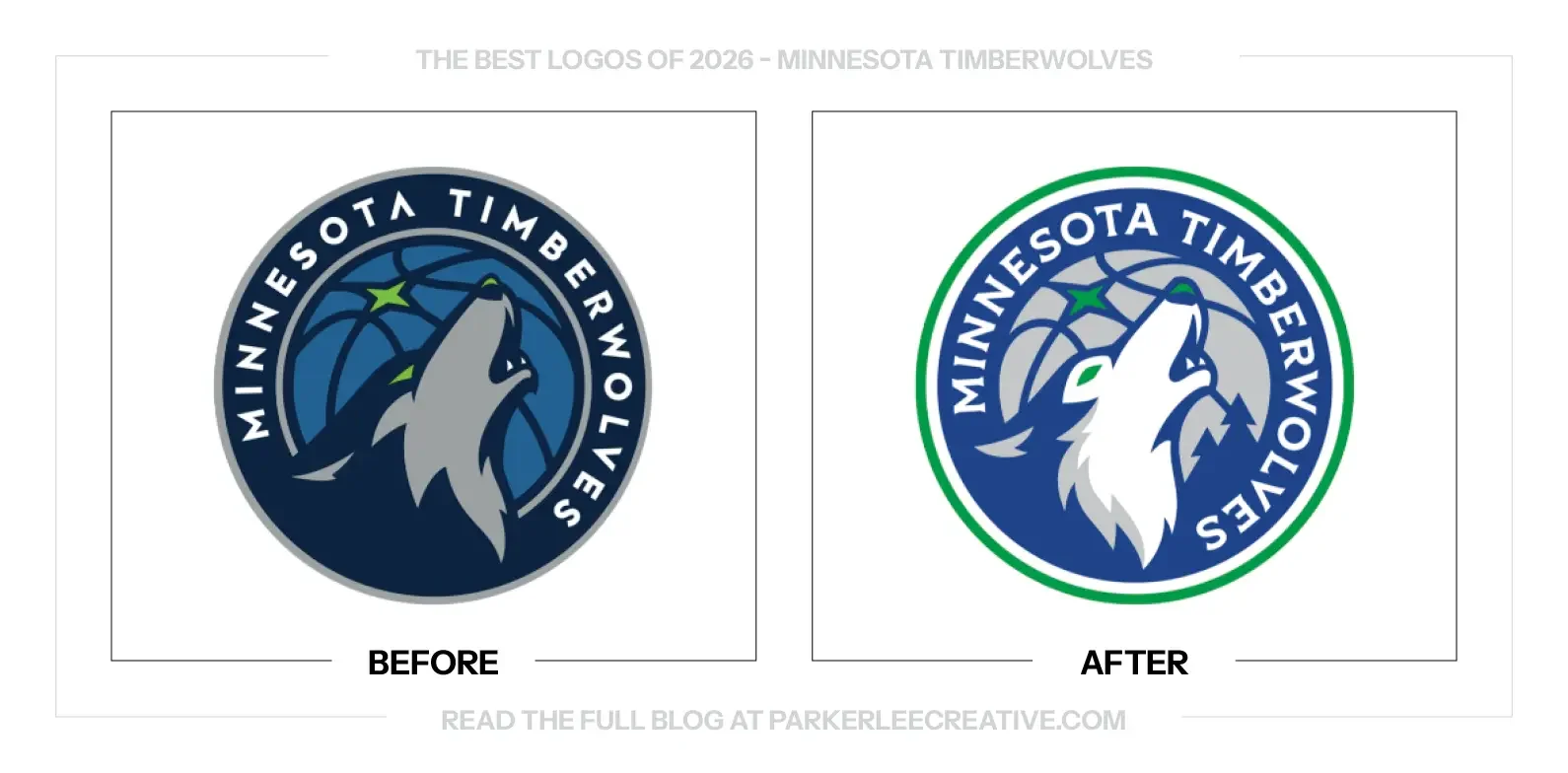
Minnesota introduced new logos, uniforms and courts for the 2026–27 season, drawing on several eras of the franchise. The refreshed system reconnects the team’s blue-and-green history, howling wolf and tree imagery rather than treating its past as something to replace.
Why It Made the List:
Bringing the pine trees back gives this refresh a connection fans can feel. They belong to the Timberwolves’ visual history, and they make the identity more specific to this team. The reference adds recognition instead of another decorative sports-brand detail.
The corrected A is the kind of refinement that makes a familiar identity easier to use. It does not need to announce itself as a new idea. Better construction can improve the wordmark while leaving the character fans already recognize in place.
The wolf feels like part of a larger return to the team’s own history. Color, lettering and the wider uniform system work together rather than asking one badge to explain everything. The refresh improves an established identity without losing its connection to Minnesota.
The Tradeoff:
The wolf’s internal shading gives the full-color mark depth, but some of that distinction can disappear in one color. A simpler production version needs to preserve the same expression and silhouette. The strongest system anticipates that difference instead of leaving it to vendors.
What Businesses Can Learn:
Make an inventory of the details your audience already cares about before starting a sports rebrand. A color, trim pattern or letterform can carry as much memory as the primary mark. Bring those pieces forward with a clear hierarchy and usable production versions.
20. Sam’s Club
Why Did the Logo Change?
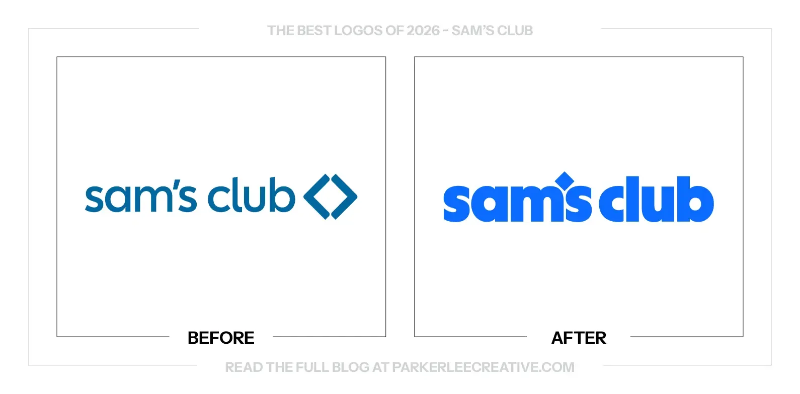
Sam’s Club introduced an updated identity alongside its Come Join Us platform and plans to refresh digital and in-club experiences. The change was intended to make the membership proposition feel more welcoming and connected across the places people encounter the business.
Why It Made the List:
The heavier lowercase wordmark gives the brand a confident, friendly voice. It has enough presence to work at warehouse scale without becoming cold or severe. The diamond has a smaller, smarter role as the apostrophe instead of sitting beside the name.
The brighter blue and big typography make the wider experience feel more alive. The identity can carry that energy through the app, signs and communications without relying on a complicated logo. It gives the business a recognizable way to speak at different sizes.
Sam’s Club has chosen a visual direction with its own personality. The broad lettering and open, upbeat tone feel right for a business built around membership and shared shopping trips. It is a more complete expression than simply making the old symbol larger.
The Tradeoff:
The new wordmark has more personality, but customers may not immediately recognize the smaller app mark on its own. The rollout needs to connect those assets clearly. I would also like the typographic care here to feel more consistent across related Walmart-owned brands.
What Businesses Can Learn:
A brand refresh should reach the experience customers actually use. Give signs, screens and everyday messages the same recognizable voice. A strong wordmark becomes more valuable when the app and physical location make its promise feel consistent.
21. San Francisco Running Company
Why Did the Logo Change?
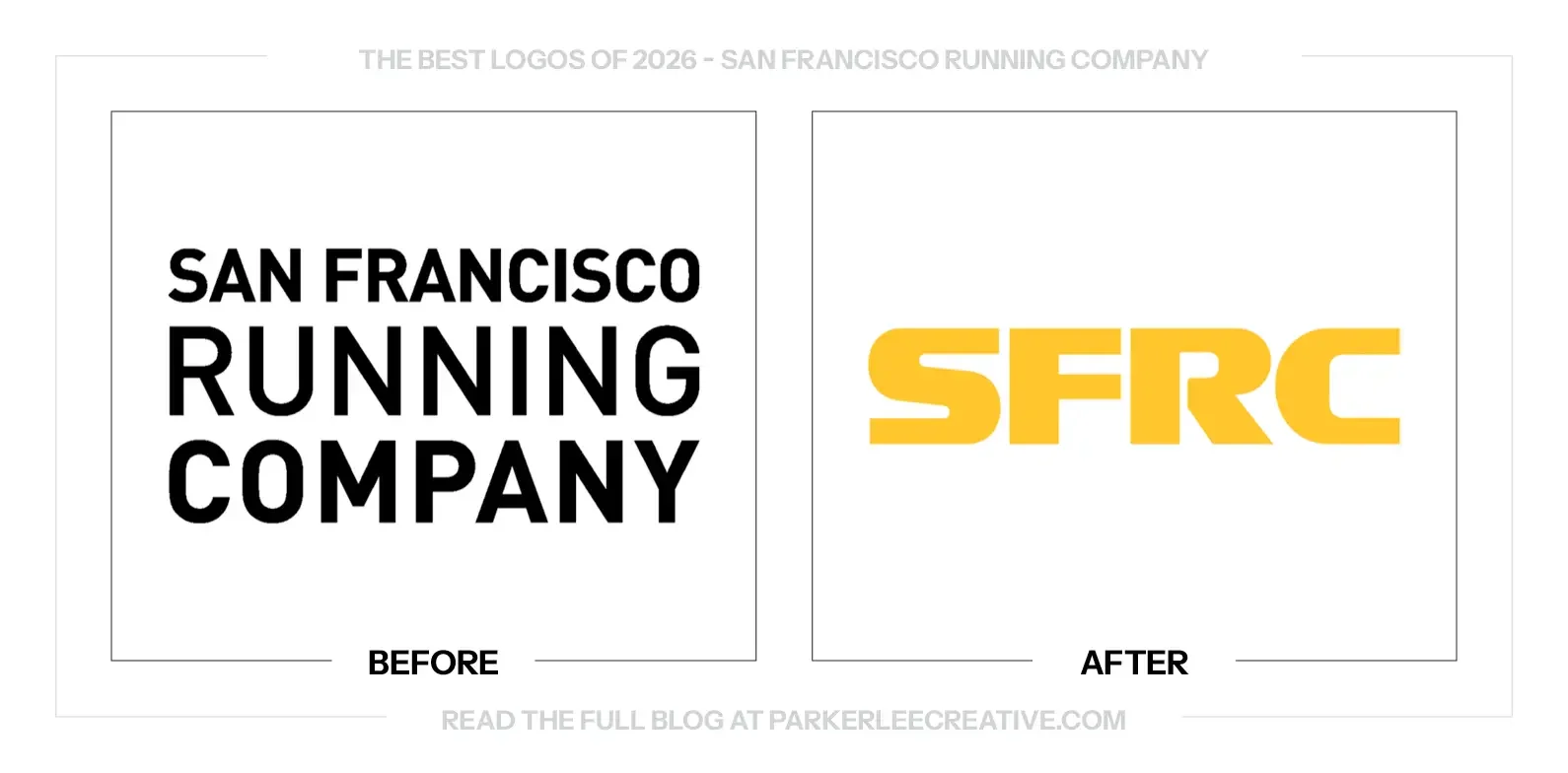
San Francisco Running Company wanted an identity that matched its gear, community and growing place in Bay Area running. Study Hall drew on rally racing to express effort, momentum and camaraderie, giving the retailer a more distinctive visual system.
Why It Made the List:
The new abbreviation feels built to move. Its broad, compact lettering carries the energy of a race patch or rally decal without illustrating a runner. For a company rooted in a serious running community, that reference feels specific and well chosen.
The system has enough restraint to let photography and motion carry the experience. SFRC becomes a useful signature across gear and communications rather than a block of competing type. The name has a clearer visual shape and more confidence in its own space.
This is a good logo with a worthwhile question attached: is it the right primary logo? SFRC means something to the community, but not necessarily to a first-time visitor. The fuller lockup matters when the brand needs to introduce itself beyond that circle.
The Tradeoff:
The abbreviation makes the mark faster to place and recognize once learned, but it removes the location and business description. Existing runners may welcome that shorthand. New customers need the full name somewhere clear before the initials can do the same job for them.
What Businesses Can Learn:
An abbreviation is a decision about audience familiarity. Test it with someone who has never heard of the business before making it the default. Keep a full-name version ready for introductions, even when the shorter mark is the stronger design.
22. Snapple
Why Did the Logo Change?
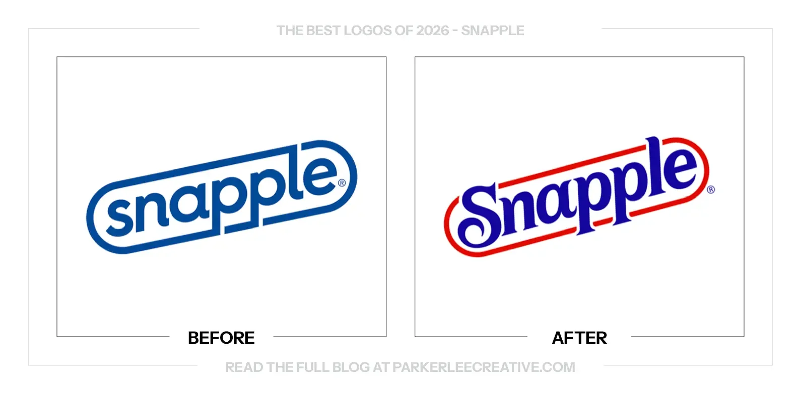
Snapple worked with Deutsch Design on a refreshed logo and packaging that reconnect the brand with its more colorful past. The identity brings familiar racetrack framing and a stronger sense of flavor into a system intended to feel recognizably Snapple again.
Why It Made the List:
The return to red and blue gives the name more life. The previous logo was serviceable, but it had become quiet. This version feels closer to the colorful, slightly offbeat Snapple people remember, without simply copying an old label and calling it finished.
The lettering has more character within the familiar racetrack shape. Its curves and rising rhythm give the name a better sense of movement. The mark feels drawn as a whole, with the container and wordmark doing the same visual job.
The packaging carries the energy through to the flavors. Color and the refreshed name work together instead of leaving the logo to provide all the personality. The product feels more inviting, and the wider identity has room to be playful again.
The Tradeoff:
Returning to familiar territory can become nostalgia for its own sake. The refreshed packaging still needs to help a new customer understand the drink and flavor. The strongest parts of the system use the past to create a clearer present, not just a recognizable reference.
What Businesses Can Learn:
Look for the moment when a brand’s personality became quieter than its product. You may not need a new idea. Recover a useful color, shape or tone from the archive, then rebuild it for the package and channels customers use today.
23. Sol
Why Did the Logo Change?
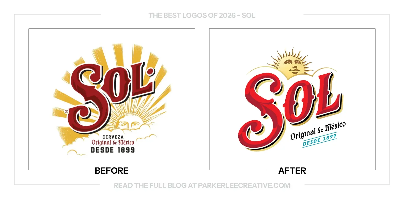
Sol worked with LOVE and lettering artist Tobias Hall to bring its Mexican heritage back into the identity and packaging. The project revisited historic labels, lettering and the sun symbol as part of a wider effort to make the beer feel more distinctive and considered.
Why It Made the List:
The sun feels like a character again instead of a burst behind the name. Giving it a face and a clearer place in the composition adds a recognizable point of personality. The idea belongs to Sol, which makes it more useful than another generic beer ornament.
The lettering has the care and irregular character that a heritage brand can use well. It feels connected to old labels and painted signs without becoming a museum exercise. The name is still the hero, but there is more to enjoy when you look closely.
The brighter red, gold and small touch of teal give the brand a fresher balance. The package can feel more lively while keeping its history visible. This is a good direction, even where the detailed drawing still asks more of production than I would prefer.
The Tradeoff:
The sun, decorative lettering and small heritage details will not survive every size or printing method equally well. The full label has room for that richness. Smaller and restricted applications need a simpler version with the same recognizable name and silhouette.
What Businesses Can Learn:
A detailed identity needs a clear reduction plan. Decide what must remain recognizable when illustration, color and small lettering disappear. Build those versions alongside the main mark so the business can keep its character across packaging, signs and small merchandise.
24. Stir Friday Night
Why Did the Logo Change?
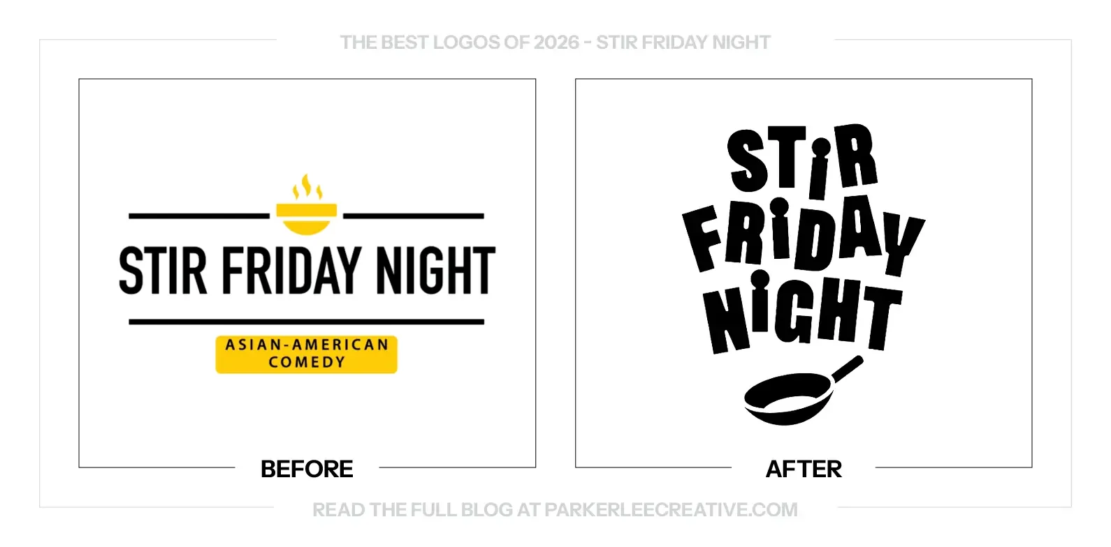
Chicago’s Stir Friday Night approached Studio Apéritif around its 30th anniversary to bring its identity into a new era. The long-running Asian American comedy troupe needed a visual presence that felt as fresh as its performances, with a new identity and website.
Why It Made the List:
The pan makes the name feel immediate. It gives Stir a visual action and connects the stacked lettering to something you can recognize in a second. The idea is simple enough to remember without needing a paragraph beside it to make the joke work.
The loose rhythm in the lettering feels appropriate for comedy. It has movement and a little unpredictability without losing the name. The individual choices feel connected, so the energy comes from the composition rather than a pile of competing effects.
The mark says several things with very little material. Name, motion and a useful cultural reference sit together in one compact idea. It is one of my favorites because the cleverness does not make the basic job of recognizing the troupe more difficult.
The Tradeoff:
The tightly stacked name is less suited to very narrow horizontal spaces, and the pan alone will need repetition before it can identify the troupe. Supporting layouts should keep the full name readable while allowing the simpler symbol to become familiar.
What Businesses Can Learn:
When a business name already contains a visual idea, explore how the lettering and symbol can complete each other. A small connection can be more memorable than a separate illustration. Keep testing whether the name is still easy to read after the clever part lands.
25. Tennessee Titans
Why Did the Logo Change?
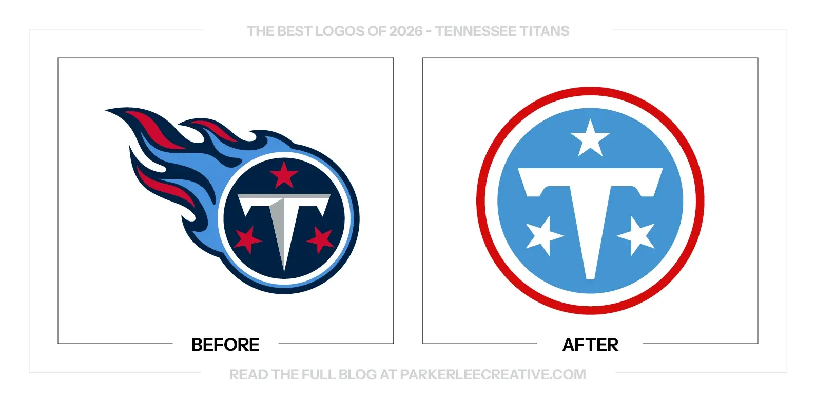
The Titans introduced new logos and uniforms in March 2026 as a new chapter for the franchise. The system connects Tennessee’s three-star reference, the team’s history and Nashville details, including a six-string stripe in the uniforms, within a more unified identity.
Why It Made the List:
The simpler circular mark feels historical and current at the same time. Removing the flames gives the T and stars a clearer relationship, with less competing movement around them. The design has enough confidence to let a small number of elements do the work.
The balanced construction gives the logo a sense of permanence. Its central T and three stars feel more like an emblem the franchise can keep than another aggressive sports graphic. The local reference is useful because it is part of the structure, not an afterthought.
The wider uniform system supports the same direction. Color and the Nashville-inspired stripe give the franchise more to work with than the primary badge alone. It feels like a considered moment to connect the team’s next chapter with the history fans already carry.
The Tradeoff:
The old flames made the silhouette unmistakably Titans, even at a glance. The cleaner badge gives that up, and the T can invite comparisons with other brands. Consistent color, uniforms and supporting marks will need to make the new emblem feel firmly owned by the team.
What Businesses Can Learn:
A sports identity should have more than aggression to rely on. Look for a local reference that can shape the construction, then carry it consistently through the uniform system. A simpler mark works best when the surrounding details make it unmistakably yours.
26. WeightWatchers
Why Did the Logo Change?
WeightWatchers refreshed its identity and digital experience as its business expanded around medical support and changing approaches to weight management. The work connects the familiar name with a stronger visual presence and a wider offering intended to support members across different needs.
Why It Made the List:
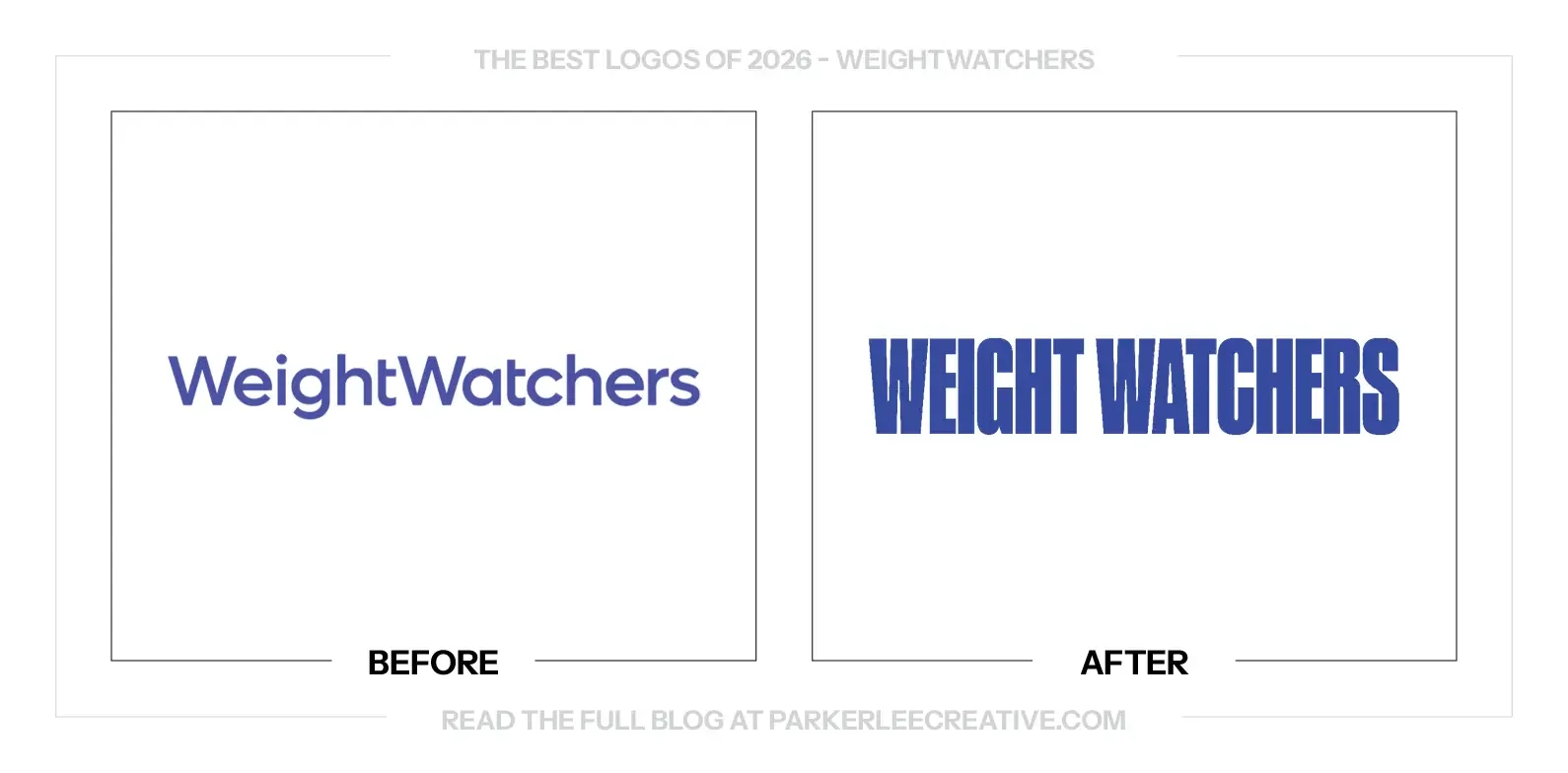
There is an obvious irony in a weight-management brand choosing heavier lettering, but the visual decision works. You cannot keep making a name thinner forever. The new wordmark has enough weight to stand its ground and be recognized without relying on a delicate finish.
The stronger proportions make the name feel more assured. The previous lettering could disappear beside louder material, while this version has a clearer presence. The brand can communicate confidence through its own name instead of adding another symbol or effect around it.
The fuller name has value at a moment when the business needs to explain itself again. The bold treatment makes that introduction direct and difficult to miss. It is a useful reminder that a recognizable name can be a stronger asset than another abbreviation.
The Tradeoff:
The condensed lettering has more presence, but it can feel forceful in a category that needs care and empathy. Photography, language and the member experience have to supply that warmth. A bolder logo should not make the support around it feel more intimidating.
What Businesses Can Learn:
Judge typography by what it needs to communicate, not by a literal association with the product. A weight-management brand does not need thin lettering any more than a fitness brand needs to look fast. Choose the form that supports recognition and the intended relationship.
You Read My Whole Blog? You Like Me! You Really Like Me!
Thank You for Reading The 26 Best Logos of 2026
But most importantly, thank you to the designers, studios, freelancers, in-house teams, and, above all else, the clients brave enough to say "yes" to new work.
For the other half of this year’s series, read The 26 Worst Logos of 2026.
Fun Fact: Did you know you can read all of The Worst Logos of Every Year or The Best Logos of Every Year in two sets of convenient hyperlinks? If I were you, I'd head right over!
Time for Your Own Rebrand?
They say knowledge is power. Now it’s time to put it to work. If you have a brand of your own and need a hand making sure your logo looks its best, I’d love to help.
For over 16 years, I’ve worked with clients ranging from mom-and-pop shops just getting started to architectural conglomerates navigating acquisitions, helping bring over 225 rebrands to life.
Get to know my design process and find answers to your questions, then say hello. I believe loyalty begins with identity, and I’d love to help you build one worth sticking with.
Legal Disclaimer: This content is provided for educational and informational purposes and is intended as commentary and criticism; all product names, logos, and trademarks are the property of their respective owners, and any copyrighted materials shown are used under the principles of fair use solely to identify the subjects discussed and to support analysis, with only the limited portions reasonably necessary displayed; no sponsorship, endorsement, affiliation, or partnership is implied, and nothing on this page constitutes legal, financial, or other professional advice.
