

Published December 15, 2022. Updated October 29, 2026.
Welcome to the first of my two annual self-improvement articles. Every year, I look back at the best and worst rebrands that caught my attention to see what we can learn.
This little article right here contains my picks for the 10 Best Logos of 2022. But let’s talk “best” for a second. It means something a little different around here. We’re not handing out awards, though I’ll absolutely give someone their flowers when they crush it. We’re not here to put anyone down, either. Design is hard work, and sometimes a solution serves an unseen purpose.
Both articles share the same global goal: helping YOU think through the best and worst paths forward for YOUR brand. A logo on the best list might still have problems. One on the worst list might get plenty right. MY job is to look at why each brand changed, sniff out what works (or doesn’t), identify what it gives up, and explore what those decisions can teach us.
I have the utmost respect for every designer, studio, freelancer, in-house team, client, and logo represented here. Putting a new identity into the world is hard and often pretty scary. These reviews focus on the finished work and the decisions businesses can learn from. Design is subjective, and I don’t expect everyone to agree with every choice. That’s part of what makes these articles fun to write and discuss.
Looking for the other side of this proverbial verbal coin? Read The 10 Worst Logos of 2022.
Have a Logo in Mind? Jump Right In with a Click!
The rebrands below are listed alphabetically. The numbers are to help you find your place; they aren’t rankings. It’s not a competition. Sorry...
American Cancer Society · Canada Dry · CNET · Kraft Mac & Cheese · Manhattn’s Burgers · Newman’s Own · Pure Life · Pyrex · Warner Bros. Discovery · Wish
1. American Cancer Society
Why Did the Logo Change?
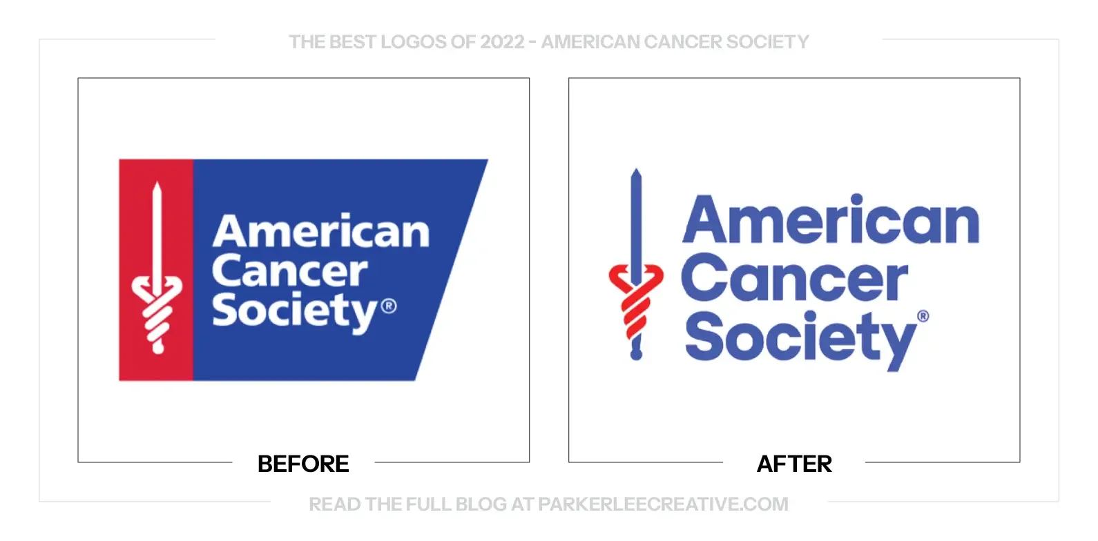
The American Cancer Society needed one identity to clarify research, advocacy, and patient support. It also had to keep the national organization visible beside well-known event brands without discarding the long-standing Sword of Hope.
Why It Made the List:
Enlarging the organization’s name and removing the enclosing field improves hierarchy immediately. The Sword of Hope remains recognizable, but it no longer forces a long name into a compact badge that struggles beside event logos.
The launch documentation ties the identity to a clearer mission and the line “Every Cancer. Every Life.” The system makes room for the full scope of the work, advocacy, and patient service instead of reducing the organization to fundraising.
The simplified palette and open lockup reproduce reliably across patient materials, advocacy campaigns, research communications, and local events. It is a measured evolution suited to an organization that cannot afford casual loss of trust.
The Tradeoff:
The cleaner wordmark feels more clinical and corporate than the red-and-blue badge it replaced. That restraint helps with clarity, but emotional warmth must come from photography, stories, language, and service experiences around the logo.
What Businesses Can Learn:
Complex organizations often need a hierarchy fix more than a dramatic symbol. Make the name readable, preserve the asset people trust, and design lockups for partnerships and sub-brands. The identity should help audiences find the right door.
2. Canada Dry
Why Did the Logo Change?
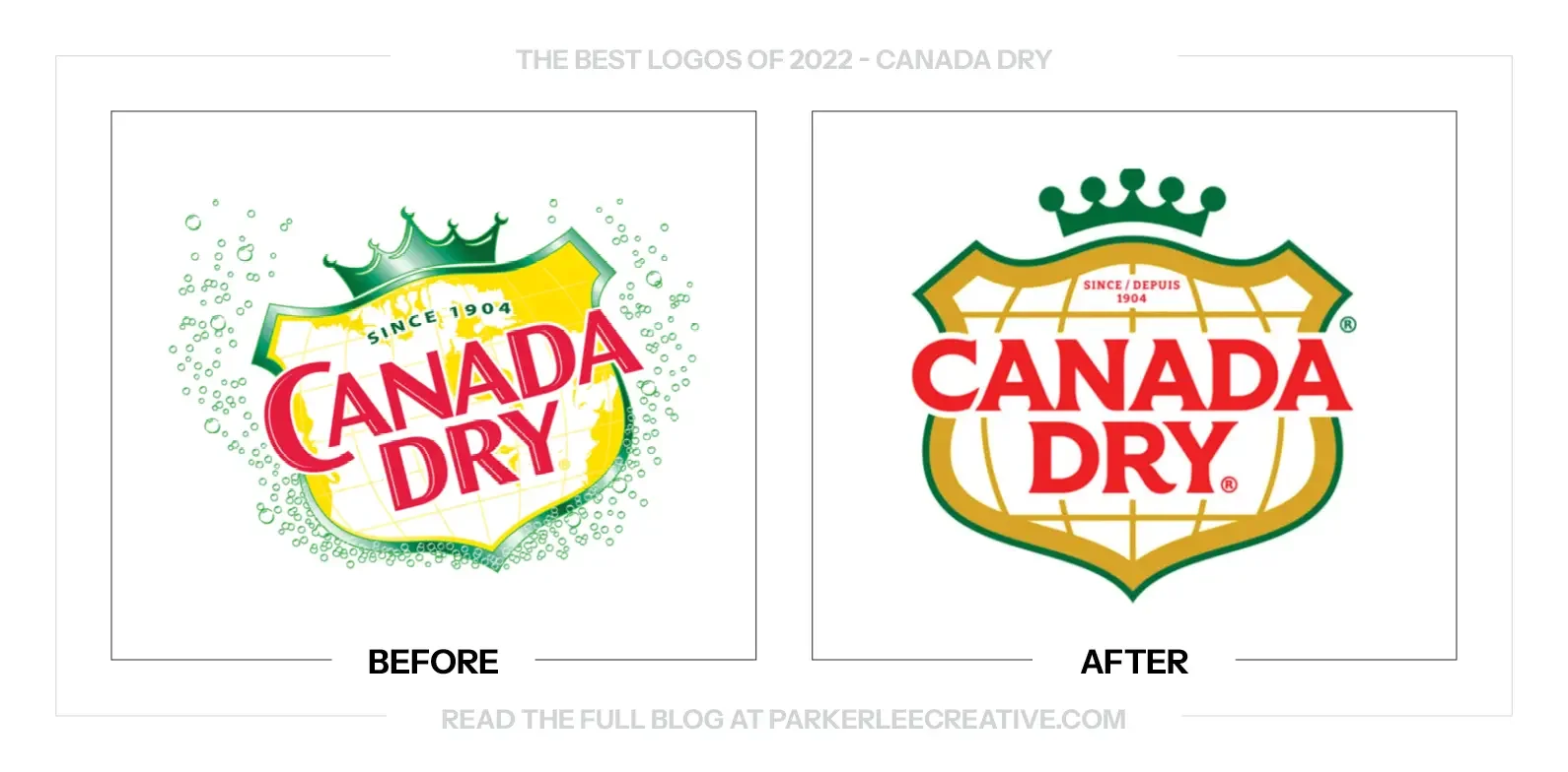
Canada Dry refreshed its Canadian packaging to modernize the shield and bring a large range into a more consistent system. The work leaned into more than a century of heritage while promising that the familiar ginger ale itself had not changed.
Why It Made the List:
The streamlined shield preserves the brand’s strongest container while removing enough ornament to improve shelf reading. Redrawn lettering, cleaner borders, and disciplined hierarchy make the package feel cared for rather than reinvented.
Canada Dry’s Canadian announcement grounds the refresh in local history, right down to map and coordinate cues, and explains why the details matter. Calling out the market matters because this was not one universal global redesign.
The system balances nostalgia with practical range management. Color and flavor information can change across ginger ale and mixers, while the shield, typography, and central composition keep every package recognizably Canada Dry.
The Tradeoff:
Latitude lines, landscape cues, borders, and type all compete inside the shield, so detail fades when reduced. The regional identity also creates a consistency challenge when customers encounter different Canada Dry systems across borders.
What Businesses Can Learn:
Define the market before judging or launching a redesign. A regional identity can answer local history and retail needs without pretending to be global. Clear documentation keeps partners and future designers from mixing separate systems.
3. CNET
Why Did the Logo Change?
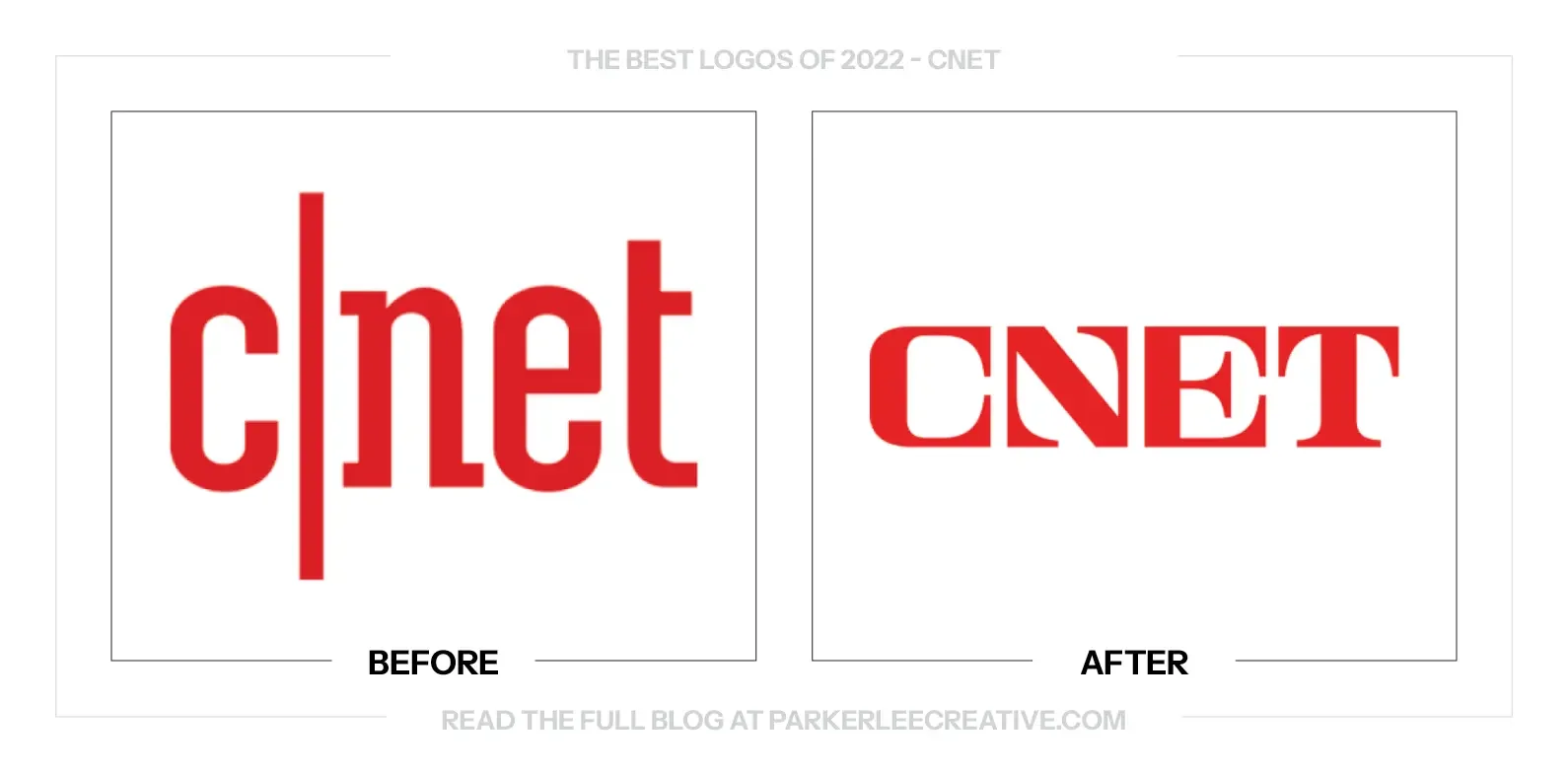
CNET wanted to be understood as an editorial publication about technology’s effect on daily life, not only a database of product reviews. The new identity used the visual language of journalism to make that broader ambition visible.
Why It Made the List:
The custom red serif wordmark gives CNET a stronger editorial posture without copying a newspaper masthead. Its sturdy shapes feel authoritative on a homepage, but they remain unusual enough to avoid disappearing among generic media brands.
Design Week’s rebrand report shows how the logo works with slab-serif headlines, direct layouts, and surreal illustration. The result is a wide-ranging, recognizable publishing system, not a lone mark dressed up for a case-study page.
Returning to a bright red and drawing from midcentury editorial design gives the brand history without restoring an obsolete interface. CNET gains a useful point of view: technology coverage can be human, opinionated, and carefully edited.
The Tradeoff:
Nostalgia is persuasive, but borrowing authority from a celebrated era of journalism can become costume. CNET has to earn the confidence projected by the type through reporting and editing, because a masthead cannot manufacture credibility.
What Businesses Can Learn:
Visual identity can clarify what kind of company a business intends to become. Choose references that support the new position, but make sure the product and behavior can carry the promise. Style should signal the work, not substitute for it.
4. Kraft Mac & Cheese
Why Did the Logo Change?
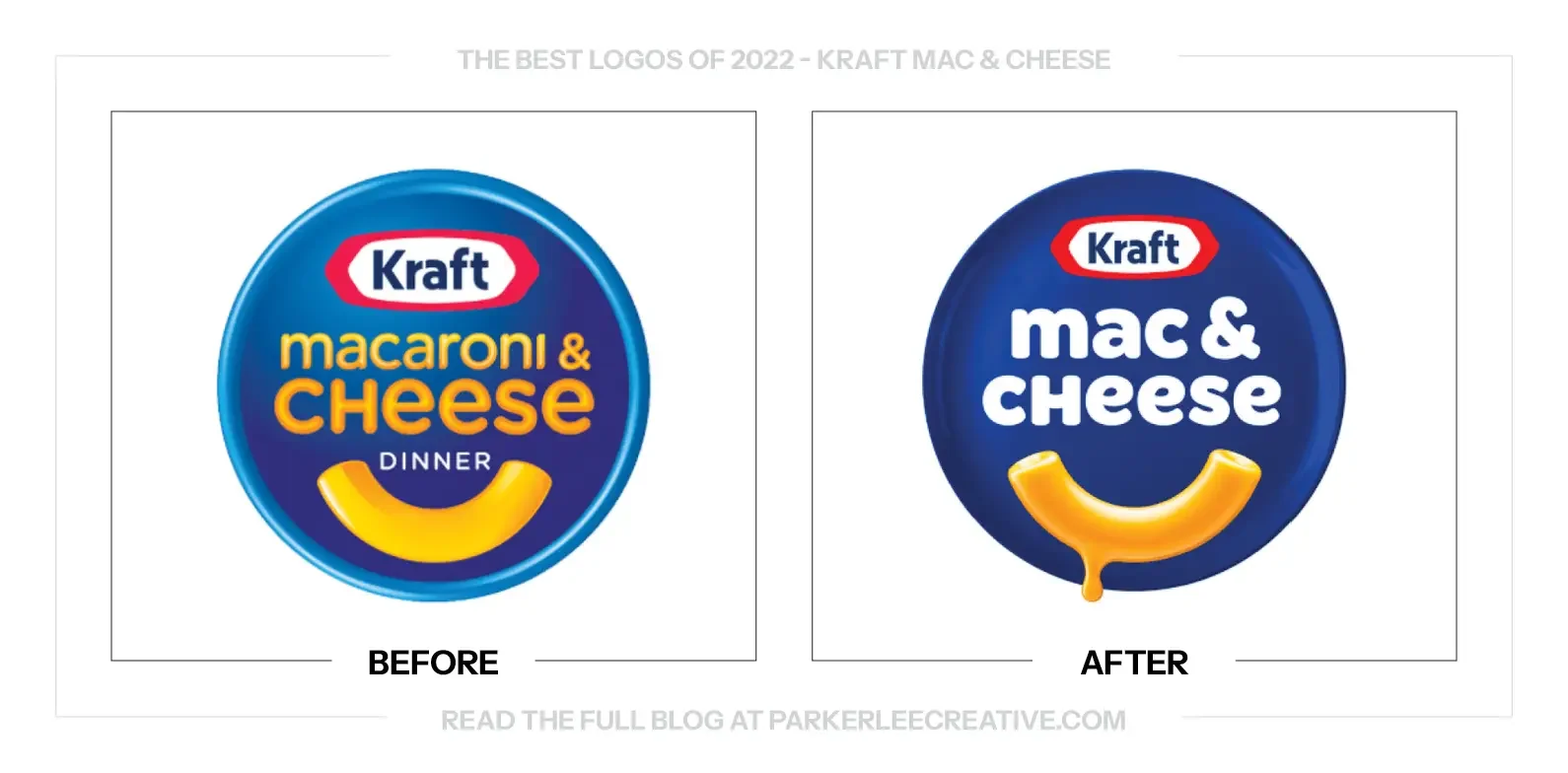
Kraft aligned the product’s formal name with what customers already called it: Kraft Mac & Cheese. The package update then clarified that shorter name, strengthened the familiar noodle smile, and simplified a box with enormous shelf equity.
Why It Made the List:
The redesign starts with customer language instead of inventing a new slogan. Shortening the name removes friction, creates a cleaner hierarchy, and makes the package sound like the people who have been asking for the product for years.
Kraft Heinz’s announcement explains that the blue box, noodle smile, and comforting tone were retained. That restraint matters because the package becomes easier to scan without making loyal buyers search for a product they already know.
The single blue field, larger smile, and shorter wordmark create a stronger read from across an aisle. The identity works because the brand did not confuse modernizing with removing every familiar imperfection that made the box approachable.
The Tradeoff:
The cheese drip and enlarged smile push the system toward indulgence and friendliness, but they also make it less plainspoken than the old box. If those devices spread too widely, a simple pantry staple could start to feel overproduced.
What Businesses Can Learn:
Listen for the name customers already use. The clearest brand decision may be hiding in everyday speech. Then improve shelf hierarchy around the assets people recognize, rather than forcing a new story onto a product that already owns one.
5. Manhattn’s Burgers
Why Did the Logo Change?
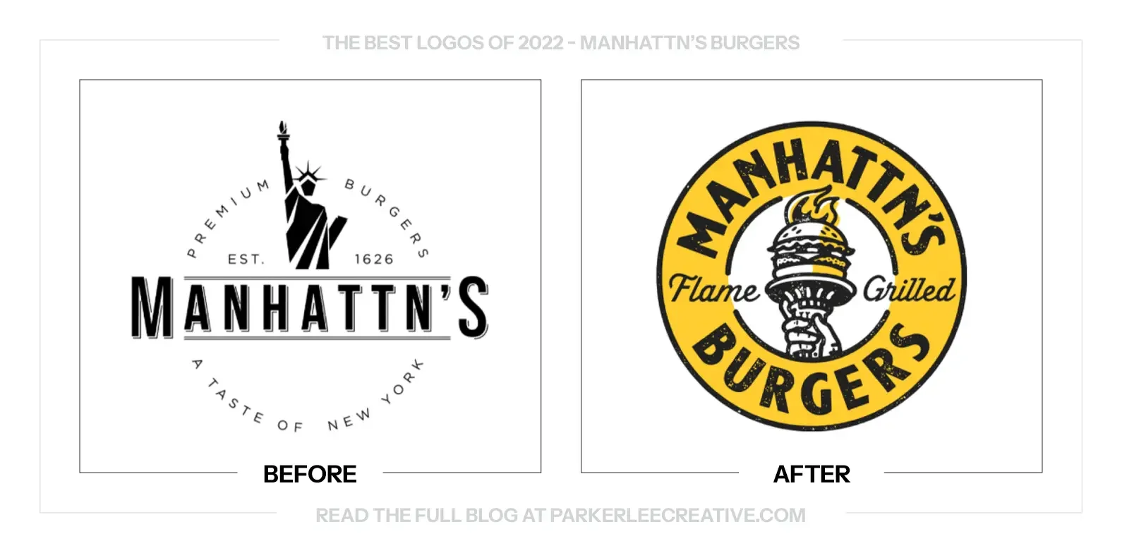
Manhattn’s needed a stronger New York story for its expansion and Paris flagship after earlier brand attempts missed the desired energy. The refresh mixed 1940s nightlife with 1970s fast-food warmth instead of copying one landmark.
Why It Made the List:
The lettering feels painted, stacked, and built for a storefront, giving the restaurant a specific sense of place before a customer sees the interior. It is nostalgic without borrowing a famous New York logo or reducing the city to one cliché.
The designer’s case study explains how steakhouse signs, marquees, neon, and fast-food graphics shaped the identity. That research shows up across packaging, apparel, menus, and signage, so the logo belongs to a full experience.
Yellow, black, texture, and confident typography create a system that can survive restaurant environments. The look feels handcrafted for a quality claim, but playful enough to keep a burger chain from presenting itself like a steakhouse.
The Tradeoff:
Layering New York nostalgia can turn into theme-park branding if every touchpoint shouts. The strongest applications leave room for food and people, letting the wordmark and a few details establish the setting without overdecorating it.
What Businesses Can Learn:
Research a place beyond its most obvious symbols. A richer visual identity comes from the signs, materials, habits, and eras that shaped an experience. Use those references to build a world, then edit hard enough that the brand stays usable.
6. Newman’s Own
Why Did the Logo Change?
Newman’s Own needed to make its charitable ownership model clearer, improve food presentation, and speak to younger shoppers. The challenge was doing all three without losing Paul Newman, the face that makes the brand unlike any competitor.
Why It Made the List:
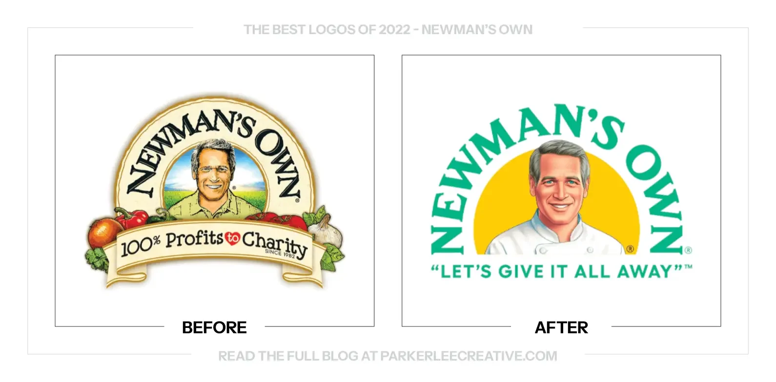
The redrawn portrait keeps Newman recognizable but simplifies his clothing, expression, and surrounding detail. Placing him in chef whites connects the founder more directly to food while giving the package a cleaner focal point.
Turner Duckworth’s case study clearly shows how “100% profits to help kids” moves forward in the hierarchy. The redesign makes the unusual ownership model easier to see instead of treating the mission as fine print under a celebrity.
Brighter color, hand-painted food illustration, and a simpler portrait make a portfolio feel related without forcing every product into one rigid template. The system can be warm and generous while staying practical on a crowded grocery shelf.
The Tradeoff:
Reducing the portrait gives food and mission more space, but it also softens the brand’s fastest recognition cue from a distance. Newman’s Own must keep the face large and consistently drawn enough that simplification does not become anonymity.
What Businesses Can Learn:
If a founder is genuine brand equity, do not erase that person to look modern. Refine the asset, clarify the role it plays, and improve the hierarchy around it. The goal is to make the story easier to understand, not less specific.
7. Pure Life
Why Did the Logo Change?
After Nestlé sold its North American water business, Pure Life needed an identity that could stand without the parent name. The 2022 update also corrected a brief yellow-label direction that looked more like flavored water than a family staple.
Why It Made the List:
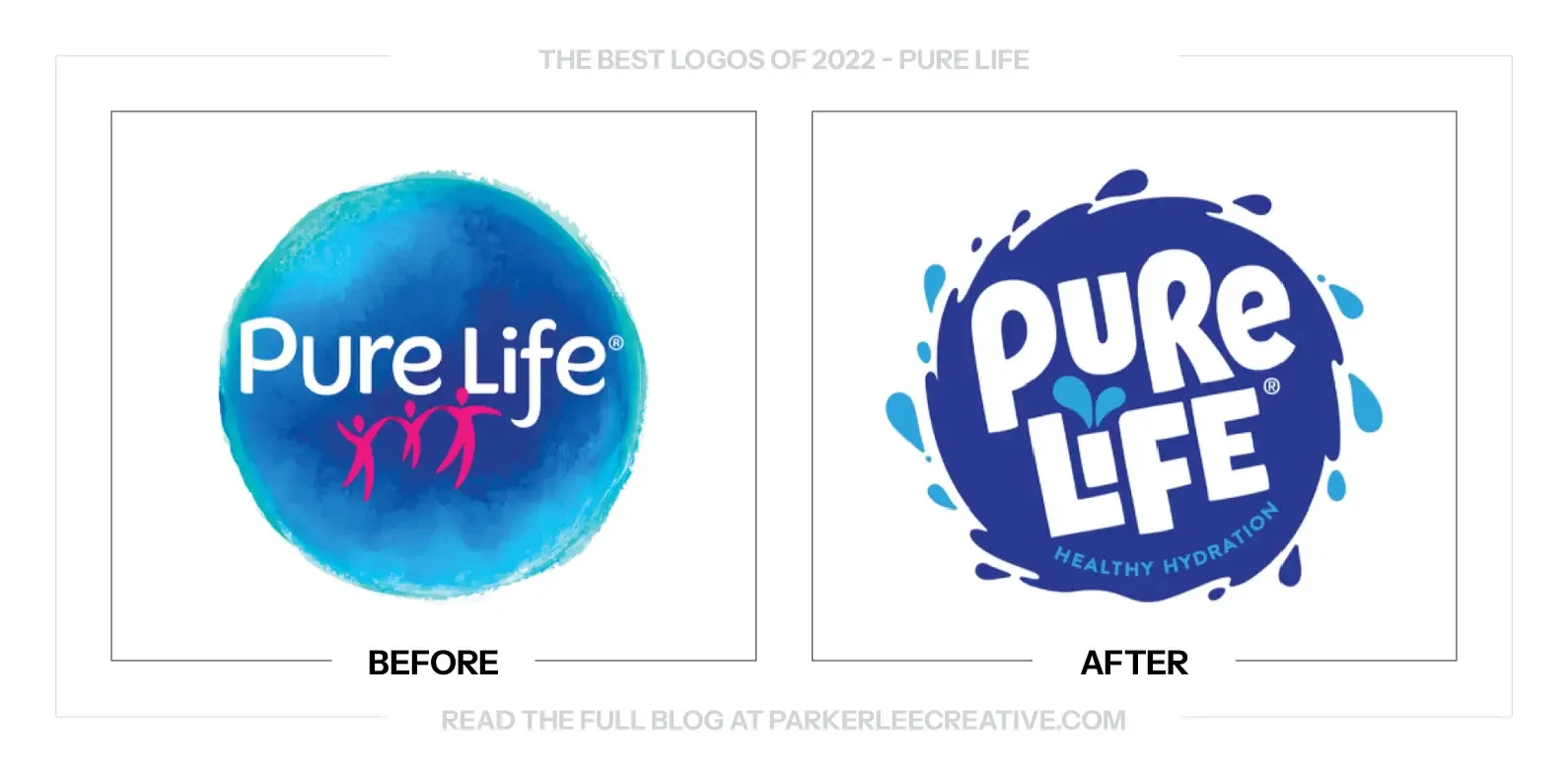
The blue circle creates a direct water cue and a dependable block on shelf, while the splash-like edge and stacked lettering give the name more energy. The mark communicates category and audience quickly without returning to the old textured globe.
The dated redesign record confirms the United States update and its water-drop letter details. Those small cuts add a proprietary touch to otherwise straightforward lettering across bottle sizes without interfering with readability.
Removing the former parent name gives Pure Life a cleaner hierarchy and more room to act as its own brand. The package reads as water first, with the product name held together by a simple and repeatable structure.
The Tradeoff:
The joined family figures disappear in the new mark. That loses a direct audience cue, while the splash shape alone is less distinctive. The water-drop cuts and consistent package composition must do real work if Pure Life wants the system to feel owned.
What Businesses Can Learn:
When ownership changes, identify which borrowed cues must leave and which customer expectations must stay. A replacement should make the product easier to recognize on its own, not simply erase the former parent and leave an empty space.
8. Pyrex
Why Did the Logo Change?
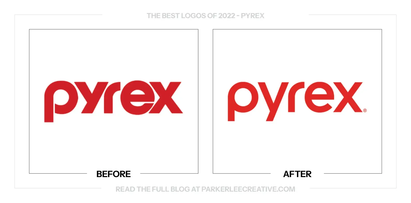
Pyrex wanted to reach younger families and move beyond a purely functional cookware story. Its refresh rejected picture-perfect kitchen culture, using handmade graphics and candid language to celebrate the imperfect reality of cooking at home.
Why It Made the List:
The core red Pyrex mark stays recognizable while handwritten type and loose illustration add the human voice around it. That division of labor is smart: trust remains in the logo, while personality lives in elements that can change by message.
Pearlfisher’s documented refresh turns imperfection into a practical system through Sharpie-like lettering, handmade imagery, and direct sub-brand names. The idea reaches packaging and content instead of stopping at a campaign line.
“Bake it!” and “Store it!” organize product uses in language that feels natural at home. The system makes a broad cookware portfolio easier to navigate, while the confident red field preserves the practical durability associated with Pyrex.
The Tradeoff:
Deliberately rough secondary graphics can become a style cliché, and too much of them would compete with a trust-heavy cookware mark. Pyrex needs enough restraint that “imperfect” continues to feel observed from real kitchens, not art-directed.
What Businesses Can Learn:
Keep the trusted part of an identity stable, then put a more human voice around it. A refresh does not need to redraw the logo dramatically when typography, naming, illustration, and packaging can solve the larger communication problem.
9. Warner Bros. Discovery
Why Did the Logo Change?
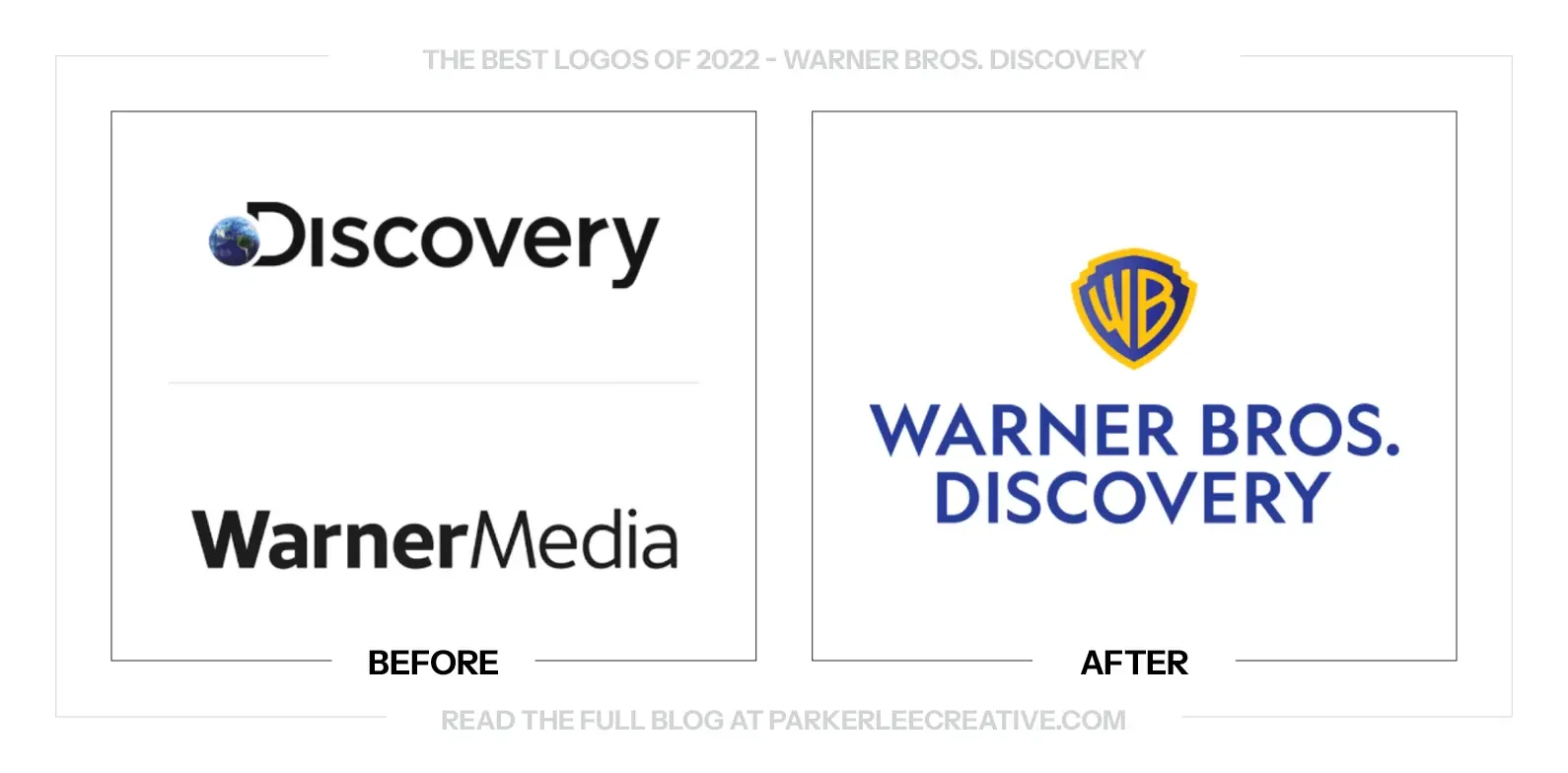
The WarnerMedia and Discovery merger needed a permanent corporate identity. A newly drawn Warner shield gave the holding company a recognizable anchor after an earlier temporary concept failed to carry the combined organization’s heritage.
Why It Made the List:
Bringing back the shield made sense. Warner Bros. brought a symbol with nearly a century of recognition, and the redraw made it cleaner for corporate use without turning the merger into an abstract shape nobody could place.
Reporting on the identity’s designers helps separate this April 2022 holding-company mark from the studio identity launched later. That distinction matters because the restrained wordmark and shield were designed for corporate architecture.
The logo works in one color, reduces cleanly, and accommodates a long company name without forcing every division into the same consumer-facing expression. It gives the parent a stable signature while leaving room for its entertainment brands.
The Tradeoff:
Warner heritage dominates the name, so Discovery feels more appended than represented. That imbalance may be strategically honest, but it limits how well the mark communicates a merger of two organizations rather than a Warner extension.
What Businesses Can Learn:
In a merger, equal visual weight is not always the right answer. Audit which assets carry recognition, choose the strongest anchor, and build a clear parent identity around it. Then let operating brands retain the equity customers actually use.
10. Wish
Why Did the Logo Change?
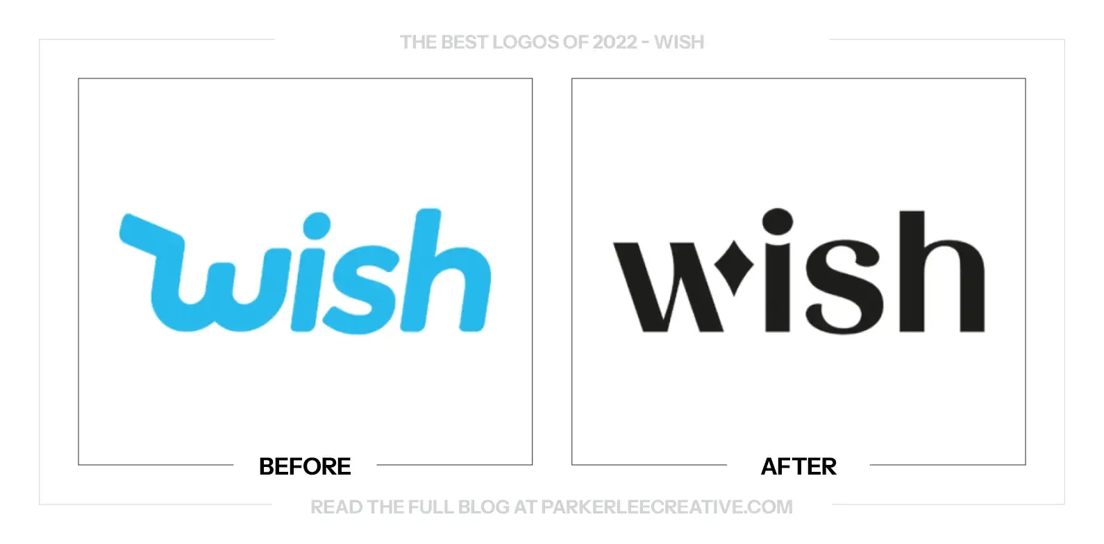
Wish was rebuilding its customer and merchant experience after twelve years with its original look. The brand needed a clearer signal of that reset, plus a visual system flexible enough to make bargain hunting feel fun without looking careless.
Why It Made the List:
The new W keeps the name easy to recognize while turning its final stroke into a flexible flourish. That one device can sparkle, point, celebrate, or frame an offer, giving Wish variety without forcing a different logo onto each campaign.
Wish’s launch announcement connects the identity to a broader product reset. The logo does not pretend to fix service problems, but it gives the redesigned experience a visible marker customers can recognize across the app and merchant tools.
The brighter palette and simpler icon hold up where Wish is actually encountered: app tiles, sale graphics, notifications, and product cards. The system feels energetic, yet the underlying wordmark stays quiet to keep merchandise in control.
The Tradeoff:
Sparkles and flourishes are common online, so the device is not ownable by default. Wish must use its motion, color, and composition rules consistently or the clever W will dissolve into the same promotional noise it was built to escape.
What Businesses Can Learn:
A logo can mark a business reset without claiming to be the reset. Pair the visual change with real operations, preserve an easy-to-read name, and give one distinctive element enough flexibility to support campaigns without losing recognition.
What the Best Logos of 2022 Have in Common
The best logo redesigns of 2022 protected recognition while making the larger brand easier to use. Kraft listened to customer language. Newman’s Own clarified its mission. CNET changed how it wanted to be understood. American Cancer Society solved an architecture problem that a prettier symbol alone could not address.
Good identity work begins with a business and communication problem, then chooses the smallest meaningful set of changes. It tests the logo in the places customers will meet it, gives supporting elements defined jobs, and documents where regional or corporate systems begin and end.
You Read My Whole Blog? You Like Me! You Really Like Me!
Thank You for Reading The 10 Best Logos of 2022
But most importantly, thank you to the designers, studios, freelancers, in-house teams, and, above all else, the clients brave enough to say “yes” to new work.
For the other half of this year’s series, read The 10 Worst Logos of 2022.
Fun Fact: Did you know you can read all of The Worst Logos of Every Year or The Best Logos of Every Year in two sets of convenient hyperlinks? If I were you, I’d head right over!
For a closer look at how the work comes together, read the professional logo design process.
Time for Your Own Rebrand?
They say knowledge is power. Now it’s time to put it to work. If you have a brand of your own and need a hand making sure your logo looks its best, I’d love to help.
For over 16 years, I’ve worked with clients ranging from mom-and-pop shops just getting started to architectural conglomerates navigating acquisitions, helping bring over 225 rebrands to life.
Get to know my design process and find answers to your questions, then say hello. I believe loyalty begins with identity, and I’d love to help you build one worth sticking with.
Legal Disclaimer: This content is provided for educational and informational purposes and is intended as commentary and criticism; all product names, logos, and trademarks are the property of their respective owners, and any copyrighted materials shown are used under the principles of fair use solely to identify the subjects discussed and to support analysis, with only the limited portions reasonably necessary displayed; no sponsorship, endorsement, affiliation, or partnership is implied, and nothing on this page constitutes legal, financial, or other professional advice.

