

Published December 15, 2019. Updated October 29, 2026.
Welcome to the first of my two annual self-improvement articles. Every year, I look back at the best and worst rebrands that caught my attention to see what we can learn.
This little article right here contains my picks for the 10 Best Logos of 2019. But let’s talk “best” for a second. It means something a little different around here. We’re not handing out awards, though I’ll absolutely give someone their flowers when they crush it. We’re not here to put anyone down, either. Design is hard work, and sometimes a solution serves an unseen purpose.
Both articles share the same global goal: helping YOU think through the best and worst paths forward for YOUR brand. A logo on the best list might still have problems. One on the worst list might get plenty right. MY job is to look at why each brand changed, sniff out what works (or doesn’t), identify what it gives up, and explore what those decisions can teach us.
I have the utmost respect for every designer, studio, freelancer, in-house team, client, and logo represented here. Putting a new identity into the world is hard and often pretty scary. These reviews focus on the finished work and the decisions businesses can learn from. Design is subjective, and I don’t expect everyone to agree with every choice. That’s part of what makes these articles fun to write and discuss.
Looking for the other side of this proverbial verbal coin? Read The 10 Worst Logos of 2019.
Have a Logo in Mind? Jump Right In with a Click!
The rebrands below are listed alphabetically. The numbers are to help you find your place; they aren’t rankings. It’s not a competition. Sorry...
Android · Bristol City · Firefox · KIWI · Lay’s · Slack · Vita Coco · Warner Bros. · WNBA · Yahoo!
1. Android
Why Did the Logo Change?
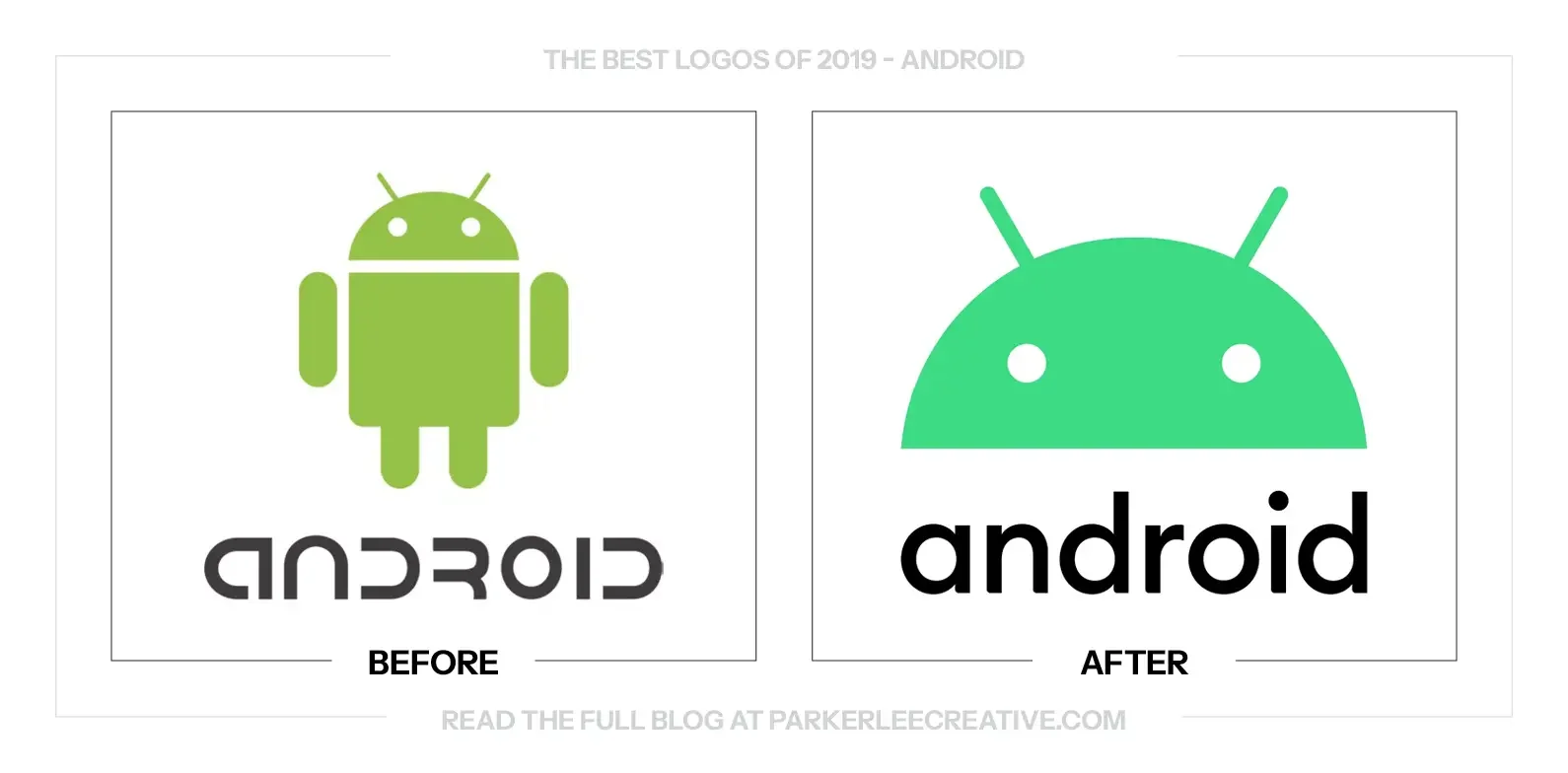
Google paired Android 10 with a naming and visual reset for a global audience. Dessert names did not translate across languages, while the green wordmark lacked contrast, so Android adopted numbers, black type, and a simplified robot head.
Why It Made the List:
The black wordmark improves contrast across backgrounds and for viewers with visual impairments. Rounded details keep it related to the robot, while a head-and-name lockup gives manufacturers a clearer asset for boot screens and packaging.
Keeping the robot’s head protects the platform’s most distinctive character while removing a body that was difficult to place beside a long name. A controlled green and supporting palette let campaigns vary without losing the identifier.
Google’s official Android update connects logo, contrast testing, and numbered release names to accessibility. The visual change addresses a measurable reading problem.
The Tradeoff:
Removing the robot’s body makes the lockup easier to use but narrows the mascot’s personality. Android also relies on hardware partners, so strong guidelines cannot guarantee that each device, carrier, and package presents the mark consistently.
What Businesses Can Learn:
Accessibility can reveal a stronger identity decision. Test contrast, language, pronunciation, and partner use as part of the design brief, then preserve the smallest distinctive asset that keeps a simplified system from becoming generic.
2. Bristol City
Why Did the Logo Change?
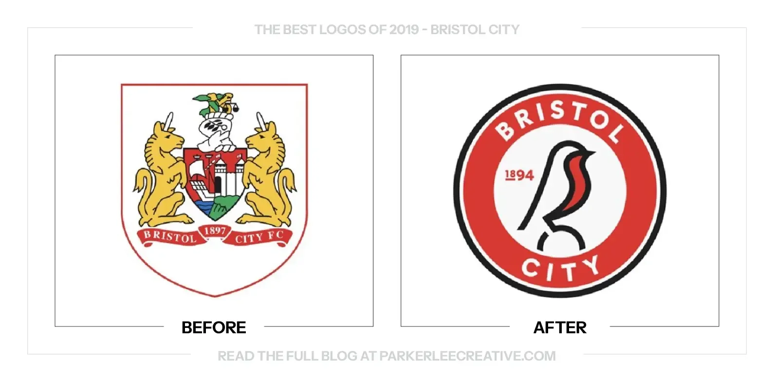
Bristol City wanted one crest for its men’s and women’s teams and a symbol supporters could own more clearly. After a survey with more than 3,350 responses, the club restored the robin, added 1894, and introduced the badge for its 125th year.
Why It Made the List:
The robin is specific to club history and supporter culture, giving Bristol City more ownership than a generic shield or initials. Perching it on a football keeps the sport explicit while the round enclosure works on shirts and avatars.
Red and white preserve match-day recognition, while linework gives the bird enough character without turning the crest into an illustration. The 1894 date adds history, and the same badge places the men’s and women’s teams under one identity.
Bristol24/7’s launch coverage records the supporter survey, the robin’s earlier use, and the club’s ownership goal. The process matters because the symbol reflects what fans asked to recover and gives both teams a shared public badge.
The Tradeoff:
The ball, date, bird, and enclosing circle create more detail than the robin needs at small sizes. Round football crests are common, so Bristol City must keep the bird drawing consistent rather than relying on the badge shape for distinction.
What Businesses Can Learn:
Audience participation is useful when it identifies meaningful equity, not when it turns every curve into a vote. Ask what people recognize and miss, show how that input changed the brief, then let design expertise resolve the final drawing.
3. Firefox
Why Did the Logo Change?
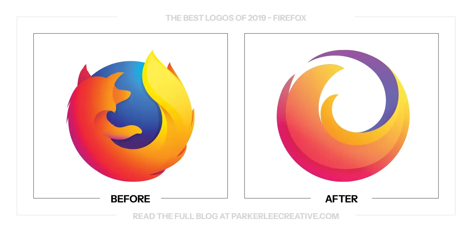
Mozilla was expanding Firefox from one browser into a family that included privacy, password, file-sharing, and monitoring tools. The identity needed a parent mark, product icons, and enough flexibility to explain a broader internet mission.
Why It Made the List:
A parent symbol built from a flame and circular motion gives Firefox a recognizable umbrella beyond the browser. The fox remains in the browser icon, while related products gain distinct shapes that still look like members of one family.
Gradients, shared curves, and a consistent construction connect the icons without making every service identical. That balance helps users distinguish a browser from Monitor or Lockwise while allowing screens and campaigns to feel coordinated.
Mozilla’s official 2019 introduction presents the logo as one part of a product architecture, not a replacement for the browser fox. The distinction matters because much of the early criticism confused the parent mark with the app icon.
The Tradeoff:
Nested symbols demand careful naming and placement. If the parent flame appears without Firefox or the browser icon is shown outside its product context, viewers may think the fox disappeared or struggle to understand which service is being offered.
What Businesses Can Learn:
When one product becomes a family, define the parent, products, and endorsement relationship before drawing icons. Assets should share enough logic to signal ownership while preserving the differences customers need to choose the right tool.
4. KIWI
Why Did the Logo Change?
SC Johnson’s KIWI shoe-care brand served countries with packaging that no longer gave its bird enough confidence or shelf authority. Landor and Glitschka Studios redrew the mascot, strengthened the uppercase name, and simplified the range.
Why It Made the List:
The bird gains a sturdier stance, eye, and more decisive silhouette without becoming a different mascot. Its red body and forward lean communicate polish and motion, while simplified feathers reproduce more reliably on tins and small labels.
Heavy uppercase lettering balances the character and reads faster than the prior narrow wordmark. A clearer red, black, and white hierarchy lets product type and shoe color change across the portfolio without weakening the master name.
Glitschka Studios’ KIWI case study shows how the illustrator gave the bird more confidence and swagger within Landor’s package program. That attention to character drawing makes the mascot a usable asset rather than a nostalgic decoration.
The Tradeoff:
The tougher bird and block lettering sacrifice the older mark’s peculiar charm. SC Johnson later exited shoe polish in the United Kingdom and explored options in parts of the United States, a business status change unrelated to the 2019 design.
What Businesses Can Learn:
A mascot refresh should improve pose, silhouette, expression, and reproduction before changing the character’s identity. Preserve the features people recognize, then test the drawing on the smallest package and in the simplest one-color version.
5. Lay’s
Why Did the Logo Change?
Lay’s had not substantially updated its packaging since 2007. The 2019 refresh needed to modernize more than one hundred products, appeal to younger shoppers, and improve shelf impact without disturbing a globally familiar snack logo.
Why It Made the List:
The smaller mark preserves the ribbon and yellow sun while giving product photography a clearer role. A refined script and simpler shading feel current, yet the package remains identifiable from color and shape before every word can be read.
Top-down chip photography reflects the way food appears in social feeds, but it solves a package task by showing texture and flavor ingredients clearly. Radiating rings organize the front rather than forcing each variety into a new layout.
Food Dive’s launch report clearly documents a 115-product rollout, the first major package change in twelve years, and the younger audience brief. That scale makes disciplined evolution more valuable than a dramatic logo replacement.
The Tradeoff:
The 2019 system preserved strong equity, but the 2025 redesign layered rays, farm textures, enlarged chips, and more copy around the same sun and ribbon. Familiar cues still need room, hierarchy, and restraint as a package evolves.
What Businesses Can Learn:
Large portfolios reward restraint. Protect the colors and shapes customers use to find the product, then build a hierarchy for imagery, flavor, and claims. A subtle logo change can succeed when the package architecture does more of the work.
6. Slack
Why Did the Logo Change?
Slack’s original hashtag mark used eleven colors and could break when reproduced at the wrong angle, background, or size. The company needed one reliable family for its app icon, website, merchandise, partner graphics, and internal products.
Why It Made the List:
Four colors and a controlled construction remove many failure points from a logo distributed across countless screens and templates. The mark stays recognizable in one color, at favicon size, on light backgrounds, and inside a square app tile.
Speech bubbles and lozenges preserve Slack’s conversation idea without drawing a message window. Rotation creates motion, while the repeated parts support animation and patterns that feel related to the primary mark instead of decorative.
Slack’s official launch explanation openly describes the old logo’s reproduction problems and the need for consistency. The redesigned asset earns its place because it answers those operational failures, not because a new symbol was overdue.
The Tradeoff:
The octothorpe became more controlled and less eccentric. Its pinwheel geometry can produce unintended readings when isolated or rotated, so Slack must protect orientation and spacing even though the construction was designed to reduce misuse.
What Businesses Can Learn:
Logo consistency is a production problem before it is a style problem. Document where the current mark fails, test files and backgrounds, then reduce the number of conditions required for success without discarding the idea customers recognize.
7. Vita Coco
Why Did the Logo Change?
Vita Coco’s first visual update in fifteen years needed to harmonize coconut water, Pressed, sparkling products, and future extensions. The company retained its tropical cues while simplifying the logo, illustrations, and package hierarchy.
Why It Made the List:
The redrawn wordmark removes heavy effects and adopts a crafted tropical rhythm without losing the name’s friendly shape. It reads more naturally on cartons, cans, and digital assets while staying recognizable beside blue and white packaging.
Imperfect fruit and palm illustrations support the company’s family-farm story without relying on stock imagery. Clearer color fields distinguish Pressed and flavors, allowing new products to join the range without restarting the design.
BevNET’s packaging report explains the goals of building equity, recruiting new drinkers, and harmonizing the portfolio. It also identifies Interesting Development, grounding the visual choices in a specific shelf and growth brief.
The Tradeoff:
Handmade type and imperfect illustration became common signals for natural food, so the style is not distinctive by itself. Vita Coco must keep its blue, palm landscape, and verbal personality consistent to avoid blending into the category.
What Businesses Can Learn:
Package evolution works when familiar buying cues survive a cleaner hierarchy. Keep the colors, shapes, and imagery shoppers use to locate the product, then standardize how flavors and formats change so future launches strengthen the range.
8. Warner Bros.
Why Did the Logo Change?
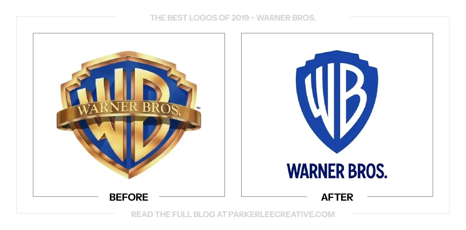
Warner Bros. was preparing for its 2023 centennial while a detailed 1993 shield struggled at small sizes and across digital platforms. Pentagram simplified the emblem, removed the banner, and built a custom type family from the WB monogram.
Why It Made the List:
The redrawn shield protects a century of recognition while reducing detail that disappeared in apps, titles, and partner lockups. Removing the sash gives the WB letters more authority and creates a silhouette at both tiny and monumental scale.
A flat corporate mark and dimensional screen version let context determine expression. The shield can sit on stationery or become a frame for film imagery, while Warner Bros. Condensed carries its letterforms into division names and headlines.
Pentagram’s Warner Bros. case study documents research, interviews, the “power of story” position, and the custom typeface. The work succeeds because heritage becomes a functional toolkit rather than a reason to preserve every old detail.
The Tradeoff:
The elongated shield and blue treatment feel institutional rather than cinematic. Warner Bros. adopted a primary corporate shield in 2023, while the 2019 design continued in secondary uses, showing how ownership can shorten a master mark’s role.
What Businesses Can Learn:
Heritage should prevent careless change, not useful change. Keep the structure audiences recognize, redraw weak details for current applications, and create separate versions when one treatment cannot serve corporate and expressive work.
9. WNBA
Why Did the Logo Change?
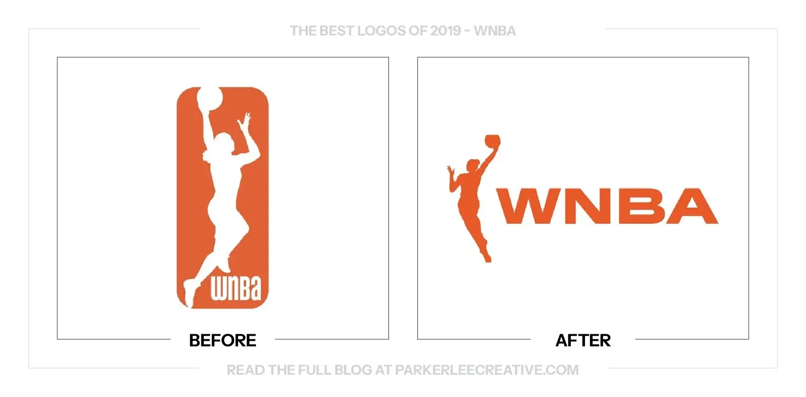
The WNBA entered its twenty-third season with rising visibility and a goal of giving players a stronger, more independent platform. Its 2019 reset introduced a freer athlete silhouette, orange as the lead color, and the “Make Way” position.
Why It Made the List:
The player now moves beyond the containing rectangle, giving the silhouette more speed and freedom while retaining a visual relationship to professional basketball. The pose feels athletic without being traced from one identifiable player.
Orange separates the league from the NBA’s red and blue while remaining loud on courts, apparel, social graphics, and broadcast packages. Strong condensed lettering and direct photography give individual players room to lead the visual story.
ESPN’s April 2019 launch report documents the brand reset, player-first strategy, and new silhouette. The identity was public in 2019 even though the broader campaign and portions of the rollout continued into the following season.
The Tradeoff:
The new athlete stands free of the old rectangle, but a league built around a player silhouette still invites comparison with the NBA. Orange, player voice, and independent composition must remain prominent so connection does not become visual hierarchy.
What Businesses Can Learn:
An endorsed organization needs both connection and autonomy. Preserve the visual cue that explains the relationship, then assign a distinct color, voice, and composition so the smaller brand can build recognition without imitating the parent.
10. Yahoo!
Why Did the Logo Change?
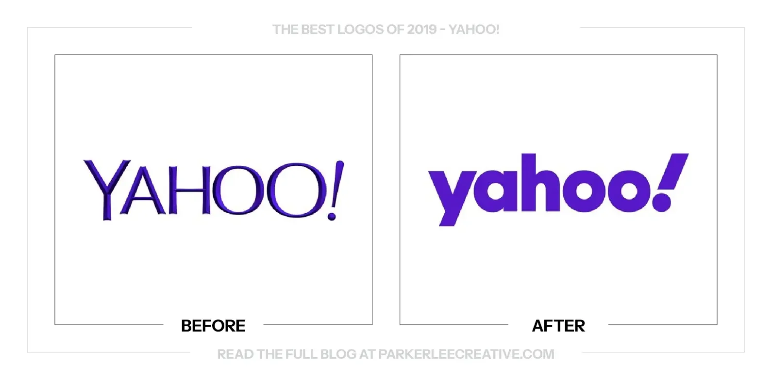
Yahoo needed a coherent identity across news, finance, sports, mail, entertainment, and a corporate structure. Pentagram rebuilt the wordmark, punctuation, color, and compact monogram so the familiar name could work with greater discipline.
Why It Made the List:
The exclamation point keeps Yahoo’s most ownable behavior and turns its angle into a rule used across layouts. A lowercase wordmark improves small-screen clarity, while the punctuation stops the sans serif name from becoming anonymous.
The y! monogram gives apps and social avatars a compact identifier without inventing an unrelated symbol. Purple remains the recognition cue, and the expanded palette creates enough contrast and variety for products with editorial voices.
Pentagram’s project coverage explains the 22.5-degree exclamation point, Centra No. 2 Modified, and clear, useful product system. Those details give Yahoo rules for motion, grids, and hierarchy across its products.
The Tradeoff:
The wordmark is more orderly but loses the irregular character associated with earlier Yahoo logos. Without the exclamation point and purple, the type alone could resemble many technology and media brands using friendly lowercase lettering.
What Businesses Can Learn:
A punctuation mark, color, or typographic habit may hold more equity than a legacy drawing. Identify that behavior, improve the name around it, and turn it into a repeatable rule that supports digital products instead of a launch-only flourish.
What the Best Logos of 2019 Have in Common
The best logo redesigns of 2019 solved practical problems without treating recognition as clutter. Slack reduced reproduction failures, Android improved contrast, Bristol City restored a supporter symbol, and Vita Coco organized a growing shelf portfolio. Each project knew which asset deserved protection and which limitation had become expensive.
Good identity work gives the logo a defined job, then assigns typography, color, imagery, motion, architecture, and usage rules to the rest of the system. It also plans for rollout. A mark that works only in a launch image is not finished, no matter how polished the presentation appears.
You Read My Whole Blog? You Like Me! You Really Like Me!
Thank You for Reading The 10 Best Logos of 2019
But most importantly, thank you to the designers, studios, freelancers, in-house teams, and, above all else, the clients brave enough to say “yes” to new work.
For the other half of this year’s series, read The 10 Worst Logos of 2019.
Fun Fact: Did you know you can read all of The Worst Logos of Every Year or The Best Logos of Every Year in two sets of convenient hyperlinks? If I were you, I’d head right over!
For a closer look at how the work comes together, read the professional logo design process.
Time for Your Own Rebrand?
They say knowledge is power. Now it’s time to put it to work. If you have a brand of your own and need a hand making sure your logo looks its best, I’d love to help.
For over 16 years, I’ve worked with clients ranging from mom-and-pop shops just getting started to architectural conglomerates navigating acquisitions, helping bring over 225 rebrands to life.
Get to know my design process and find answers to your questions, then say hello. I believe loyalty begins with identity, and I’d love to help you build one worth sticking with.
Legal Disclaimer: This content is provided for educational and informational purposes and is intended as commentary and criticism; all product names, logos, and trademarks are the property of their respective owners, and any copyrighted materials shown are used under the principles of fair use solely to identify the subjects discussed and to support analysis, with only the limited portions reasonably necessary displayed; no sponsorship, endorsement, affiliation, or partnership is implied, and nothing on this page constitutes legal, financial, or other professional advice.

