
The 24 Best Logos of 2024
Welcome to The 24 Best Logos of 2024, one of two articles in my annual Best and Worst Logos of the Year series. Every year, I look back at the rebrands that caught my attention and share what businesses can learn from them. Here, we are going to take a look at some of this year’s strongest work. Looking for The 24 Worst Logos of 2024? Read the companion article to learn about rebrands that may have missed the mark.
Below, I break down The 24 Best Logos of 2024. For each one, I look at why the business rebranded, where the new identity succeeds, what it gives up, and what your business can learn before starting a rebrand of its own.
A quick note before I get into the list: I have respect for every designer, studio, in-house team and client represented here. Putting a new identity into the world is hard. These reviews focus on the finished work, but the point is not criticism for criticism’s sake. This series is here to help business owners and brand teams understand why companies rebrand, learn from the choices behind the work and make better decisions when it is their turn. The entries are numbered to make the article easy to follow, but they are not presented in any particular order. Design is subjective, and I do not expect everyone to agree with every choice. That is part of what makes these articles fun to write and discuss.
But when it does come time for you to discuss a new logo, Parker Lee Creative is an award-winning, independent creative studio specializing in logo design and brand identity. We help businesses build new identities and refresh the ones they have outgrown. Our process starts with what the logo needs to communicate, then tests the work everywhere customers will see it. If you are considering a rebrand, contact us and tell us your story. We would love to help you create something worthy of next year’s Best Logos of the Year article.

1. A&W Canada
Why Did the Logo Change?
A&W Canada wanted an identity that felt current without discarding recognition tied to its orange oval. The refresh clarified the wordmark, reduced clutter, and created a warmer system for restaurants, packaging, menus, and digital service.
Why It Made the List:
The redesign protects the orange oval and familiar letterforms, then removes outlines and effects that weakened them. Rethink’s A&W case study shows how restraint can make established equity feel more confident across every location.
A simpler mark handles storefronts, cups, wrappers, app icons, and small menu placements without needing a special version for every surface. That range matters more than novelty for a restaurant brand with frequent customer contact.
The supporting typography, color, illustration, and photography feel friendly without turning the identity into staged nostalgia. A&W looks more human and appetizing while still behaving like the same place regular customers already know.
The Tradeoff:
Removing the heavier outlines gives the logo clarity, but it also reduces some of the diner-era punch associated with older A&W signage. The broader system has to supply enough texture and personality so the cleaned-up oval never feels generic.
What Businesses Can Learn:
When a familiar symbol still carries value, start by improving its performance instead of replacing it. Clean up competing details, test it on the smallest and messiest applications, and let the surrounding system deliver freshness.

2. Decathlon
Why Did the Logo Change?
Decathlon needed to operate as one sports brand rather than a retailer surrounded by dozens of competing sub-brands. The refresh unified its portfolio, refined its wordmark, and introduced an icon designed for products, stores, and motion.
Why It Made the List:
L’Orbit grows from the angle of Decathlon’s familiar A, so the new symbol feels connected to existing equity. Wolff Olins’ case study explains how its peak and circular motion support sport, progress, and participation in every use.
Consolidating 85 labels under one master brand gives customers a clearer path through products and gives the company one recognizable signature. The identity solves an architecture problem before asking the logo to create excitement.
Decathlon Sans, the brighter blue, energetic motion, and direct imagery provide enough range for entry-level gear and technical products. The system can celebrate serious performance without making casual movement feel secondary.
The Tradeoff:
L’Orbit is clean and adaptable, but a slanted peak inside an oval is not automatically distinctive in global sports retail. Its ownership will depend on disciplined repetition, especially as old sub-brand names and packaging disappear.
What Businesses Can Learn:
If a portfolio has become difficult to navigate, a redesign should begin with brand architecture. Decide what deserves its own name, what belongs under the master brand, and which shared assets can make the complete offer easier to understand.

3. Anaheim Ducks
Why Did the Logo Change?
The Anaheim Ducks had spent years using a webbed D while fans kept asking for the original masked-duck identity. The 2024 evolution restored that character, sharpened its construction, and made orange a central expression of Southern California.
Why It Made the List:
The redesigned Wild Wing mark recovers an unmistakable franchise asset instead of inventing a safer sports badge. The Ducks’ official announcement details how the original mask was rebuilt while keeping its instantly recognizable stance.
Sharper sticks, a more expressive eye, and stronger geometry make the mascot feel faster without losing its odd charm. The silhouette reads on a jersey and helmet, while the webbed D remains available as a useful secondary mark.
Orange gives the club a color it can connect to Orange County and own across uniforms, merchandise, arena graphics, and broadcasts. That local cue is more useful than a decorative reference that cannot guide actual design choices.
The Tradeoff:
The return leans heavily on nostalgia, and the masked duck will always carry a playful Disney-era association. That is part of its strength, but the supporting system must keep the club from feeling like a revival act frozen in the 1990s.
What Businesses Can Learn:
Customer affection is evidence. Before replacing an old asset, learn which symbols people still wear, request, and recognize without prompting. A thoughtful redraw can restore neglected equity while improving the mark for modern production.

4. Bolthouse Fresh Foods
Why Did the Logo Change?
Bolthouse Farms separated its fresh-carrot operation from its beverage business in 2024, creating Bolthouse Fresh Foods as a distinct company. The new identity had to signal continuity for buyers while giving produce a clearer focus.
Why It Made the List:
The identity keeps the Bolthouse name prominent, which protects trust with retailers and shoppers during a corporate separation. The company announcement explains the business split behind the change without forcing a new story.
A carrot-led symbol makes the fresh-food focus visible without forcing customers to read a corporate explanation. Its simple shape can work on produce bags, cartons, trade materials, trucks, and supply-chain labels without losing clarity.
The warm orange and green palette feels agricultural, but the clean typography keeps the business from looking quaint. That balance supports a company selling familiar produce through a large, modern distribution operation at scale.
The Tradeoff:
Carrots and leaves are common category signals, so the symbol faces a real distinctiveness challenge. The name may carry recognition at first, but consistent packaging and a proprietary visual system are needed to build independent memory.
What Businesses Can Learn:
When a company separates or spins out, the visual transition must manage reassurance and independence together. Keep the equity that reduces customer confusion, then use one clear signal to explain the new organization’s focus with clarity.

5. New York Botanical Garden
Why Did the Logo Change?
The New York Botanical Garden needed its public identity to represent more than a beautiful destination. The 2024 refresh connected horticulture, plant science, education, and environmental work through a bolder, more active voice.
Why It Made the List:
The living logo changes through organic letterforms inspired by flowers, bees, trees, and other forms found in the Garden. NYBG’s launch story shows a flexible mark grounded in real collections rather than one fixed floral motif.
NY Botanical Gothic draws on New York design history while avoiding the hushed elegance common to cultural institutions. Its large shapes give the Garden a public voice that feels welcoming, urgent, and rooted in the Bronx community.
Bright color, direct language, and active layouts give science and education equal weight with visitor imagery. The toolkit can promote an exhibition, explain research, or recruit learners without changing voice between those tasks.
The Tradeoff:
The changing logo creates energy, but variation can weaken recognition if teams treat every organic form as interchangeable. Clear rules are essential so the identity feels alive by design, not inconsistent from one campaign to the next.
What Businesses Can Learn:
A flexible visual language needs a fixed idea. Define what may change, what must stay constant, and why variation helps the audience. When that logic is clear, movement and variety can strengthen recognition instead of diluting the core mark.

6. Chicago Stars FC
Why Did the Logo Change?
Chicago Red Stars wanted a name and crest that could represent a broader future while strengthening its connection to the city. Chicago Stars FC kept the star idea, added civic references, and prepared the club for the 2025 season.
Why It Made the List:
The four-point star remains central, protecting a useful bridge from Red Stars to Chicago Stars. The club’s official reveal explains how the crest connects team history with a new chapter while preserving recognition among existing supporters.
Lake blue, city red, and the pale blue field create a direct Chicago connection without copying the municipal flag. The rounded shield and centered star stay clear on uniforms, social avatars, tickets, and supporter merchandise.
The shortened name is easier to say and extend, while FC clarifies the sport for national and international audiences. The identity gives the organization a cleaner platform without erasing the supporters who built its reputation.
The Tradeoff:
Stars is broader but less distinctive than Red Stars, and the crest enters a crowded field of shield-based football identities. Repetition, supporter adoption, and a strong matchday voice will decide whether the new name feels fully owned.
What Businesses Can Learn:
A name change should keep at least one bridge customers can recognize. Preserve a symbol, color, phrase, or story that makes the transition feel intentional, then ensure the new name is easier to use and broad enough for planned growth.

7. Grammarly
Why Did the Logo Change?
Grammarly’s writing assistant had expanded across browsers, apps, and generative tools, creating more small interface moments for its mark. The 2024 update replaced the circular G with a sharper suggestion-like symbol and refined wordmark.
Why It Made the List:
The new icon resembles an editing suggestion marker while still containing a G, tying the symbol to an action users see inside the product. Brand New’s 2024 spotting records the public change rather than describing grammar literally.
Its pointed form distinguishes the app from the many circular initial icons competing in a browser toolbar. The silhouette remains simple enough for a favicon, extension badge, mobile icon, and in-document product prompt at sixteen pixels.
The refined wordmark feels more deliberate beside the new symbol, while Grammarly green preserves recognition. It is a modest update that improves a digital tool where frequent, tiny appearances matter more than a dramatic reveal.
The Tradeoff:
The suggestion-marker shape fits the product but is more abstract than the old G. Since the parent company became Superhuman in October 2025, the mark now serves the Grammarly product rather than the organization behind the wider suite.
What Businesses Can Learn:
Digital identities should be judged in the interface, not only on a presentation board. Test symbols at favicon size, beside alerts, in crowded toolbars, and across light and dark modes before deciding whether a clever idea truly works.
8. H&H Bagels
Why Did the Logo Change?
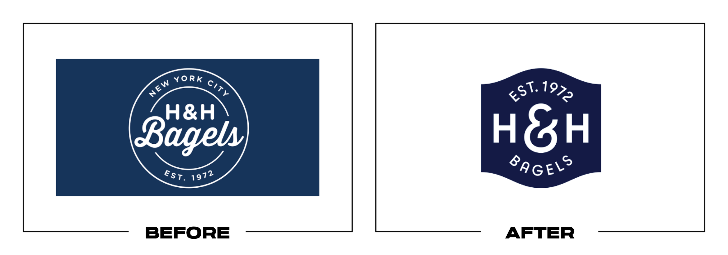
H&H Bagels was preparing for wider expansion while competitors borrowed the same generic New York deli cues. The refresh needed to preserve its 1972 heritage, create a more ownable seal, and support stores beyond Manhattan without imitation.
Why It Made the List:
Custom lettering and a redrawn seal give H&H an identity competitors cannot reproduce by choosing a stock script and navy oval. Creative Review’s project coverage documents the expansion brief before the company leaves New York.
The visual language balances navy with cobalt, red, and warmer food tones, creating more range without losing the classic shop character. Serif, sans serif, and script styles have assigned roles instead of becoming clutter in applications.
Packaging, menus, storefronts, photography, and collaborations share the same New York confidence. The result feels premium enough for growth while staying direct, busy, and slightly imperfect in a way that suits a working New York shop.
The Tradeoff:
The richer system depends on careful art direction. If every type style, badge, and accent color appears at once, the identity can become costume-like. Expansion teams will need firm templates to protect its intentional roughness.
What Businesses Can Learn:
Heritage is not a license to copy familiar category clichés. Identify which details genuinely belong to the company, redraw them with care, and build rules that let new locations feel consistent without becoming a themed imitation.

9. Impossible Foods
Why Did the Logo Change?
Impossible Foods needed to appeal more directly to meat eaters, not only shoppers already interested in plant-based products. The 2024 redesign replaced cool scientific cues with red packaging and a warmer, appetite-led voice built for food.
Why It Made the List:
Red makes the range read like food rather than laboratory output, supporting the company’s effort to compete with animal meat on taste. Impossible Foods’ announcement states that strategic shift plainly rather than food science.
The softened wordmark feels more inviting, while the fork-like S adds a compact product cue without turning the logo into an illustration. Its bold construction holds up across packaging, freezer doors, menus, and digital campaigns.
Large product names, strong food photography, and a consistent red field make the portfolio easier to shop. The system gives burgers, nuggets, sausage, and future products a common family resemblance without hiding their differences.
The Tradeoff:
Red is effective for appetite, but it is heavily used across meat and fast-food categories. Impossible must rely on typography, voice, and distinctive packaging behavior to keep the shift from blending into a wall of familiar food cues.
What Businesses Can Learn:
Positioning should shape visual decisions. If the business needs to reach a different buyer, understand what that person expects to see, then translate the product’s strongest promise without abandoning the values existing customers trust.

10. KitKat US
Why Did the Logo Change?
The US KitKat identity needed stronger shelf presence without losing a mark shoppers recognize immediately. The 2024 refresh tightened the lettering, removed muddy inner shadows, and introduced a bolder retro-modern finish for Hershey’s market.
Why It Made the List:
Sharper letterforms and tighter spacing make the wordmark more compact, while the chunky shadow adds depth without the old interior effects. Creative Bloq’s review details the US-only update and why it feels louder today in stores.
The thinner white ring gives the red field more breathing room and directs attention toward the name. That improvement matters on small bars and multipacks, where an extra outline or weak contrast quickly turns into visual noise.
The result feels nostalgic without restoring an old logo. It keeps the breakable-bar energy, familiar red, oval frame, and playful weight, giving Hershey a cleaner asset while leaving global Nestlé packaging unchanged in other markets.
The Tradeoff:
The heavier shadow brings personality, but it can become dense at very small sizes and may date faster than a flatter wordmark. The separate US identity also adds complexity for a brand that shoppers encounter across global media.
What Businesses Can Learn:
Regional ownership and licensing can create legitimate identity differences. Be clear about where a redesign applies, preserve the cues customers use to find the product, and improve reproduction before adding fashionable effects.

11. mophie
Why Did the Logo Change?
mophie needed to reassert its role in mobile power as charging accessories became more crowded and visually interchangeable. Its October 2024 refresh introduced a softer wordmark, new digital experience, and broader identity system.
Why It Made the List:
The lowercase wordmark feels approachable while its rounded construction connects naturally with compact hardware and molded product forms. mophie’s launch announcement confirms the 2024 debut and the practical business case for change.
Removing the separate circular m creates a simpler signature for battery cases, chargers, cables, packaging, and ecommerce thumbnails. The name now carries the recognition instead of depending on a symbol many customers never learned.
The identity launched with a redesigned site and current products, which lets customers encounter it through actual shopping rather than a concept reel. That connection between brand and experience gives the update practical credibility.
The Tradeoff:
Rounded lowercase technology wordmarks are common, so the logo alone does not create much distance from competitors. Product design, color, motion, and a consistent tone must do more of the work that the retired symbol once attempted.
What Businesses Can Learn:
Removing a weak symbol can be smarter than endlessly refining it. If customers remember the name but not the icon, invest in a stronger wordmark and make sure the product, packaging, website, and service all reinforce the same identity.

12. New York City FC
Why Did the Logo Change?
New York City FC wanted a crest that could work more cleanly across kits and media as the club prepared for a permanent stadium. The 2024 update simplified the badge while retaining its circle, monogram, colors, and subway-token roots.
Why It Made the List:
The revised badge keeps nearly every recognizable ingredient while improving spacing, line weight, and small-size clarity. NYCFC’s official brand page shows how the refined crest and borough marks fit together across applications.
Enlarging the NYC monogram gives the club’s most important identifier more authority on jerseys and avatars. Removing the outer wording reduces noise without abandoning the circular form supporters have known since the club’s 2015 launch.
Five borough-inspired secondary marks expand the toolkit beyond one crest and give community programs more specific tools. The club can recognize local places while maintaining one master badge for competition and broadcast use.
The Tradeoff:
The update is subtle enough that many fans may see little reason for it, and the removed name reduces clarity for newcomers. The borough marks also require careful use so they support local connection without fragmenting the main identity.
What Businesses Can Learn:
Refinement can be valuable when the underlying concept still works. Measure whether spacing, hierarchy, and reproduction are limiting the mark, then fix those issues while preserving the shapes customers already recognize at a glance.

13. Ocean Spray
Why Did the Logo Change?
Ocean Spray’s first major identity overhaul in more than two decades needed to engage younger shoppers without losing its grower-owned history. The refresh updated the logo, labels, typography, photography, and voice around a bolder idea.
Why It Made the List:
The fruit wave remains the logo’s anchor, but a real splash mechanism produced a more tactile and imperfect image. Marketing Dive’s report explains how the refresh connects the asset to its cranberry growers and why it mattered.
Printer-inspired type and candid grower photography move the brand away from polished agricultural stock imagery. The work makes its cooperative structure visible and gives the packaging a story competitors cannot borrow honestly.
The “wildly uncommon” idea organizes labels, illustration, voice, and campaigns without requiring a dramatic logo replacement. Ocean Spray improves shelf energy while keeping the name, fruit, and blue banner shoppers already use.
The Tradeoff:
The expressive display type follows a packaging trend and can compete with flavor information when overused. Because the logo itself changed only slightly, the wider system must stay disciplined for shoppers to notice a meaningful difference.
What Businesses Can Learn:
An unusual business model can be a stronger brand asset than a decorative logo idea. Find the people, process, or ownership structure competitors cannot claim, then make that truth visible across packaging, photography, and language.

14. OXY Acne Care
Why Did the Logo Change?
OXY marked its fiftieth year by relaunching for teenagers who meet acne care through crowded shelves and social content. The update introduced rounded lettering, neon green, clearer category language, new packaging, and two products.
Why It Made the List:
The softer wordmark replaces a severe black-and-white look with a tone that feels less clinical and more approachable for younger buyers. OXY’s relaunch announcement connects the design to its teen audience without losing credibility.
Adding “Acne Care” under the name answers the first retail question immediately, especially for shoppers who do not know the legacy brand. Clear product strength and format labels make the broader range easier to compare at retail.
Neon green creates a recognizable shelf block across cleansers, pads, wash, and treatment products. The color feels energetic without abandoning the direct performance language customers expect from an acne-care line on crowded shelves.
The Tradeoff:
Rounded type and neon green make OXY friendlier, but they also risk looking like a short-lived youth trend. The system needs calm information hierarchy and credible product communication so energy never undermines trust over time.
What Businesses Can Learn:
For a functional product, clarity earns attention. State what the brand does, make variants easy to compare, and use personality to reduce intimidation. A lively identity should support the decision, not distract from it at retail.

15. PAGODA Snacks
Why Did the Logo Change?
PAGODA Snacks needed a stronger, more compact identity for frozen-food packaging and digital partnerships. The 2024 update enlarged the pagoda, strengthened the wordmark, and organized both elements inside a bold red holding shape.
Why It Made the List:
Elevating the pagoda from a minor detail to the main symbol gives the name an immediate visual counterpart. The redesign overview shows how the architecture and wordmark now form one compact unit rather than leaving it decorative.
The rectangular red block creates stronger contrast across photography-heavy frozen packages, retailer listings, and esports placements. It can travel as one asset instead of requiring separate symbol, name, and background treatments.
The update preserves red and the category reference, so existing shoppers retain familiar cues. Bolder type and tighter alignment modernize the mark without stripping away the visual story attached to the PAGODA name at a glance.
The Tradeoff:
A literal pagoda can reduce a broad food culture to one familiar symbol, and the red block resembles many Asian-food packages. Photography, product naming, and voice need specificity so the identity does not rely on shorthand alone.
What Businesses Can Learn:
Literal symbols can work when they improve recognition, but they should not carry an entire cultural story. Build distinctiveness through composition, language, imagery, and product detail, then test the complete package in context.

16. PEZ
Why Did the Logo Change?
PEZ needed a more robust wordmark for licensing, character collaborations, packaging, and tiny dispenser applications. The 2024 redraw kept its candy-block construction while strengthening the lines and spacing for reliable reproduction.
Why It Made the List:
The redesign treats the famous letter construction as an asset worth engineering, not simplifying into ordinary type. Typejockeys’ PEZ case study explains how stronger lines improve readability across collaborations in production.
Cleaner internal spacing helps the logo survive on small candy packs, dispenser stems, digital thumbnails, and licensed graphics. Those improvements are modest in a comparison image but valuable across thousands of production files.
The block-built letters still look unmistakably like PEZ candy, preserving the direct connection between name, product, and play. The update improves technical performance without sanding away the oddness that makes the mark memorable.
The Tradeoff:
The dense construction will never be as effortless at tiny sizes as a plain wordmark, and stronger lines can make it feel heavier. Alternative lockups and minimum-size rules remain necessary for especially cramped licensed applications.
What Businesses Can Learn:
A distinctive logo may need maintenance, not replacement. Redraw weak curves, spacing, and line weights with the production team involved, then document minimum sizes and versions so the original idea performs reliably in production.

17. Perkins American Food Co.
Why Did the Logo Change?
Perkins wanted to move beyond an aging family-restaurant image while preserving the bakery and comfort food customers know. The 2024 rebrand introduced a new name, warm wordmark, updated restaurants, and more flexible service formats.
Why It Made the List:
“American Food Co.” broadens the promise beyond pancakes without hiding what the restaurant serves. Dunn & Co.’s Perkins case study shows how the identity supports a remodeled full-service concept and Griddle & Go across formats.
The handwritten wordmark feels hospitable and food-led, while the circular sunburst adds a compact cue for signs, packaging, and social icons. Warm yellow and green shift the atmosphere away from generic family dining in every use.
The brand changed alongside menus, interiors, uniforms, and operating models, so the visual work has a real experience to organize. That integration makes the new identity more credible than a logo applied to an unchanged restaurant.
The Tradeoff:
Script lettering and warm retro colors are common in modern restaurant branding, so the toolkit could become familiar quickly. Food quality, service, interiors, and disciplined local execution must make the promise feel specific to Perkins.
What Businesses Can Learn:
A restaurant rebrand should reach beyond the sign. Align the name, menu, service model, interior, uniforms, packaging, and digital ordering so customers experience one idea from discovery through the meal, not just the dining room.

18. Pluto TV
Why Did the Logo Change?
Pluto TV wanted a more contemporary presence as free ad-supported streaming became a crowded category. Its tenth-year refresh simplified the logo, added motion and custom type, and reinforced its “Stream now. Pay never.” service promise.
Why It Made the List:
The new wordmark is bolder and easier to read than the previous ringed construction, especially in television menus and small app placements. Paramount’s announcement links the refresh to comfort and easy viewing across devices.
A 22-degree typographic angle nods to the 22 stars in Paramount’s historic mark without forcing that reference into the logo. Motion can help viewers “find their orbit” while the static signature stays relatively simple in motion.
Yellow becomes a strong navigation and promotional cue across a mostly dark streaming interface. The high contrast lets Pluto feel lively beside content artwork without adding more gradients, rings, literal orbit graphics, or extra icons.
The Tradeoff:
The simplified wordmark loses much of the planetary idea that made the previous mark immediately thematic. Yellow and bold sans serif type work well in an interface, but they require distinctive motion to avoid streaming category sameness.
What Businesses Can Learn:
For a digital service, the identity and interface should be designed together. Choose color, type, and motion that improve navigation and recognition around customer content, then keep the primary mark simple enough to stay out of the way.

19. Robinhood
Why Did the Logo Change?
Robinhood wanted its visuals to reflect a broader product range and a more mature position than its early commission-free trading story. The 2024 refresh simplified the feather and introduced a restrained, modular toolkit for growth.
Why It Made the List:
The feather keeps its hidden upward arrow while losing one lower segment, improving clarity without discarding the company’s best-known asset. Transform’s report covers Porto Rocha’s system across a wider range of products and services.
Black, white, neutrals, and controlled Robin Neon shift the tone toward serious investing while preserving one electric color customers know. The palette gives financial information and product screens room to lead across screens.
Custom type, technical illustration, precise photography, and modular layouts support stocks, retirement, crypto, and premium products without creating a separate visual language for each offer. The system is built for portfolio growth.
The Tradeoff:
Maturity can become anonymity. The black-and-white foundation resembles many finance and technology brands, and reducing the feather removes some friendliness. Robin Neon and illustration need disciplined use to keep the brand recognizable.
What Businesses Can Learn:
Growing up does not require becoming colorless. Protect the strongest symbol or color, then refine the surrounding system so new products feel credible. Maturity should improve clarity without erasing the personality that built awareness.

20. Stride Health
Why Did the Logo Change?
Stride Health needed to explain that it supports independent workers with health coverage, tax help, and benefits, not one narrow insurance transaction. The refresh created a warmer platform that spotlights a frequently overlooked audience.
Why It Made the List:
The refined script fixes awkward joins while retaining the human, energetic quality of the earlier wordmark. Redscout’s Stride case study connects the identity to a broader strategic foundation for independent workers in daily use.
Bold yellow backgrounds and black-and-white portraits turn freelancers and gig workers into the central visual asset. Highlighted labels make complex benefit language easier to scan without pretending the products are simple to choose.
Illustration, motion, product screens, and messaging share an advocacy tone that distinguishes Stride from conventional insurance. The toolkit can explain taxes and health plans while still feeling like one supportive service across tasks.
The Tradeoff:
The script wordmark carries warmth, but it can lose clarity at small sizes and may feel less authoritative in regulated contexts. Strong sans serif typography and straightforward product language must balance its tone without losing trust.
What Businesses Can Learn:
When customers feel ignored by a category, visibility is strategic. Put real audience language and needs at the center, then use design to make complex choices more approachable without minimizing their consequences at every step.

21. Tupperware
Why Did the Logo Change?
Tupperware needed a more relevant identity as it expanded beyond direct-sales parties and confronted serious business pressure. The 2024 refresh introduced a lid-inspired T, brighter colors, and a more flexible system for retail and digital use.
Why It Made the List:
The peeled-back top of the T turns a familiar container action into a concise proprietary idea. The Hard Copy’s rebrand review identifies Landor’s role and shows why that device gives the logo a recognizable signature at retail.
Bold colors drawn from the product range give Tupperware more energy across ecommerce, stores, and social content. The scalloped lid shape creates a useful container for messages without competing with product photography on shelf.
“Useful is beautiful” gives the visual system a practical foundation tied to how the products work. The identity treats storage as an everyday design tool rather than leaning only on nostalgia for home demonstrations in modern retail.
The Tradeoff:
The identity could not resolve debt or an outdated operating model. Tupperware filed for Chapter 11 in September 2024, and an investor group later acquired the brand and core operations. The lid detail still needs a stable business behind it.
What Businesses Can Learn:
Brand design can clarify a turnaround, but it cannot substitute for one. Align the identity with real changes in distribution, service, and product strategy, then avoid claiming that fresh graphics solved deeper operational issues.

22. United Way
Why Did the Logo Change?
United Way needed a global system that could unite local organizations, clarify how the network creates impact, and engage a new generation of donors and volunteers. The 2024 refresh modernized the mark and introduced “United is the Way.”
Why It Made the List:
The familiar hand, person, and rainbow remain, but clearer geometry and spacing improve digital reproduction across a large affiliate network. United Way North Carolina’s announcement documents the global rollout across affiliates.
“United is the Way” turns the organization’s name into a useful call to action instead of an institutional label. It can frame local stories while giving more than a thousand affiliates one recognizable verbal platform in daily use.
A broader color and layout system gives communities room to represent local issues without rebuilding the identity each time. Shared templates can improve consistency while keeping people and outcomes more visible than the logo.
The Tradeoff:
Modernizing a symbol used across independent local organizations creates rollout and governance challenges. If older and newer versions coexist for too long, recognition can fragment and the promise of a unified network becomes harder to see.
What Businesses Can Learn:
Distributed organizations need governance as much as creative assets. Build templates, training, migration plans, and clear ownership into the redesign so local teams can adapt the toolkit without weakening the shared network identity.

23. Vocation Brewery
Why Did the Logo Change?
Vocation Brewery had bold beers and recognizable colors, but its packaging and off-pack identity lacked a consistent focal point. The 2024 refresh restored the eye symbol and built a more cohesive system around craft for a wider audience.
Why It Made the List:
The eye converts Vocation’s focus on brewing into a symbol that can watch over every can, tap, sign, and campaign. Turner Duckworth’s case study explains why the overlooked asset returned to the center rather than adding a new device.
Existing core colors remain attached to familiar beers, protecting shelf navigation while the master identity becomes clearer. Detailed illustrations give each variety a story without letting the range lose its family resemblance.
An approachable pub voice replaces unnecessary technical performance, making expertise easier to enter. The identity respects serious brewing while avoiding the exclusivity that can make craft beer feel designed only for insiders.
The Tradeoff:
Eyes are common symbols in craft beverages and creative brands, so the mark needs Vocation’s typography, illustration, and voice to feel ownable. Detailed can art can also compete with the eye when hierarchy is not tightly managed.
What Businesses Can Learn:
A forgotten secondary asset may solve the consistency problem better than a new invention. Audit what already exists, identify the symbol with the strongest strategic fit, and give it a clear role across every customer touchpoint.
24. Verizon
Why Did the Logo Change?
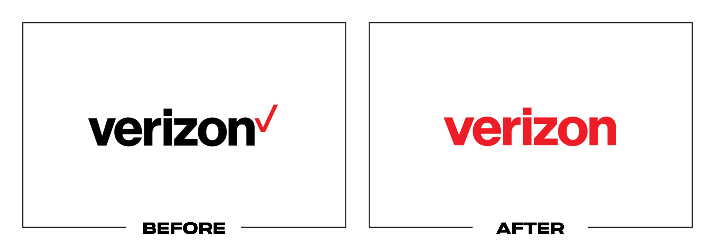
Verizon wanted to feel more visible and energetic as its services expanded beyond a largely invisible network utility. The 2024 refresh removed the detached checkmark, introduced a glowing V, and broadened its color and image system.
Why It Made the List:
The V emerges from the wordmark itself, giving Verizon one connected signature instead of a name followed by a small check. Verizon’s official release ties its red and yellow glow to truth and horizon instead of a separate badge.
Red remains the dominant recognition cue, while yellow, cream, photography, and motion give Verizon more warmth. The toolkit can support mobile, home internet, business, entertainment, apps, stores, and national campaigns with one voice.
The symbol scales cleanly for compact digital placements and can animate as a source of light. It gives the logo a useful behavior related to connection and possibility without illustrating towers, signals, or devices literally.
The Tradeoff:
The standalone glowing V resembles other entertainment and technology icons, most obviously Netflix’s N in dark settings. Verizon will need consistent motion, color, and context to make the symbol feel proprietary rather than familiar.
What Businesses Can Learn:
A symbol drawn from the name can simplify a fragmented lockup, but resemblance testing matters. Compare it against competitors and adjacent categories in real contexts, then build distinctive behavior beyond the static shape in motion.
What the Best Logos of 2024 Have in Common
The strongest redesigns did not chase one visual trend. They made a specific decision about what to protect and what to change. A&W, PEZ, and the Anaheim Ducks restored or refined familiar equity. Decathlon and United Way organized complex networks. Bolthouse Fresh Foods and Chicago Stars used identity to explain a business transition. NYBG and Vocation built flexible systems around one central idea.
Several projects also show why a logo should be judged inside its operating environment. KitKat and Ocean Spray had to win on packaging. Grammarly and Pluto TV had to work in interfaces. NYCFC and the Ducks had to survive uniforms, broadcast, and merchandise. The logo matters, but its value comes from making an entire system easier to recognize and use.
For the opposite side of the year, read The 24 Worst Logos of 2024. That list examines projects where strategy, symbolism, hierarchy, timing, or execution created avoidable problems.
Logos and trademarks are the property of their respective owners and are shown for identification, commentary, and criticism. No endorsement or affiliation is implied.
Thanks for Reading The 24 Best Logos of 2024
Thanks for reading our annual Best Logos of the Year article. It really means a lot to me. I also want to thank every designer, studio, in-house team and client who brought this year’s work to life. I may have opinions about the results, but this series would not exist without people willing to take creative risks in public.
For the other half of this year’s series, read The 24 Worst Logos of 2024. You can also browse the blog for earlier Best and Worst Logos of the Year articles and more logo design reviews.
Does your business need a new logo? We provide logo design and brand identity services for businesses that need something new or have outgrown what they already use. Fill out the form below and tell us your story. We would love to help forge a new identity for your brand that connects with your customers, tells your story, and lands you at the top of next year’s Best Logos of the Year article.
Legal Disclaimer: This content is provided for educational and informational purposes and is intended as commentary and criticism; all product names, logos, and trademarks are the property of their respective owners, and any copyrighted materials shown are used under the principles of fair use solely to identify the subjects discussed and to support analysis, with only the limited portions reasonably necessary displayed; no sponsorship, endorsement, affiliation, or partnership is implied, and nothing on this page constitutes legal, financial, or other professional advice.
